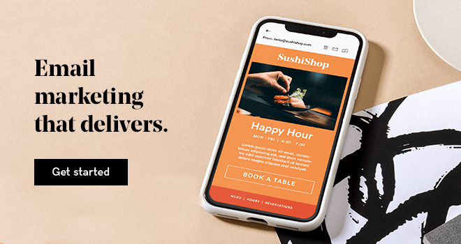
An active email list is probably one of your most important business assets. There isn't another marketing medium that gives you such a direct and intimate connection with your audience.
In our over-connected, and always-on world, email marketing is only growing in importance.
An email newsletter is a great way to stay at the front of your customer's minds while providing valuable information, like your latest blog posts, insider tips, alerts to sales, company news and more.
There's a lot you can do with email. But, one hurdle you'll have to overcome is getting your subscribers to open, read, and take action on your emails.
We won't cover things like subject lines or growing your email list in this post, but instead focus on email newsletter design. A well-designed email newsletter can help keep your readers interested and get them to take action.
Below you'll learn what email newsletters are and how you can design an email newsletter that holds your visitor's attention (even if you're not a designer yourself).
What is an email newsletter?
Let’s start with the basics: What is an email newsletter?
You've probably seen an email newsletter pop up in your inbox before. Maybe you even read one this morning while you were going through your inbox.
Email newsletters give brands a way to communicate with their subscribers.
They're a series of regular recurring emails that contain informational content, or a roundup of recent offers and content that's been published during the week (or month), depending on how frequently you email your list.
Usually, the type of content you're sharing in your email newsletter is dictated by your industry. Some industries, like ecommerce and other retail-based businesses, will feature a lot more product-oriented content and images, while others will only use their email newsletter to alert readers about a new blog post that went live.
The overall goal with an email newsletter isn't to sell products or make money for your business (at least directly).
Instead, it’s to provide value to your subscribers and deepen the relationship deepen your relationship, and build trust. That way, when you're doing a product launch or have something to sell, there's going to be much less resistance on the side of your buyer.
7 email newsletter design tips
Now that you’re well-versed in the why behind email newsletters, you’re ready to dive into some design best practices.
- Get your dimensions right.
- Create a compelling (but not overwhelming) header.
- Choose colors in alignment with your brand.
- Include plenty of white space.
- Focus on content over design.
- Include a compelling CTA.
- Let holidays and seasons inform your design.
You can think of the design of your email newsletter as being similar to the design of your website.
It needs to be intentional and speak directly to your market, as well as be engaging and include plenty of white space to create an enjoyable experience for the reader.
The market that you’re in will also dictate the overall design.
For example, in some markets, you won’t even have a design, and you’ll go as basic as possible, so the email will look like you fired up Gmail and sent a text email out to your list. But, for most markets, you’ll want some sort of design in place, even if it’s simple.
Keep the following design principles in mind as you create your email newsletter.
1. Get your dimensions right
The first thing you’ll want to focus on is the dimensions. If your email newsletter is too large or too small, it’ll look strange in people’s email clients.
Instead of opening up an email that’s easy to read, they’ll have to zoom in on the text or scroll from side to side just to read your content.
Deliver this kind of experience to your visitors too many times, and instead of looking forward to your emails, your subscribers will be ready to delete your email as soon as it lands in their inbox.
Having too many unsubscribes, or low open rates, can also lead to your emails being flagged as spam. This means it won’t reach their inbox in the first place.
The industry standard size is 600 pixels. You can hover around this number, but most email marketing providers offer templates that are in this standard size as well.
To guarantee that your email looks good in your visitor’s email client, including mobile devices, aim for 600 pixels or a maximum of 640 pixels.
Related: Email design 101 — How to create a beautiful email
2. Create a compelling (but not overwhelming) header
Your header is going to be the first thing your visitors see when they open your email. You’ve already done the hard work of having your subscribers open your email; your header should assure them they’re in the right place.
Here are a few super simple headers that are in alignment with the brand and website as a whole:
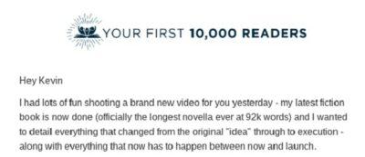
Nick Stephenson of Your First 10K Readers keeps things simple with his header. It’s a perfect match with the logo used on the site. So, when readers click through they’ll see the same logo design at the top of the page.
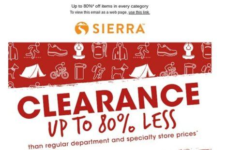
Another very simple header is from Sierra Trading Post. Here the header once again matches up with the logo.
Directly below the header, you’ll find another clickable image with the focus of the email, which is to get subscribers to click through to the website to check out the massive sale they’re having.
Often, your header can be your website logo. If the color of the email template doesn’t match the background of your website, then feel free to change the color or dimensions to make sure it looks right.
You can either go directly into your content below your logo, or include a header as you would on a blog post.
Once again, this will depend on the type of content you’re including in your newsletter.
For example, if you’re creating a roundup newsletter of the best content of the week, you’ll want an additional header to reflect the topic of the email, or each section of your email.
Take a look at how AngelList does it:
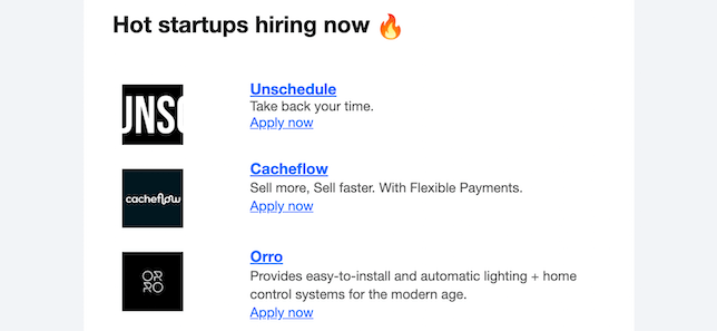
This newsletter has a few different sections which are broken up with different headers, including blog posts, industry updates, and the list of startups that are hiring in the respective niche the newsletter covers.
The overall design of your header should be in alignment with your website and brand as a whole.
This means a similar color choice, the same logo, and the same font choices (if possible). That way, when a reader clicks through to your website the experience will be seamless.
Related: How to design a logo in 12 steps — A DIY guide
3. Choose colors in alignment with your brand
When you design an email newsletter you’ll want it to be in alignment with your website. So, if your website uses primarily red, orange, and yellow, then you’ll want to use these colors throughout your email newsletter.
For example, the The Marginalian email newsletter is basically a carbon copy of the website.
For a lot of website owners, this won’t work or even make sense, but for this website it works perfectly. A lot of blogs employ this strategy to offer a seamless reading experience.
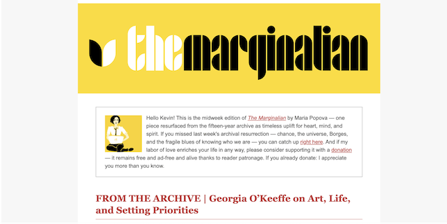
The newsletter uses similar fonts, colors, images and spacing. If you click through from the email newsletter to the website, you’ll have a nearly identical experience.
Another factor to consider with color is using complementary colors for your call-to-action (CTA) buttons and links. This will help them stand out and encourage your subscribers to click.
This is a very simple example, but the basic blue hyperlink text does get your attention:
The same goes for buttons in your newsletter, even though the rest of the email has a few hyperlinks your eyes automatically go to the yellow button:
4. Include plenty of white space
We have limits on how wide our newsletters can be, but there’s really no limit on the length of your email newsletter. So, with virtually unlimited real estate there’s no reason to clutter your newsletter as this will overwhelm your readers.
Even if your newsletter contains a lot of information, make sure to leave plenty of space to let it breathe.
For example, the Umzu newsletter is filled with products, links, testimonials and more. Even with a lot of different links and information, the email newsletter isn’t overwhelming — it’s the exact opposite.
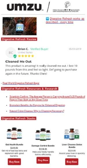
If you’re going to be including a lot of links, information and products in your email, then you’ll need even more white space to balance out your email.
In the example above, you’ll also notice that there’s a logical organization to the email.
First, the product is mentioned. Then there’s a testimonial. Then they offer a way to learn more, followed by even more ways to purchase the product.
5. Focus on content over design
Even the most engaging design can’t prop up a boring newsletter.
Before you start designing your newsletter, you’ll need to plan out what it’s going to be about.
For example:
- Will it be a roundup newsletter of the best blog posts across the web?
- Is the goal to showcase your selection of seasonal products?
- Are you just sending out a link to a recent blog post you published?
- Do you want to refer your subscribers to an affiliate offer?
- Maybe you have a content-heavy site and want to showcase a few of your most popular posts from the previous week?
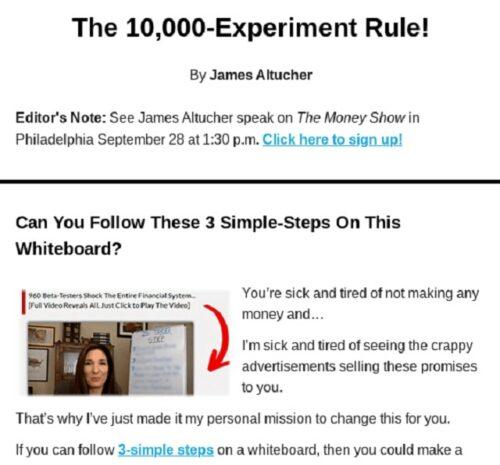
For example, author James Altucher sends out an email newsletter with his most recent articles, along with links to different offers throughout the copy of the newsletter.
One great strategy is to write the copy for your email newsletter and build your design around it. This will influence your design and the different elements, images, and CTAs you have in place.
Now, for most business owners it does make sense to have a basic template that you’re working from. This will ensure that all of your emails have a similar look, even when the content, structure, and style of each email differs.
When your readers open an email, you want them to have a similar experience again and again. You wouldn’t change the design of your website every day or week, so do the same with your emails.
6. Include a compelling CTA
Simply having a beautiful CTA button doesn’t mean your readers are actually going to click.
The CTA is just as important as the design of the button. But, what actually makes a good CTA?
Here are a few tips to get you started:
Use actionable language related to the rest of your email.
Your CTA needs to be active, which means the language exists in the present. Think of classic examples like “click here” or “sign up.” You should get more personalized, but these are a great place to start.
For a more targeted example, let’s say your email highlights the benefits of a product or service you offer and you’d like your readers to sign up for a free trial. In this case a CTA like, “Start your 30-day free trial today” or “Get your free sample today” would work.
Make the CTA stand out from the rest of your email.
Your CTA needs to be distinct from the rest of your content. So, if your subscriber is scanning the email, the CTA will easily catch their attention.
To do this, keep the following in mind:
- Use a bright button or text color that’s different than the rest of the colors in your email.
- Have plenty of white space surrounding the CTA; don’t bury it right next to other content.
- Make your CTA responsive, so it looks good whether it’s being viewed on a tablet, desktop, or mobile.
The fewer CTAs the better.
The fewer CTAs you have in your email, the better. Overwhelm your reader with things to click and your click-through rates will suffer. With an email newsletter, you’re generally trying to speak to multiple needs and interests, so you’ll end up having multiple CTAs.
But, make sure they’re relevant to each section of the email.
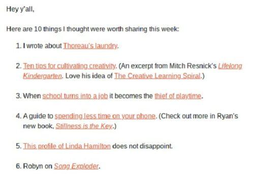
For example, author and designer Austin Kleon has a weekly roundup email newsletter. Even though there are a lot of links, it’s not overwhelming.
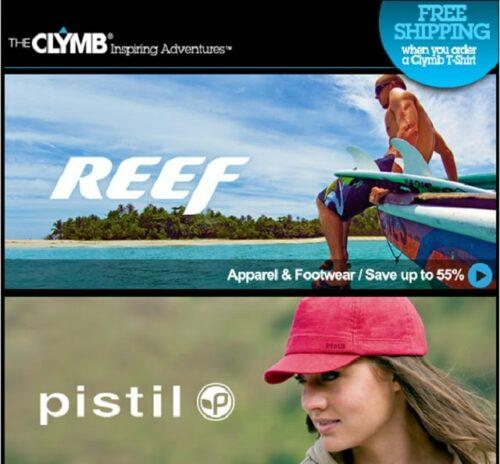
For another example, we’ll look at The Clymb.
Their email newsletter encourages subscribers to click through to their site by showcasing how much of a discount they’ll receive when buying products from their site.
The newsletter is also divided into multiple sections that address different segments of their market.
7. Let holidays and seasons inform your design
You might have a standard email newsletter design for your campaigns, but for holidays and seasonal content, you can switch things up a bit.
For example, a lot of your email newsletters that’ll be going out during Black Friday, Cyber Monday, and the rest of the holiday season will be about sales you’re running. So, you can let the design of your emails reflect that.
Feel free to depart from your original email designs and get a little seasonal.
Here’s an example of how Sephora structures their Black Friday email newsletter:
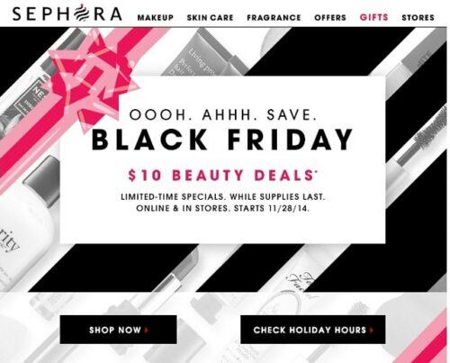
It’s simple, straightforward, and right to the point. The goal of the email is to get subscribers to click through to their site and take advantage of the deal.
Closing thoughts: Designing the best email newsletter for your business
By now you should have a better idea of the reasons why you’d want to design an email newsletter, as well as some design best practices to keep in mind when you’re creating yours.
Often, your email marketing provider will have templates you can use to provide a foundation for your design. Since professional designers create these templates, you’ll have a head start on designing a beautiful and compelling email newsletter.
Just choose your design, add your images, content and links, and click send!
Ready to start designing your first email newsletter? Learn how easy it is with GoDaddy Email Marketing.
This article includes content originally published on the GoDaddy blog by the following authors: Emma Wilhelm, Plume & Post and Sally McGraw.