If you design websites, you've got an opinion about typefaces and web fonts. Heck, chances are pretty good you've got an opinion that rivals soccer hooligans’ or baseball fans’. I've seen friends stop speaking to each other after fighting about Helvetica. Is Baskerville the most classic serif around? Do you even know how to kern headlines the right way?
Because, you know, there has to be a right way.
These days I like to stay diplomatic when I hang out with typophiles. Stay practical, keep my head down, avoid mentioning the word Verdana. Still, despite our opinions, I think there are a few guiding principles to keep in mind which web fonts to use for web design. Typefaces are important. They help brand a business. They instantly tell readers what type of a company or organization they're dealing with. It's important we don't flub it up.
Consider this a micro-list of three thou-shalt-not-dos when it comes to fonts and Web design.
1. Thou shalt not use more than two fonts
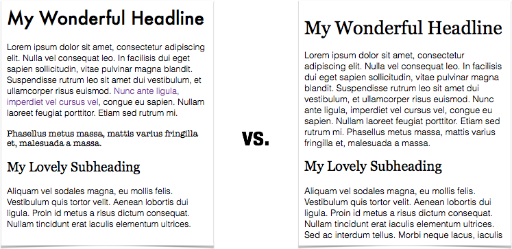
Listen, I understand the temptation. You just discovered Google Fonts™ or Font Squirrel and you're itching to play around. You're excited to stretch your wings a little. But it's not worth it. Websites are supposed to do one thing really well: communicate. Switching up your fonts (or colors or layout) halfway through a page only confuses visitors. They shouldn't have to work to understand what's going on.
To make it easier for them, keep the number of fonts on your website to a minimum. Two fonts is a great rule to design by. One for headlines and menu items, and one for the main body on your website. Maybe you have a third for the hipster logo you designed. That's cool. Just keep it in the logo. There's no need to pepper it throughout the site.
2. Thou shalt not use handwriting fonts
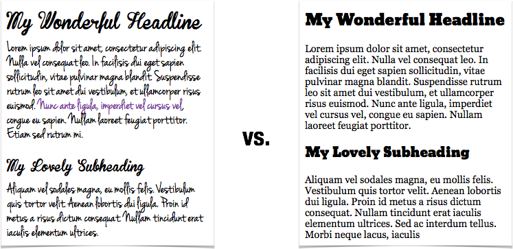
I know they're cute. I know they're novel. We love novel things. Heck, I still pull up Weird Al Yankovic songs on YouTube® a couple of times every year. It's fun. I like showing my kids. It reminds them that I have a sense of humor.
But that's the thing with novelties: too much is overload. They only work in small doses. They can quickly lose their charm. Handwriting fonts are novel. They're the Weird Al of typefaces. Use them for special projects or a design that absolutely needs to look like handwriting. Maybe for blueprints or the top of a wedding invitation. Don't use them for your headlines or text on your website.
Your readers will thank you.
3. Thou shalt not suffocate your text
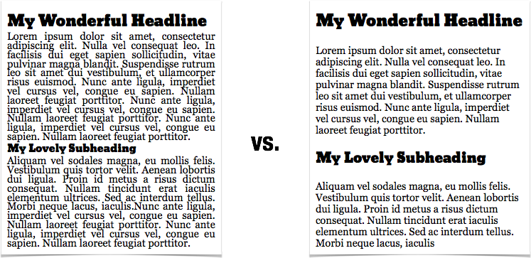
Great fonts aren't enough. Words, sentences, paragraphs—they need to breathe. In an effort to fit everything above the fold or make text fit in a specific box, some designers cram it all together. Or, even worse, some Web developers decide that columns, margins, and padding are for novices. If someone wants to make the text easier to read on a website, they'll set their browser up the right way. This is Tron Web design. The USER is in control. I'll just serve them markup and they can do what they want.
Here's the deal: If you're trying to squeeze a bunch of text into a little space, rewrite the text. Or, better yet, redesign your site. If you think the USER will resize their browser and fix their spacing to make your site easier to read, you're wrong. We're lazy USERs. Every single one of us. Use columns, use normal font sizes, play with line heights and spacing. Make reading a pleasure. Learn from websites like Medium and apply those principles to your design.
Keep it simple
Pretty simple list, right? Easy to remember. Stick to two fonts, give your text room to breathe, and keep it professional. It might seem a little restrictive, but trust me, there are thousands of elegant font combinations and layouts you can try that will send the right message to your visitors. Don't believe me? Check out Awwwards' The 100 Greatest Free Fonts for 2014 for some great ideas. I know you'll come up with something beautiful.


