
Can you remember the last time you experienced a website on a mobile phone, that was just the shrunken desktop version? If so, you probably did one of two things:
- Pinched, zoomed or swiped around the page trying to find the info you came for.
- Completely left the site and started again somewhere else.
It’s no secret: a mobile-friendly website is a user-friendly website.
Statistics show that mobile Internet usage in the United States surpassed desktop in March of 2015. Consider using responsive web design to offer a consistent and optimal user experience on all devices — desktop, tablet, mobile, even wearables.
What is responsive web design?

You might have heard of responsive web design. It’s not a shiny trend anymore, but more of a shift in the thinking behind building websites. Web designer Ethan Marcotte actually coined the term in 2010:
“Responsive web design offers us a way forward, finally allowing us to design for the ebb and flow of things.”
So what does this mean for you and your web users?
A responsive web design creates a system for a single site to recognize and react to the size of a user’s device — with one URL and one content source. A fluid and flexible layout adjusts according to screen size, offering an optimized browsing experience.
To get even more technical: one set of HTML code is served for a page, regardless of the device which accessed it. The difference is the page’s presentation, which changes based on CSS media queries. These queries apply rules for how the browser should display elements, based on the size of a device.
Even the mighty Google recommends a responsive web design as the most effective configuration for smart phone-optimized sites. Google’s algorithm for ranking in mobile search results changed on April 21, 2015 (a date aptly dubbed “Mobilegeddon”). A website with an effective mobile experience will show up on search results above one without. And, with a responsive web design, you no longer have to worry about being mobile-friendly or not!
3 elements of effective responsive web design
There are three components that work together to create an effective responsive web design:
- A fluid grid
- Flexible text and images
- Media queries
A fluid grid ensures that a responsive web design is flexible and scalable. A page is divided into equal columns. Web design elements will have consistent spacing and proportion, and adjust to screen-width based on percentages.
Grids aren’t anything new. Web designers have used them for building websites since the beginning. However, these grids of the past were fixed width, using absolute pixels. This poses a constraint when viewing on smaller screens (hence, the shrunken desktop version).
Flexible text and images adjust within a layout width, according to the content hierarchy set with CSS. Text can now be legible regardless of the end user’s device. With a flexible container (within the grid), text wraps automatically with an increase in font size on smaller devices.
Flexible images can prove to be more challenging because of load times on smaller device browsers. But keep in mind that these images can scale, crop, or be removed depending on what content is absolutely essential to the experience.
Media queries power the flexibility of a layout. They specify the CSS to be applied in a certain way, depending on a device’s breakpoint. A breakpoint is the point where a page layout responds to the viewport size. It could be 320 pixels for mobile, 760 pixels for tablet, or 1,200 pixels for desktop. (These values are just examples; your breakpoints may vary.)
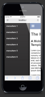
For example, a layout might change for an iPhone portrait orientation vs. an iPad landscape orientation. Content could stack in one column, font sizes increase for readability, and navigation condenses (you’ve probably seen this exhibited with those mobile “hamburger” menus that look like three straight lines stacked on top of each other).
Media queries allow for multiple layouts of a design, which use the same HTML-coded web page. It’s the mathematics behind the visual display.
Pros & cons of responsive web design
Considering the facts, it’s safe to say you will need some kind of mobile-friendly solution (whether a separate mobile site or mobile app). To help determine if RWD is the right solution for your website, take a look at some of the pros and cons:
Pros
- Increased reach to customers on tablets and smartphones
- Consistent brand and user experience on all devices
- Good for SEO, and measuring analytics in one place
- Single content source for updates and maintenance
- Google recommended!
Cons
- Increase in design and development time, to accommodate all breakpoints
- More testing and QA across many devices
- Higher load times
Looking ahead
Bottom line: nowadays your website needs to look great and work well on a desktop’s, tablet’s and smartphone’s browser. A responsive web design can help achieve this. RWD also helps increase visibility on search engines — because it is mobile-friendly.
Get this: the number of smartphone users internationally will surpass 2 billion in 2016 — and more than 60 percent of searches come from mobile. If a responsive web design is the right strategy for you, take the steps toward moving to a more consistent, fluid and flexible web experience on all devices.


