In today’s information age, every successful business needs a website — even small businesses. But a great-looking website doesn’t have to cost thousands of dollars. With the right tools and some basic tips, even a website newbie can create a great site. If you’re wondering how to design a website when that’s not your forte, these ideas can keep you from making some common mistakes.

How to design a website: The basics
Ready to learn how to design a website if you’re not a website designer? It comes down to three basic steps:
-
Secure strong hosting.
-
Pick a website building tool.
-
Add content.
Now, let’s look at each step in detail.
1. Secure strong hosting
To create a website, you must first have a place to put that site; this is called your website hosting. You also need a domain name, or URL, so that people can visit the site. There are literally hundreds of options for website hosting, but you’ll want to make sure that whatever hosting service you choose does a good job of covering these bases:
- Reliability: What’s the hosting provider’s uptime guarantee?
- Storage: How much space will you need for your website’s files? Hint: Large eCommerce sites and websites with lots of images (e.g. photography sites) need more storage capability.
- Bandwidth: Expecting heavy website traffic? Make sure your hosting plan includes adequate bandwidth.
- Scalability: If traffic spikes, will your hosting provider scale your hosting services to account for the increase? If not, your site could crash.
- Security: Pay close attention to the security features included in a hosting plan, including 24/7 monitoring and protection against DDoS attacks.
- Support: What kind of technical support can you expect?
A deep-discount or no-name provider could end up costing you thousands in downtime, lost files, and poor customer service.
Go with a company that is well-known and established.
2. Pick a website building tool
Once your hosting and domain name are set up, it’s time to figure out how to design a website that will not only look great, but be easy to manage. A little planning ahead in the beginning will make it easier to keep an up-to-date, functional site without draining large amounts of your time.
All-in-one website builder
To get a website up quickly, with very little technical knowledge required, consider using a website builder like GoDaddy’s Website Builder. The intuitive, swipe-to-style interface makes it easy to add text and images, change color schemes, even set up product pages if you plan to sell online. This tool features responsive mobile design, and most plans include PayPal integration, SSL, and built-in email marketing and search engine optimization tools. Hosting and domain also are included in the monthly fee.
WordPress
If you’ve got a bit more time and are looking for a website that you can customize to your heart’s desire, consider using a content management system (CMS) like WordPress.
A CMS will allow you to change how your site looks and update the content (text, images, etc) on your website without having to worry about coding or advanced design principles.
You simply input what you want to showcase, and the CMS takes care of the “how” for you. Best of all, here are thousands of other WordPress users, tutorials and support networks to help you if you have questions. If you go with GoDaddy’s WordPress Websites, you’ll get a Quick Start Wizard that will help you get your WordPress site up fast. The Quick Start Wizard gathers basic info about your business and then uses this data to help you choose a theme and populate content on your site.
3. Add content
Once you’ve chosen your website building platform, it’s time to add content. The type of content you need will depend on your goals for your website, but basically you’re looking at five core pages:
Home page
Here’s where you’ll include the top things visitors need to know in order to decide whether or not to do business with you. Create content that briefly but powerfully describes who you are and what you have to offer, with visuals that grab visitors’ attention.
- Tagline: Describe your business in one short sentence.
- Call-to-action: What’s the most important thing you want visitor to do before they leave your site?
- Primary contact information: Include on main way for customers to contact you.
- Products/services: Feature one or more of your products or services, with a link to a dedicated Products/Services page to learn more.
- Sign-up form: Make it easy for visitors to leave their information.
- Testimonial / Trust badge: Start earning trust at first glance by including a customer testimonial and or trust badge (e.g. Better Business Bureau).
Products / Services page
Here’s where you’ll break out your products or services, with compelling images and descriptions. Include a video if possible. Based on your business, you might also include pricing information, payment options, shipping info, and your return policy.
About page
This is a dedicated page to tell your story. You might include photos and/or videos of yourself and/or your team in action, a short biography, company or product awards, and a standout customer testimonial.
Testimonials page
Nothing inspires confidence like testimonials from other satisfied customers.
Contact page
Include methods for contacting you (i.e. phone number, email address, mailing address). If you’ve got a physical location, embed a map. Get strategies for creating a great contact page here.
Best practices for designing a website
There are no rules when it comes to how to design a website; anything goes on the internet. Great sites, however, have several common features. Avoid the common mistakes and pitfalls of bad websites. Whether you’re using an all-in-one website builder or a CMS and looking at themes, keep the following tips in mind for great results.
Keep it clean & simple
You’ve heard the old adage “less is more.” When it comes to professional-looking websites, this is quite often the case. Decide what information is the MOST important to your users and focus on conveying that message on the home page. Additional information can be placed on other pages and linked to from the main page.
Keep the site from looking too busy or confusing at first glance; your message should be clear to a visitor within the first 10 seconds. Don’t be afraid to use whitespace and limit yourself to one or two clear fonts throughout the site.
Decide on a color palette and limit the site to those colors, rather than using an entire rainbow of hues.
Clear, easy-to-use navigation
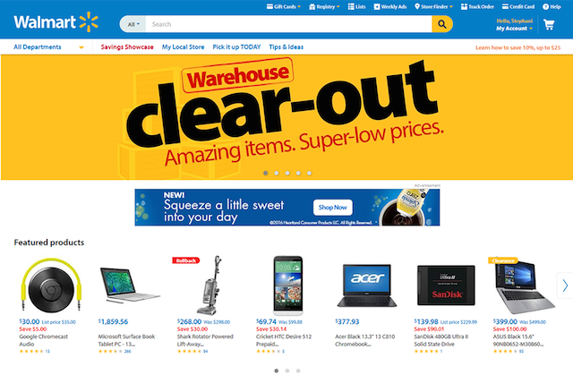
If you want users to explore your website, you need to make it easy for them to navigate.
Keep your navigation menus prominent and easy to find on your site.
Make sure the options are clear and intuitive. Use sub-menus to group similar pages together without clustering all options onto one line.
Again, content DOES matter
This might seem obvious, but what your website says is just as important as how it’s said.
A great-looking site won’t help your business grow if the content isn’t relevant.
Make sure your copy presents useful and accurate information about your business. It should represent your current practices, policies, prices, etc. — and be helpful to your clients.
Write the text in a clear, natural language, rather than trying to stuff each paragraph with keywords. Keep that information updated; review your copy periodically and revise as needed.
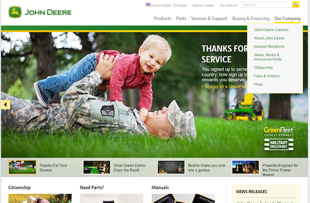
Use images to make the site more appealing, but don’t go overboard; too many images can be overwhelming and confusing. A very large number of images could cause users to leave your site by increasing your page load times.
Use images in a way that creates an appealing visual and doesn’t detract from your message.
Make contact information clear and accessible
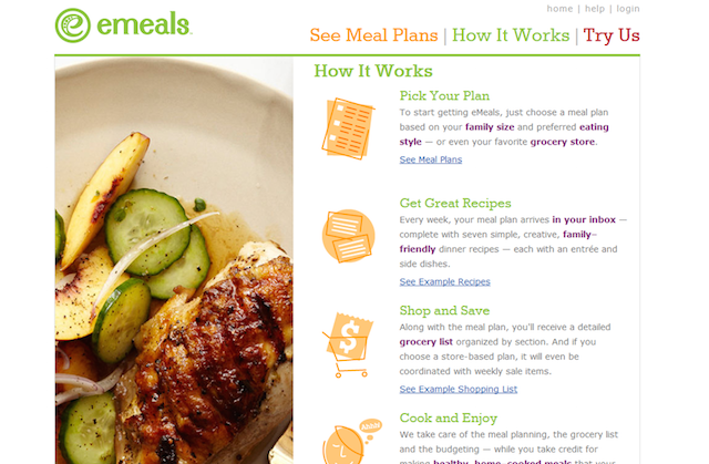
No matter how much information you put out on the web, the ultimate goal is to get customers to contact you. Make it easy for them by clearly posting your contact information.
This will look different across websites depending on your business. Some will only need an email address and/or phone number to reach their customers. Others may have a brick-and-mortar location and wish to post an address. If you do have a physical location, integrating a map into your site can be useful.
Another useful tip for providing your contact information is to use a Schema Markup. This doesn’t really matter to your users, but search engines use this information to locate your business in local search results. Not a coder? Not to worry! There are even schema generators to create the code for you. Just include the generated code in your website’s footer and make it that much easier for potential customers to find you.
Design for SEO
SEO stands for search engine pptimization. A website with good SEO scores will rank higher in results from search engines like Google and Yahoo.
You may not think SEO is important for a small business, but it can be a great way to increase your organic traffic.
When you think about SEO considerations from the start, you can figure out how to build a website that reaps the benefits of SEO without requiring additional time and resources in the long run. Again, a CMS like WordPress makes this easy via the use of plugins such as Yoast SEO.
Responsiveness
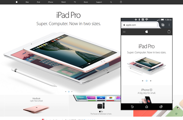
Long gone are the days when you knew a user would only visit your website from their computer. Today’s customers will view your site from any number of devices, from mobile phones and tablets to laptops and widescreen desktop monitors. When considering how to design a website, make sure you also think about that site’s responsiveness.
You need to put a good foot forward to any potential clients no matter what device they use to view your site.
Cross-browser compatibility
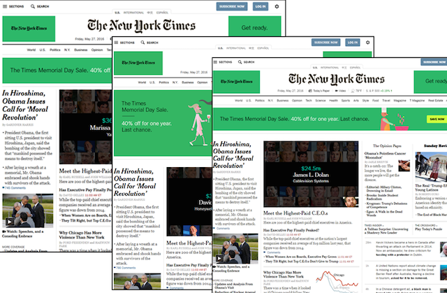
Just like you don’t know which device your users might be using, you don’t know which browser they might choose. Check your website from multiple browsers to ensure it looks the same on each. While you don’t need to spend time and effort on EVERY browser possible, it’s a good idea to check the Big 5: Firefox, Safari, Chrome, Edge and Opera (Microsoft has discontinued support for Internet Explorer, but you may wish to check IE as well).
With a little forethought and advanced planning, you can create a site that will be an asset to your small business — even when you have no idea how to build a website!


