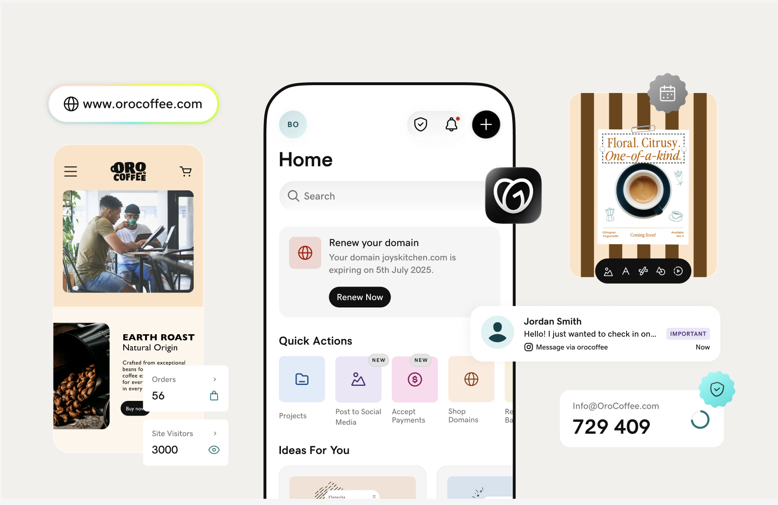
As we skid into a new year, we’re all excited about the opportunity to refresh. While the future remains uncertain, you can always bet on GoDaddy app to help keep your content ahead of design trends with relevant, inspiring and beautiful tools and templates.
We’ve taken a look at emerging design trends that seem certain to gain momentum in the year ahead.
Peek at the list below for popular aesthetics and ideas that’ll give you an upper hand on the competition. You can embrace any of these options as you plan your fresh on-trend content for 2023.
1. Inclusive authentic representation
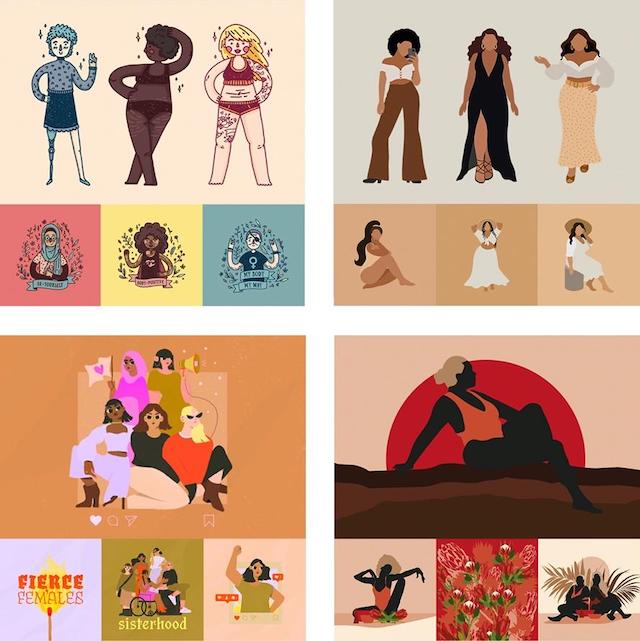
Less of a design trend and more of an ongoing evolution, the concept of diversity is gaining more traction these days.
There’s more to it than simply having more POC (people of color) or women making appearances in your content. Window dressing diversity, without any real substance or understanding, is bound to be obvious to consumers. It also does your brand no real favors.
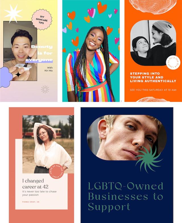
A little research goes a long way. Think about ways to tie culture with design elements through things like:
- Fonts
- Symbols
- Patterns
- Numbers
- Food
- Animals
- Objects
- Color palettes
Getting these small details right can have a huge impact on those consuming your content. Something as simple as recognizing a familiar symbol or cultural celebration in an advertisement can make people feel seen. It enables them to connect with your brand in a way they didn’t before.
In general, more businesses are making a concerted effort to explore new global markets. Make sure to pay special attention to cultural details to really set your brand apart from your competitors.
2. Honest minimalism
A stripped-down, warm, humanist aesthetic goes a long way when encouraging viewers to engage with sensitive or taboo topics (think personal hygiene products or mental health topics). You can use this approach to speak honestly and openly about a product, service or related topic by sticking to a minimalistic design.
The idea isn’t to distract viewers with beautiful design, but rather to engage them with a straightforward message.
Go for something that’s healthy, friendly, and real. You can achieve this by styling photographic images and graphics with designs like:
- Straight baselines
- Ample spacing
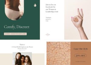
- Highly legible typography
- Compositional balance
Adding these elements gives your design an aura of simplicity and harmony. Plus it makes for a great first impression. And who doesn’t want a little more of both these things in their lives?
Related: Find the boost your business needs in these 5 social media trends
3. Y2K digital retro
Here’s a design trend that seeks to emulate a 2000s aesthetic. It’s usually achieved by creating layered layouts inspired by:
- Retro computer interfaces
- Magazine covers and spreads
- Notebook doodles

Frames and text are combined in a kind of organized collage – less expressive and carefully structured. It’s a smorgasbord of design elements wedged somewhere between analog (photo collages, stickers, magazines) and digital (computer UI, precision, gradients). Featured design elements could include:
- Layers and overlapping
- Faux user interfaces
- Mixture of bold and pastel colors
- Pixel fonts
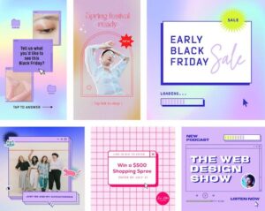
Designers often use these elements to revive and merge aesthetics that draw on youthful abandon. A playful energy runs as an undercurrent throughout this style. You could also incorporate a photo filter with:
- Low contrast
- Subtle tints of pink or purple tones
- Slight saturation increase
- Graphic overlays (like glitter or sparkles)
Remember, the Y2K Retro style is a playful design trend. It’s best used for a younger demographic and is ideal for personal, fashion, beauty, and e-commerce businesses.
4. Photo cutout collage
This is becoming popular in the fashion vertical, emulating the “quick collage” aesthetic you may recall from the Y2K Retro Trend. Inspired by teenagers from the 90s and early aughts, this design trend evokes the physical act of cutting photos from a fashion magazine. Backgrounds are often left white to replicate something you’d see in an editorial spread.
A photo cutout collage is all about reproducing multiple looks, styles and people on the same page.
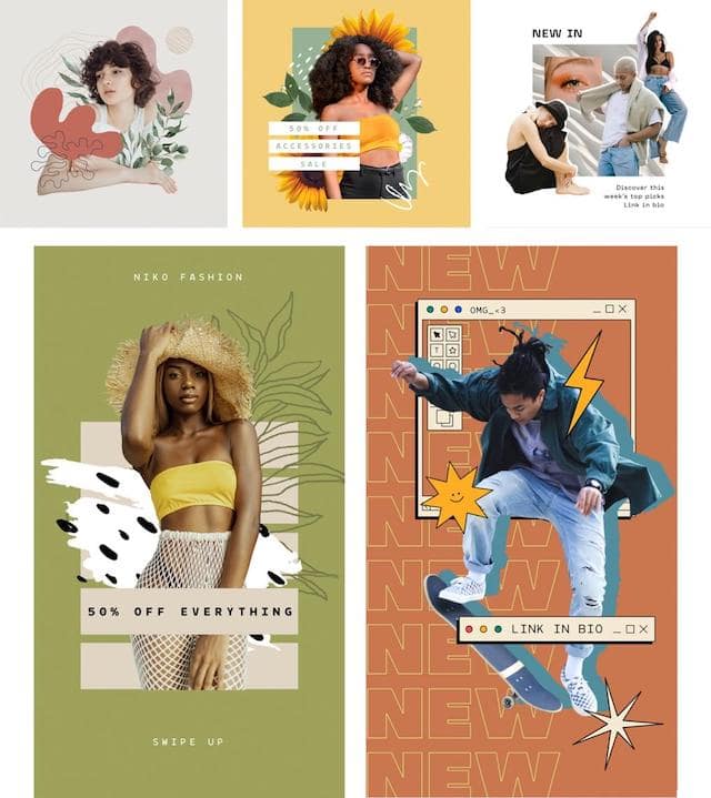
There’s a sense of form that can be echoed or stacked.
You can even consider it an “anti-design” in the sense that there’s often an intentional amateurism or naïveté about it. Composition isn’t textbook here, so clumsy or even crowded designs could easily translate into loose and playful ones.
This style combines well with other collage elements like:
- Paper
- Tape
- Doodles
However, this collage style is less textural than a paper collage. There’s a smoother feel to it that mimics the glossy pages of a fashion magazine. You can easily recreate this with an outline effect using GoDaddy app’s Remove Background tool. Simply duplicate the cutout image, make it a solid color and position it behind the main image.
5. Distorted gradients and fine details
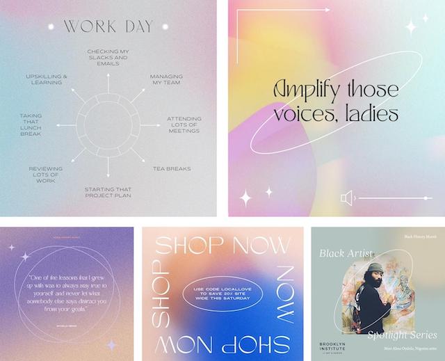
This design trend generates an interesting contrast between the fluid (gradients) and the meticulous (lines, shapes, and lettering). Shapes and typography are typically either white or black with color-rich backgrounds.
In terms of colors, a grainy gradient is more defining than specific palettes. You can also apply this principle to vivid or more neutral colors.
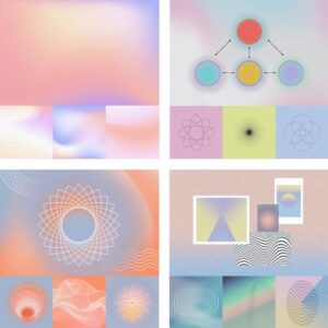
There’s also a subtle sense of the cosmic here. Shapes and text (often including delicate Serifs) appear like star constellations against the endless galaxy of a gradient background. You can even imagine these shapes as alien hieroglyphics from a glance.
Combining this design trend with The Shape of Things trend creates beautiful gradients that appear either inside or around organic cut-out windows. It’s best suited for female-focused brands, particularly in the realm of beauty and fashion, but could also benefit bloggers or help showcase ecommerce products.
6. Ultra-bold two-tone
This design trend lies at the intersection of Bold, Minimalist, and Playful styles. It’s defined by an absence of any excess or clutter. It’s a minimalism that shouts instead of whispers, coming alive with the playful use of color and shapes.
Simplicity prevails here, but there's a strong graphic emphasis that gives designs a powerful jump-off-the-page energy.
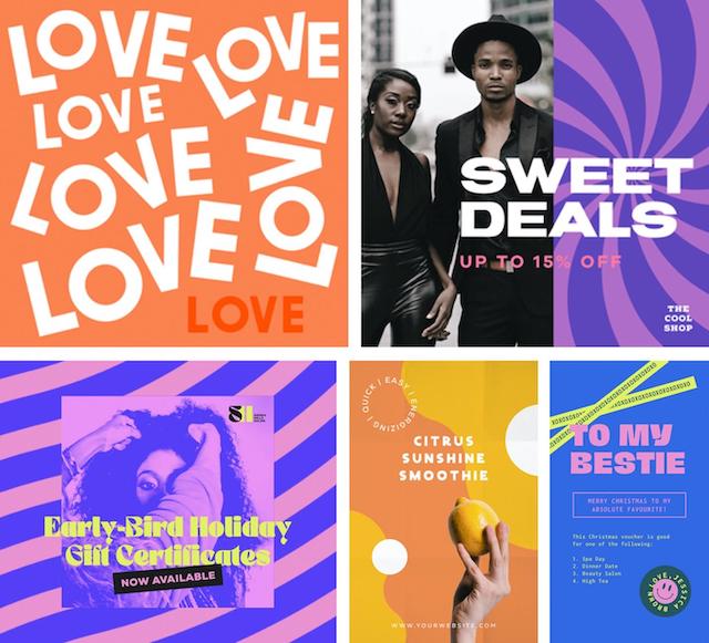
They veer away from basic primaries and head toward more unusual or contrasting hues. Black and white colors are often used for accents.
Heavy abstract shapes and/or bold display fonts dominate the composition edge to edge. There’s also an opportunity for unconventional typography, or even letters and numbers as shapes. This is great for:
- Punchy messaging
- Poster design
- Brand identities
It gives your design high impact at a distance, but It also becomes a very contemporary editorial or advertising style when paired with stylized photographic imagery.
7. Playful classicism
Juxtaposing the Classical and Playful styles gives rise to a distinctive, eye-catching aesthetic, which still leans towards neatness.
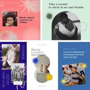
Based upon classic editorial design style, the selection of colors and shapes here injects:
- Energy
- Vibrancy
- Pop of sensibility into the layout
The use of playful color palettes sometimes gives rise to unusual juxtapositions. These could mean a mixture of earthy and fruity, or subdued and bright.
Graphics are also typically very simple shapes. They are often activated as text stickers, which is a hot design trend on its own right now. Typically, the font selection veers towards classic editorial, but words and letters appear in a more expressive mode.
8. The shape of things
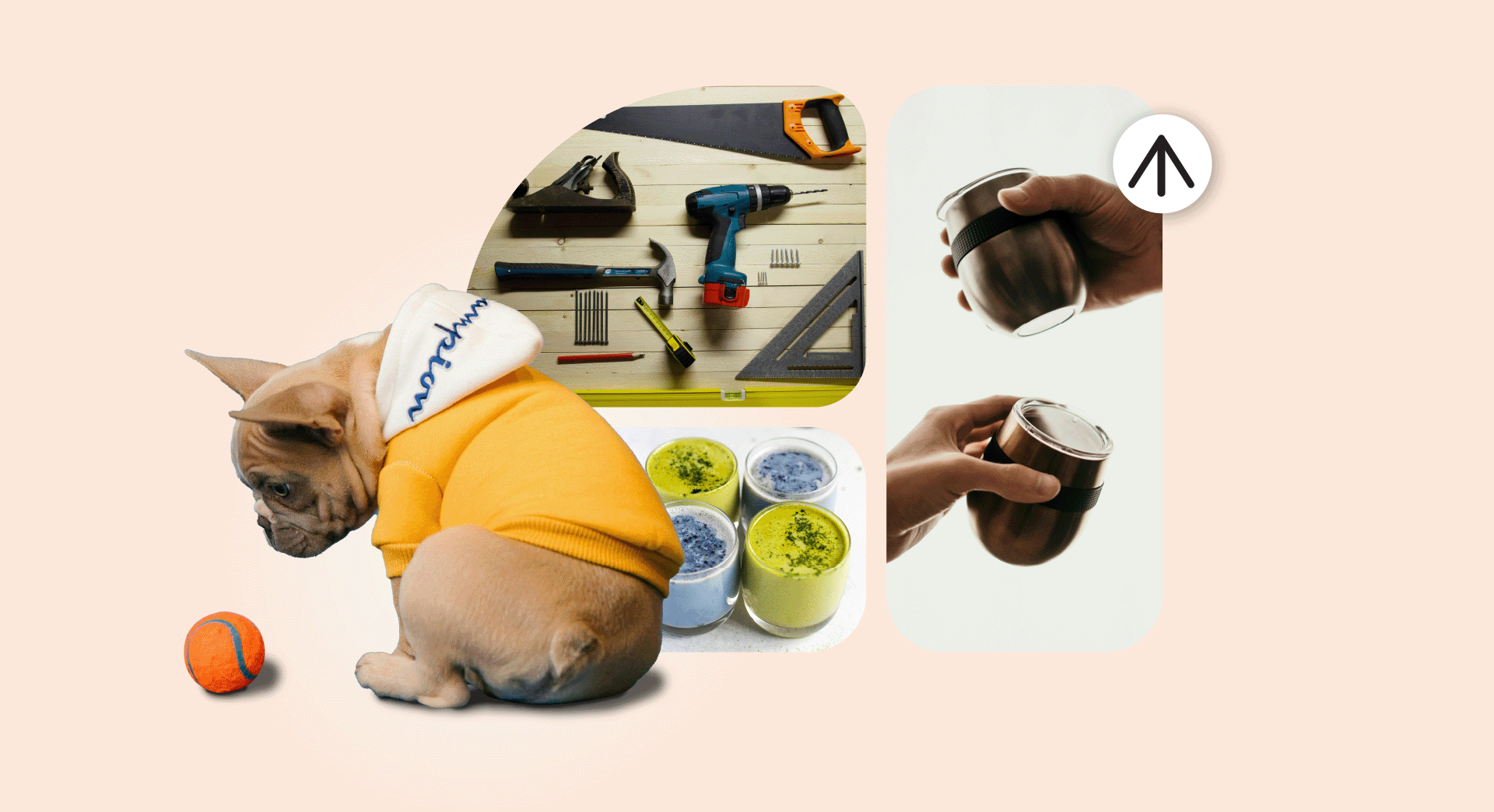
This design trend uses shapes as masks. Think of it like windows into a beautiful world. It’s frequently used in a clean minimal style with subdued, earthy or pastel palettes.
However, we’ve recently seen this technique evolve with a wider range of color expressions. It’s often paired with contemporary Serif typography and the overall look and feel is elegant. You can accomplish this by fine tuning:
- Combination of colors
- Fonts
- Composition
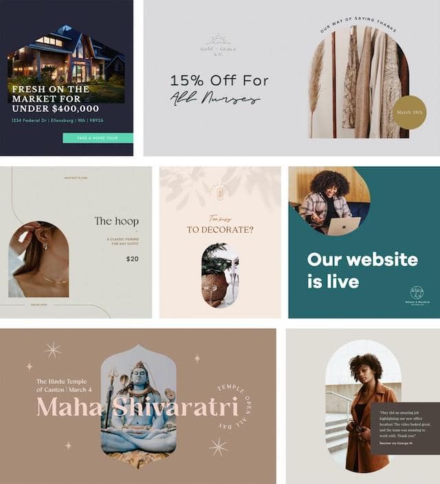

Aside from text, there are rarely any extra graphics to distract from the primary focal point: strong photographic images.
Even though the shapes are simple, there's still room for subtle playfulness and movement in terms of how they’re arranged.
9. Retro revival
As we’ve mentioned before, nostalgia is making a huge comeback in the design world. It’s a sentiment that’s played out in imagery, graphics, colors and fonts.
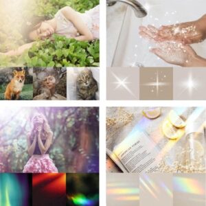
Gen-Z is exploring the look and feel of the 70s, 80s and 90s. They typically consider these decades as undiscovered treasures that flee the complexity of chaotic modern times. It’s often looked at as a refuge, where they can take comfort in the certainty of a bygone era.
This design trend also follows an evolutionary pattern that tries to make modern imagery look less modern. We’re seeing the softening and distortion of photographs through elements like:
- Sparkles
- Glow
- Fading
- Kaleidoscope (for a retro film aesthetic)
The 70s palettes are also back with a distinctive range of colors including:
- Orange
- Brown
- Yellow
- Purple
- Pink
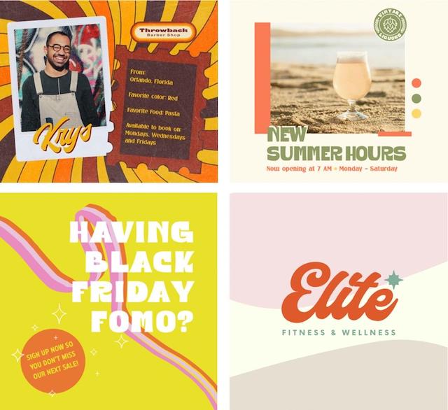
Typefaces are often chunky, puffy, and cheeky with words and phrases that are often wavy or curvy. Most have Serif flairs that give them a distinct personality.
10. Retro Psychedelic Type
This design trend exhibits a lot of wavy, wobbly, and warped fonts. You can expect to see even more weird and wonderful variations emerge as the year wears on. They seem to be a reimagining of what psychedelic typefaces could be (or would have been) if the 70s were happening now. Styles include a retro sensibility with a more contemporary execution.
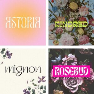
A headline typeface with a modern-retro style ignites visual interest. It adds a touch of personality into the design.
Ironically, a modern 70s psychedelic aesthetic reads as “progressive” more than “old school.” This typeface typically works well for brands that consider themselves to be a little strange or unique. They may opt to use this style to stand out from the crowd. With more restraint, it's also great for elegant or sophisticated brands – especially in the fashion and beauty spaces.
The fonts themselves are playful and curvaceous. This means that the baselines, spacing and composition tend to be more standard to anchor legibility. It also pairs well with several other design trends we’ve mentioned above.
Explore the latest design trends today
Inspired by these trends to start designing your own content? Explore more of GoDaddy app’s templates and graphics to find a fresh, on-trend aesthetic for your brand. Download the free app right now!
