Since more than 50 percent of Americans shop online, your new business plan might be to simply set up an eCommerce store on the web, and wait for the money to roll in. However, the most successful eCommerce websites are built with the customer in mind — and that involves some legwork.
Fortunately, most of the elements you’ll need to make your eCommerce site effective, such as strong imagery and user-focused design, are simple to implement. In fact, as long as you consider the customer at every decision point, you’ll be on the right path to bolstering your income.
Before you begin your web design process, review the four elements below, which are vital to any successful eCommerce website.
1. Exemplary use of images
First, you’ll want to consider your eCommerce site’s visuals. High-definition screen formats are popular for a reason, and you’ll need to make sure your product images are crisp and clear:

After all, around 78 percent of consumers consider high-quality images to be a key factor in their purchasing decisions. So it pays to dedicate some time to making sure your products stand out visually.
Luckily, adding quality images to your store doesn’t have to be a difficult task. Here are some tips for doing it well:
- Offer plenty of product variations: For example, if you’re a clothing company, showcase both men’s and women’s designs, along with the colors you sell.
- Show the product in use if possible: Continuing with the clothing store example, a picture of a t-shirt being worn is more useful than one folded up and ready to be shipped.
- Make sure your images look professional: You want to show off your products, which means good lighting, appropriate framing and tasteful editing, if necessary.
While you could get lost down the rabbit hole that is product photography, following these tips will start you out down the right road.
Editor’s note: GoDaddy’s Online Store makes it easy for you to add up to 1,500 products, with up to 10 images per product.
2. A hassle-free checkout procedure
For many customers, a smooth checkout procedure is key to a high conversion rate.

According to Baymard Institute, nearly 70 percent of visitors will abandon their carts mid-visit, and just over a quarter of that group does so because of a complicated checkout process.
In short, don’t assume your work is done just because the customer has reached the end of the sales funnel.
If you want to provide a hassle-free checkout process, here’s some advice to consider:
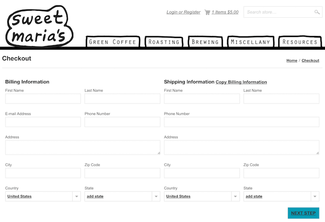
- Don’t include too many fields – only use those necessary to get paid and make the delivery.
- Offer a way to automatically duplicate entered content (such as the delivery and billing addresses), if your shopping cart solution doesn’t include one by default.
- If your eCommerce platform makes them available, purchase extensions that improve the customer’s ease of use (such as an address finder, for example).
Consider using a form creator extension to help refine and optimize your checkout screens.
As you might imagine, optimizing for conversions isn’t solely about your checkout process. But it is an important factor, and skipping this step is simply leaving money on the table.
3. Clear descriptions and pricing
Clarity is essential when creating your product descriptions and pricing. They also need to be compelling and easy to understand.

You may be interested to know that 81 percent of customers carry out research before purchasing, and unclear pricing accounts for nearly a quarter of abandoned carts, according to the data from the Baymard Institute. In short, getting this element right is crucial, and product information and pricing should be delivered clearly:
Product descriptions: There are plenty of factors to consider here, but keeping sentences concise and direct will serve you well. It’s important to find a balance between offering depth and selling the customer on the item.
Pricing: We’re not talking about your pricing strategy here, but how the numbers are displayed. Make them prominent, and show both the original and discounted prices, if applicable, along with a percentage, if possible. If you are offering a discount on the item, make that extremely obvious!
Don’t forget to also factor in shipping costs. Since 44 percent of customers abandon a cart because of expensive shipping, offering a free option (and promoting it on the product page) could net you a higher sales yield.
4. A prominent call to action (CTA)
Finally, we come to your call to action (CTA). This is the word, phrase or sentence that converts your visitors into customers.
On an eCommerce site, this is usually the Buy button.

An Econsultancy survey from 2013 reported that 95 percent of consumers deemed strong user experience to be a crucial factor in determining whether they clicked on CTA buttons. So there’s more to consider here than just your text.
The good news is, there are a few simple tips you can implement to give your CTAs a boost:
- Use a prominent accent color, or one that’s different from the other colors on your site.
- Experiment with the placement of your CTA, and employ heatmap tools, such as Inspectlet, to help gauge where your visitors’ attention is being drawn to.
- Finally, split test your CTAs to refine their overall usefulness.
This can be a fairly complicated process, and it takes time to get it right. Our advice is to consider your CTAs alongside all of your site’s other elements, rather than as the sole key to your customers’ wallets.
Setting up a successful eCommerce website takes much more than simply choosing a theme, uploading your products and waiting for the cash to roll in. There are a number of moving parts you’ll have to refine and optimize if you have any chance of success.


