
Creating a landing page can help turn interest into action. A good page gives people a clear next step, such as buying a product, booking a service, joining a waitlist, or downloading a useful resource.
It doesn’t need to be complicated. The most effective landing pages keep the offer focused, make the value easy to understand, and remove anything that gets in the way of the next click. Let’s take a closer look at how to create a landing page that actually works.
What is a landing page?

A landing page is a focused web page people reach after clicking an ad, email, social post or search result. It is built around one campaign and one primary action, like purchasing a product, requesting a quote, booking an appointment, registering for an event or sharing an email address in exchange for a resource. The goal is to keep the path simple so visitors can quickly decide if what your page promotes is right for them.
According to industry research, the average landing page conversion rate across industries is approximately 6%, though top-performing pages can achieve conversion rates of 10% or higher.
How visitors reach landing pages
A few examples of ways people end up on landing pages include:
- An email marketing blast
- A paid ad on Google or other search engines
- By searching for specific keywords on search engines, thanks to strong SEO
- Any targeted marketing activity
The purpose of a landing page is to persuade the visitor to take one specific action.
Landing page vs. homepage
A homepage introduces your business. It helps people explore your products, services, story and other parts of your website. That makes it useful for general discovery, but the menus, product links and other navigation options can pull visitors away from a particular campaign goal.
A landing page is purpose-built for a single conversion. It generally limits navigation and gives the visitor one clear call to action (CTA). Each extra link is another possible exit from the action you want them to take.
| Homepage | Landing Page |
|---|---|
| Homepage | Landing Page |
| Invites visitors to explore your brand, products and company information | Guides visitors towards one campaign-specific action |
| Often includes menus, category links, social links and multiple CTA | Keeps links and distractions to a minimum, usually with one primary CTA |
| Works well for broad, ongoing website traffic | Works well for paid ads, email campaigns, launches and targeted offers |
| Measures engagement across many journeys | Measures a specific conversion, such as a sale, sign-up or booking |
In short: use a homepage to give visitors the bigger picture, and a landing page when you want your audience to take a specific next step.
GoDaddy Airo AI Builder
Describe your idea. We'll build your live website in minutes.
With a few prompts, Airo AI Builder generates your website, web app, pages, databases and logic in minutes — no coding required. Start for free with 50 AI credits a month. No credit card required.
Build for FreeCommon types of landing pages
There are several types of landing pages used for different purposes.
| Landing Page Type | Description | Best Use Case |
|---|---|---|
| Lead capture | Collects contact information in exchange for valuable content | Building email lists, generating leads for sales teams |
| Click-through | Provides product details before directing to purchase | E-commerce, SaaS free trials, subscription services |
| Splash | Captures attention before main site access | Announcements, age verification, language selection |
| Squeeze | Short, focused page requesting minimal information | Quick opt-ins, digital downloads, appointment booking |
| Event | Promotes events with registration forms | Webinars, conferences, workshops |
| Coming soon | Builds anticipation for upcoming launches | New product launches, website relaunches |
Lead capture pages
Lead capture landing pages are commonly used to collect email addresses in exchange for something like an ebook, white paper or a webinar. Companies use them to find potential customers and build lists for email marketing, newsletters, prospecting and inbound sales. They are often used with pay-per-click (PPC) ads, leading to higher conversion rates and better results.
When customising a lead capture landing page, it's important to include strong headlines, visuals, a CTA—the button or link that prompts visitors to take action—and relevant user information fields (name, email address, etc.). A good lead capture landing page may also feature testimonials, social proof and trust signals above the fold to build trust and increase conversions.
Click-through landing pages
Click-through pages encourage a sale or subscription through a simple CTA button. The button takes people into a checkout flow, a free-trial sign-up or another transaction step.
They are common in ecommerce and SaaS campaigns. A click-through page can highlight key features and benefits of a product, introduce a free trial or give shoppers the confidence they need before buying.
Splash page
A splash page is often displayed as soon as the visitor arrives at a website. It’s a creative way to capture attention before they reach the intended destination.
The term “splash” captures its purpose of generating significant interest. Unlike most landing pages focused on turning browsers into buyers, splash pages have specific goals, such as making announcements about conferences, events, or promotions. They typically have limited copy, request little to no information, have an intriguing background image and are highly focused.
Squeeze landing page
Squeeze pages, sometimes called ‘opt-in pages,’ are short, direct lead-capture pages. They typically ask for a small amount of information in exchange for a digital download, email series or booking. Their lean format makes them useful for straightforward offers and quick tests.
The primary goal of squeeze pages is to drive transactions rather than provide detailed information.
Squeeze landing pages are particularly popular among those who are new to creating landing pages because they require minimal time but tend to yield excellent results. For more experienced SaaS and ecommerce brands, these are also great templates for A/B testing to optimise conversion rates.
Thank you landing pages
A thank-you page confirms that someone has completed an action. It can also help maintain momentum with a useful next step, such as adding an event to their calendar, reading a related guide or following your business on social media.
When a customer completes a form or makes a purchase, acknowledging their action with a thank you message can be a strategic move to keep leads interested. These landing pages can also be used as an opportunity for upsells, collecting feedback, or prompting sharing on social media.
Coming soon page
Launching a new product or business? Create anticipation with an inviting coming soon landing page. Use this to offer a sneak peek of your upcoming offerings without revealing everything.
A few ideas for your coming soon page:
- Include a launch date or countdown to build excitement and let visitors know when to return.
- Add a "notify me" email form to send them a message with a link to the landing page once your launch is live. This email list will be invaluable for future marketing campaigns.
- If you're revamping your site instead of launching a new line, use a website under construction template to inform visitors about your upcoming changes.
Event landing pages
In this era of time constraints and too many commitments, hosting a successful event, conference, or meet-up requires a compelling reason for potential attendees to invest their time.
One way to do this is to create an event landing page that encapsulates all relevant details.
Include a registration form for convenience, and consider incorporating a countdown timer to generate excitement and urgency. You could also use videos or photos from previous events to give attendees a glimpse of what to expect.
Use testimonials and social proof from past attendees to build trust and credibility with your target audience. To increase sign-ups, ask for only the most crucial registration information. By streamlining the sign-up process, you can minimise barriers and get more sign-ups.
How to create a landing page: quick steps
Building an effective landing page requires these eight steps:
- Define your conversion goal — Determine the single action you want visitors to take (purchase, sign-up, download, etc.)
- Identify your target audience — Understand who you're trying to reach and what motivates them
- Think of a web page layout — Select a landing page layout that suits your goal and industry. To make things easier, learn how to create a website with AI and Airo
- Craft your headline and hero image — Create an attention-grabbing headline and choose a compelling visual
- Write benefit-focused supporting copy — Highlight how your offer solves problems or adds value
- Add a clear CTA — Include a prominent call-to-action button with actionable text
- Include social proof — Add testimonials, reviews, or trust badges to build credibility
- Publish and test — Launch your page and use A/B testing to optimise performance
Want to build your landing page fast? GoDaddy Airo AI Builder can help you create a professional website quickly with AI, so you can get your online presence up and running without starting from scratch.
How to plan your landing page
Before building your landing page, there are a few things you need to define your target audience and goals.
Know who your target audience is
Understanding the people you want to reach makes every decision on the page easier. Review your existing customers, sales conversations, reviews and website data to identify common needs, motivations and concerns.
Useful details can include location, interests, buying habits, business size and the problem your product or service solves. Use those insights to shape the language, imagery, proof points and offer on your page.
Audience segments can benefit from their own landing pages. A first-time customer, a returning customer and a business buyer may respond to different pain points, examples and offers. Tailored pages can make the experience more relevant and increase the chance of conversion.
Understand your goals for the landing page
Before you start creating your landing page, you’ll want to set a goal. What are you looking to get out of it?
Your landing page’s conversion goal should be something that benefits your business. Knowing your goal before you start creating your landing page will help you focus your efforts. When you know what you want to achieve, you can choose your content and design elements based on that goal. This will make your landing page more effective and more likely to move visitors to the next stage of the buying process.
Additionally, it will help you measure your results. Once you know your goal, you can track your progress and measure your results. This information will help you improve your landing page over time.
How to find the correct goal for your landing page
If you’re not sure what your goal is, ask yourself:
- What is the purpose of my landing page?
- What action do I want visitors to take?
- How will achieving this goal benefit my business?
One way to think about goals is the SMART technique. SMART stands for Specific, Measurable, Achievable, Relevant, and Time-bound. Here are some examples of SMART goals for landing pages:
- Generate 100 leads per month
- Increase sales of a new product by 20% this year
- Get 1,000 people to sign up for a webinar six weeks from today
- Collect 500 email addresses for a newsletter
Crucial layout elements of a landing page
Most landing pages include powerful imagery and video, text that highlights the benefits of your products or services, subheadings and calls to action throughout. Learn more about each element below.
1. Introduction section
- Company or product logo
- Compelling headline
- Brief introduction
- Representative hero image
2. Product/offer description
- Key information about your offering
- Unique selling propositions (USPs)
- Benefits and outcomes for the customer
- Functionality or features overview
3. Call to action
- Clear CTA button or form
- Supporting text that reinforces the action
- Optional: A visual element that draws attention
4. Trust and credibility (references)
- Customer testimonials
- Certificates or awards
- Proof of quality (reviews, ratings, case studies)
- Social proof elements
5. Frequently Asked Questions (FAQ)
- Cost and value
- Time commitments or delivery timelines
- Ease of use or implementation
- Flexibility and cancellation policies
A closer look at each element
Hero image
The hero section is the first thing visitors see. A strong visual can quickly show what you offer and make the page feel more relevant. A bakery might show a celebration cake, for example, while a trades business might show finished work in a customer’s home.
The goal of your hero image is to quickly confirm relevance and support the primary CTA — not to decorate the page.
Visuals should support the headline and CTA, not simply decorate the page. Do not force an image above the fold if it does not make the offer easier to understand. A page can still work well with a strong headline, concise copy and a clear CTA.
Strong headline and subheadings
The best landing pages have captivating headlines that include the main keyword for the page, along with a good hook to capture your reader’s attention. Use subheadings to help visitors scan the page and understand the key benefits without working through large blocks of text.
Different headline angles can appeal to different audiences. Test approaches such as:
- Problem-based: “Stop waking up exhausted”
- Aspirational: “Wake up ready for the day, every day”
- Value-based: “Daily greens in one simple scoop”
- Identity-focused: “Made for people who refuse to run on empty”
Match the angle to the offer and the audience, then test alternatives to see what earns more engagement.
Supporting copy
Supporting copy adds the details people need to act. Focus on outcomes, not only features. Explain how the offer helps the visitor, what is included and what happens after they click. Use short paragraphs, descriptive subheadings and bullet points to make the content easy to scan. Plain language is usually more persuasive than jargon.
As you write, think about the visitor reading it: are they being actively encouraged to buy your product throughout the text, or are they overwhelmed by too much information?
Call to action
A CTA tells visitors exactly what to do next. Good CTA copy is direct and specific, such as “Book my free consultation”, “Get my quote” or “Start my free trial”.
First-person phrasing can make the action feel more personal and immediate. “Start my free trial” can feel more owned by the visitor than “Start your free trial”. Test both options and keep the version that best supports your goal.
Make the CTA easy to find and use. Choose a button colour with enough contrast against the page background, leave clear space around it and ensure it is large enough to tap on a phone. Subtle visual cues can help draw attention, but the button should never compete with the message around it.
Common CTA examples:
- Buy now
- Start my trial today
- See all deals
- Sign up for our newsletter
- Get my quote
- Book now
FAQs
An FAQ section can answer the concerns that cause people to hesitate. Add it toward the bottom of the page after you have explained the main offer and benefits.
Cover practical topics such as price, delivery time, cancellation or returns, eligibility, setup and flexibility. Helpful answers reduce uncertainty, build trust and can ease the load on your support team.
Conversion-focused landing page design
The most effective landing pages make it easy for visitors to understand the offer and take the next step. Use these principles to keep your page clear, focused and built for conversion:
- Make the value of your offer clear as soon as visitors arrive.
- Share important details openly, without hiding key information.
- Repeat the main benefits throughout the page to reinforce the value.
- Use a prominent CTA and remove links or elements that distract from it.
- Choose simple visuals and a clean layout that are easy to read on mobile.
- Address common concerns around price, timing, flexibility or the process to build trust and reduce friction.
Understanding message match
Message match is the practice of keeping the message in your ad, email or social media post consistent with the landing page it leads to. If your ad promotes a free consultation, for example, the landing page should clearly feature that same offer, along with the details visitors expect to see.
This consistency reassures people that they have landed in the right place and helps them stay focused on the action they came to take. It also reinforces the interest that prompted the click in the first place, making the message match a simple but effective way to support stronger conversion rates.
Privacy, consent and other legal considerations
Landing pages that collect personal information should make it clear what information you collect, why you collect it and how people can contact you about it. A visible link to your privacy policy is a sensible baseline, particularly when your form asks for names, email addresses, phone numbers or payment details.
Terms, disclaimers and other notices may also be appropriate, depending on your offer and industry. Financial, health and other regulated services can have additional obligations. Legal requirements vary, so seek advice that fits your business and the places where you operate.
For Australian email marketing, get consent before sending commercial electronic messages and include a functional unsubscribe option. The Australian Communications and Media Authority says unsubscribe requests must be actioned within five working days. A double opt-in process, where a subscriber confirms through a follow-up email, is not always required but can help demonstrate consent, improve list quality and reduce spam complaints.
Businesses covered by the Privacy Act should also consider their obligations under the Australian Privacy Principles. Keep legal links easy to find and review them as your data practices change.
Optimising performance and conversions over time
Landing pages work best when they are monitored and improved, not published and forgotten. Be sure to:
Keep landing pages fast and reliable
Speed affects the visitor experience, especially on mobile. Google research found that 53% of mobile visitors leave a page that takes longer than three seconds to load. Some industry benchmarks estimate that each additional second of load time can reduce conversions by 12%, although the precise impact differs across audiences and offers.
Aim for a fast, lightweight page and check it on real mobile devices as well as desktop screens. Large images, unnecessary apps or plugins, extra code and features that do not support the campaign can slow a page down. Compress images, remove anything that does not serve the goal and regularly check forms, buttons and links for errors.
Test one change at a time
A/B testing compares two versions of a landing page to see which performs better. Create a variation, change one meaningful element and split traffic between the original and the variation.
Useful elements to test include:
- Headlines and headline angles
- CTA wording, colour and placement
- Images or videos
- Form length
- Testimonials, pricing details or offer framing
Review enough data to make a sensible decision, then carry the learning into the next test. Landing page optimisation is an ongoing process. Regular analytics reviews and error checks help you understand what resonates with your audience and keep your campaigns effective over time.
Examples of successful landing pages
Landing page inspiration can come from any industry. Look for pages that make the offer easy to understand, use proof to build confidence and give visitors a simple path to act.
Slack
Slack’s Digital HQ page captures attention with a short animated visual and clear benefit-led copy. It introduces the product quickly, then builds on the message with customer stories, recognisable brand logos and statistics that support its value proposition.
The page also includes an FAQ section that addresses common concerns before they become barriers to sign-up. This is particularly useful for a product that may involve several decision-makers or require visitors to understand how it fits into their existing work processes.
Bunnings
Bunnings makes it easy for customers to move from inspiration to action. Its project and product content combines practical advice, clear product information and helpful next steps, so visitors can understand what they need before adding items to a shopping list or cart.
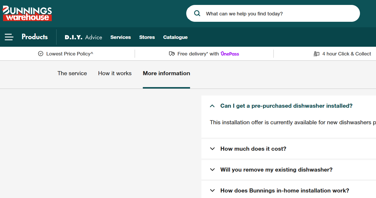
This approach works particularly well for home improvement customers, who may arrive with a project in mind but need guidance on materials, tools or the process involved. Clear categories, product imagery and task-focused content help reduce uncertainty and make the next step feel manageable.
Lyka
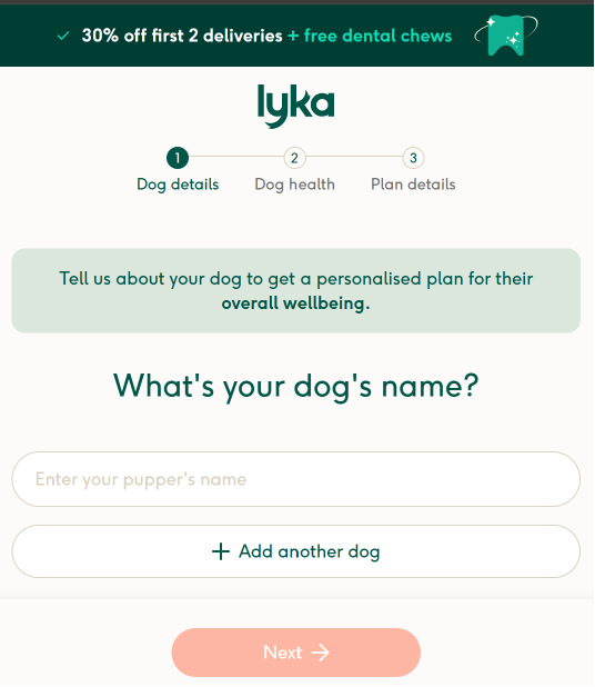
Lyka uses a personalised feeding plan offer to make its proposition feel relevant to each dog owner. Rather than sending visitors straight to a generic product catalogue, the page encourages them to begin with information about their dog’s needs.
Benefit-led copy explains the value of the service, while an introductory offer helps create momentum for first-time customers. The page also makes the next step clear, guiding visitors into the process of creating a tailored plan.
Lyka is a great example of a landing page that turns personalisation into part of the offer. The. The more directly an offer reflects a visitor’s needs, the easier it can be to move them towards conversion.
Vegemite
Vegemite uses a familiar Australian brand identity to make its products instantly recognisable. Its online experience pairs bold packaging, simple product information and recipe ideas that show visitors practical ways to use the product.
Recipe-led content gives people a reason to explore while naturally connecting inspiration to the product itself. Clear imagery and a consistent tone reinforce the brand at every step, helping visitors feel confident about what they are buying.
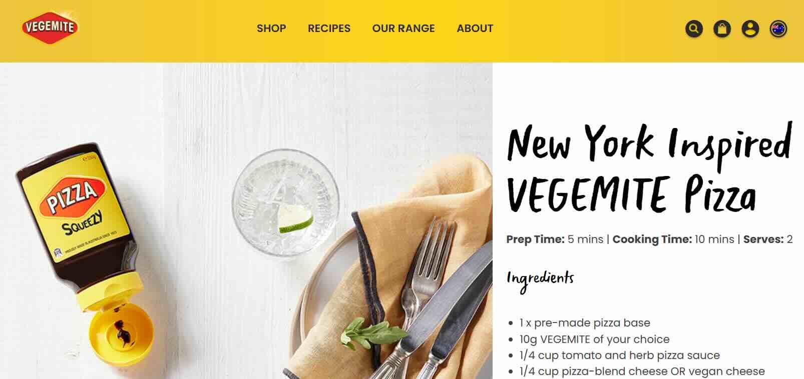
Vegemite demonstrates how a landing page can use strong brand recognition and useful content to keep an offer memorable, relevant and easy to act on.
Ready to create your landing page?
A strong landing page gives your campaign a clear destination and visitors one simple next step. Keep the offer focused, make the value easy to understand and use a clear CTA to guide people towards a purchase, booking or sign-up. Review your results after launch, then test small changes to improve performance over time.
Create your landing page with GoDaddy Website Builder today to start turning campaign traffic into action.
Frequently asked questions about landing pages
Do I need a full website before I can create a landing page?
No. A landing page can stand on its own. Send people directly to it through your ads, social media posts or emails. This works well for limited-time campaigns, new offers and business ideas you want to test before building a complete website.
Homepage vs landing page: what’s the difference?
A homepage gives visitors an overview of your business and several paths to explore. A landing page keeps things focused on one offer and one action, such as making a purchase, booking a service or signing up. With fewer links competing for attention, it is easier to guide visitors towards the CTA.
How long should a landing page be?
The right length depends on what you are offering and how much information people need before they are ready to act. Keep the page easy to scan and focused on the essentials. More detailed offers may need extra copy, proof and reassurance, while simpler offers can get straight to the point.