An e-commerce store is a great way to sell products, engage customers, and create a brand. A well-planned e-commerce website design determines how long your website visitors will stay in the store and how much they will buy.
Due to the Covid-19 pandemic, online sales have skyrocketed, and e-commerce stores have gained more popularity than ever.
A good e-commerce website design turns more of your visitors into buyers.
It doesn't matter how much traffic you get on your e-commerce store unless it is converting. A few intelligent tweaks can immediately improve your conversion rates by 2X or 3X.
When it comes to e-commerce design, there is a lot we can learn from the big e-commerce players like Amazon and Flipkart. These companies have pioneered the e-commerce web design over a period of time by spending tons of money on testing and optimization.
Therefore, for the majority of design aspects, you can take inspiration from what is already working for them.
Here are a few sections and pages of your e-commerce store that you can improve with simple tweaks:
1. Shopping cart pages
To improve any e-commerce website design, it’s a good idea to start with the check-out pages. These are the pages that are closest to conversion — the moment when a casual shopper makes the decision to actually buy a product.
Your job is to make visitors comfortable and ready to make the purchase.
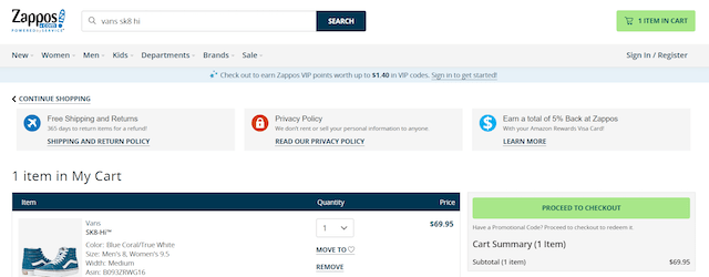
Contrast-colored multiple check-out buttons
Isolate the color of your check-out buttons so that they are easily noticeable on the page. Use color for these buttons that are not used anywhere else on the page.
See in the figure below how the green color check-out buttons stand out on the check-out page of Zappos.
Include product image that they are buying
Having the image of the product on the checkout page prevents the buyer from leaving by confirming that they have selected the desired product.
If the image is not visible, some people try to confirm by going back because product names can be hard to remember.
When someone looks at the product image, their chances of leaving without buying decreases.
So reduce your cart abandonments by placing a high-quality product image on your check-out page.
Responsiveness
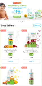
In a recent study, around 79% of smartphone users made a purchase using their mobile devices.
Responsiveness means whether a website is optimized to be functional and aesthetically pleasing on devices of different sizes or not.
You’re leaving a lot of money on the table if you haven’t optimized your e-commerce store for smaller screens. As a web designer or store owner, it’s your responsibility to provide a good shopping experience to the users on their mobile devices.
Related: 11 top web UX trends
2. Header section
Another obvious place to improve your e-commerce website design is the header, as it is the first section that gets noticed by those who view the website.
The purpose of the header section is to assure them that they are in the right place.
Key things to keep in mind while designing the Header section of the e-commerce store:
Search bar
All the major e-commerce stores have prominent search bars in their headers.
Search bars allow the users to find the product that they are looking for. And, more importantly, it helps in increasing conversions.
How?
A person who searches for a particular item has made a small commitment on your website, and he is more likely to stay, engage and purchase from the store.

Double header
These days, double-headers have become standard in the e-commerce world. It allows you to display more content in the header section of your website.

The top-most header displays information like:
- Customer service
- Phone number
- Search bar
- Account registration
- Cart
- Email opt-in
- Unique Selling Proposition (USP)
- Ongoing offer
The below header has other standard navigational links based on the categories you offer.
The idea is to present more relevant information to the user but not to stuff the space. You have to make the content consumable without cramming it up on one side.
3. Footer section
Footers are an essential element of your website as they provide:
- Another chance for the visitor to take an action
- Access to important information
There might be some missed opportunities on your website in the Footer section. Let’s take a closer look and see how we can make it more useful for the visitors.
Email opt-in
An opt-in opportunity allows users to add their email to your subscription list. You can further add them to your pre-purchase or welcome email sequence flows to get more engagement and conversions.
Here the key is to mention the benefits they will get once they sign up.
Try proposing more tangible benefits than just saying that they will get a weekly newsletter subscription (e.g. Be the first to learn of our sales). Nobody wants more junk in their inbox.
 Social proof
Happy images of people using your products work like a charm when it comes to converting cold audiences. These, along with customer reviews, are often called social proof because they "prove" the value of your products.

This tends to increase sales because we are social animals. We like to do what our peers are doing.
You can place user-provided photos in the Footer section because these images are unrelated to an individual product but talk about the entire brand.
4. Homepage
Don’t forget the homepage as you look for ways to improve your e-commerce website design. Even if the site visitors have landed first on the product page or a category page, they tend to browse the Homepage before making the final purchase.
Image navigation
Users often leave a website page in just 10-20 seconds. This is all the time you have to get them interested and help them get where they want to go.
Make your category and product pages easy to navigate. Make it convenient for your customers to search for the products.
The easier it is to navigate the categories, the easier it will be for your customers to find what they are looking for and purchase the product.
Featured products
This allows people to see some of the most popular products on your online store.
How often have you entered the store by just looking at those beautiful dresses on mannequins in the windows? Many times I suppose.
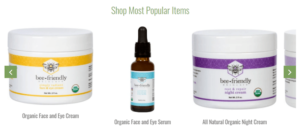
The featured items always stand a high chance of selling. The reason is because people like to buy products that other customers like. The number of people who have bought it acts as an endorsement of the product. Therefore, it is advisable to showcase them to the website visitors.
5. Product details pages
These are the most important pages in your store. The visitor is already on the edge of buying your product, and you have to guide them to complete the purchase. Product pages are critical as they can make or break sales.
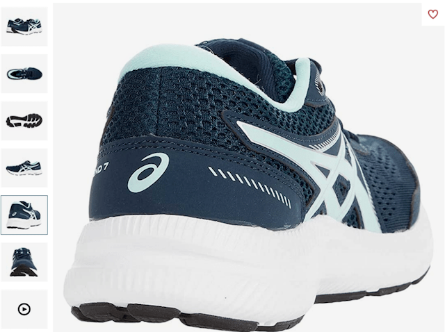
More than one high-quality product image
With the image zoom feature, people can have an closer look at:
- What the product looks like
- How is the consistency
- How is it used
Also, try and include some product sales videos. People love watching video content, and it helps to increase conversion on the product page.
USP in image format just below Add to Cart button
Adding your unique selling proposition (e.g. India’s #1 agarbatti producer) confirms to the visitor they have made the right choice. It helps turn the fence-sitters who are unable to decide into confident buyers.
Improve your e-commerce website design
E-commerce store design can be tricky given the requirements to categorize the products, display the product information, and streamline checkouts and payments. But, you can use some of the tips mentioned in this article to not only make your website good-looking but also to increase the number of people who decide to make purchases.
So what are you waiting for? Use these tips to give your store some more firepower to skyrocket your business.
________________________________
Got a few minutes? (Probably not.)
Fumbling for login credentials, running endless updates, explaining product purchases... No thanks. We built the Hub from GoDaddy Pro to save you an average three hours per month for every client site you maintain.

