When anyone thinks of creating a new website, writing website content, or interacting on an existing website to improve user experience, the onsite customer journey, or conversions, they almost always begin with the key services, products and sales pages. They then look at the checkout pages for online purchases, the home page, testimonials or reviews, the about page, maybe an FAQ or support page. They even look at the blog. Rarely does any website owner prioritize the website contact page.
When it comes to the contact page of a website, most people barely give it any thought.
Even some of the most beautiful, well-designed websites in the world have ho-hum contact pages. A basic contact form is added to the page, the page is checked off a list of website to-dos, and focus is given to something that matters more. Or worse, the website contact page is viewed as a necessary evil and is created to be more of a barrier than an invitation.
In many cases, the website contact page doesn't even have any contact information on it, which blows my mind! At Bourn Creative, we have landed several high-value, long-term clients over the years supply because our contact information was easy to find and we answered the phone.
Your website contact page deserves to be a priority
Your website is the hardest working member of your team. It works 24 hours a day, 7 days a week, 365 days a year. It is never sick, it never takes a vacation, and it does exactly what you tell it to.
When it comes to your website contact page, you have two choices:
- You can quickly create the page, add a contact form, call it good, and move on — providing visitors with a mediocre experience at best, that lacks any true connection or brand resonance, or help.
- You can invest in your website contact page to make it a valuable tool for visitors that not only provides all of your contact information and a contact form, but additional touch points for your brand messaging and invitations to connect further.
If it isn't obvious, the second option is the best choice.
The contact page is one of the most visited pages on a website, and often, the first step in beginning conversations with prospective clients and customers.
It needs to be warm, friendly and inviting, and it needs to provide visitors easy ways to get in touch with you — and not just through a sterile contact form.
Re-evaluate your website contact page
Did you breeze through the creation of your contact page, or haven't given it much attention since launching your website? Now is the time to go back and re-evaluate its effectiveness. Some of the questions you want to ask include:
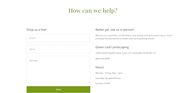
- Does it provide complete contact information, including a phone number and address?
- Are there multiple options to contact you? Is there an email address and a contact form?
- Is the copy and tone of the content on-brand? Does it reflect your brand's personality?
- Is there additional information provided that is valuable to visitors at this stage?
- Are you inviting visitors to connect with your further or stay in touch?
- Does the contact form go to a thank you page with helpful “next steps” information and invitations to stay connected?
Did you answer no to the questions above? If so, I'm willing to bet that your contact page isn't quite up to par with the brand experience you want your prospects, clients and customers to enjoy, and that means it time for an upgrade.
12 simple ways to improve your website contact page
-
Be helpful.
-
Skip the negativity.
-
Make it easy.
-
Provide all of the information.
-
Build the relationship.
-
Add value.
-
Segment your contact options.
-
Get personal.
-
Add personality.
-
Use responsive design.
-
Make sure it works.
-
Include a call-to-action.
Your website contact page can be used for more than displaying your contact information and a contact form. If planned and designed correctly, it can be a valuable resource for both you and your prospects. Not sure where to start? Below are 12 ideas that will immediately improve your website contact page.
1. Be helpful
While some visitors are just curious, most will visit your contact page because because they need something — they need help, they have a question, they want something, or they have a problem — and they are turning to you for the answer or solution. Start things off right by offering to help. Replace the boring, canned “Contact Us” headline, with “How Can We Help?” or “What can we do for you?”
The same is true for your contact form button. Replace the generic, lackluster “Submit” with “Send My Message” or “Get Help.”
2. Skip the negativity
When researching websites of designers and developers, I was blown away by how many contact pages list all the reasons why you should NOT contact the freelancer or company and what things they will not respond to. Visitors haven't even had a chance to connect with the site owner, they are looking for help of some kind or to take the next step and learn about paying them money, and their first experience is with negativity. Ouch.
Instead of focusing on who shouldn't contact you, why they shouldn't contact you, and what you won't help with, turn your contact page content around and focus on who is the best fit for your products/services, what the form is for, and what you can help with.
Then add a list of links to alternate resources (or educational blog posts) for those who aren't a good fit or are looking for something you can't help with. If some people do fill out your contact form with requests you don't want or don't fit with your products/services, have canned responses ready so you can continue to be helpful.
We have landed multiple high-value, long-term clients from referrals made by people we turned away after receiving their contact form, all because our templated responses were so helpful.
3. Make it easy
Everything on your website, even the contact page, should be as frictionless as possible. Don't bury your contact information at the bottom of the page underneath a contact form, don't set the information in tiny type, and don't exclude information. Make it as easy as possible, completely obvious, for visitors to find the contact information they need.
4. Provide all of the information
I know it’s tempting to only offer visitors a contact form, but resist the urge. It's unfriendly, cold and sterile, it's unhelpful, and it is unprofessional. It makes it look like you don't take your business seriously, it will make visitors question your trustworthiness, and it will hurt your credibility.
At minimum, provide a phone number and mailing address.
Include an email or a contact form, or publish both options and let the visitor choose which option they prefer. If you have different locations, departments or team members and people need to be able to contact them directly, provide complete contact information for each one.
5. Build the relationship
Invite visitors to not only fill out your contact form or contact you, but to connect with you further:
- Include a call-to-action to subscribe to your email newsletter or a checkbox to subscribe as part of your contact form.
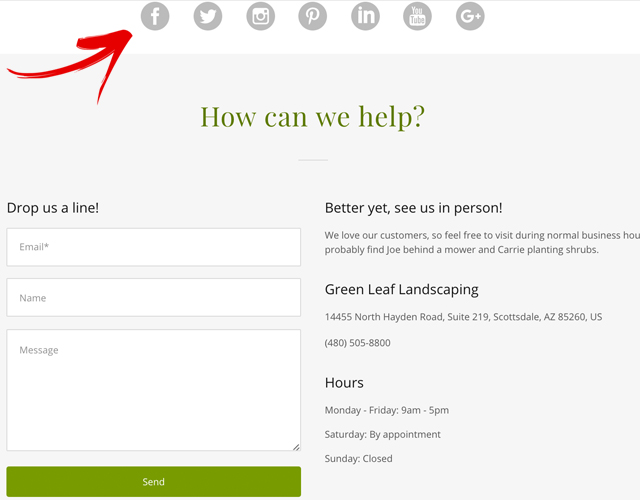
- Include links to your Facebook page, Twitter profile, YouTube channel, Instagram account, LinkedIn page, Pinterest page — any place you are actually active and engaged with your audience.
6. Add value
Track why people are filling out your contact form, contacting you, or calling you, so you can provide even more value and enhance their experience interacting with your brand.
For example, if you notice that if people commonly contact you with the same question, write a blog post on the topic. Then you can either add a link to your contact page, encouraging visitors wondering about the topic to read the post before reaching out, or you can have a canned response ready for those who reach out, so you make the personal connection.
7. Segment your contact options
At Bourn Creative, prospective clients contact us about new projects, and others contact us about speaking opportunities, with questions, and for other general reasons. We immediately segment those inquiries by funneling them to separate contact pages. Prospects are sent to a “project inquiry” page, specifically to meet them where they are at, and all other inquiries are routed to the general contact page. Each page uses a separate form, weighted with different levels of priority, and with different follow-up protocols.
At first we noticed prospects were still using the general contact page to reach out about new projects because that is what they are used to doing on almost all websites. To combat this, we added a section to the top of our general contact page, redirecting those who want to get in touch with us about a new project. It is obvious and works like a charm.
8. Get personal
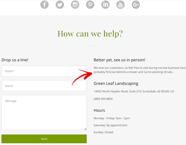
People want to do business with people, not nameless, faceless companies. They want to know who they are dealing with, who is behind the company they are about to give their money to, and who they will be working with or communicating with.
People want to do business with people.
Get personal on your contact page and consider adding a photo of the people who respond to and answer the contact form or the phone. Let your visitors know real people, actual humans, are on-hand and ready to help them.
9. Add personality
Just like an actual person, your brand has a personality. You have a brand voice, a language, a tone that you use in your marketing, social media interactions and website content that reflects that personality.
Your website contact page needs to use the same voice and showcase the same personality.
If your brand is casual and fun, the language and calls-to-action on your website contact page also need to be casual and fun. And the contact form thank you page, after they have taken action, is the perfect place to really kick it up and let your brand personality flow.
10. Use responsive design
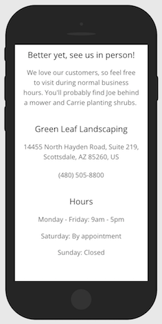
It sounds silly to have to tell you that your website needs to be responsive, and that it needs to be easy to use on devices of any size, but it needs to be said.
A huge number of small business websites are still not mobile-friendly and not only is this bad for your search rankings, it's bad for your conversions.
More than 60 percent of all internet browsing is happening on mobile devices. If your website isn't responsive, it isn't easy to use and visitors will leave. If your website contact page and contact form aren't responsive and easy to use on mobile devices, you risk losing out on new business, new clients, new customers, and the opportunity to create new fans.
11. Make sure it works
Test your contact form. Make sure it is easy to use and that it works. Fill the form out and go through the process like a new website visitor. Make sure the thank you page displays as it should, make the sure the content is correct and updated, make sure the right person received the email notification, and that the correct follow-up is happening.
Like WordPress? Learn how to create a contact form using the Ninja Forms plugin.
12. Include a call-to-action
One thing that many website owners forget to include on their contact page is a call-to-action. Only including your contact information and a contact form is not enough. You actually need to ask visitors to contact you and encourage them to take action, to reach out, to fill out the form, to ask a question.
An effective call-to-action will increase contact page conversions — an email, a form submission, or a phone call — and if you're anything like us that means you're going to, in turn, increase sales.
A consistent, cohesive brand experience
The most important thing to remember is that your website contact page isn't something you can ignore or breeze through quickly. It needs to be part of your website strategy, part of your brand messaging, and part of your conversion process. Your website contact page also needs to provide a consistent brand experience, so every interaction with your brand, even on the contact page, is positive, friendly and helpful. Because you never know what that single connection could lead to.
While the person contacting you today might not be a great fit for your services or might not be able to afford you right now, you don't know who they know, who they may refer you to, or who they may go to work for in the future — and providing them with an extraordinary experience on the simplest of pages can make a lasting impression.

