
Standing out as a freelance web designer isn't easy. Clients are busier than ever—it's difficult to even get their attention, let alone get them to reach out about starting a project.
Even as a highly skilled professional, you still need to spend time creating a strong web design portfolio to show off your expertise and your past projects — an online portfolio that lets you break through the noise and stand above the competition.
Unfortunately, building an online presence and portfolio isn't something that comes easily to many freelance web designers. You'd rather be doing great work for your clients than talking about yourself and your skills. So to help you start building your own portfolio site and winning more business and better clients, we've put together 20 inspiring examples of web design portfolios from a mix of freelance designers and creative studios around the world.
Before we jump into the list, though, let's take a look at what goes into a stellar web design portfolio.
Your business needs a website.
What to include on your web design portfolio website
To make your web design portfolio stand out, be sure to include these essential elements:
- They grab clients' attention by using bright colors, original imagery, or interactive elements to stand out from the competition. When sourcing images, it's smart to use free-to-use images for your site to ensure your portfolio looks professional and stays copyright-compliant.
- They frame every element around the ideal client. Instead of just talking about what you do, they explain what you do for your clients, focusing on benefits over features or services.
- They cut out all unnecessary fluff. The best web design portfolios don't overcomplicate things unnecessarily—they make navigation straightforward and always direct visitors toward the desired result.
- They show the design journey using case studies. Potential clients want to know you can solve their problems, and the best way to explain how you'll achieve this is through detailed case studies. Explain the challenges behind the project and how your solution overcame them, and highlight measurable outcomes from each project.
- They create confidence using social proof and other trust signals. Potential clients trust the recommendations of others, even from people they don't know. You can also include other trust signals, like describing your process and mirroring clients' beliefs in your copy.
- They inject a bit of personality. Clients hire people, not brands—adding a few personal touches to your portfolio helps create a connection with your ideal clients.
- They include a clear call to action. Since your portfolio is meant to attract new clients, make sure you're asking them for their business. A clear CTA lets clients know what they should do next, whether that's setting up a call, filling out a contact form, or something else.
Now that we know what should go into your web design portfolio, let's take a look at some examples from other designers.
Related: Check our complete 2024 guide on web design.
20 stellar web design portfolio examples to inspire your own
#1: John Henry Müller
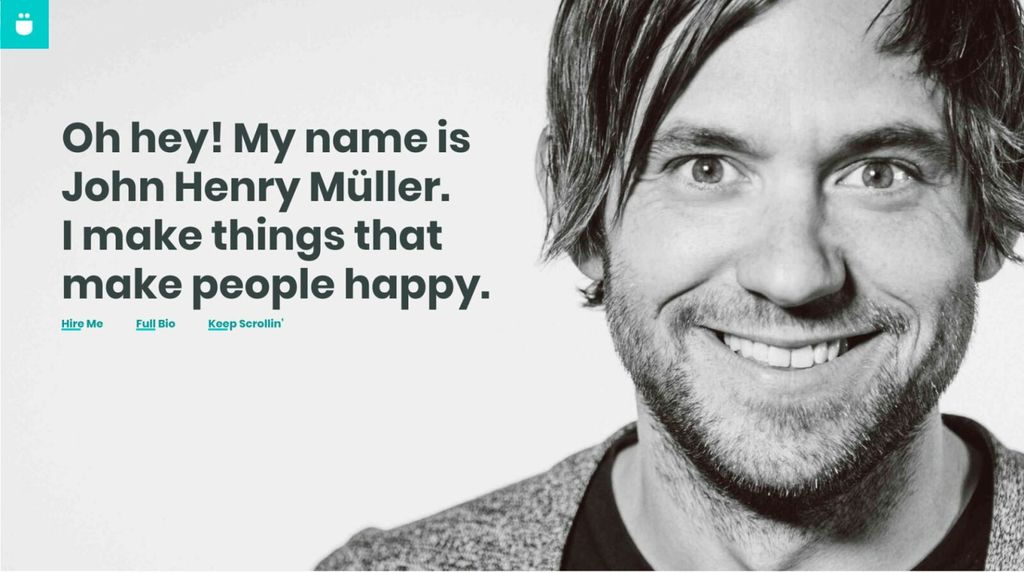
Portfolio Link: https://johnhenrymuller.com/
John injects a ton of personality into his portfolio with bright colors, friendly photos, and friendly copy that help attract the type of clients he loves working with. It's also worth checking out his terrific (and witty) case studies as a great example of how to add some personality to your own portfolio.
#2: Olivier Guilleux
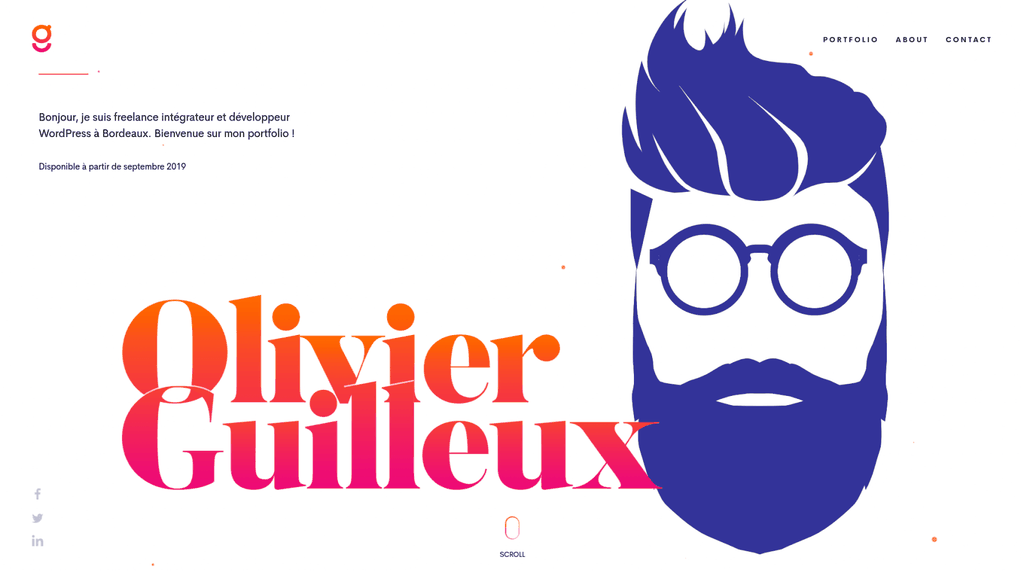
Portfolio Link: https://www.olivier-guilleux.com/
Olivier's portfolio pairs minimalist design with bright colors, along with subtle animations on the home page to grab visitors' attention. His portfolio pieces, like this one detailing his work on design blog AA13, effectively show off his design skills, and each one includes a clear CTA to inquire about his design services. It's a great example of using minimal design to maximum effect.
#3: Rumsey Taylor
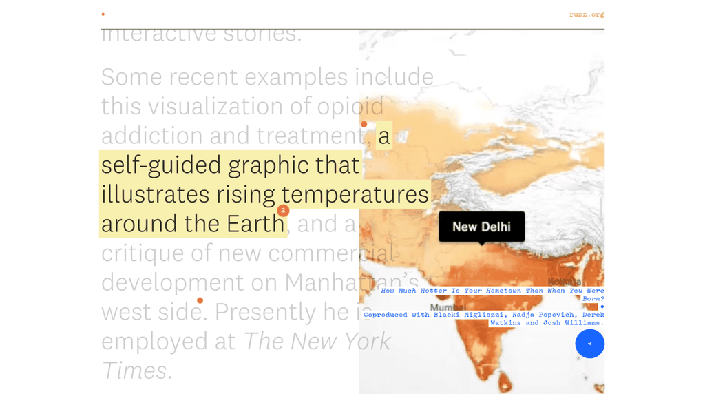
Portfolio Link: http://rumz.org/
Rumsey specializes in creating interactive online stories, so it's fitting that his portfolio includes a touch of his interactive design prowess. Scrolling through his site's copy brings up interactive elements that overlay the page—each element links to the final published work, showing off both his past work and his talents in a unique form factor that's sure to stick in clients' minds.
#4: Raphael Aleixo
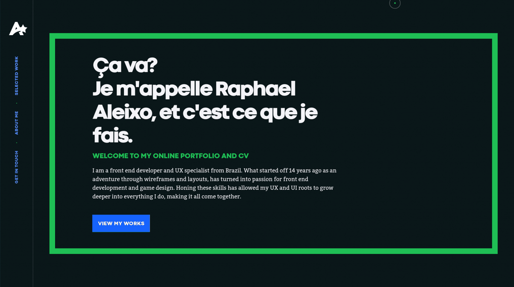
Portfolio Link: https://aleixo.me/
Portfolios don't need to be overly complicated, and front-end developer Raphael's one-page portfolio gets straight to the point: showing off his design prowess. A unique left-to-right scrolling motion lets him include multiple projects on the same page, and clicking each project brings up a more detailed case study. The dark theme helps the colorful screenshots pop, and the vertical menu makes the site easy to navigate.
#5: Jarrod Drysdale
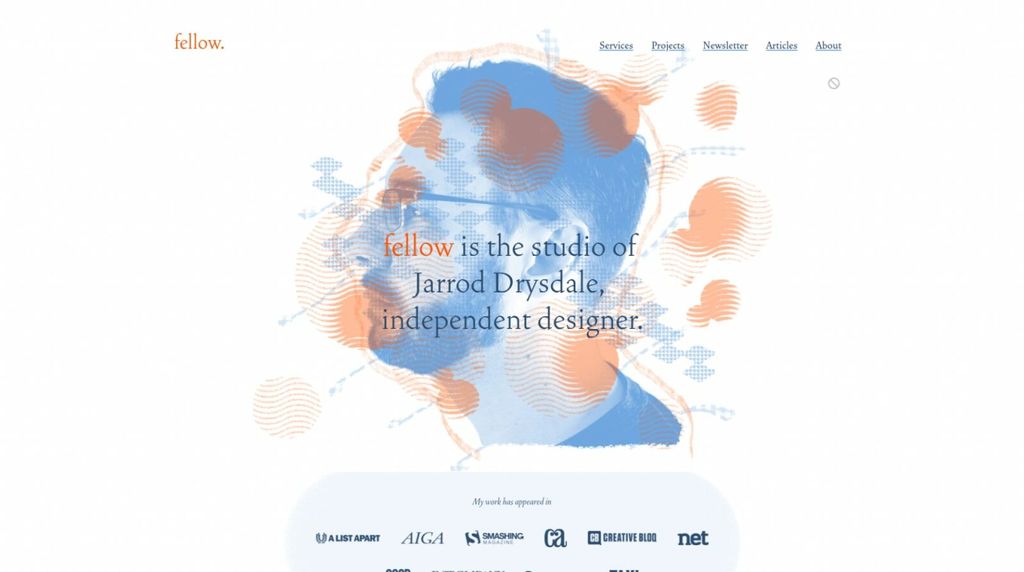
Portfolio Link: https://studiofellow.com/
Yes, Jarrod's portfolio website is beautiful, but it's the copy that really shines here. His Services page explains clearly how his designs help customers achieve their goals, linking to detailed case studies that demonstrate the value of his work. Jarrod's ability to link design to results is something you should strive for in your own web design portfolio.
#6: Ramon Gilabert
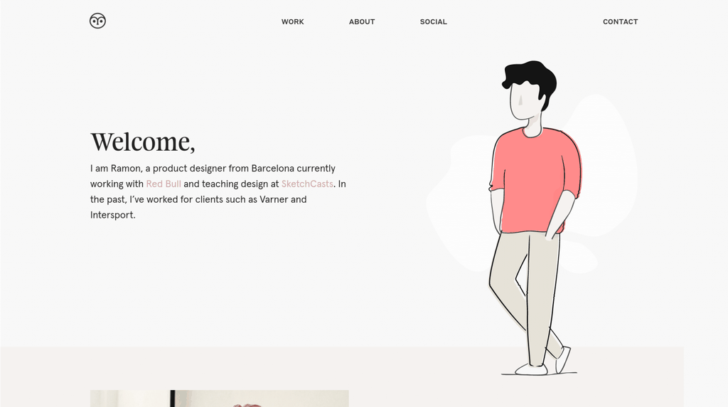
Portfolio Link: https://gilabert.design/
Ramon's portfolio design is calming and beautiful, and the design adapts particularly well to mobile—important when more than half of web traffic these days is on mobile. His case studies are particularly effective, listing specific results and explaining his thinking behind the project.
#7: Alex Coven
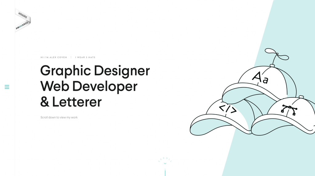
Portfolio Link: https://www.alexcoven.com/
Like Ramon's site, Alex's portfolio is notable for its minimalist design, but what makes it truly special is the great navigation. The menu pops out from the left side and contains most of the site's content, letting Alex use the majority of the page to show off his best work. It's a unique approach — and one that works quite well.
#8: The Wonder Jam
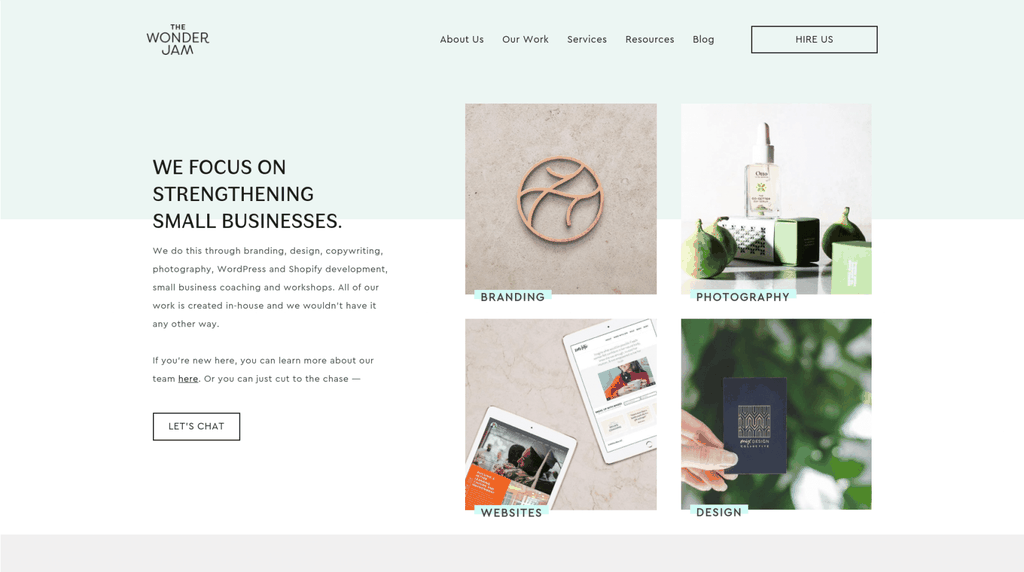
Portfolio Link: https://thewonderjam.com/
Our first studio! Design duo Allie and Adam Lehman put their clients first in every part of The Wonder Jam's web design portfolio. From the great use of testimonials, friendly client photos, and clear descriptions and transparent pricing of their services, every element serves the same purpose: to put the success of their clients front and center.
#9: Steven Hanley
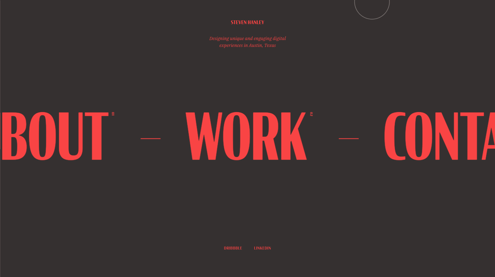
Portfolio Link: https://www.steven-hanley.com/
Steven's a digital designer with a penchant for bold typography, which takes center stage in his portfolio—at least until you click on one of his case studies. The eye-popping colors, strong headings, and interactive design come together to show off Steven's design skills and attract his ideal clients.
#10: Angle2
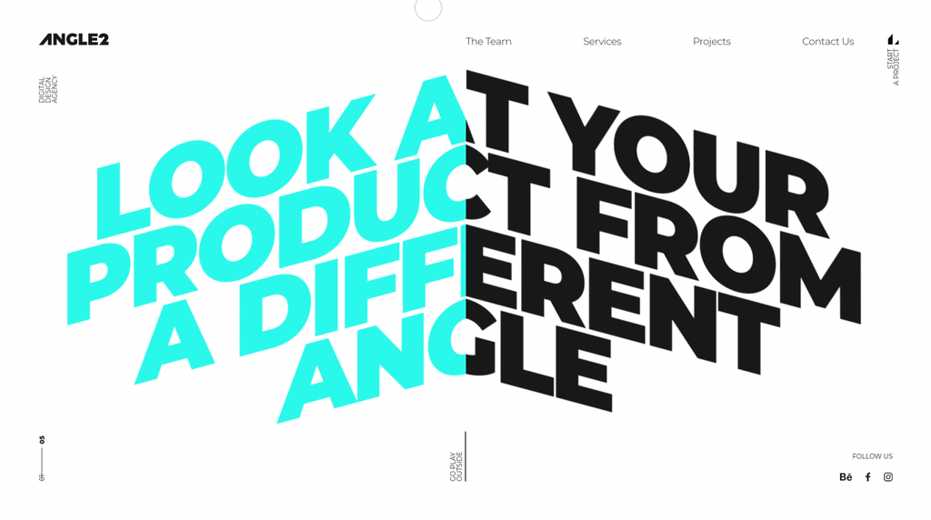
Portfolio Link: https://angle2.agency/
Another interactive portfolio with great typography, Angle2's interactive headline captures your attention immediately. As you scroll down, the angled design continues through their case studies and services, lending a unique, but somehow cohesive and engaging, agency portfolio.
#11: Branex
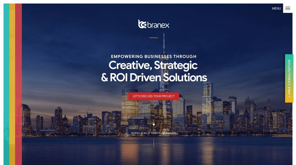
Portfolio Link: https://www.branex.com/
Branex's web design portfolio stands out for two main reasons: the colorful design and the detailed case studies. Embracing bright gradients and a unique palette, the site certainly stands out from generic business templates, and their detailed case studies cover both the design and the final results.
#12: Up Late Studio

Portfolio Link: https://upl8.com/
Up Late Studio's one-page portfolio takes the neon theme to a whole new level. The bright colors and flashing signage make for a memorable portfolio website, but the rest of the design shows a little more constraint, with customer testimonials and a slideshow of past work.
#13: Momkai
Portfolio Link: https://www.momkai.com/
Momkai is a design studio built around simplicity—their portfolio is clean and easy to follow and works particularly well on mobile. Each case study, like this one from their work with stroller company Bugaboo, shows off their web and graphic design work through a combination of animated images, video, screenshots, and compelling copy. It's a simple design that works to great effect.
#14: Sage McElroy
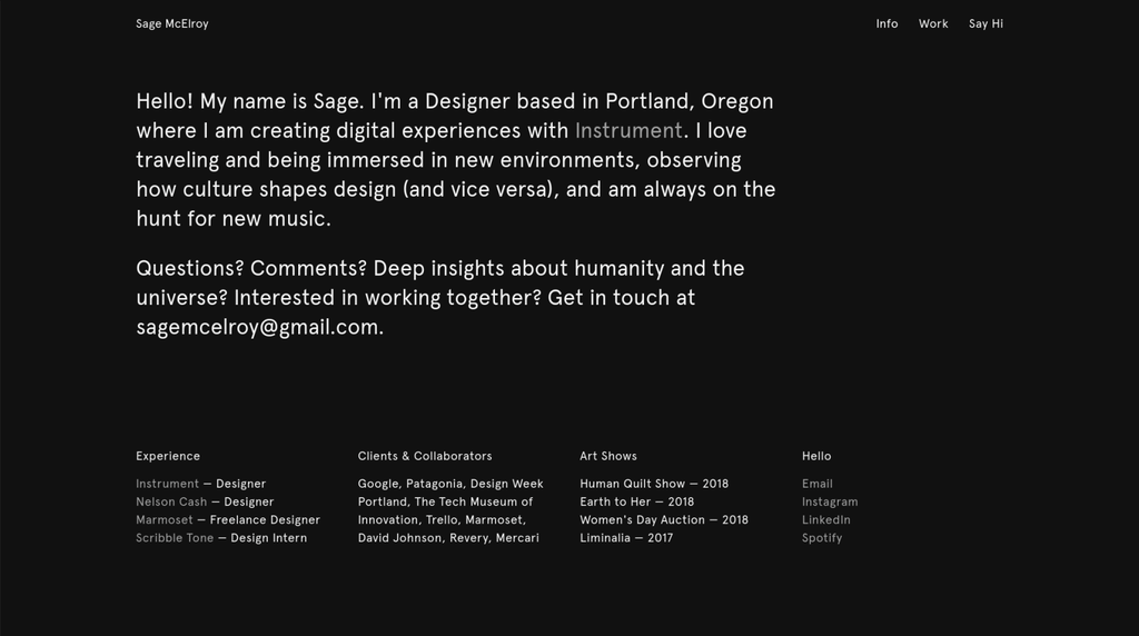
Portfolio Link: http://sagemcelroy.com/
Sage's personal site is from the rare breed of portfolios that make dark themes work well. The friendly text and detailed case studies get straight to the point of a portfolio —showing off Sage's work—and there are plenty of opportunities to reach out via email to inquire about new projects. All the essentials of a great portfolio, without the fluff.
#15: Jake Dow-Smith
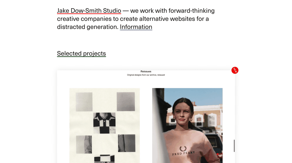
Portfolio Link: https://dow-smith.com/
Jake Dow-Smith's minimalist site has a unique approach to showing off their portfolio pieces. Each piece is presented as a short embedded video, showing visitors not just how the sites look but also how they work. The site also loops back to the start as you scroll—a fun touch, if a little confusing for visitors.
#16: Gin Lane
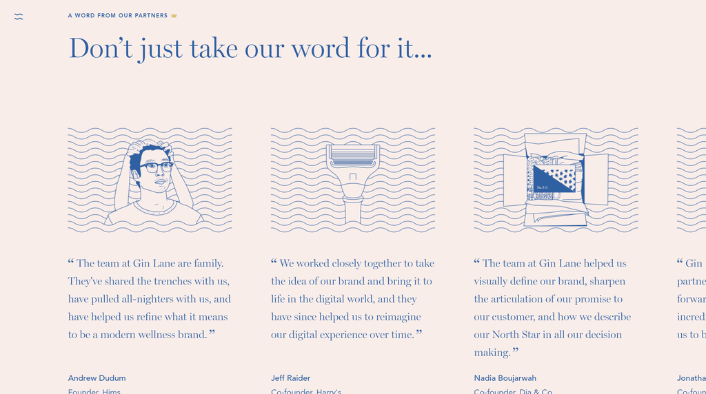
Portfolio Link: https://www.ginlane.com/
Editor’s note: Since the time of writing, Gin Lane has closed their agency business and started a new company called Pattern—this post refers to their portfolio as it stood at publishing time.
Great typography, use of color and motion, detailed case studies—Gin Lane has one of the best all-around web design portfolios out there. The site also works just as well on mobile as it does on desktop, flowing perfectly to fit the smaller screen design. And the emojis add a whimsical touch to the friendly copy.
#17: Matt Olpinski
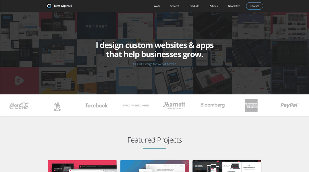
Portfolio Link: https://mattolpinski.com/
We love how Matt balances his services and product offerings on his site—but the real highlights here are his in-depth case studies, like this one for fitness website FitLegit. Each case study includes a breakdown of Matt's design approach, covering everything from colors to typography to information architecture. Wrapping up each case study is a testimonial from the client, along with a call to action to talk about Matt's services. It's a master class in putting together great web design case studies.
#18: David Hellmann
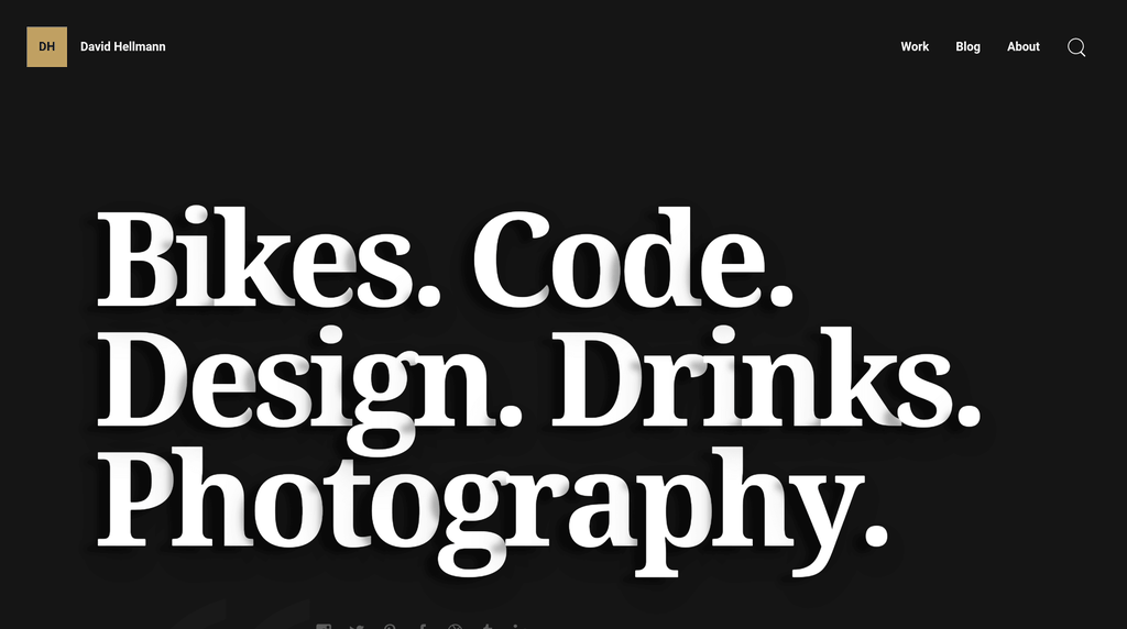
Portfolio Link: https://davidhellmann.com/
The quirky “jumping” heading and dark theme on David's portfolio catch your attention immediately, and the attention to small details continues throughout the rest of the site. David also includes photos from his Instagram feed, adding a personal touch to the professional site.
#19: ZURB
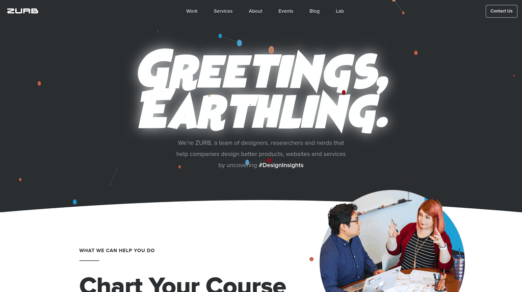
Portfolio Link: https://zurb.com/
Zurb's site has personality in spades. The space theme continues through their typography and copywriting, and their case studies (like this one from their work on Men's Wearhouse) detail their unique approach to helping clients discover “Design Insights.” As a bonus, they've also hidden 42 cows in unexpected places around their site—see if you can find all of them!
#20: Nicky Tesla
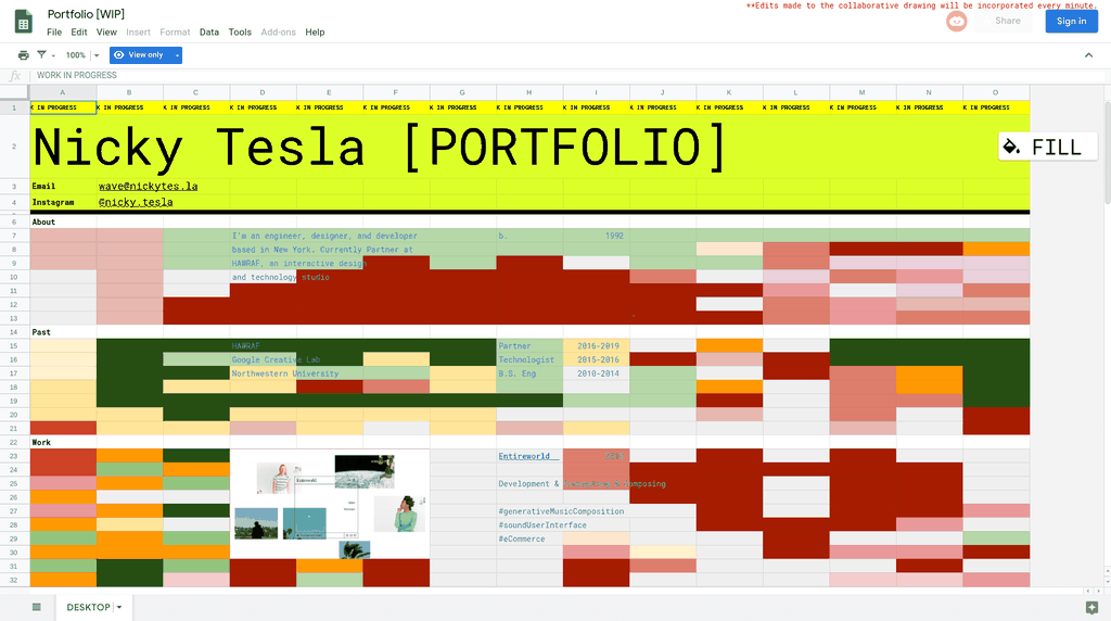
Portfolio Link: https://nickytes.la
It's . . . well, it's a spreadsheet. Specifically, Nicky's portfolio is an interactive Google Sheet that's publicly available and attached to a domain name. The spreadsheet portfolio even includes an interactive drawing—visitors can change the background colors at will, and the changes are reflected on the live site. It means it's not exactly the most readable portfolio, but it's certainly one of the most remarkable.
Make your portfolio about your clients
Your web design portfolio can be a very personal site, reflecting your design approach and your individual personality—but don't forget that, ultimately, your portfolio's job is to sell. That means focusing on how you help your clients—how you solve their problems, how they derive value from your services, and how happy they are to work with you.
With inspiration from these examples, and a little bit of effort, you too can create a killer web design portfolio that attracts your ideal clients and wins you more business.
Header photo by Jonathan Farber on Unsplash
Efficiently deliver better results.
When you use The Hub from GoDaddy Pro, suddenly there’s more time in your day to focus on what matters most. Forget about juggling admin tasks. Reclaim your time and use it to make clients feel like the center of your universe.
Disclaimer: All known trademarks contained herein are the property of their respective owners and their inclusion does not represent any affiliation, endorsement, or sponsorship.
*AI-assisted full website including all of the premium features like online store, appointment scheduling, and marketplace selling to name a few, requires paid subscription.
Social media marketing calendar available with GoDaddy Airo, some features will require paid subscription.
Professional Email through Microsoft Office 365 30-day free trial with an option to renew into a paid subscription beyond the promotional period.
While the LLC starter plan is free, there are likely some state and/or local filing fees associated with your filing which will be determined during the filing process.