
When you’re hustling, time is money and that money comes in coins, not bills. It’s why we made our Website Terminology Glossary for web pros. This free resource for designers, developers, marketers or anyone else makes it easier explaining technical stuff to clients.
Rather than a lengthy back-and-forth, quickly find definitions that break it down in real terms. Start getting time back — and put more of those coins in the bank.
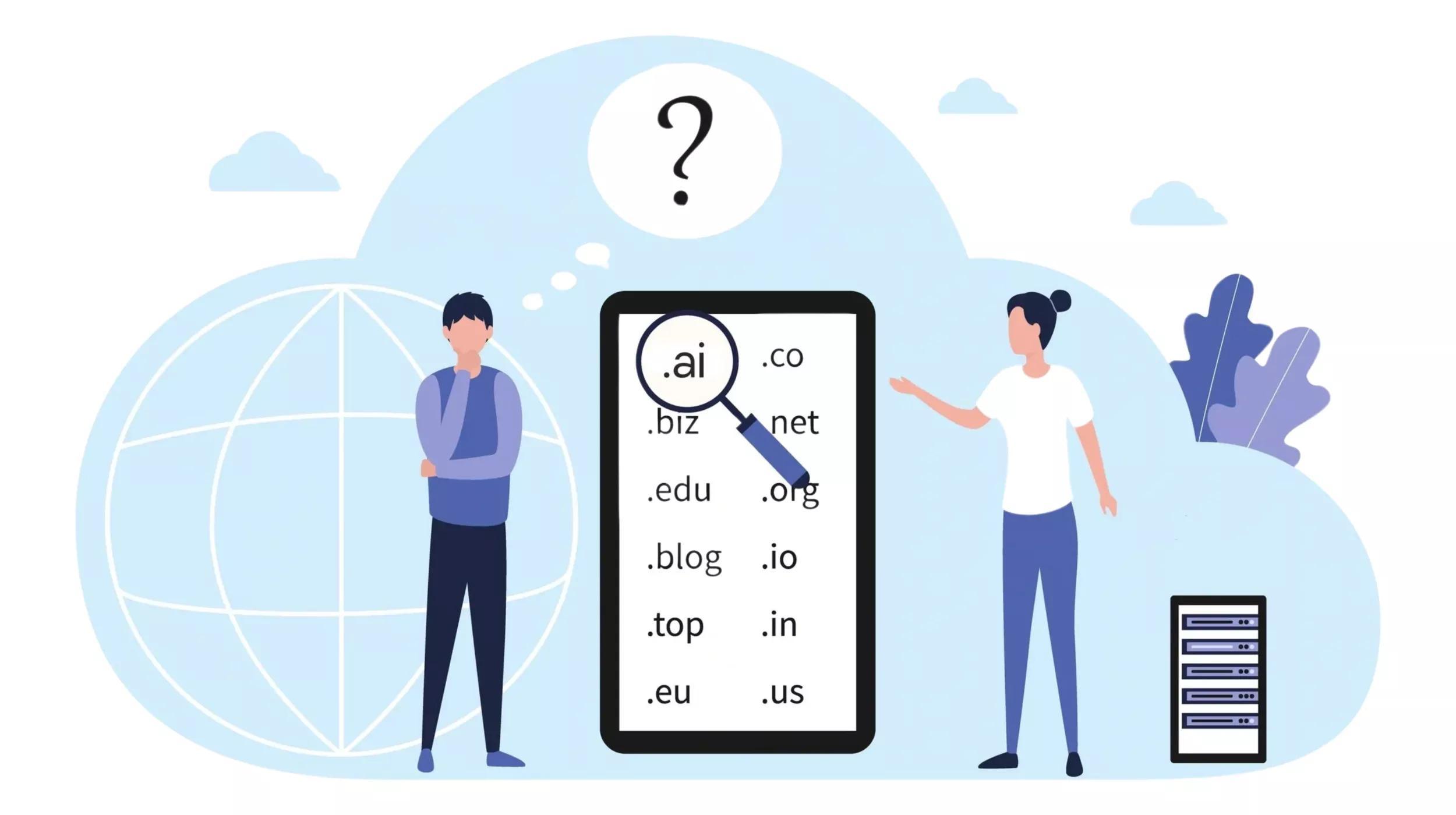
Website Terminology Glossary: Resellers, Vol. 1
When you're explaining reseller terms, it's often helpful to circle back to basic commerce. Reselling might be mysterious to some, but most people understand the basics of selling stuff for a profit.
Application programming interface (API)
An API enables companies to open their applications data and functionality to third-party developers, business partners and internal departments within their companies. This allows services and products to communicate with each other.
It's kinda like
Ordering food of a food delivery app. You choose the meal you want based off the menu, where it then goes to a POS system who passes it on to the kitchen. It then is delivered to you once made.
You also might hear
adaptor, interface, middleware, middle layer
Buy rate
The buying rate is the rate which a business would buy an amount of product at a set price. They would then sell the product with a markup to an individual or a company.
It's kinda like
When you ran a lemonade stand in summer. You would use your spare change or pocket money to buy some ingredients your buy rate then you would sell it for a few bucks to make a profit.
You also might hear
bid price, acquisition cost, purchase price
Cross-sell
To cross-sell is to sell related or complementary products to a customer. Cross-selling is one of the most effective methods of marketing.
It's kinda like
A fast-food restaurant asking if you would like to add fries to your order when you are only purchasing just a burger.
You also might hear
resale, partnering
Margins
Margins represent the difference between the cost of a product and how much you sell it for. It can also mean the amount by which revenue from total sales exceeds costs in a business.
It's kinda like
Buying a pair of shoes from a wholesaler for $20 and then selling them to consumers from $50. So, your profit margin is $30.
You also might hear
mark up, gross profit, net profit
Minimum retail rate (MRR)
MRR is the minimum price a reseller can sell a company's product. It sets limits for resellers on both advertised prices as well as the actual selling prices of the manufacturer’s products.
It's kinda like
Buying a product from a company who sells a product for $20. The manufacturer would then limit the reseller from selling the product under $20 to ensure a fair market.
You also might hear
minimum retail price (MRP), minimum resale price, minimum advertised price (MAP)
Upsell
Upselling is inviting a customer to purchase products or services at the next highest price tier. It could be upgrading to a premium version of a product or adding on insurance to protect a project.
It's kinda like
A business owner visits a print shop for business cards. They intended to use a basic design, but the salesperson helps them see the value in a professionally designed business card. The business owner chooses a glossy finish to best display the colors.
You also might hear
boost, push, recommend, promote
Reseller
Resellers purchase services or goods for resale rather than consumption. Retailers are considered resellers, as they resell goods to end consumers. Wholesalers are also considered resellers as they resell the goods they purchase to retailers.
It's kinda like
A company who buys furniture from the manufacturer to then sell them to consumers, instead of the manufacturer selling directly to consumers.
You also might hear
distributor, wholesaler, merchandiser, vendor
Storefront
In the digital world, a storefront is a reseller website. Some of the better reseller programs offer members a ready-to-use storefront stocked with the products they intend to resell. A storefront will also usually include some type of payment method.
It's kinda like
An online retailer having a store in the mall with some of its popular products that consumers can buy.
You also might hear
shopfront, bricks and mortar, showroom
Turnkey
This is an arrangement where the provider assumes responsibility for all required setup and ultimately provides the business to the new operator only upon completion of the requirements. It already has a proven, successful business model and merely requires investment capital and labor.
It's kinda like
Buying into a fast-food franchise. Everything is supplied and set up, and the person buying into it provides finances and operates the business.
You also might hear
business ready, ready operate
White label
White-labeling is when a business takes their logo off a service or product and uses the branding requested from the purchaser. This is done mainly with supermarket chains.
It's kinda like
A coffee company using the same coffee blend of a coffee company who does the coffee roasting, but the company who roasts the coffee puts it in a plain coffee bag or the other coffee company’s branding.
You also might hear
private label