Constructing a strong brand identity is important for any business in the construction industry. Your logo is a visual representation of your brand, so it should represent your values, expertise, and commitment to quality.
Ready to create a logo for your construction company that reflects the professionalism and reliability you offer? Let’s jump in and get building.
How to make a construction logo
1
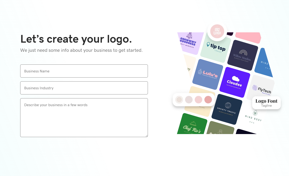
Add details about your business: name, industry and a short description
2
Choose up to 3 words that best describe the personality of your business
3
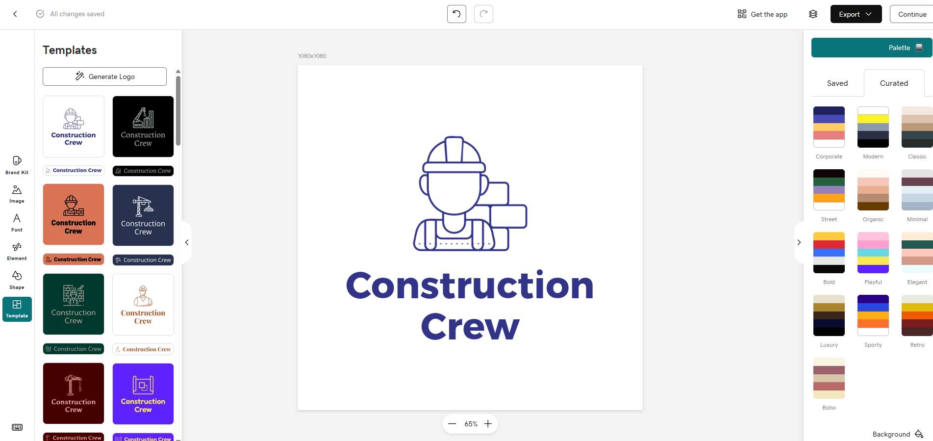
Choose a logo version already created or make further edits

Construction logo ideas and examples
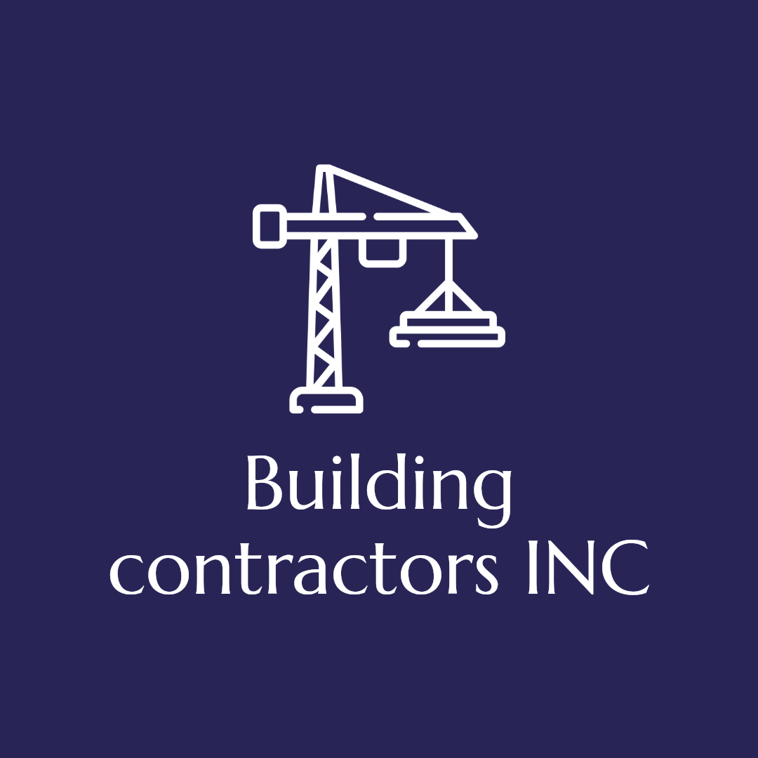

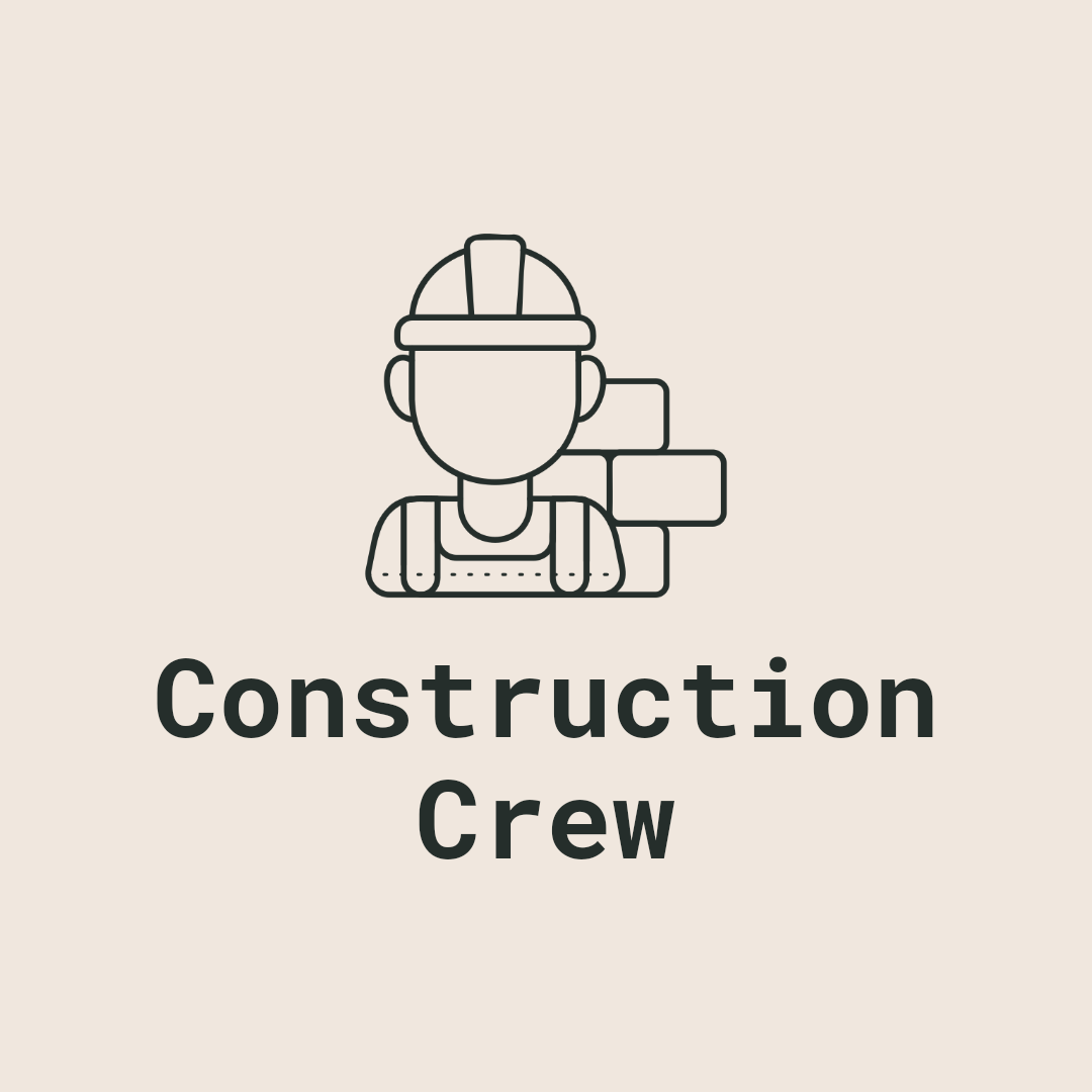
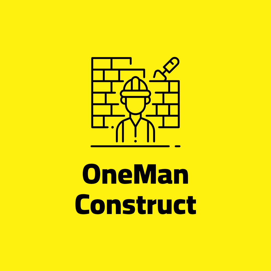


Looking for inspiration for your construction company’s logo? Great construction logos often combine bold fonts, simple icons like rooftops or tools, and strong color palettes that convey reliability and strength. Whether you prefer a modern minimalist look or a classic design with industry-specific symbols, our construction logo maker can help you create a logo that stands out and builds trust with your clients.
Construction logo design tips
1. Bold, Sturdy Fonts
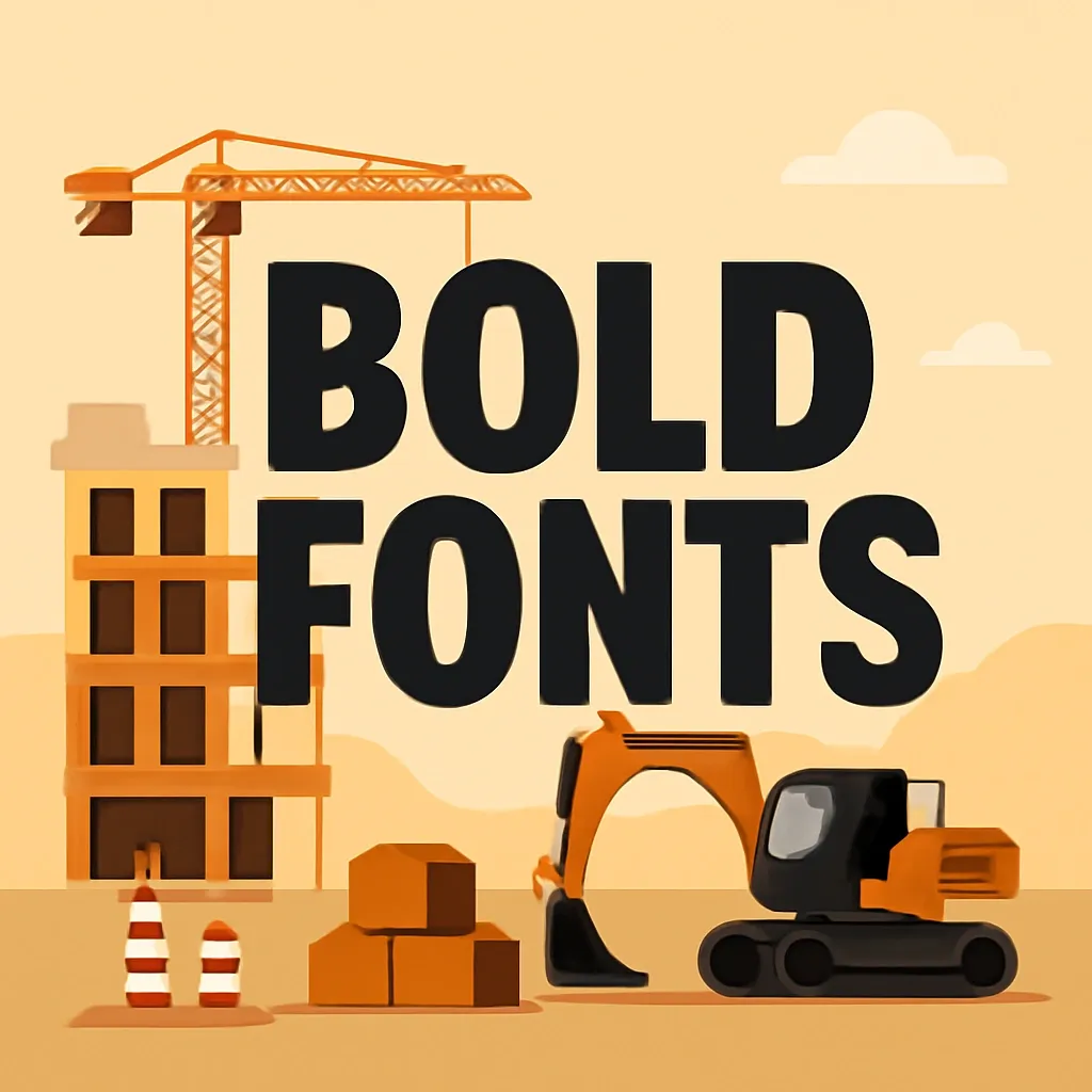
The font you choose sets the tone for your brand identity. In construction, it’s important to project strength, reliability, and professionalism. Sans-serif and slab-serif fonts like Montserrat, Bebas Neue, or Rockwell are popular choices because they are easy to read and suggest durability. Avoid script or overly decorative fonts, which can look fragile or be hard to decipher at a distance.
Top tip: Select a bold, uncomplicated font that remains legible and professional at any size.
2. Industry-Appropriate Colors
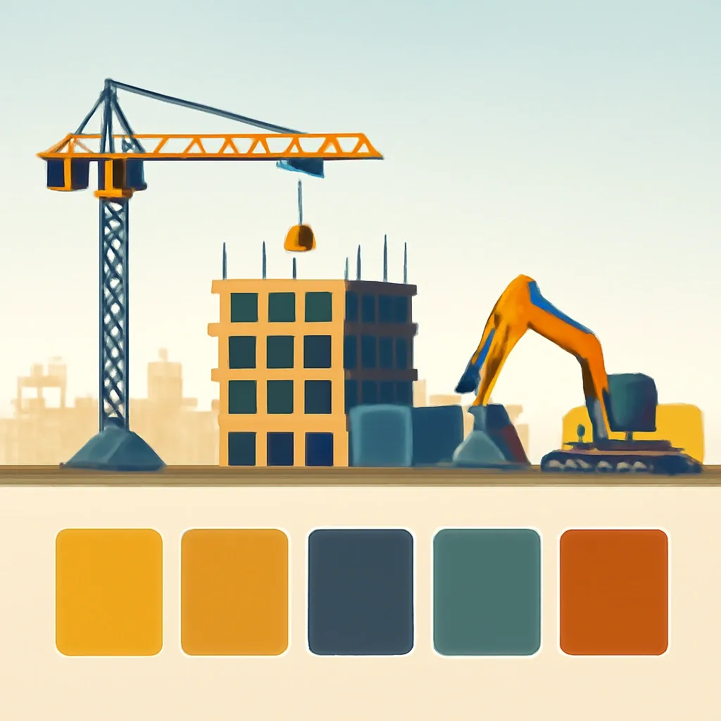
Colors evoke emotions and are a powerful way to communicate your business values. Blue implies trust and dependability, gray stands for stability and practicality, black suggests strength and authority, while earth tones evoke a sense of groundedness and connection to the environment. Brighter colors like orange or yellow can add energy and attract attention, but should be used sparingly to avoid overwhelming the design.
Top tip: Choose one to two primary colors that reflect your brand values, and use brighter tones only for highlights or accents.
3. Simple, Recognizable Icons
Icons instantly communicate what your business does and help your logo stand out. For construction, think about using images like rooftops, houses, cranes, hammers, or geometric building blocks. Keep icons simple and stylized rather than detailed or realistic, as intricate images can get lost when the logo size is reduced.
Top tip: Pick a clear, relevant icon that still looks good and recognizable at a small scale.

4. Balanced Layout
A well-balanced logo is visually appealing and easy to remember. Symmetry or thoughtful asymmetry can create a sense of order and professionalism. Make sure your text and icons are aligned so that one element doesn’t overpower the other, and that the logo looks great both horizontally and vertically. Test the logo in different formats to ensure it’s adaptable.
Top tip: Arrange your logo elements so that they create a harmonious, balanced design — test for readability and impact in various sizes and orientations.
