So it’s time to redesign your website or a website for a client. That's great! What are the first steps? Jumping into Sketch or Photoshop and whipping up some design comps? Maybe firing up your note-taking app of choice and drafting some copy? Browsing a few of your favorite websites for inspiration?
If any of those options sounded like a good first step, you might be neglecting a crucial part of the process, a website analysis.
What is a website analysis?
Simply put, a website analysis is an examination of a website through the lens of improving the site's ability to meet or exceed a defined goal.
Every website should have a goal.
The goal could be for users to purchase a product or find an answer to a question. Perhaps the goal is to get more signups for a mailing list. In the case of a blog, the goal is likely to share information with more readers.
There are many techniques that can be used to analyze a website, including keyword analysis and usability analysis. Keyword analysis is the process of researching the language of your audience so we can be more easily found in search and can better communicate with our audience when they arrive on our site. Usability analysis is the process of considering how to design and structure your website to meet the needs of a certain demographic.
SEO and keyword analysis
Apart from a few edge cases, the goal of almost every website owner is to get more traffic. Search engines are capable of driving large amounts of targeted traffic, and time invested optimizing a website for search can pay off handsomely.
Before making any big changes, it’s wise to investigate what is already there and make sure the basics are covered. Does every page have a descriptive and "click-worthy" title? Remember, a title tag is not just a place to stuff keywords.
Click Through Rate (CTR) is a factor in Google's ranking algorithms, so titles should be both keyword rich and phrased in a way that encourages clicks.
Do the home and inner pages have meta descriptions? Do they have a smattering of semantic and descriptive heading tags? These on-page basics are the generally the easiest to fix up and surprisingly many websites get them wrong.
Bounce rate is another metric that factors into Google's rankings. Try not to mislead users or make false promises. If someone visits your site through a Search Engine Result Page (SERP), but then immediately leaves because they couldn't find what they were looking for, that's going to negatively impact search rankings over time.
Who is your audience and what language do they use?
One of the most useful techniques for our website analysis will be putting ourselves in a user's shoes. Who are our users? How old are they? What region are they from?
Using the same language as your user is an effective way to target better keywords. This idea is the root of keyword analysis. Keyword analysis (aka keyword research) is the exercise of investigating and picking the best keywords for your target segment.
One of my favorite techniques to gather information about the language a customer uses is to look at the comments and reviews for a competing product or site. What words are customers using to describe the product? Are they looking for a “fixed-gear bicycle” or a “fixie?” A “stand up paddleboard” or a “sup?” Small changes in wording can result in significant increases in search engine traffic.
In addition to understanding how they name things, understand what adjectives do your visitors use. Do they want something "strong" or something "full bodied?" Something "elegant" or something "formal?" If a user searches for a “full bodied coffee” but you’re using the term “strong,” you’ll be losing potential customers.
Granted, with recent updates like RankBrain, Google is getting a lot smarter when it comes to synonyms and similar terms. Still, a direct keyword match is likely going to be the most effective at driving traffic.
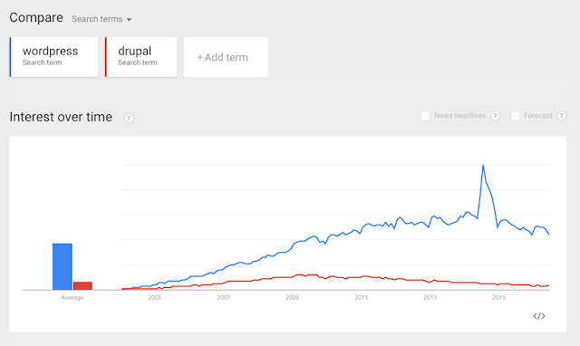
A great tool for exploring keywords is Google Trends. It allows you to compare two or more phrases based on how often they’re searched for. Maybe you want to create a website about content management systems but can’t decide which to target. After looking at this graph comparing WordPress and Drupal, the choice becomes a lot easier.
Usability analysis
Usability, according to Wikipedia, is the “ease of use and learnability of a human-made object.” In our case, it’s the ease of use and learnability of a website.
One of the best ways to improve your website’s usability is to put yourself in the shoes of your customer.
Regardless of what the goal is, we want users to accomplish it with as little friction as possible.
This means a website intended for senior citizens might want to use larger font sizes and buttons. A website for children could utilize illustrations and avoid complex instructions. A website intended to sell a product should feature a big, bright call to action (CTA) button that’s easy to identify.
Another consideration is your user’s equipment. As someone who likely uses a computer everyday for work, there’s a good chance that you’re working on a computer with a relatively modern processor and updated web browser. You may have a large monitor with accurate color representation. Many of your users won’t have the same luxury.
All too often I see design comps that feature extremely subtle color differences or light text against a light background. Sure, on my Retina Macbook Pro these designs look great, but on an older monitor all the colors bleed together and the text is barely legible.
Be mindful of tunnel vision
Tunnel vision is another hurdle a website owner or designer needs to overcome and can be identified as part of a website analysis. After working day and night on a website, one naturally develops familiarity with it. Like driving around your home town, you’ll know how to navigate and find what you’re looking for without direction. A new user won’t have the same familiarity!
One of the oldest and most effective ways to analyze your website — particularly for problems relating to tunnel vision — is user testing. Literally watching someone use your website.
There are a few tools available like Loop11 or UserTesting.com that let you do this virtually, but I like the old fashioned approach. I’ll ask a friend, a relative, or someone at a meetup or conference to pull up the site, then I’ll watch over their shoulder while they browse around.
Are they unsuccessfully clicking the site’s logo hoping it will return them to the home page? Are they having trouble finding a certain page or piece of information? Is the language on labels and buttons unclear or causing confusion? These are all elements to watch for during your user testing.
When doing user testing, be sure to communicate the goal or task you’d like users to accomplish.
Ask your users to add a product to a shopping cart or find out the pricing for your product. Ask them to sign up for your newsletter or leave a comment, then watch for any hang ups while they work towards the goal. Remember, you know this website like the back of your hand. It can be surprising to see what a new user struggles with when you see the process through their eyes.
What do you recommend?
There are many ways to further improve your website through website analysis. Running a page speed test, upgrading your web hosting, performing conversion optimization through A/B testing, and analyzing analytics to track user flow are all potential next steps in the process.
The important takeaways are, no matter what you’re doing to improve your website, be sure to keep your users and their goals in mind. One of the most difficult — yet critical — aspects of designing for the web is recognizing and avoiding your own biases.
What steps do you take when designing a new website? How do you learn and cater to your users? Let us know in the comments.