

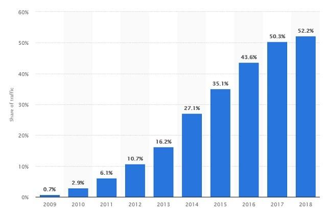
Considering the dominance of mobile devices over desktop, it is becoming imperative to leverage the power of mobile SEO best practices. According to Statista, mobile devices have a whopping 52.22% market share of global web page views. And mobile searches have long surpassed desktop searches, meaning more people now use their mobile devices to search online.
Related: Beginner’s SEO guide: Search engine optimization for small business websites
What is mobile SEO?
Put simply, mobile SEO means optimizing your website for mobile devices.
By following the best mobile SEO practices, you can improve your website’s search performance on mobile devices.
What’s more, Google has rolled out mobile-first indexing, giving preference to mobile-optimized websites.
So, my friend, mobile optimization is something that you cannot ignore no matter what you do and how big/small your business is.
Related: Google’s mobile-first index: How you can prepare your website
7 mobile SEO best practices to boost Google search ranking
Here are seven mobile SEO techniques recommended by Google:
- Adopt a responsive web design.
- Improve site speed.
- Use legible typography.
- Improve accessibility.
- Don’t use flash content.
- Avoid using intrusive interstitials.
- Prepare your website for mobile-first indexing.
Follow these mobile SEO best practices to optimize your site for search traffic success and more valuable leads.
Need some help with your mobile SEO efforts? GoDaddy SEO Services can help. Our experts will learn about your business, then get to work updating your SEO, so you can focus on your business.
1. Adopt a responsive web design
People use different mobile devices, which come in different screen sizes.
If your website uses responsive web design, it will offer an optimized viewing experience across all the mobile devices (tablets/smartphones), irrespective of their screen sizes.
Besides, responsive web design is Google’s recommended design pattern.
By adopting a responsive web design, you will:
- Have a single URL for a page for the various devices (desktop/smartphones/tablets). This will make it easier for users to link to your content.
- Reduce the load-time of your website so you won’t need any redirection to offer a device-optimized view.
- Increase crawling efficiency of Googlebot so that a single Googlebot user agent crawls your page once to retrieve the page rather than different Googlebot agents crawling all the versions (tablets/smartphones/desktops) of content to retrieve them. Better crawling efficiency means more indexed pages.
- Improve the online browsing experience of your website so it will look great across all devices.
Considering the benefits of responsive web design, doesn’t it make sense to adopt this design pattern as part of your mobile SEO best practices?
Related: Responsive web design tutorial: step-by-step
2. Improve site speed
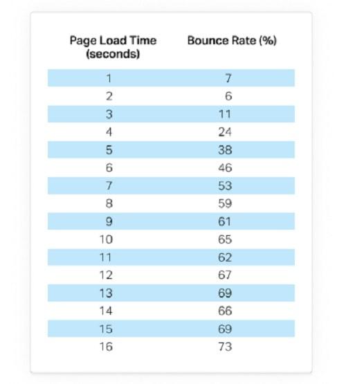
Pingdom has collected data for bounce rate corresponding to load time and found that bounce rate soars to 38% if website load time is five seconds.
And not only do slower sites have big bounce rates but they also lose ranking. Since July 2018 page speed has become a ranking factor for mobile search, according to Google Webmasters blog.
Improving site speed is a must for your mobile SEO best practices.
The good news is Google can help you improve your site speed. What you need to do is analyze your website using PageSpeed Insights. Google will suggest opportunities to speed up your page load.
Also, you will get detailed information about the performance of your website.
Following are some tips to speed up your website:
- Optimize your images
- Leverage browser caching
- Minimize redirects
- Use a content delivery network (CDN)
- Avoid bad requests
When you’re making changes to speed up your site, don’t forget to create a backup. You won’t want any modifications to your site causing any disruptions, so you’ll want a fully working copy always available to return to should anything go wrong during the optimization process.
Editor’s note: Protect your website from the unexpected with GoDaddy’s Website Backup service, featuring automatic daily backups and one-click restore.
Related: Understanding page load speed and website performance
3. Use legible typography
Mobile SEO best practices focus on offering your visitors a superior user experience.
If your website font size is too small, users will have to zoom in to view your web content properly. Google says:
“Avoid setting the font size too small to be legible on a mobile device, forcing those visitors to “pinch to zoom” in order to read.”
Follow these best practices to offer an optimized viewing experience to mobile users:
- Each line should have not more than eight-10 words (70-80 characters).
- Each paragraph should not include more than two to three lines.
- Use font size around 16px.
- Break long blocks of text into smaller chunks of content.
- Get leading (space between lines) right.
Also, you should not forget to maintain white space on web pages to avoid making web pages look messy.
4. Improve accessibility
Have you ever faced an accessibility problem due to small touch buttons?
Well, I did. And believe me, it is frustrating.
Not only does it affect user experience but can also increase bounce rate because not all users have enough patience to click the right touch button after the first try.
Google recommends,
“Avoid setting touch elements such as buttons and links so close to each other that a mobile user cannot easily tap a desired element with their finger without also tapping a neighboring element.”
For better mobile SEO, you should make sure that:
- Touch buttons are sized and spaced according to mobile users
- Links are in a contrast color of the text on your web pages
- Use the right color and contrast on web pages to convey information effectively
Read Google’s document on Accessible Styles.
Related: What is web accessibility and how do you get started?
5. Don’t use flash content
Mobile devices are not able to play all types of content.
License-constrained media, videos needing the flash player (or other players that most mobile devices don’t support), or any other kind of unplayable content frustrate mobile users and offer a poor mobile experience.
Google is tirelessly working to offer a seamless search experience to users.
Unplayable content is frowned upon by the search engine giant.
Google recommends the following actions:
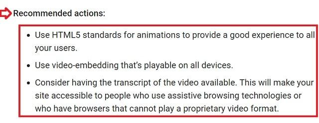
Google has created a detailed document on video best practices to help webmasters to include videos in their content.
6. Avoid using intrusive interstitials
Intrusive interstitials either completely or partially cover the content of web pages. Interstitials are the pages the popups that come up to ask for your email or age confirmation. In other words, intrusive interstitials affect the accessibility of your content.
Google has a warning about this:
“Pages where content is not easily accessible to a user on the transition from the mobile search results may not rank as high.”
Here are some examples of intrusive interstitials that you must avoid:
- Having a standalone interstitial that users have to dismiss to access content
- Having a layout where above-the-fold content looks like an interstitial and the main content is underneath the fold
- Showing a popup that completely covers the main content immediately after users reach the page or after a few seconds
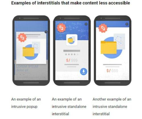
Avoid using these intrusive interstitials to improve the mobile SEO of your website.
7. Prepare your website for mobile-first indexing
Mobile-first indexing means Google will use the mobile version of the website for crawling, indexing and ranking.
Site owners, who have migrated to mobile-first indexing, will see significantly increased crawl rate from the Smartphone Googlebot, according to Google.
So, your mobile SEO will not be completed unless you also prepare for mobile-first indexing.
Here’s what’s changing with mobile-first indexing:
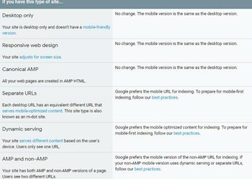
Follow the best practices for mobile-first indexing. Doing so will improve your website’s performance on mobile devices.
Final thoughts
Mobile SEO is huge. If your website is not optimized for mobile devices, you will lose a significant number of visitors.
These seven mobile SEO best practices will certainly improve the search visibility of your website on mobile devices and help you generate more leads.