WordPress is a great platform that can be used to create a website or blog. Due to its ease of use, it has become the most popular content management system (CMS) in the world. However, some factors can contribute to poor WordPress speed and performance, and you should be informed about them before building your site using this platform.
Your business needs a website.
Optimizing WordPress for the best speed & performance is very important
The first reason is that WordPress was initially designed for bloggers, not for enterprise users who needed more control over their site's performance and security settings. For this reason, WordPress doesn't have any built-in caching which means it has to generate every page from scratch every time someone visits your site — this can make your site slow if it isn’t correctly optimized.
Why can a WordPress website run slow?
Here are some reasons your WordPress website may run slow:
- Images are not optimized
- Outdated plugins and/or there are too many of them
- Outdated theme
- The site is creating too many requests
- Outdated PHP version
- Not implementing caching and compression methods according to best practices
- Unoptimized database
- Additional issues
It is always recommended that you use the latest version of the WordPress core files to ensure maximum compatibility.
Every website is built differently and is a case of its own. The same optimization techniques might not work the same on any two given websites, but we will list some optimizations we consider to be good practices on most websites.
Things to do before you start optimizing your website
You should test your website using online tools such as GT Metrix, Pingdom Tools, Page Speed Insights, and Lighthouse tools, which can be found in Chrome’s inspect tool. The Lighthouse tool can give you better insights into page speed and performance, as well as mobile optimization recommendations.
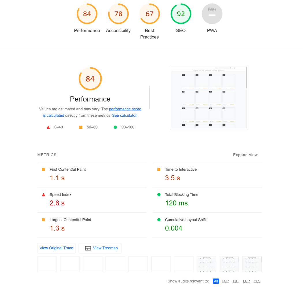
There are a couple of important metrics that are common to most performance-measuring tools. These are critical for the overall user experience and the speed of your website. These metrics are
- LCP
- CLS
- FCP
- TBT
- TTFB
Largest Contentful Paint is a metric that measures how quickly the largest above-the-fold content element is rendered onto your page. You need to identify the largest text block or image (usually hero images) and optimize their load time.
Cumulative Layout Shift is focused on measuring the visual stability of your website and helps you prevent unexpected layout shifts, affecting how users interact with the webpage. Reducing CLS is essential since shifting pages can lead to a negative user experience.
First Contentful Paint is a time stamp when the browser loads the first bit of content from your website. This can be a text or an image, a non-white canvas, or SVG. This is the moment when your users can see the first signs of content on your website.
Total Blocking Time is the time that passes while tasks longer than 50ms block the main thread and affects the usability of a page. During this time, the webpage is usually unresponsive before it becomes interactive.
Time To First Byte is the time that passes between sending a request to the server and receiving the response, specifically receiving the first byte of information.
For more detailed information on how Google Page Speed Insights work, you can check this link to their official documentation.
The recommendations from these reports can guide you in the right direction to the ideal level of optimization of your website. Scoring 100 on these reports may not always be possible (your hosting environment can, for example, impact this), however, the goal is to get this number as high as possible with regards to the content of your site.
WordPress speed & performance tactics we recommend
Always make sure you create a backup of your website and database before you make any optimizations!
1. Image optimization
Unoptimized images are the most common cause of poor WordPress speed and performance. Large and unoptimized images can lead to large page sizes and significantly increase page load time. Using full images that are over 5000px and several MB can hinder your site’s speed.
When you notice the “Optimize images” warning in one of the performance-measuring tools, you first need to check how image-heavy your website is.
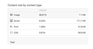
You can use Pingdom tools to generate a report which will show you the share your images take up of the total page size, as well as the total image size on that page.
The best practice is to always upload images optimized for the web. We suggest using one of the image optimization plugins available on the WordPress repository, such as Robin Image Optimizer or WebP Express. Although many caching plugins have image optimization options; we recommend using a separate plugin for image optimization.
These plugins have bulk optimize features that scan your uploads folder and automatically optimize/scale the images to improve performance.
The PageSpeed insights and Google’s Lighthouse may display the warning for “Serve images in next-gen formats” which usually refers to the WebP format.
The WebP Expres plugin for this task since it generates copies of all images on your hosting in WebP format, and serves them to users. This should improve the “Serve images in next-gen formats” score for mobile devices.
Another important feature that can improve image loading is the lazy load option that is usually available within the image optimization plugins.
If not, there are a few plugins that provide this functionality, and WP Rocket’s Lazy Load plugin is fast, simple, and does the job perfectly.
However, in some cases, the images that are loaded above the fold (logo, hero, or featured images) should not be lazy loaded because lazy loading will affect the FCP (First Content Paint). These images should be excluded from being lazy-loaded and should load as fast as possible.
2. WordPress plugin maintenance
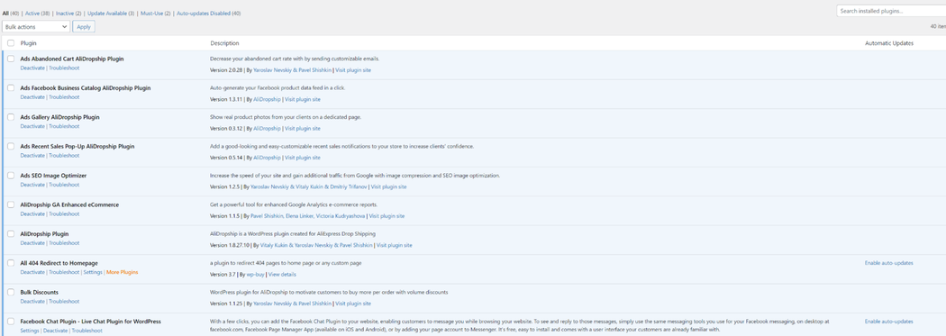
A large number of plugins can cause or contribute to poor WordPress speed or performance. Using only the necessary for your website is the best way to go.
The plugins should be regularly updated to prevent compatibility issues and increase security.
Obsolete plugins can sometimes break your website or provide a backdoor for malicious content. Therefore, always make sure that the plugins on your site are regularly maintained and updated by their developers.
3. Theme maintenance
Your active theme handles your website’s good looks, but it can also cause some performance issues if not updated and optimized. Usually, outdated themes cause issues, since they are using deprecated code and create a larger number of requests. Updating your theme to the latest version ensures your website is compatible with the latest technology.
When the theme stops receiving regular updates and isn’t actively maintained by its developers, the best course of action would be to rebuild your site using a theme that is updated regularly.
Also, the best practice is to remove unused themes and keep one default WordPress theme for potential troubleshooting. You should also check the number of scripts (requests) that the theme is using. If the theme is bloated, it would be wise to consider a theme that is more performance-oriented.
4. Reducing the number of requests
When the website loads, it sends out multiple requests for various JavaScript and CSS files. These requests can be render-blocking and can increase your website’s load time.
Minification is the process of minimizing code and markup in your web pages and script files. It's one of the major methods used to reduce load times and capacity usage on websites.
Minification helps improve site speed and accessibility, directly translating into a better user experience.
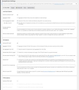
The Autoptimize plugin offers JavaScript and CSS file minification and deferred load. It reduces the number of requests sent from the website upon initial loading. When you activate the plugin, you need to access the JS, CSS & HTML options and their sub-options.
Enabling the suboptions should be done with caution, as some can break the website (alter its look and functionality). In some cases, you will need to use the “Exclude scripts from Autoptimize” option, where you can exclude a script from being minified.
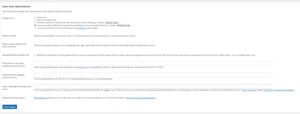
On the Extra tab, you can resolve how Google Fonts are displayed (to have them as non-blocking resources), as well as prevent the loading of some WordPress core JavaScript files that are commonly unused.
Another very useful plugin for this task is WP Rocket. However, this is a paid plugin, and it’s a stand-alone solution for website caching and static asset optimization.
If you encounter some JavaScript and CSS files that are loaded on pages that don’t require them, you can use the Asset Cleanup or the PerfMatters plugin to determine where the plugins and scripts are loading, and deactivate them if necessary.
5. Outdated PHP version
Running your website on the latest version of PHP helps your website respond swiftly and decreases page load time. The latest PHP versions are 8.0 and 8.1 so you should make sure that your website is compatible with these versions.
The latest versions of the WordPress core are fully compatible with PHP 8.0 and 8.1, so your plugins and theme should follow. I
f, for some reason, your plugins/themes are not compatible with PHP 8, you should update them to their latest available versions. If updates are not available, you should notify the developers about the incompatibility or switch to an alternative plugin or a theme that is fully compatible with PHP 8+.
If some issues occur while updating the PHP version, it is most likely a conflict with a plugin or theme.
6. Caching and compression
Caching is the process of storing and recalling frequently served data to speed up websites. Since WordPress generates every page from scratch every time someone visits your site, caching helps by serving the static resources to your users from the cache.
Most managed WordPress platforms have caching enabled by default, however, on cPanel or similar hosting platforms, it is recommended that you install a caching plugin. You can use WP Rocket, WP Super Cache, or W3 Total Cache for this purpose.
7. Database optimization
We often overlook database optimization as a factor in website speed, but sometimes the database becomes bloated with post revisions, transient data, and spam comments.
The common tables that become bloated are wp_options, wp_posts, and wp_postmeta. Transients usually bloat the wp_options table, and post revisions usually increase the wp_postmeta table’s size.
You can prevent post revisions from piling up by adding one line of code to the wp-config.php file that limits the number of post revisions per post:
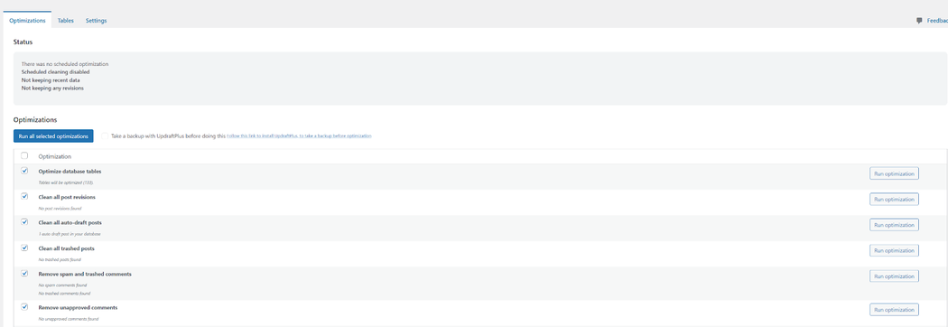
define( 'WP_POST_REVISIONS', 10 );You can also use the WP-Optimize plugin to check the state of your database. If you notice your database is too large in size, you need to check the WP-optimize report and perform the recommended optimizations.
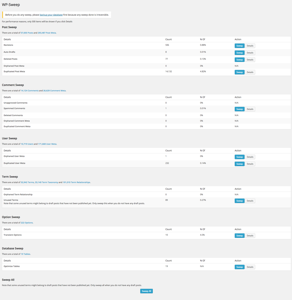
WP Sweep delves into the database issues in more detail. Instead of executing direct delete MySQL queries, this plugin makes use of the right WordPress delete functions as much as possible.
8. CDN
Another way to improve the performance of the website is to use a Content Delivery Network. Using CDN can improve loading times for all website visitors, no matter where they are located.
Every time a user visits the website, they are served content from whichever server is closest to them. GoDaddy Managed Hosting for WordPress provides a built-in CDN service that will improve the performance of your website.
9. Bonus optimizations
Another commonly overlooked issue is the WooCommerce cart fragments build-up. It can increase the initial page load time by up to 1 second.
WooCommerce makes an AJAX request to check your cart and update your cart totals wherever your theme shows cart contents (like the header menu). This AJAX call is made to override caching plugins, which is good, but it increases load time.
We can resolve this by using the Disable Cart Fragments by Optimocha plugin which allows you to keep using the caching plugin and you still get to update the cart totals when the cart is not empty.
Note that if products are listed on the front page, the plugin can break the add-to-cart functionality.
You can run into “Leverage Browser caching”, “Add Expires headers”, and “Configure E-tags” warnings in your GT Metrix report. Those issues can be resolved by adding a piece of code to the .htaccess file on your website.
However, these optimizations only work for resources served directly from your website. These directives won’t work for external resources like fonts.googleapis.com, downloads.mailchimp.com, www.youtube.com, and www.gstatic.com.
# START EXPIRES CACHE
ExpiresActive On
ExpiresByType text/css "access 1 month"
ExpiresByType text/html "access 1 month"
ExpiresByType image/gif "access 1 year"
ExpiresByType image/png "access 1 year"
ExpiresByType image/jpg "access 1 year"
ExpiresByType image/jpeg "access 1 year"
ExpiresByType image/svg "access 1 year"
ExpiresByType image/x-icon "access 1 year"
ExpiresByType application/pdf "access 1 month"
ExpiresByType application/xhtml-xml "access 1 month"
ExpiresByType application/javascript "access 1 month"
ExpiresByType text/x-javascript "access 1 month"
ExpiresByType application/x-shockwave-flash "access 1 month"
ExpiresDefault "access 1 month"
# END EXPIRES CACHE
# BEGIN Cache-Control Headers
<ifModule mod_headers.c>
<filesMatch "\.(ico|jpeg|jpg|png|gif|swf|pdf|svg)$">
Header set Cache-Control "public"
</filesMatch>
<filesMatch "\.(css)$">
Header set Cache-Control "public"
</filesMatch>
<filesMatch "\.(js)$">
Header set Cache-Control "private"
</filesMatch>
<filesMatch "\.(x?html?|php)$">
Header set Cache-Control "private, must-revalidate"
</filesMatch>
</ifModule>
# END Cache-Control Headers# BEGIN Turn ETags Off
FileETag None
# END Turn ETags OffClosing thought on WordPress speed & optimization
Making sure that your website is properly optimized can have a great impact on your SEO and overall user experience. Implementing the optimizations listed above should significantly improve your site’s loading time, which should in turn lead to increased user retention and lower bounce rates.
