

Have you ever stumbled upon a beautifully designed website and wondered how it all came together? For most stunning websites, there’s an aspect to the design you may never see - wireframing. These unsung heroes of web design produce the skeletal framework that guides the entire development process.
Whether you're a seasoned designer or just dipping your toes into the web development waters, understanding wireframes will transform how you approach website creation. Below, I’ll walk you through everything you need to know about wireframes – from basic concepts to practical wireframe examples across different website types.
Wanna learn more? Awesome! Let's dive in!
What is a wireframe?

You know how you need blueprints before you can build a home, retail shop, or any other building? Well, a website wireframe is like the blueprint for websites – it’s basically a two-dimensional architectural drawing of the layout, structure, and functionality of your website. In this case, you don’t have the distractions of colors, fonts, or images.
Creating a wireframe for a website is a great way to get everyone on the same page with your vision before you actually spend the time and money designing your website. You can make them as complex or as simple as you like as well. They can vary in levels of detail, from simple hand-drawn sketches (low-fidelity) to more detailed digital versions (high-fidelity).
Wireframe size guidelines
Designers typically use these specs for website wireframes:
Desktop:
- Width: 1024px-1920px (1440px is ideal for most screens)
- Focus on "above the fold" content while planning for scrolling
Mobile devices:
- Width: 320px-428px
Tablets:
- Width: 768px-1024px
Keep in mind, you’re not trying to just shrink content to fit a smaller screen. Instead, rethink how elements reflow and reorganize based on the available space. Consider how navigation menus might transform from horizontal bars on desktops to hamburger menus on mobile, or how multi-column layouts might stack vertically on narrower screens.
Steps to creating an effective website wireframe
Creating a wireframe doesn't have to be overwhelming. Let’s break the process down into manageable steps. This way, we can approach wireframing systematically and ensure we're setting a solid foundation for our website design.
Understand your purpose and goals
Before you draw a single box, get crystal clear on what you're trying to achieve and the KPIs to determine if you’re achieving your goals. Consider the primary purpose of your website, the target audience, and actions you want visitors to take. This will help guide your entire wireframing process.
Identify key content
Your content should dictate design choices, not vice versa. Identify and prioritize essential elements (i.e. headlines, body text, CTAs, media, forms, etc…) based on user importance. This critical hierarchy directly shapes your wireframe's layout, guiding viewers from must-see content to discoverable elements.
Define layout structure
It’s best to arrange your content to create intuitive user flow, using familiar patterns. Think navigation at top, logo in upper left, footer below. Sketch your page's architectural blueprint by mapping major zones into a cohesive framework that guides users naturally through your digital space.
Start with a low-fidelity wireframe
You might want to begin with simple shapes representing content blocks, focusing solely on fundamental layout. Quick sketches on paper or basic digital tools allow rapid iteration and easy modifications. Details can come later when you advance to higher-fidelity versions.
Analyze and refine
Evaluate your wireframe objectively. Does it support your goals with important elements prominently placed? Here you’ll identify potential issues/make improvements. You might want to show your wireframe to others for feedback to spot problems or opportunities you might have missed.
Send to design team
Once you're confident in your wireframe, it's time to hand it off to the design team. Provide clear documentation about the layout decisions you've made and any specific functionality requirements. Good communication at this stage can prevent misunderstandings and ensure the final design aligns with your goals.
What should a wireframe include?
You don't need fancy tools to create effective wireframes. Just grab a pen and paper, or marker and a whiteboard to get started!
Here’s what your blueprints should include:
- Structure elements – Headers, footers, navigation menus, and content areas that form your page's skeleton
- Interactive components – Simple boxes with labels for buttons, forms, search bars, and dropdown menus
- Content hierarchy – Clear indicators of what's most important versus supporting information
- Image placeholders – Empty boxes with X's. It’s just enough to show where visuals will appear
- Logo spaces – Simple placeholders you can replace with actual logos later with GoDaddy’s easy logo maker
Remember to design responsively for all screen sizes (Desktop – 1024-1920px width; mobile—320-428px width; tablet—768-1024px width).
Elements should intelligently transform based on screen size – like navigation bars becoming hamburger menus on smaller devices.
Best 10 website wireframe examples
Different website types require unique wireframe approaches. For example, an ecommerce site focuses on product displays and checkout flows, while a portfolio prioritizes showcasing creative work effectively.
The examples below highlight distinct wireframe structures across various website categories.
Each one demonstrates the essential elements needed for that specific site type, from conversion-focused landing pages to content-rich blogs. When you're ready to add visual branding to your wireframe, learn how to make a logo that perfectly complements your design.
Hopefully, these wireframe examples will jumpstart your design process, regardless of which website category matches your project needs.
Ecommerce website wireframe
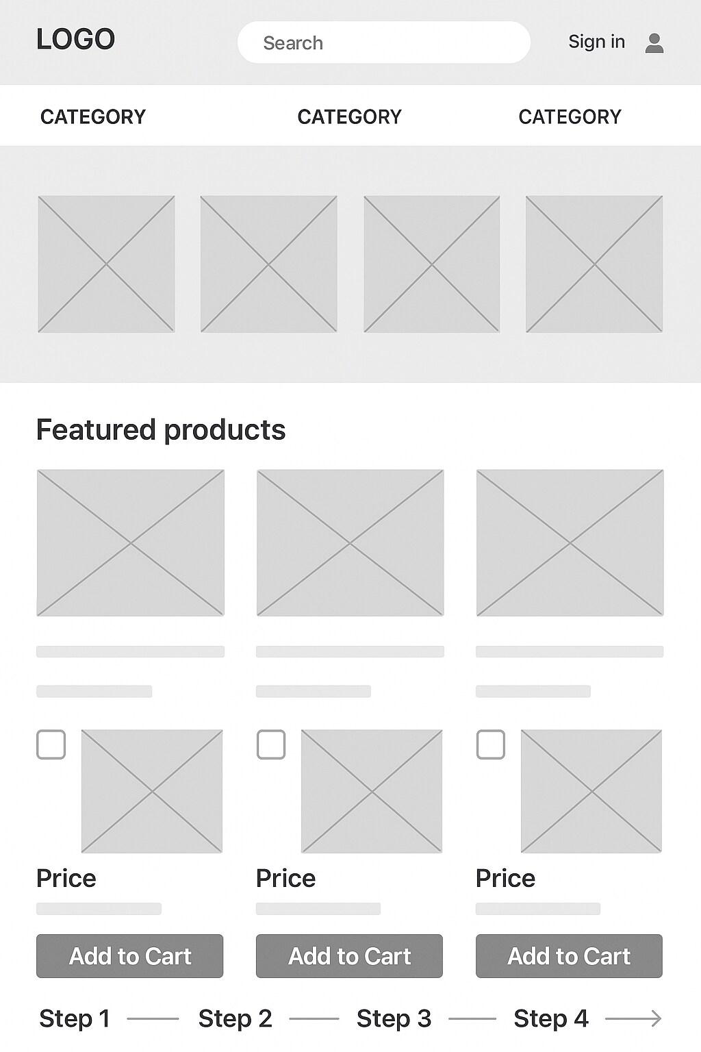
Ecommerce wireframes prioritize the shopping experience and conversion path. The primary goal is to move visitors smoothly from product discovery to checkout, so the flow must be intuitive and frictionless across all device sizes. A well-designed ecommerce wireframe typically includes a prominent search bar, clear navigation categories, and featured product sections on the homepage.
Product list pages need filtering options to help shoppers narrow their selection, while product detail pages require space for multiple images, detailed descriptions, pricing, variants (size, color, etc.), and prominent "Add to Cart" buttons. The shopping cart should be visible throughout the site, often as an icon in the header with an item counter.
Checkout flows deserve special attention in ecommerce wireframes, breaking the process into logical steps with progress indicators. Payment options, shipping methods, and order summaries need clear placement.
Trust indicators like security badges and return policy links are also essential elements to include. Understanding how to accept payments on your website is crucial to finalizing your ecommerce wireframe design.
For inspiration, look at GoDaddy’s online store website templates that demonstrate proven ecommerce layouts. The wireframe structure should accommodate product imagery while maintaining focus on driving conversions.
Services website wireframe
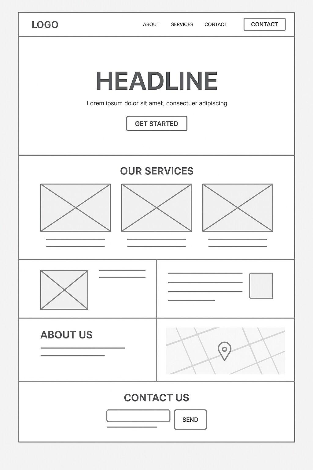
Services websites focus on communicating expertise, building trust, and generating leads. Their wireframes emphasize information hierarchy that educates visitors about offerings while guiding them toward contact forms or consultation requests.
The homepage typically includes a compelling headline (sometimes called a value proposition) with supporting text that clearly articulates what services are offered and who they benefit. Service-specific pages contain more detailed explanations, often with space for case studies or testimonials that provide social proof.
Unlike ecommerce sites, service wireframes emphasize company information -- team bios, about pages, and credential sections help establish authority. Contact information should be prominent, with multiple opportunities for visitors to reach out. Location details are often more important for service businesses, especially those with local clientele, so map integration and address information also need dedicated space.
Service wireframes also benefit from clear CTAs (calls to action) that direct visitors to take the next step, whether that's scheduling a consultation, requesting a quote, or signing up for a newsletter. When designing your service website wireframe, website templates for professional services can provide useful structural guidance.
Remember to ensure your service website wireframe works responsively across desktop, mobile, and tablet screen sizes. For location-based services, make sure address information and maps are easily accessible on all devices to help potential clients find your business.
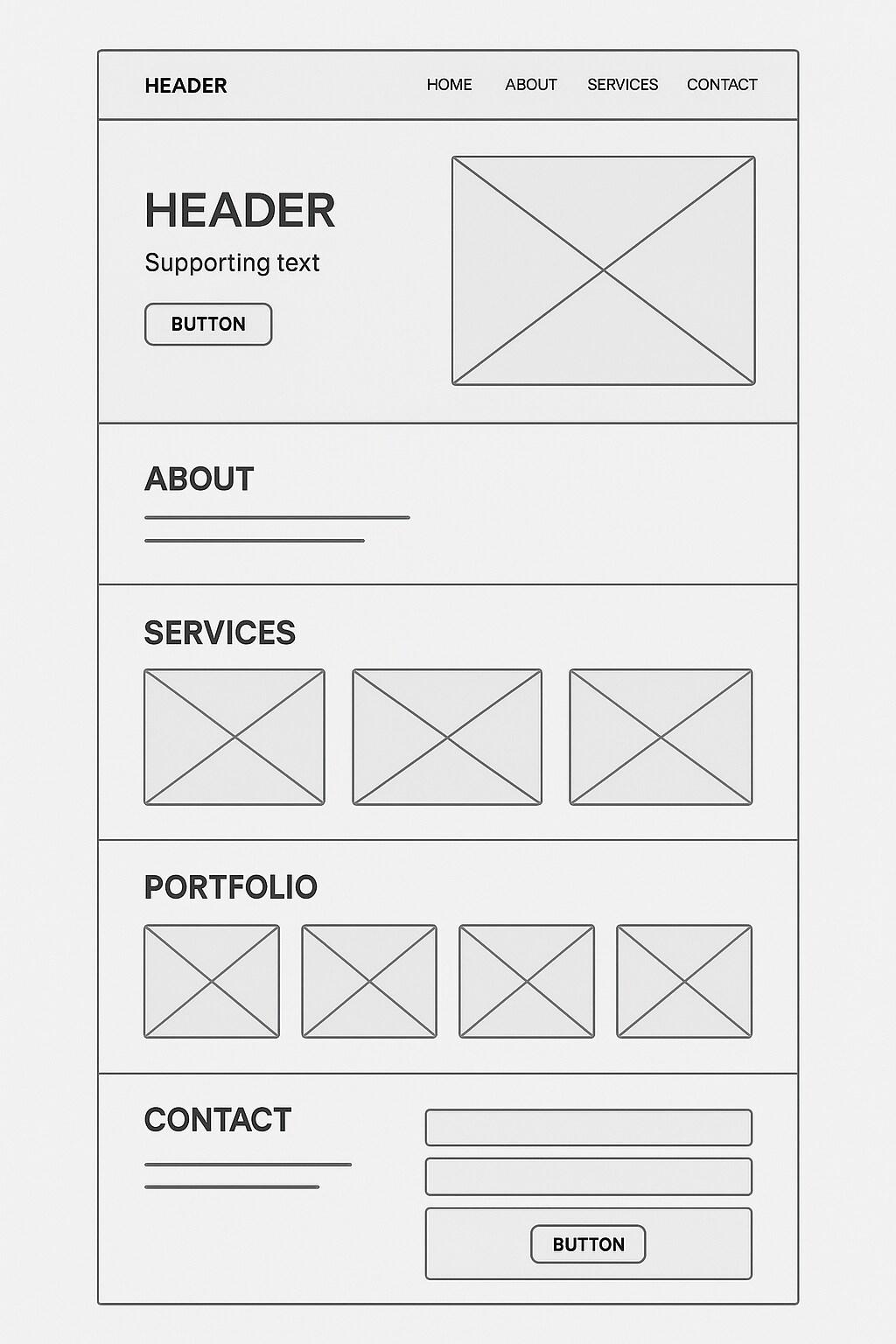
Portfolio website wireframe
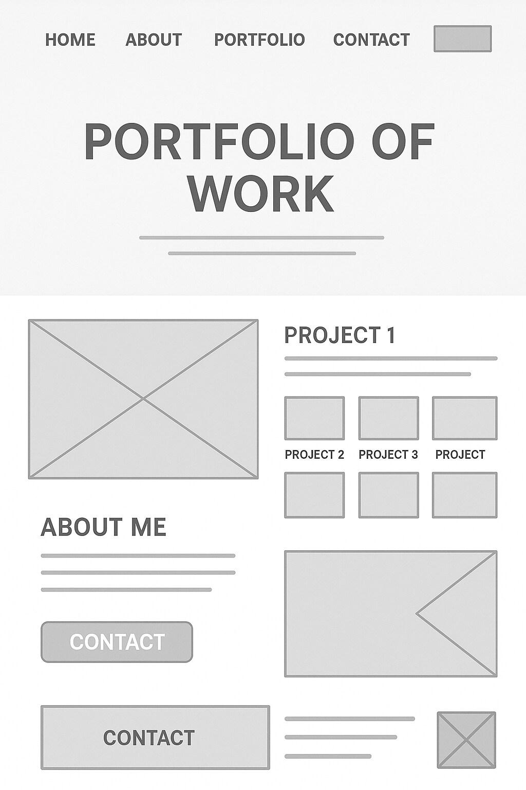
Portfolio wireframes serve to showcase creative work in an organized, visually impactful way. Whether for photographers, designers, artists, or agencies, the primary focus is on presenting projects effectively while communicating professional identity.
The layout needs to balance visual impact with ease of navigation. A portfolio homepage often features selected work samples or a striking introduction, with streamlined navigation to project categories or a complete work archive.
Project pages need flexible layouts that adapt to different types of content. Some projects might be image-heavy, while others could include videos, process documentation, or case studies.
Portfolio wireframes should accommodate various screen sizes, including larger-than-average monitors that hiring managers or clients might use to review work. Navigation should allow visitors to browse projects easily, moving between them without returning to an index page.
Contact information needs to be readily accessible, as the ultimate goal is typically to generate new business opportunities. The wireframe should also include space for brief bio information — if you need tips, here’s a guide on how to write a bio about yourself — skills lists, and potentially a blog or news section for sharing industry insights.
For inspiration, check out Wordpress portfolio ideas, templates for artists or designers, and personal portfolio templates that can inform your wireframe structure. Also keep in mind that for creative professionals, even the wireframe stage needs to consider how the final design will reflect their aesthetic sensibilities.
Blog website wireframe
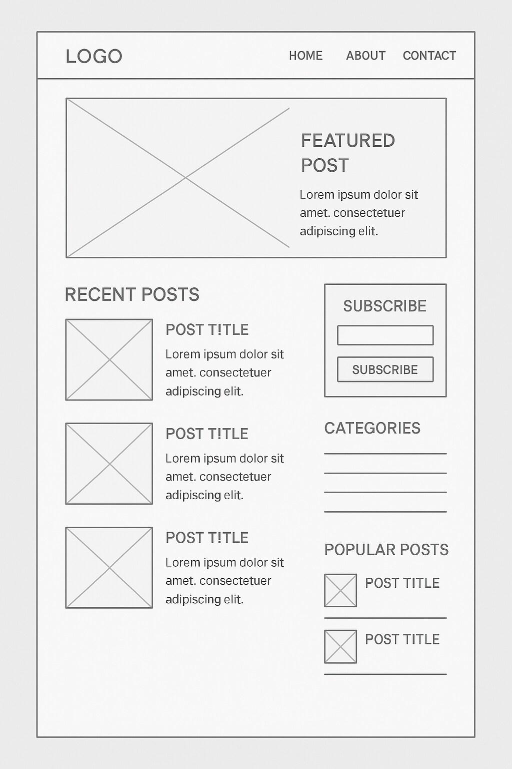
Blog wireframes focus on content readability and exploration. The main components include featured or recent posts on the homepage, clear categorization, and archive access. Individual post layouts need to accommodate various content types – text-heavy articles, image galleries, video embeds, or combinations of these elements.
Navigation is crucial for blogs, with category menus, tag clouds, and search functionality helping readers find relevant content. Sidebars typically contain subscription forms, popular post lists, author information, or advertisements. The wireframe should account for social sharing buttons to extend content reach.
For blogs with multiple contributors, author profiles and bylines need designated space. Comment sections require careful planning to encourage engagement while maintaining visual hierarchy. Posts also need related content suggestions to keep readers on the site longer.
Pagination or infinite scrolling options should be considered during wireframing too, because they impact how users experience the site. The wireframe should also accommodate subscription forms to capture visitor emails – a vital asset for bloggers building an audience. If you’re thinking about content structure as well as design, it’s helpful to learn how to write a blog post, so the layout supports your writing goals and your readers’ needs.
When planning a blog wireframe, consider using blog website templates as reference points for established reading patterns and content organization strategies.
Educational website wireframe
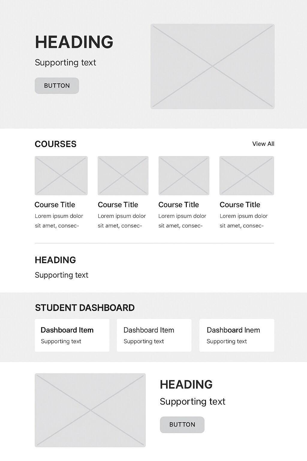
Educational websites need to organize significant amounts of information in accessible, user-friendly ways. Their wireframes focus on content structure, learning paths, and clear navigation systems that help users find exactly what they need.
Course catalogs or learning resources require organized listing pages with filtering options. Individual course or resource pages need space for descriptions, learning outcomes, prerequisite information, and enrollment options. User dashboards for students or e-learners should display progress tracking, completed courses, and recommended next steps.
Educational wireframes often include space for various content formats such as video lessons, reading materials, quizzes, and interactive elements. Discussion forums or community features, if you choose to include them, will need dedicated sections that encourage peer learning and engagement as well.
For institutions or organizations offering formal education, your wireframe should include administrative elements like application forms, tuition information, and academic calendars. Search functionality is particularly important for educational sites with extensive content libraries.
You may want to consider securing a .education extension for your educational website to reinforce your site's purpose and credibility right from the URL. Educational wireframes should prioritize clarity and ease of navigation to reduce cognitive load on learners.
Event website wireframe
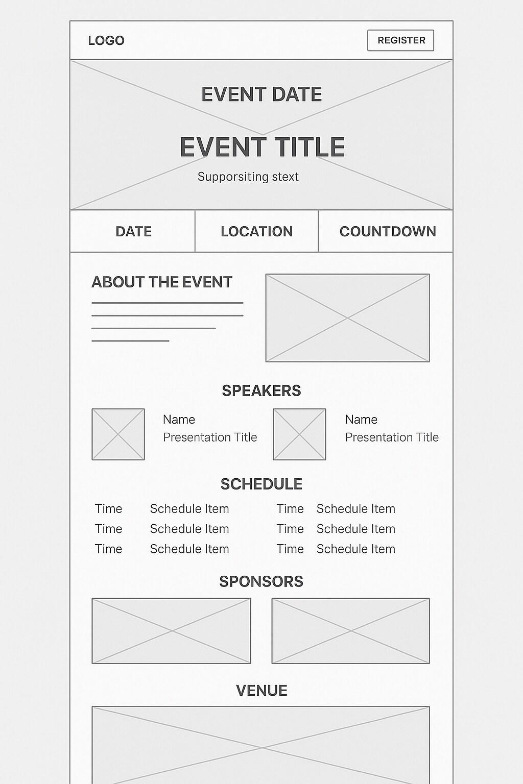
Event websites have unique requirements centered around dates, schedules, and driving registrations or ticket sales. Their wireframes need to prominently feature event dates, locations, and countdown elements on the homepage to create urgency and clarity.
If you’re hosting speakers or performers, they’ll likely need profiles or speaker/profile pages, and these require dedicated sections with bios, photos, and presentation information. Schedule or agenda pages need flexible layouts that work for single-day or multi-track events, often with filtering or search options for large conferences.
Registration or ticket purchase flows deserve special attention in the wireframe as well. Think clear pricing tiers, package comparisons, and streamlined checkout processes. The wireframe should include space for sponsor recognition, frequently at multiple visibility levels.
Venue information needs dedicated sections with maps, transportation options, and accommodation details. For recurring events, the wireframe should accommodate archives of past events while keeping focus on the upcoming one.
Location-specific elements are crucial for event websites – if your event is city-specific, you might consider a .nyc domain extension or similar geographical domain to reinforce the location. Event wireframes work best when they balance providing comprehensive information with driving the primary conversion goal of registrations.
Restaurant website wireframe
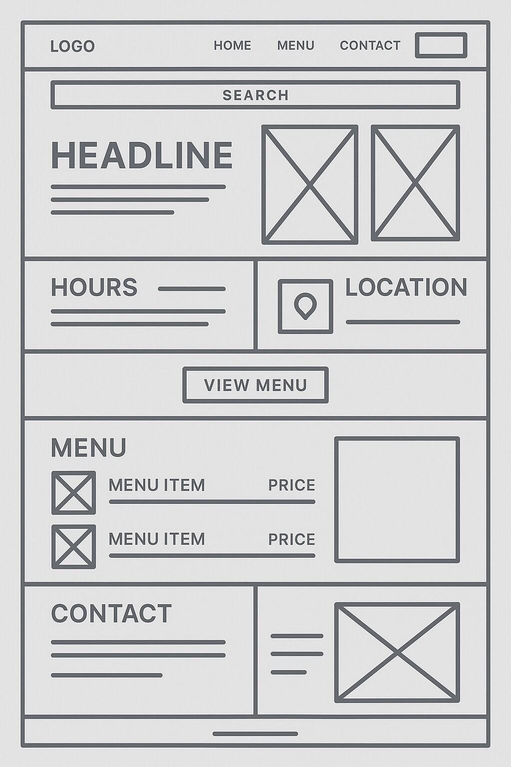
Restaurant wireframes focus on appetite appeal, practical information, and conversion to reservations or visits. The homepage typically features food imagery (represented as placeholders in the wireframe), hours of operation, location, and direct access to menus and reservation systems.
Menu pages need flexible layouts to accommodate different menu structures – from simple lists to complex organizations by meal period, course, or dietary preference. Contact and location information should be especially prominent, with embedded maps and directions.
Online ordering capabilities, if offered, require careful wireframe planning for seamless menu browsing, customization options, and checkout. Reservation systems need integration points clearly defined in the wireframe, whether using third-party services or built-in functionality.
Special sections for private events, catering, or gift cards will need dedicated wireframe elements too. Photo galleries showcasing the space, food, and atmosphere need organized structures that maintain site performance.
It might be a good idea to consider domain extensions like .pizza, .restaurant, or other hospitality domain extensions to reinforce your culinary focus. For inspiration, GoDaddy’s hospitality industry website templates can provide proven structures for restaurant websites.
One-page website wireframe
One-page websites condense all essential content into a single, scrollable page, making wireframing particularly important to establish the right flow and hierarchy. These wireframes organize content in clearly defined sections that progress logically as the user scrolls.
Navigation in one-page wireframes typically appears as a fixed header with links that smoothly scroll to the corresponding sections. Each content section needs clear visual separation, often with distinct background treatments indicated in the wireframe.
Content density requires careful planning – one-page sites risk overwhelming users if too much information is crammed together. The wireframe should establish breathing room between sections while maintaining visual cohesion throughout the page.
Call-to-action placement becomes particularly strategic in one-page wireframes, with primary conversion points positioned at natural stopping points in the scroll journey. Contact forms usually appear near the bottom but may be supplemented by floating contact buttons accessible throughout.
One-page wireframes work particularly well for personal websites, product launches, or event sites where content is limited and the conversion path is straightforward. The challenge lies in creating a logical narrative flow that guides visitors toward desired actions.
Dashboard wireframe
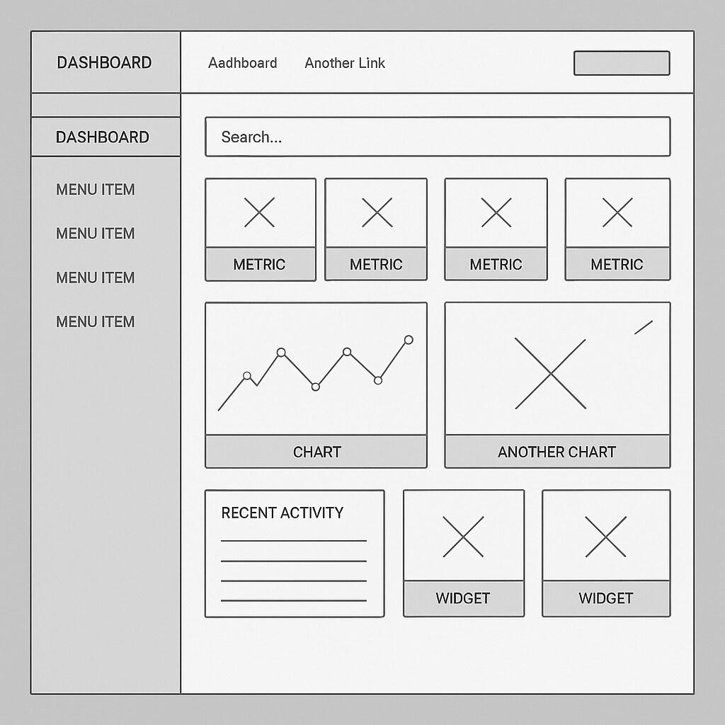
Dashboard wireframes usually organize complex data and functionality into intuitive interfaces for users to monitor, analyze, and take action. They require careful attention to information hierarchy, with the most important metrics and alerts positioned prominently.
The wireframe typically includes a persistent navigation system, user account access, and customization options. Data visualization areas – for charts, graphs, and status indicators – need flexible frameworks that can accommodate various data types.
Dashboard wireframes often feature modular components that users can arrange according to their preferences. Action centers or notification areas require dedicated space, usually in consistent locations that users can quickly check.
Filter and search functionality deserves special attention in dashboard wireframes, as users need efficient ways to drill down into specific data segments. The wireframe should also address different states – empty states, loading indicators, and error messaging.
Responsive considerations are crucial for dashboards, as the wireframe needs to adapt gracefully between desktop monitoring and on-the-go mobile access. Dashboard wireframes must balance comprehensive functionality with clean, uncluttered layouts that prevent information overload.
Landing page wireframe
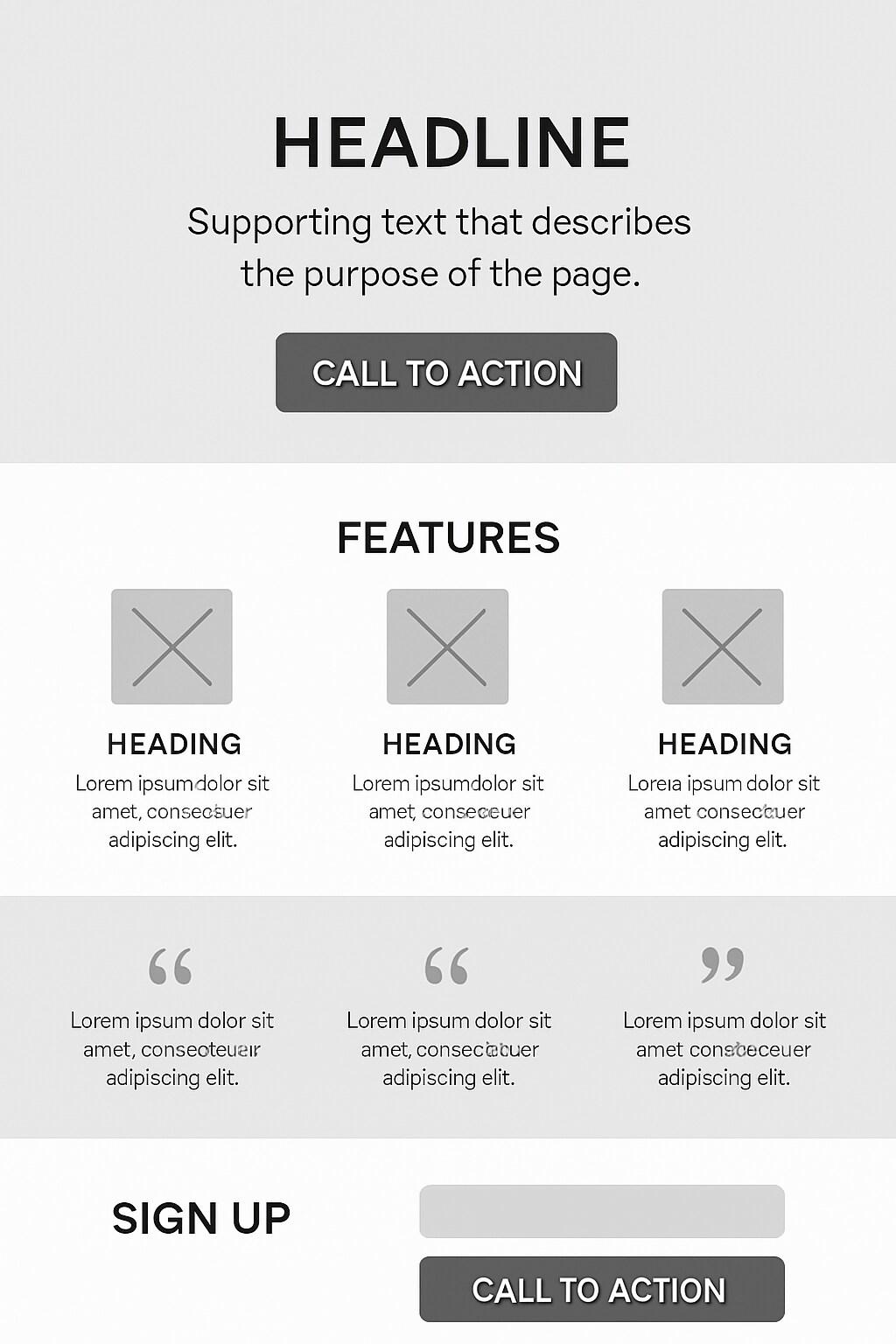
Finally, let’s talk about landing page wireframes. These focus on conversion optimization, with every element supporting a single call to action. They typically feature minimal navigation – often none beyond the primary CTA – to maintain focus on the conversion goal.
The hero section requires careful planning, with space for a compelling headline, supporting subheadline, and primary call-to-action above the fold. Benefit sections need clear visual hierarchy, often using feature blocks with icons or small illustrations indicated in the wireframe.
Social proof elements – testimonials, client logos, review scores – need strategic placement to build credibility at the right moment in the visitor's journey. The wireframe should include multiple CTA placements throughout the page, becoming more urgent as the visitor scrolls.
Form design receives particular attention in landing page wireframes, balancing the need for information capture with the friction that each additional field creates. Visual indicators for security, guarantees, or risk-reversal need designated space to address visitor concerns.
Landing page wireframes often include A/B test variations, exploring different content structures, form placements, or CTA approaches. The goal is creating a focused path that removes distractions and guides visitors toward conversion. You should build your ideal customer persona first to know what you’re aiming for.
Top tools for creating website wireframes
The right tools can make all the difference when creating website wireframes. Let’s explore some of the most popular to choose from.
1. Figma: This has long been considered an industry favorite, offering a collaborative interface design platform where multiple team members can work simultaneously. Its browser-based, and its large component library makes creating consistent wireframes efficient.
2. Sketch: Favored by Mac users, this platform provides a clean, intuitive interface specifically designed for digital product creation. Its extensive plugin ecosystem extends functionality, while its symbol system allows for reusable components that maintain consistency across wireframes.
3. Adobe XD: Adobe XD bridges wireframing and prototyping, allowing designers to create interactive wireframes that demonstrate user flows. It integrates seamlessly with other Adobe products too.
4. Balsamiq: For those seeking simplicity, Balsamiq intentionally produces wireframes that look hand-drawn, emphasizing that they're works in progress rather than finished designs. This low-fidelity approach helps stakeholders focus on structure and functionality rather than aesthetics.
5. ChatGPT: Though it’s not perfect – I admit, it’s far from it – if you don’t have a designer you’re working with, and don’t want to play with new tools, ChatGPT can render a pretty decent wireframe if you give it a good enough prompt.
Still stuck? GoDaddy’s Website Builder is an excellent wireframing tool, especially if you're planning to build your site on the same platform. Create a draft version focused on layout and structure before adding your actual content and styling.
Wireframing success: Turning vision into reality
We've explored what wireframes are, why they matter, and examined specific examples across 10 different website types. These skeletal frameworks are essential planning tools that align expectations, identify potential issues early, and create user-centered experiences.
Wireframes are practical blueprints that help teams make informed decisions about layout, functionality, and content hierarchy before investing in detailed design work.
Whether you sketch with pen and paper or use sophisticated digital tools, the principle remains consistent: plan first, design second. Doing this will save you time, reduce the number of revisions, and ultimately will result in websites that effectively meet user needs and business objectives.
Ready to implement these principles? I recommend you begin by identifying your website's purpose, gathering content requirements, and sketching basic layouts. It’s worth noting that wireframing improves with iteration. In other words, perfection is NOT the goal of early drafts. For inspiration along the way, you can explore web design trends while maintaining your unique brand identity.
If you’re ready to move beyond wireframing to website creation, GoDaddy's Website Builder offers an intuitive platform bridging planning and implementation. Whatever approach you choose, remember that great websites result from thoughtful planning that begins with wireframing.
Frequently asked questions
To close things out, here are some of the most frequently asked questions I’ve seen about website wireframes:
What is a website wireframe vs prototype vs mockup?
A wireframe is the bare-bones layout showing the basic structure and functionality without visual design elements – like an architectural blueprint for what is web design. A mockup adds visual elements like colors, typography, and images, showing the final look without interactivity. A prototype combines both layout and visuals with interactive elements, letting users experience how the website will actually work. Each serves a different purpose: wireframes focus on structure, mockups on aesthetics, and prototypes on user interaction. Understanding these differences helps teams communicate more effectively throughout the project lifecycle.
How long does it take to wireframe a website?
It depends on complexity! Simple sites might take just a few hours, while content-rich sites with multiple user flows could extend to several days or weeks. ecommerce sites typically need more time than informational websites. Factors affecting timing include the number of unique templates needed, stakeholder involvement (more feedback rounds = more time), and whether you're starting from scratch. Budget 1-2 days for a basic website, 3-5 days for medium complexity, and 1-2 weeks for feature-rich websites. Don’t skip the wireframing though because thorough wireframing saves development time by preventing major structural changes later!
Should wireframes have color?
No, website wireframes should not have color. Using grayscale (black, white, and gray shades) keeps everyone focused on structure without getting distracted by visual design elements.
That said, limited color can occasionally be useful. For example, using a single accent color to highlight primary CTAs or color-coding different content types. If you do add color, use it sparingly and purposefully (i.e. just one or two colors with specific meaning).
Generally, the more color you add, the closer you're moving toward a mockup instead of a wireframe. For most projects, it’s best to stick with grayscale and save the color palette discussions for the visual design phase.