

These days, nearly 60% of internet traffic is coming from mobile devices. As such, it’s essential that your site looks and works just as well on phone and tablet screens as it does on desktop.
It pays to use a website builder and test it by simulating access from different devices, as it’s the best way to catch issues and make sure the experience is spot‑on before you publish. This guide will show you exactly how you can ensure that your site is mobile-ready from the start.
What is a responsive website?
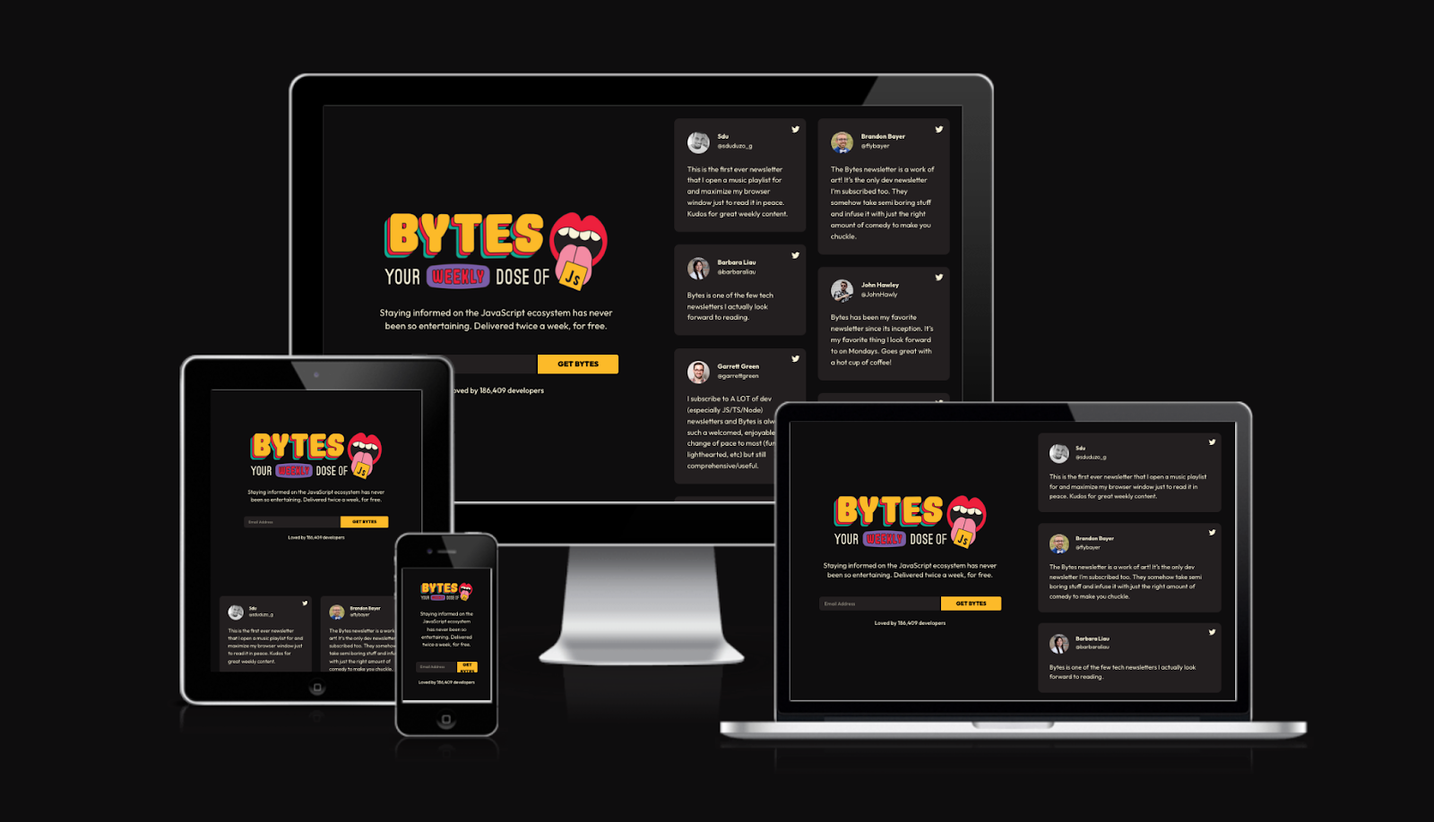
A responsive website adapts seamlessly to devices of different sizes and resolutions, from smartphones to tablets and desktop computers.
You don’t need to create separate designs for each resolution, though. Instead, you’ll want to build a responsive site, which uses a single design that scales and reflows the page’s elements to fit the screen size for proper viewing. This includes the menu layout, image sizes, and typography.
Because smartphones and tablets don’t use a standard size, it’s key to use online tools that simulate different screen sizes and browsers during development so that you can ensure your site is displaying as intended.
Why is responsive testing important?
A responsive test verifies that the page you designed adapts cleanly to any screen width without breaking. This means no buttons that don’t fit, overlapping menus, clipped images, or unreadable text.
Testing your site on different devices also confirms less obvious factors like pixel density, orientation, and touch support, which all change how a page is perceived and used.
Catching these issues with a robust, responsive builder like GoDaddy Website Builder before launch reduces bounce, since mobile users expect fast, friction‑free browsing.
6 free tools for responsive testing
To help dial up your site’s responsiveness, here are six free tools to help you out.
1. Am I Responsive?
Am I Responsive is a site that shows a page on mobile devices — smartphones and tablets — plus laptop and desktop screens. However, it’s limited to four resolutions, all modeled on Apple devices.
2. Responsive Test Tool

Responsive Test Tool lets you test your website's responsiveness across 50+ device screen sizes instantly without owning physical hardware.
It provides side-by-side comparisons, custom viewport settings, and real-time previews to identify design flaws quickly. The tool is free, browser-based, and requires no installation, making it accessible for developers, designers, and business owners to ensure seamless mobile experiences.
3. Google Chrome DevTools (responsive mode)
Responsive mode (Device Mode) in Chrome DevTools lets you simulate phone and tablet screens right from your computer.
You can choose predefined devices or set a custom size, emulate touch, tweak device pixel ratio, and change the user agent. It also helps inspect media queries and test loading conditions with network and CPU throttling.
You can rotate orientation and spot broken menus, clipped text, or sluggishness, and tweak CSS live.
4. Responsively App
Responsively App is a free, open‑source developer browser built to view your site at multiple sizes at once.
It’s pretty straightforward: open a URL (even local) to get a panel of synchronized viewports. Its standout feature is that it mirrors navigation and scrolls across all views. You can click on one device and the rest follow, speeding up review of breakpoints, forms, and repeated components.
5. BrowserStack
This platform combines a responsive checker with a cloud of real devices.
The Responsive Checker lets you instantly see how a URL renders on popular models, and BrowserStack Live opens your site across thousands of real combinations of browsers, operating systems, and phones. It supports staging via Local Testing, real‑time debugging, and evidence capture, which makes it great for finding differences that emulation can miss.
6. LambdaTest
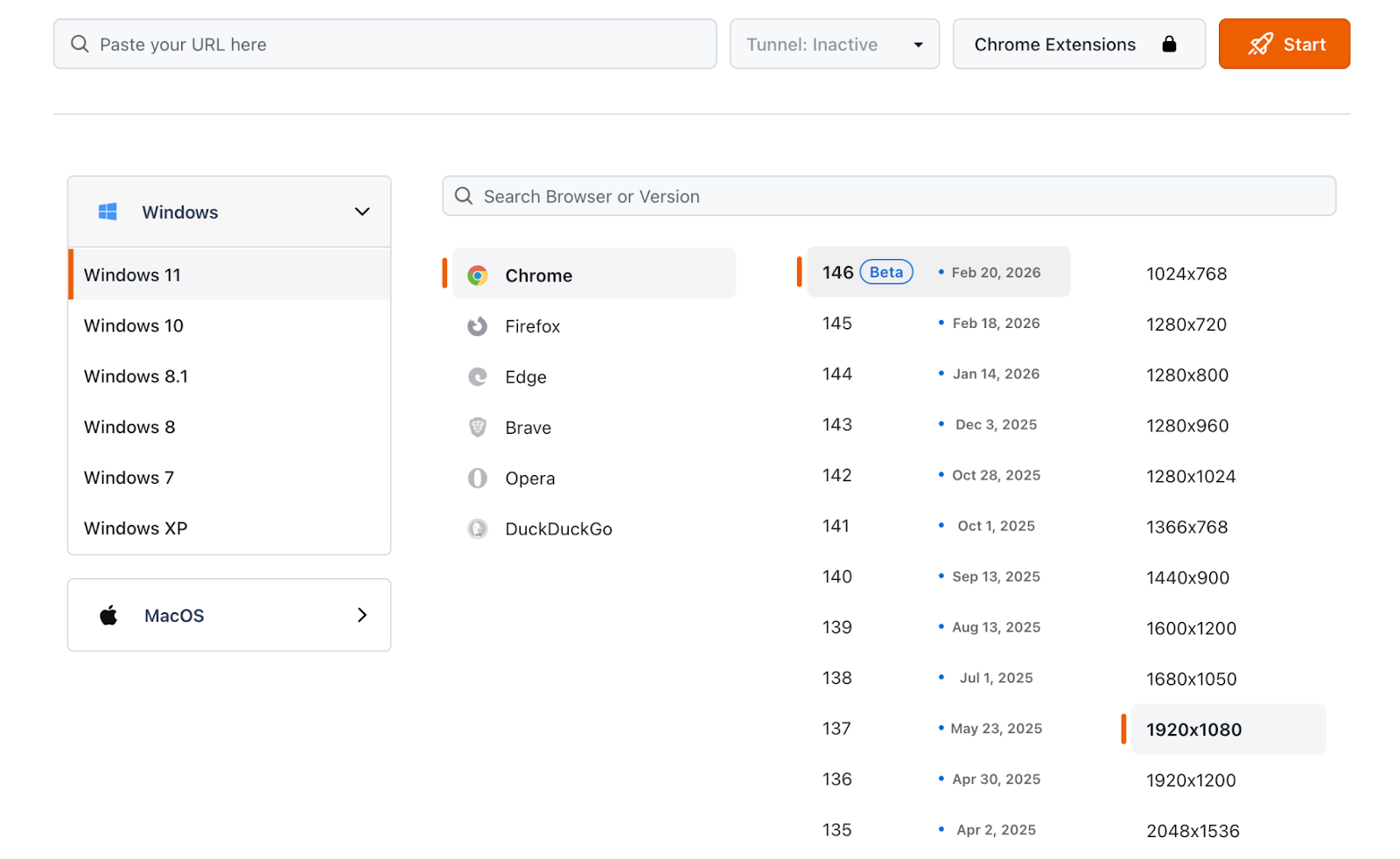
This option offers cloud‑based, cross‑browser, and responsive testing with access to thousands of browsers and devices.
For responsive testing, it shines with quick size switching, landscape mode testing, and support for locally hosted sites. Its dedicated responsive browser, LT Browser, adds QA‑friendly tools like marking issues during review and features that speed up scrolling and side‑by‑side comparison. It even supports basic auth and debugging tools.
Differences between responsive testing and testing on real devices
Both approaches aim to make your site look great on any screen, but they offer different levels of accuracy. Responsive testing is fast for iteration, while real devices confirm final behavior.
- Environment fidelity: Emulation approximates the exact viewport and experience, but doesn’t run your site on the actual mobile hardware and browser.
- Real performance and networks: On real devices, you’ll feel variable latency, limited processing power, and micro‑stutters that can be easy to miss on a desktop.
- Browser/OS bugs: Certain intermittent issues only appear on specific real‑world combos of version, engine, and OS.
- Interaction and physical details: Touch gestures, keyboard behavior, browser bars, notches, and scaling can affect layout, accessibility, and usability.
- Cost/speed: Emulation is instant and inexpensive for early detection, but real‑device testing is essential before you publish.
Common mistakes when testing a responsive site
Even if a site is technically responsive, it’s normal to find issues during testing. These are the ones that most often break the mobile experience, so it’s critical to know them and prevent them early.
- Not setting the viewport meta tag: Define width=device-width and initial-scale=1 to avoid forced zoom and tiny text.
- Tap targets too close together: Follow recommended sizes and spacing so fingers can tap accurately, and re‑check menus, filters, and links on mobile.
- Content wider than the screen: Find the element causing horizontal scroll (tables, banners, or cards with fixed widths) and switch to relative CSS sizing to fix overflows.
- Heavy images or no responsive variants: Use srcset/sizes and compression to speed up loading and improve metrics like LCP.
- Testing only with emulation: Also verify keyboard behavior, orientation, and performance on real devices.
Responsive testing and SEO: how it affects rankings
Google primarily crawls and indexes with a smartphone agent, which means the mobile version is what counts for content, internal links, and metadata.
If your responsive design hides text, swaps content, or makes navigation harder to use, it can make it more difficult for Google to fully understand your page. Mobile performance also feeds experience signals: poorly-optimized images can worsen metrics like Largest Contentful Paint (LCP).
Thorough responsive testing helps surface these issues, improves usability and speed, and keeps mobile and desktop consistent so your site stays accessible and easier to rank.
FAQs about responsive testing
What are responsive tests, and what are they for?
Responsive tests check how a site adapts to multiple screen sizes. They confirm that text is readable without zoom, menus and buttons are comfortable to tap, and there’s no horizontal scroll. You can run them with browser tools, extensions, and on real mobile devices.
What should you look at to know if a responsive test is successful?
A test is successful when the page keeps the same content on mobile and desktop without clipped elements. Testing across devices confirms the menu is accessible, buttons have enough space, there’s no sideways scrolling, forms work with the mobile keyboard, and pages load quickly on mobile networks.
How do you choose an app to build truly responsive web pages?
Pick an app with genuine responsive templates, breakpoint‑based editing, and instant previews for mobile, tablet, and desktop. Look for clean code output, optimized images and fonts, and built‑in technical SEO tools (titles, metadata, sitemap). If it includes real‑device testing or DevTools integration, even better.