The release of WordPress 6.1 on Nov. 1, 2023, introduced a new stock theme: TwentyTwentyThree. As with any stock theme, the purpose is to show off the shiny new toys
that ship with the newest version of WordPress. TwentyTwentyThree gives us a good look at what 6.1 can do and lets us imagine the near future of WordPress as it continues its evolution toward a no-code design system.
TwentyTwentyThree is certainly ready for your consideration whether you use it in production or wish to evaluate it for future use.
TwentyTwentyThree: Block theme for makers
TwentyTwentyThree could not be a better example of how you can build every element of a WordPress site only with blocks. That's the hallmark of a block theme.
This theme is considered a stripped-down version of its recent predecessor, TwentyTwentyTwo. That theme had a well-defined art direction. In contrast, TwentyTwentyThree is so design-agnostic that, unlike its predecessor default WordPress themes, it comes with no stock images. And it's very lightweight. And that is the point.
This puts you — content creator, designer or site developer — in command.
Let's have a look at TwentyTwentyThree's distinct features.
Style variations
This feature, a part of the Site Editor, just might be ushering in a new Childless Theme era. If you've ever needed to make wholesale changes to a theme, you might know of the pain required to create a child theme where your custom styles and functions reside.
The idea that you can now change the style of a theme without actually using a different theme is in full display with the style options that TwentyTwentyThree offers.
In addition to the default style, these 10 style variations are easy to select for your web site. Notably, each style variation was created by a member of the WordPress community.
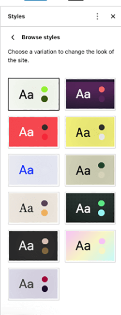
Each style is defined by its color palette and typography. Think of these as starting points that you can change to suit your needs.
Color palettes
Each of the 11 style variations has a five-set (starting point) color palette. The default style variation uses the following:
| Base | Contrast | Primary | Secondary | Tertiary |
| #ffffff | #000000 | #9DFF20 | #345C00 | #F6F6F6 |
 |  |  |  |  |
You can always change any color from the default style or to any of its other 10 variations.
Typefaces
The TwentyTwentyThree theme comes with font families which might be new to you. Select the typeface name to see more information.
System font
These draw upon the fonts already installed on a user's system.
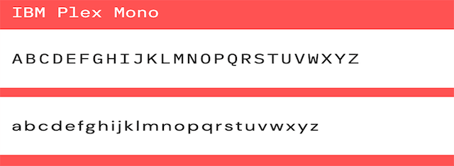
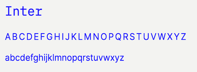
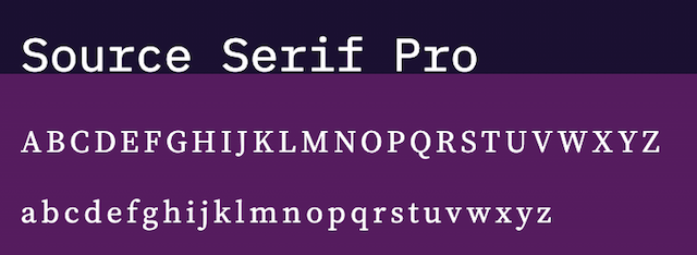
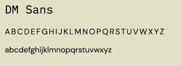
All of these fonts are packaged with TwentyTwentyThree, meaning you are not pulling them from third-party sources such as Google where privacy issues were raised earlier last year in the EU. Plus, a font is only loaded if used, which is a real performance boost (but this is not new to most WordPress block themes).
You can always stray from the built-in fonts if you prefer.
And, as with any block theme, you can assign color or typeface to a single block, such as a heading, to apply to the entire site.
You still can't set properties such as letter spacing, word spacing, or line height on a sitewide basis but expect that to change with the release of WordPress 6.2 in March 2023.
Fluid typography and spacing
You're probably wondering, “I thought most WP themes were responsive already. What's this?”
TwentyTwentyThree focuses on your content and you don’t have to fret as much as you did before as to whether your typeface and surrounding space would optimally render on all devices.
How does it work?
Traditional responsive design uses CSS media queries to target desktop, laptop and mobile device widths. The problem with that approach is that designers cannot set breakpoints for each type of device. This accounts for some design issues that must be resolved on a case-by-case basis.
Fluid typeface does not target a device's width. Rather, using the three values of the clamp property (a minimum, a preferred, and a maximum size) it works with the viewport of the device and scales accordingly.
This is an elegant solution, particularly for headings and large text sizes.
For smaller sizes, such as body copy, the traditional media query approach is still the way to go.
For additional details and some of the technical specs, see Adding Fluid Typography Support to WordPress Block Themes from CSS-Tricks. In that article, you’ll see some of the technical specs which account for how fluid typography works.
Summing up
Sometimes it's hard to tell what new features any theme can bring. I find myself asking, “Is this feature theme-specific, or is this part of WordPress core?”
The only way to find out — short of reading through documentation — is to test it by trying different themes. So I did a lot of testing and, as it turned out, what is built into TwentytwentyThree specifically (and not WordPress core) were the features described above.
While TwentyTwentyThree doesn't look dazzling, that's just where its strength lies.
Think of it as a powerful blank slate where you have a wide range of design possibilities at your fingertips. This theme asks, “What is the future of WP themes if we can start with a blank page?”

