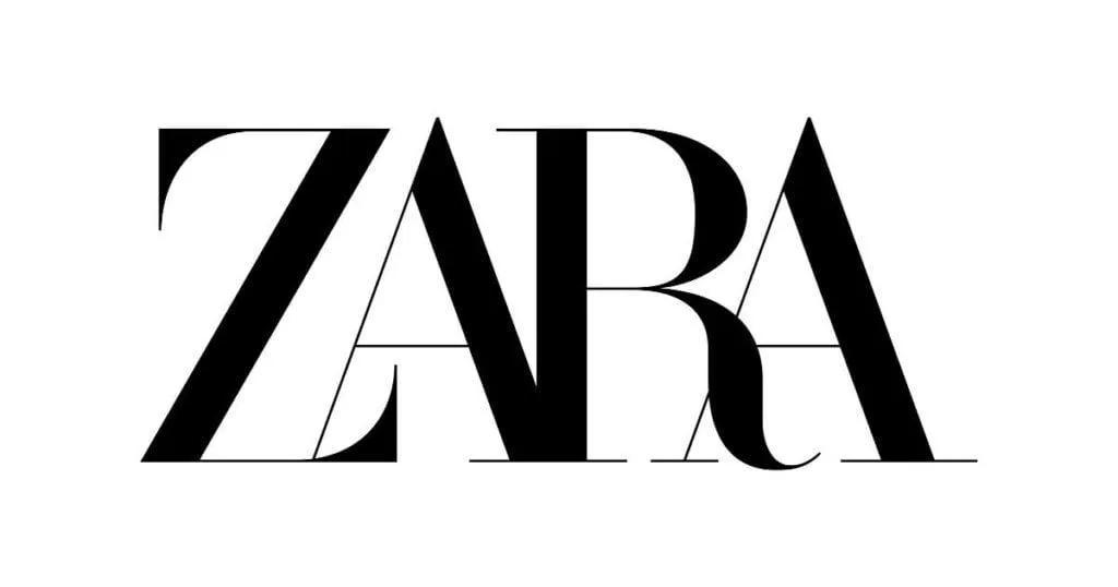
When it comes to building a memorable brand, sometimes your name says it all. That’s the power of a wordmark logo. Simple, bold, and focused on typography, wordmarks rely on the design of your business name to make a lasting impression rather than icons or graphics. Let’s explore what a wordmark is in more detail, wordmark logo examples from well-known brands, and tips for creating one that’ll help your business stand out.
What is a wordmark logo?
A wordmark logo (sometimes called a logotype) is a type of logo that uses your business name as the main design element. Instead of combining symbols or icons with text, wordmarks rely entirely on custom typography, letter styling, and spacing to express your brand’s personality.

Think of the bold red lettering of Coca-Cola or the clean simplicity of Google’s signature “G.” These brands use type alone to create a look that sticks, and you can, too.
Wordmarks work especially well for businesses with short, unique, or memorable names. They’re easy to read, look great at any size, and offer plenty of creative room to play with fonts, colors, and spacing. If you’re ready to design your own, GoDaddy’s logo maker can help you test out different styles in just a few clicks.
Related: What is a logo?
Key traits of a wordmark logo
Wordmarks may seem simple, but there’s a lot of thought behind them. The key characteristics that make them successful are:
- Focuses entirely on your business name
- No symbols or graphic elements
- Emphasizes font style, letter spacing, and color
- Works well with short or distinct names
- Clean, modern, and highly legible
- Easy to scale across websites, business cards, signage, and more
- Offers a timeless, professional look across platforms
When to use a wordmark logo
Wordmark logos can be a powerful branding tool, but they’re not right for every business. Here are a few situations in which they make the most sense:
- Your business name is short, unique, or easy to remember. Wordmarks work best when the name itself is strong enough to stand alone.
- You’re building brand recognition from the ground up. New businesses can benefit from using the name front and center to make it stick.
- You want a clean, minimal design. Wordmarks naturally lean into simplicity, making them perfect for brands with a modern, no-fuss style.
- You’re planning to use your logo in lots of different places. Wordmarks scale well across everything from websites to social media to product packaging.
- You want full control over styling. With endless choices for types of logo fonts and logo color combinations, wordmarks are easy to customize for the look you want.
If your business name is long or difficult to remember, you might want to consider a combination logo that blends text with a visual symbol. That way, you get the best of both worlds: name recognition and a graphic that sets you apart.
Tips to create a wordmark logo that stands out
Creating a great wordmark logo requires making thoughtful design choices that reflect your brand’s personality and stand the test of time. The best wordmarks are distinctive, readable, and flexible enough to work across everything from social media profiles to packaging and signage. Below are expert tips on making a wordmark logo that leaves a lasting impression.
1. Choose a font that matches your brand
Your typeface sets the tone for your entire brand. A sleek sans serif font can make your brand feel modern and innovative, while a classic serif font gives off a sense of tradition and reliability. If your brand is more creative or hands-on, something handwritten or script-based can add a personal touch.
Before you settle on a font, think about your brand’s personality. Are you polished and professional? Fun and casual? Once you know your voice, you can find a font that brings it to life.


2. Customize your typography
You don’t want your wordmark to feel like a copy of someone else’s. Small typography customizations can go a long way in making your logo unique. Try adjusting the letter spacing, tweaking individual characters, or connecting letters in creative ways. These changes help your logo feel original and more reflective of your brand. You don’t need to be a design pro to make these tweaks; many logo design tools make it easy to adjust your text until it feels just right.

3. Ensure readability
Your wordmark needs to be easy to read at a glance. If someone can’t tell what your business name is, the design isn’t working. Try shrinking your logo down to see if the letters still look clear. If they blur together or lose shape, it’s time to simplify.
Avoid fonts that are too thin or overly stylized. Decorative fonts can be fun, but often get lost in smaller formats like social media profile images or email footers. Stick with something that stays sharp on both big and small screens.

4. Play with color, but keep it simple
Color is a great way to add personality to your wordmark, but less is usually more. Stick to one or two colors that represent your brand well. You should make sure your wordmark works well in black and white, too. That flexibility will help it look great across different backgrounds and materials.

5. Check availability and protect your design
Before you move forward with your new wordmark, take time to make sure it isn’t already in use. A quick online search is a good start, but you should also check official trademark databases. This will help you avoid any legal issues or forced rebrandings down the line. Once it’s ready, learn how to use the right trademark symbols to claim ownership of your work. This gives you legal protection and helps build credibility with customers.

6. Pay attention to spacing and proportions
Great wordmarks feel balanced. Look at the spacing between each letter and the overall shape of the word. Everything should feel even and intentional. Uneven spacing or awkward proportions can make your logo look awkward or unprofessional. Use design tools with guides and grids to help you line everything up. It’s a simple way to make sure your wordmark feels polished, no matter where it appears.
7. Go for timeless, not trendy
It’s easy to get pulled in by design trends, but the best wordmarks hold up over time. Focus on simple, classic design choices that won’t feel dated in a year or two. A clean font and solid layout will always outlast flashy gimmicks.
You can still add personality with subtle flourishes, but make sure the core of your design feels grounded and dependable. Your logo may change slightly over the years, but its foundation should remain strong.

5 famous wordmark logo examples
When done well, wordmarks can become just as iconic as any symbol or mascot. These renowned wordmark logo examples show how typography alone can build an unforgettable brand. From bold reinventions to timeless classics, each one highlights how the right font choice and styling can shape public perception and drive brand recognition.
GoDaddy
GoDaddy’s original branding leaned heavily into playful, offbeat visuals. But 2020 brought a rebrand, complete with a new wordmark. The updated logo uses a clean, modern sans serif typeface with lowercase letters to reflect a more professional, approachable tone.

Disney
The Disney wordmark was originally based on Walt Disney’s signature. Over time, the logo evolved into the stylized version we know today, with its swirling “D” and whimsical letterforms. The hand-drawn look hasn’t changed much since the 1980s, because it doesn’t need to — it perfectly captures the brand’s sense of magic, creativity, and timeless storytelling. Its consistency has helped make it one of the most recognizable logos in the world.

Netflix
When Netflix launched in 1997, its logo featured a reel of film because the company originally rented physical copies of movies. As the company transitioned into streaming, it dropped the graphic and embraced a bold, all-caps wordmark in red and black. The current design reflects its digital-first identity and works seamlessly across screens.
The simplicity of the wordmark helps Netflix stand out in app stores, on smart TVs, and across global markets. The red color conveys energy and excitement, while the strong, geometric font communicates innovation in entertainment.

NASA
NASA’s wordmark, known as the “worm” logo, was introduced in 1975 as part of a push to modernize the agency’s image. The sleek, curved wordmark replaced the older, more detailed “meatball” logo. It was retired in 1992 but was brought back in 2020 for select missions and merchandise. Today, the worm lives on as a beloved piece of space design history.
Its continuous, rounded lines reflect progress and forward motion — a fitting choice for an agency built on exploration and discovery. It’s also a reminder that even government agencies can benefit from a strong, stylish brand.

Amazon
Amazon’s earliest logo was a stylized “A” over a river. But by 2000, the company rebranded with the simple, type-based logo we know today. The curved arrow — connecting “a” to “z” — was added to highlight the company’s growing selection and reinforce its customer-first mindset. The typeface has seen slight tweaks, but the overall design has stayed consistent.
The smile-shaped arrow adds a human touch to the otherwise minimal design, making it feel both friendly and efficient. This mix of clarity and cleverness has helped Amazon build trust as it expanded from books to an everything store.

Wrapping up: why wordmark logos are memorable
A great wordmark logo doesn’t need flashy graphics or complex design. With just your business name and the right typography, you can create a visual identity that feels clear, confident, and uniquely yours. That’s what makes wordmarks so powerful: they’re simple, scalable, and built to stick in people’s minds.
Ready to get started? Use GoDaddy’s logo maker to create a wordmark logo that captures your brand’s personality and helps your business stand out from the crowd.
FAQ on how to create a wordmark logo
What is a wordmark?
A wordmark is a type of logo that uses your business name as the main design element. Instead of graphics and symbols, they rely on font choice, spacing, and color to create a distinct visual identity that’s simple, professional, and easy to remember.
What is the difference between a logotype and a wordmark?
“Logotype” is a broader term that refers to any logo made up of text. A wordmark is a specific type of logotype that focuses exclusively on the business name, with no added symbols or imagery. All wordmarks are logotypes, but not all logotypes are wordmarks.
What is an example of a wordmark?
Some famous examples of wordmarks are Google, Disney, Netflix, and Amazon. Each of these brands uses only stylized text to form their logo — no icons or extra design elements.
Disclaimer: Third-party logos, names, and marks are registered trademarks of their respective owners. All rights reserved.


