Creating a memorable logo is crucial for establishing a strong brand identity, and one of the key elements of any logo is its font. Choosing the right font can elevate your logo, making it more recognizable and conveying the right message about your brand. In this article, we'll explore 44 of the best fonts for logos and provide guidance on how to select the perfect one for your business. Whether you're looking for a classic serif, a modern sans-serif, or something more artistic, you'll find plenty of options here to inspire you.
Design faster with our new Logo Maker — Airo Plus™ Logo
Airo Plus™ helps you quickly generate a logo that looks great everywhere – no design experience needed.
The 4 main types of logo fonts
When it comes to logo design, there are four main types of fonts to consider: serif, sans-serif, script, and display fonts. Each of these has its unique characteristics and can evoke different emotions and associations. Below, we`ll dive into each type and provide popular examples of fonts within each category.
Serif logo fonts
Serif fonts are classic and elegant. They feature small lines or strokes attached to the end of a larger stroke in a letter or symbol. These fonts are often associated with tradition, reliability, and authority. Here are ten examples of serif fonts that work beautifully in logos:
- Times New Roman: Times New Roman is a classic serif font renowned for its strong readability and formal appearance. Originally designed for newspaper printing, it has become a standard typeface in academic and professional settings. Its balanced proportions and clean lines make it a reliable choice for both body text and headings.
- Georgia: Georgia is a modern serif font that is celebrated for its exceptional legibility, especially on digital screens. Designed with a larger x-height and open letterforms, it combines a timeless aesthetic with practicality. Georgia’s warm and approachable appearance makes it a popular choice for web design, long-form reading, and any context where readability is paramount.
- Garamond: Garamond is a serif font often associated with luxury and high-end brands. Its delicate serifs and graceful curves lend a refined touch to any text, making it ideal for projects that require a sense of heritage and sophistication. Garamond’s subtle charm and historical roots make it a favorite for print materials like books and invitations.
- Baskerville: Baskerville is a refined serif font that blends tradition with modernity. Known for its crisp lines and high contrast between thick and thin strokes, Baskerville is often used in both print and digital media. Its timeless quality makes it suitable for a wide range of applications, from academic publications to stylish branding.
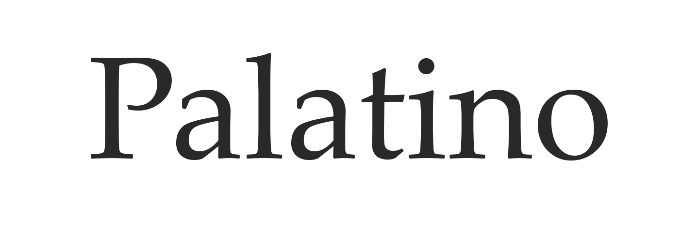
- Palatino: Palatino is a versatile serif font that performs well across various contexts, whether in print or on screen. Its wide letterforms and generous spacing provide excellent readability, while its classical design exudes a sense of warmth. Palatino is often used in book publishing, branding, and any project that requires a touch of elegance.
- Caslon: Caslon is a traditional serif font that has been a staple in the world of publishing for centuries. With its sturdy, reliable letterforms and classic design, Caslon is often chosen for books, magazines, and other long-form text. Its timeless appeal and versatility make it a go-to font for designers seeking a sense of authority and tradition.
- Century Schoolbook: Century Schoolbook is a simple, clean serif font known for its high readability, especially in educational materials. Its rounded letterforms and generous spacing make it an excellent choice for children’s books, textbooks, and other instructional content. The font’s clarity and ease of reading make it a trusted option for conveying information clearly.
- Bookman: Bookman is a bold serif font that commands attention with its strong presence and classic design. Its thick strokes and wide letterforms make it ideal for headlines, posters, and other displays. Despite its boldness, Bookman maintains a sense of elegance, making it a popular choice for impactful yet sophisticated designs.
- Minion: Minion is a serif font with a warm and approachable feel, making it suitable for both print and digital projects. Its well-balanced proportions and subtle design details give it a timeless quality that works well in a variety of contexts, from book typography to branding. Minion’s versatility and legibility have made it a favorite among designers and typographers alike.
- Sabon: Sabon is a serif font that exudes class. With its refined letterforms and consistent structure, Sabon is often used in high-end print materials such as invitations, brochures, and luxury brand identities. Its understated beauty makes it a timeless choice.
Sans-serif logo fonts
Sans-serif fonts are modern and clean. They’re characterized by the absence of the small lines found in serif fonts. They convey simplicity, clarity, and professionalism, making them popular for tech companies and modern brands. Here are the top thirteen sans-serif fonts for logos:
- Helvetica: Helvetica is a timeless sans-serif font known for its clean lines, neutrality, and versatility. Designed in the 1950s, it has become one of the most widely used typefaces in the world for its ability to convey clarity and modernity across various mediums. Helvetica’s balanced and straightforward design makes it a favorite for branding, signage, and corporate communication.
- Arial: Arial is a widely used sans-serif font known for its simplicity and high readability, making it a staple in both digital and print designs. Originally meant to be a more modern alternative to Helvetica, Arial features slightly softer curves and a more open design. Its widespread adoption across platforms and devices ensures consistent legibility and accessibility in various applications.
- Verdana: Verdana is a sans-serif font specifically created for screen readability, with wide letter spacing and a large x-height to ensure clarity at small sizes. Created in the 1990s for digital use, Verdana is straightforward and highly legible, making it ideal for web content, online documents, and interfaces. Its unadorned design emphasizes functionality and ease of reading in digital contexts.
- Futura: Futura is a geometric sans-serif font that embodies modernism with its clean, precise, and stylish design. Created in the 1920s, it is characterized by its near-perfect circles, triangles, and straight lines, giving it a futuristic and timeless appeal. Futura’s bold simplicity and visual impact make it a popular choice for contemporary branding, advertising, and editorial design.
- Calibri: Calibri is a sans-serif font with a soft and friendly feel, crafted for readability in print and on screen. As the default font in Microsoft Office, Calibri has become one of the most recognizable and widely used typefaces in business and professional communication. Its rounded corners and open letterforms provide a warm, approachable tone while maintaining a clean and modern appearance.
- Gill Sans: Gill Sans is a humanist sans-serif font that is approachable and versatile, combining elements of both classical and modern design. Created in the 1920s, it features a clean yet slightly quirky design, with subtle curves that add warmth to its otherwise geometric structure. Gill Sans is often used in branding, signage, and editorial design for a balance of formality and friendliness.
- Myriad: Myriad is a clean sans-serif font that’s ideal for corporate branding and communication. Its open and balanced letterforms provide excellent readability, while its modern design conveys a sense of reliability and professionalism. Myriad’s versatility makes it suitable for a wide range of applications, from logos to marketing materials, particularly in tech and corporate industries.
- Tahoma: Tahoma is a simple and easy-to-read sans-serif font often used in technology branding and user interfaces. Designed with clear, straight lines and a compact structure, Tahoma performs well in digital environments where legibility at small sizes is crucial.
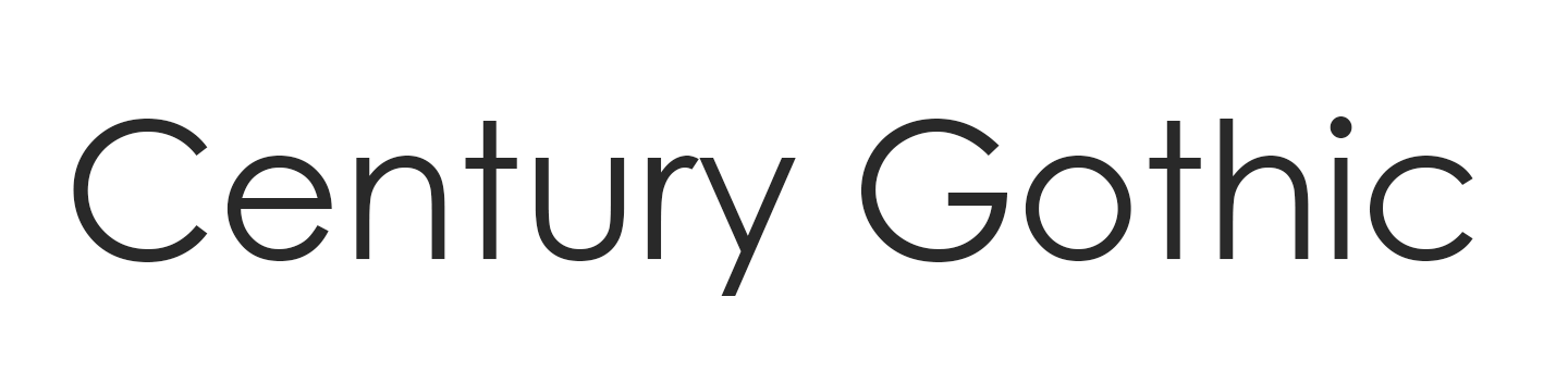
- Century Gothic: Century Gothic is a sleek, modern sans-serif font with a geometric design that exudes minimalism and elegance. Its uniform thickness and circular letterforms make it visually appealing for contemporary branding, headlines, and print materials, especially in fashion, tech, and lifestyle brands.
- Roboto: Roboto is a highly readable sans-serif font that’s popular in digital design, particularly for user interfaces and mobile apps. Developed by Google, Roboto combines a modern aesthetic with open curves and a strong, consistent rhythm. Its adaptability and clarity make it a go-to font for Android devices and a wide range of digital applications where functionality and style are equally important.
- Avenir: Avenir blends geometric precision with humanist warmth. It has a balanced design that feels modern without losing personality. The name "Avenir" is French for "future," reflecting its forward-thinking aesthetic. Unlike purely geometric fonts, Avenir has subtle organic variations that make it feel more approachable and less mechanical. It’s ideal for progressive companies, tech brands, and startups that want to balance professionalism with approachability, conveying innovation while remaining accessible.
- Proxima Nova: Proxima Nova is a modern interpretation of geometric sans-serif styles. It combines the clean structure of fonts like Futura with improved readability and warmth. Its precise geometry and familiar letterforms make it exceptionally versatile across digital and print applications. The font maintains clarity at all sizes while adding subtle personality through carefully balanced proportions. It’s a good option for digital-first branding, media companies, online publications, and modern businesses that need fonts that perform consistently well across websites, apps, and traditional media.
- Lato: Lato is a sans-serif font with slightly rounded edges and soft letterforms that balance simplicity and friendliness. The rounded terminals and open apertures create a warm, inviting feel while maintaining professionalism. Its generous spacing and large x-height ensure excellent legibility across all branding materials, from small mobile screens to large signage. The font’s name comes from the Polish word for "summer," reflecting its light, warm character. It’s suitable for tech companies, startups, service-based businesses, health and wellness brands, and companies seeking a neutral, versatile logo font.
Script logo fonts
Script fonts are decorative and often mimic handwriting or calligraphy. These fonts can add a personal touch to your logo, making it feel more artistic and unique. Here are eleven beautiful script fonts to explore for your logo:
- Lobster: Lobster is a bold and stylish script font that captures attention with its unique, hand-drawn look. Its thick, flowing curves and retro flair make it ideal for headlines, logos, and branding in creative industries. The font’s distinctive character and strong visual impact ensure that it stands out in any design.
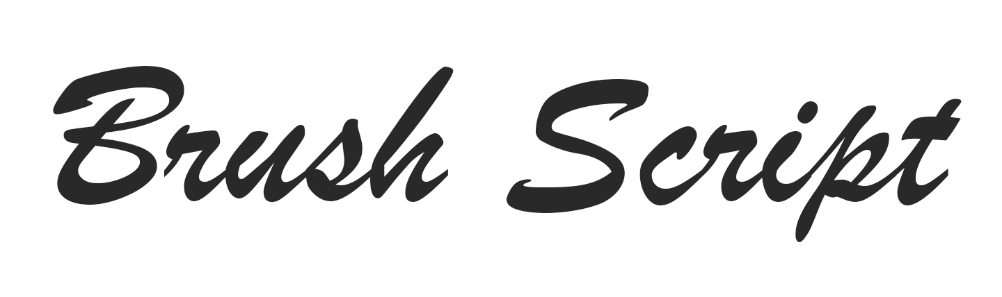
- Brush Script: Brush Script evokes a casual, approachable feel that’s reminiscent of handwritten lettering. Its smooth, flowing strokes give it a warm and friendly appearance, making it a popular choice for informal invitations, greeting cards, and retro-themed designs. The font’s timeless appeal lies in its ability to convey a personal touch while maintaining legibility.
- Great Vibes: Great Vibes is a flowing script font that exudes sophistication and grace, making it perfect for high-end branding and luxury designs. Its smooth, connected letterforms create a sense of movement and refinement, ideal for wedding invitations, upscale packaging, and formal events. The font’s delicate curves and balanced proportions make it both beautiful and highly readable.
- Pacifico: Pacifico is a fun, relaxed script font that brings a sense of playfulness and friendliness to any design. With its carefree, hand-drawn style, Pacifico is perfect for branding in the arts, crafts, and entertainment industries. The font’s whimsical character makes it well-suited for projects that aim to convey joy and creativity.
- Alex Brush: Alex Brush is a refined script font that adds elegance and sophistication to any design. Its smooth, flowing strokes and balanced letterforms give it a polished appearance, making it ideal for formal invitations, logos, and upscale branding. It’s both visually appealing and highly legible.
- Allura: Allura is a light, delicate script font that is perfect for wedding-related branding and other romantic designs. Its flowing lines and gentle curves create a sense of softness and beauty, making it ideal for invitations, stationery, and feminine branding.
- Sacramento: Sacramento is a sleek script font that combines vintage charm with modern elegance. Its thin, stylish strokes and distinctive letterforms make it ideal for upscale branding, editorial design, and fashion-related projects. Sacramento’s sophisticated yet approachable style makes it both eye-catching and versatile.
- Dancing Script: Dancing Script is a playful and lively script font that brings a sense of joy and movement to any design. Its bouncy, connected letterforms and informal style make it perfect for casual brands, greeting cards, and fun, light-hearted projects. The font’s energetic character adds a little whimsy and creativity to any text.
- Cookie: Cookie is a sweet and friendly script font with a vintage feel that’s reminiscent of classic signage and old-fashioned advertisements. Its rounded, smooth letterforms and retro charm make it ideal for bakery logos, nostalgic branding, and packaging design. Cookie’s inviting style also evokes a sense of comfort and familiarity.
- Parisienne: Parisienne is a romantic script font that is perfect for luxury branding and sophisticated designs. Its delicate, flowing lines and classic style embody the charm of Parisian fashion and high-end aesthetics. Parisienne’s graceful curves and refined appearance make it an ideal choice for wedding invitations, upscale packaging, and any project that seeks to convey elegance and romance.
- Grand Hotel: Grand Hotel is inspired by 1930s retro signage, specifically the title screen of the 1937 film "Cafe Metropole." It captures the essence of vintage, Art Deco-era lettering. Its flowing letterforms bring polished, vintage charm to logos that want to bridge the gap between formal calligraphy and casual handwriting. The hand-drawn quality appears refined without feeling overly formal or stiff, making it approachable. Grand Hotel is best for cafes and bakeries, boutique hotels and hospitality brands, wedding businesses and event planners, handmade goods and artisan products, and retro-inspired logos.
Display logo fonts
Display fonts are bold and eye-catching, so they’re often used for larger text in logos. They are designed to make a statement and are perfect for brands looking to create a strong visual impact. Here are ten powerful display fonts for logos to consider:
- Bebas Neue: Bebas Neue is a sans-serif display font known for its clean, legible, all-caps design and striking impact. Its straightforward geometric shapes and uniform stroke weight make it ideal for headlines, posters, and branding that requires a strong visual presence.
- Playfair Display: Playfair Display is an elegant serif display font that combines classic sophistication with modern sensibility. Its high contrast between thick and thin strokes and its graceful curves create a timeless look, making it perfect for editorial design, luxury branding, and high-end publications.
- Abril Fatface: Abril Fatface is a strong serif display font that commands attention with its dramatic contrasts and robust presence. Its heavy weight and stylish serifs make it an excellent choice for headlines, posters, and branding that need to make a strong impression.
- Anton: Anton is a sans-serif display font characterized by its thick, robust letterforms and high readability. Designed for maximum impact, it is ideal for headlines, advertisements, and other applications where clear visibility and strong presence are essential. Anton’s modern and straightforward design helps it perform well in both digital and print formats.
- Stencil: Stencil is a distinctive sans-serif display font that evokes a military or industrial feel with its cut-out letterforms and utilitarian design. Its unique style is perfect for projects that require a rugged or vintage aesthetic, such as posters, packaging, and branding with a strong, authoritative presence.
- Showcard Gothic: Showcard Gothic is a fun sans-serif display font with a retro, distinctive presence. Its rounded letterforms and playful design make it ideal for nostalgic branding, posters, and events that benefit from whimsy and character.
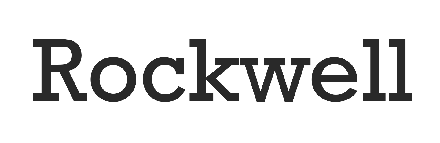
- Rockwell Extra Bold: Rockwell Extra Bold is a serif display font known for its strong, geometric shapes and commanding presence. Its heavyweight and solid construction make it an excellent choice for headlines, advertising, and any project that requires a bold statement. This is a font that would work well for a construction company logo.
- Haettenschweiler: Haettenschweiler is a condensed sans-serif display font that demands attention with its narrow, impactful design. Its strong vertical lines and compact letterforms make it ideal for headlines, signage, and branding that need to capture and hold the viewer’s gaze.
- Jokerman: Jokerman is a whimsical display font with a unique style that combines decorative elements with a fun, informal approach. Its irregular shapes and eccentric design make it perfect for creative projects, invitations, and branding that aim to convey a sense of liveliness, imagination, and originality.
- Oswald: Oswald is a reworking of the classic gothic sans-serif style, updated for modern use with its bold and versatile design. Its narrow, elongated letterforms and strong presence make it suitable for headlines, advertisements, and web design where clarity and impact are essential. Oswald’s contemporary yet classic look ensures it fits well in both print and digital contexts.
How to choose the best logo font
Choosing the right font involves understanding the meaning behind your logo, its purpose, and the message you want to convey. Consider the nature of your business, your target audience, and the overall feel you want your brand to have. For example, a law firm might opt for a serif font to convey professionalism and tradition, while a tech startup might choose a sans-serif font for a modern and sleek look. Many brands use a wordmark logo, where the font choice becomes the defining element of the logo itself.
In addition to these considerations, it’s essential to ensure that your font is legible and impactful across media, from business cards to billboards to websites and more. Test your logo at different sizes and on different devices to confirm readability.
Below are a few more key things to think about when choosing a font for your business logo.
Identify your brand`s creative identity first
Before choosing a logo font, you need to have a clear understanding of your brand’s personality. Define what sets your business apart, the emotions you want to create, and the values you stand for. This makes it easier to choose typography that reflects your brand instead of chasing short-term design trends.
A brand built around innovation often pairs well with clean, geometric sans-serif fonts. A brand rooted in tradition tends to align better with classic serif typefaces. The right choice reinforces your message and helps create a consistent, recognizable look across every touchpoint.
How many fonts should you use in a single logo?
When designing or redesigning a logo, it’s best to stick to one or two fonts. Using too many fonts can make your logo look cluttered and confusing. If you do decide to use more than one font, ensure that they complement each other. For example, pairing a serif font with a sans-serif font can create a balanced and visually appealing logo.
Here are some tips on how many different fonts to use based on the logo type and its purpose:
- Stick to one or two fonts. Generally, using one or two fonts in a logo is ideal. This ensures a clean, cohesive look and avoids visual clutter. One font can be used for the main text (like the company name), while another can complement it for additional elements (like a tagline).
- Consider the logo’s purpose.
- Business logos: For corporate or business logos, simplicity and professionalism are key. Stick to one primary font or pair a serif font with a complementary sans-serif font. This can create a balanced and versatile design suitable for various applications, from business cards to websites.
- Freelance or creative ventures: If the logo is for a freelance or creative venture, you can experiment with more expressive font combinations. A playful script font paired with a clean sans-serif can convey creativity while maintaining readability. However, avoid using too many fonts to keep the logo impactful and legible.
- Maintain legibility. Ensure that any fonts used are legible at different sizes. Overly decorative or intricate fonts might look great in large formats, but can become unreadable in smaller sizes. Test the logo in various sizes to ensure it remains effective and clear.
- Consistency with brand identity. The fonts chosen should reflect the brand’s identity and values. For instance, a tech company might use sleek, modern fonts to convey innovation, while a luxury brand might opt for elegant serif fonts to represent sophistication. Consistent font use helps reinforce the brand’s message and personality.
How to combine logo fonts
Combining fonts in a logo can create a dynamic and visually appealing design, but it requires careful consideration to ensure that the combination enhances rather than detracts from the overall brand identity. Follow these tips to effectively combine fonts in a logo:
- Contrast font styles for impact: Use contrasting fonts to create visual interest and hierarchy. For example, pair a bold sans-serif font with a delicate script font to distinguish between the main brand name and a tagline. This emphasizes different elements of the logo and ensures that each part stands out clearly.
- Complementary styles: Choose fonts that complement each other in terms of style and tone. For instance, combining a classic serif font with a modern sans-serif font can create a balanced look that blends tradition with contemporary flair. Ensure that the fonts have some common characteristics, such as similar x-heights or letter shapes, to maintain harmony.
- Limit font types: Use no more than two or three fonts in a logo to avoid visual clutter. Stick to a primary font for the main text and a secondary font for taglines or descriptors.
- Match font weights and sizes: When combining fonts, ensure that their weights and sizes work well together. For example, if you use a heavy, bold font for the main text, choose a lighter weight or smaller size for supplementary text. This helps maintain a clear hierarchy and keeps the logo visually cohesive.
- Ensure strong color contrast: Choose font colors that stand out clearly against the background and each other. Strong contrast improves readability and helps key elements of your logo stand out. Keep your color choices aligned with your brand identity, and test your logo in both full color and black and white to make sure it stays clear and legible in any setting.
- Consistent letter spacing and alignment: Pay attention to letter spacing and alignment to ensure that the combined fonts align seamlessly. Inconsistent spacing or misalignment can disrupt the visual flow of the logo. Adjust kerning and alignment as needed to achieve a polished look.
- Test for versatility: Ensure that the combined fonts work well across various sizes and formats. Test the logo in different applications, such as on business cards, websites, social media profiles, and large signage, to confirm that the font combination remains effective and legible in all contexts.
- Reflect brand identity: The fonts you choose should reflect the brand’s personality and values. For example, a tech company might use clean, modern sans-serif fonts, while a luxury brand might opt for elegant serif fonts. And don’t neglect logo color combination considerations. Color plays an important part in your brand’s identity.
- Avoid overly decorative fonts: While decorative fonts can be eye-catching, they can also overwhelm a logo if overused. Use decorative fonts sparingly and pair them with simpler, more readable fonts to maintain clarity and effectiveness.
- Consider font licensing: Ensure that you have the appropriate licenses for any fonts you use in your logo, especially if the logo will be used commercially. Some fonts require licensing fees or restrictions for commercial use.
- Seek feedback: Before finalizing your font combination, gather feedback from colleagues, clients, or target audiences. Their perspectives can provide valuable insights into how the logo and its font combination are perceived and whether any adjustments are needed.
Proven font pairing examples
Don’t want to start building your logo from scratch? Try out these font combinations that work well across different brand styles:
- Montserrat + Hind: A modern, approachable pairing that works well for contemporary brands. Montserrat’s geometric structure balances nicely with Hind’s softer, more human feel.
- Futura + Lora: A sleek combination that blends modern and classic design. Futura’s clean lines contrast with Lora’s elegant serif details for a more refined look.
- Poppins + Libre Baskerville: This pairing mixes contemporary style with a sense of trust and stability. Poppins feels friendly and modern, while Libre Baskerville adds a more traditional touch.
- Grand Hotel + Oswald: A bold pairing that combines retro character with strong visual impact. Grand Hotel’s script style stands out against Oswald’s condensed lettering.
Test your logo font choices before finalizing
Before making a final decision, test your logo in real-world settings. A font that looks great in one format may not perform as well everywhere else. You can test your logo by:
- Checking different sizes: Make sure your logo stays readable from small favicon sizes to large-scale signage.
- Testing multiple backgrounds: Try your logo on light, dark, colored, and image-based backgrounds to confirm it remains clear and versatile.
- Previewing real applications: Place your logo on websites, social media profiles, business cards, packaging, and other brand materials.
- Gathering feedback: Share a few options with colleagues or customers to get outside perspectives.
- Giving it time: Revisit your choices after a few days to see which one still feels right long term.
Choose a logo font for your business logo
Selecting the perfect font for your logo is an essential step in creating a brand identity that resonates with your audience. Whether you`re starting a new business or rebranding an existing one, the right font can make a big difference in how customers perceive your brand.
If you`re ready to create a logo, the GoDaddy Logo Maker offers a wide range of fonts to choose from. For help getting started, read this guide on how to create a logo. When you’re done, don’t forget to trademark your logo to protect your brand for years to come.