
Looking to give your website a more polished, professional feel? One easy way to do that is by adding a favicon. If you’ve ever wondered what a favicon is and why it matters, you’re not alone.
While it might be small, it plays a big role in branding, helping your site stand out and look professional across tabs, bookmarks, and search results. It’s one of those subtle design elements that users may not consciously notice, but they’ll definitely miss if it’s not there. Let’s explore everything you need to know about favicons, from why they matter to how to create one and add it to your website.
What is a favicon?
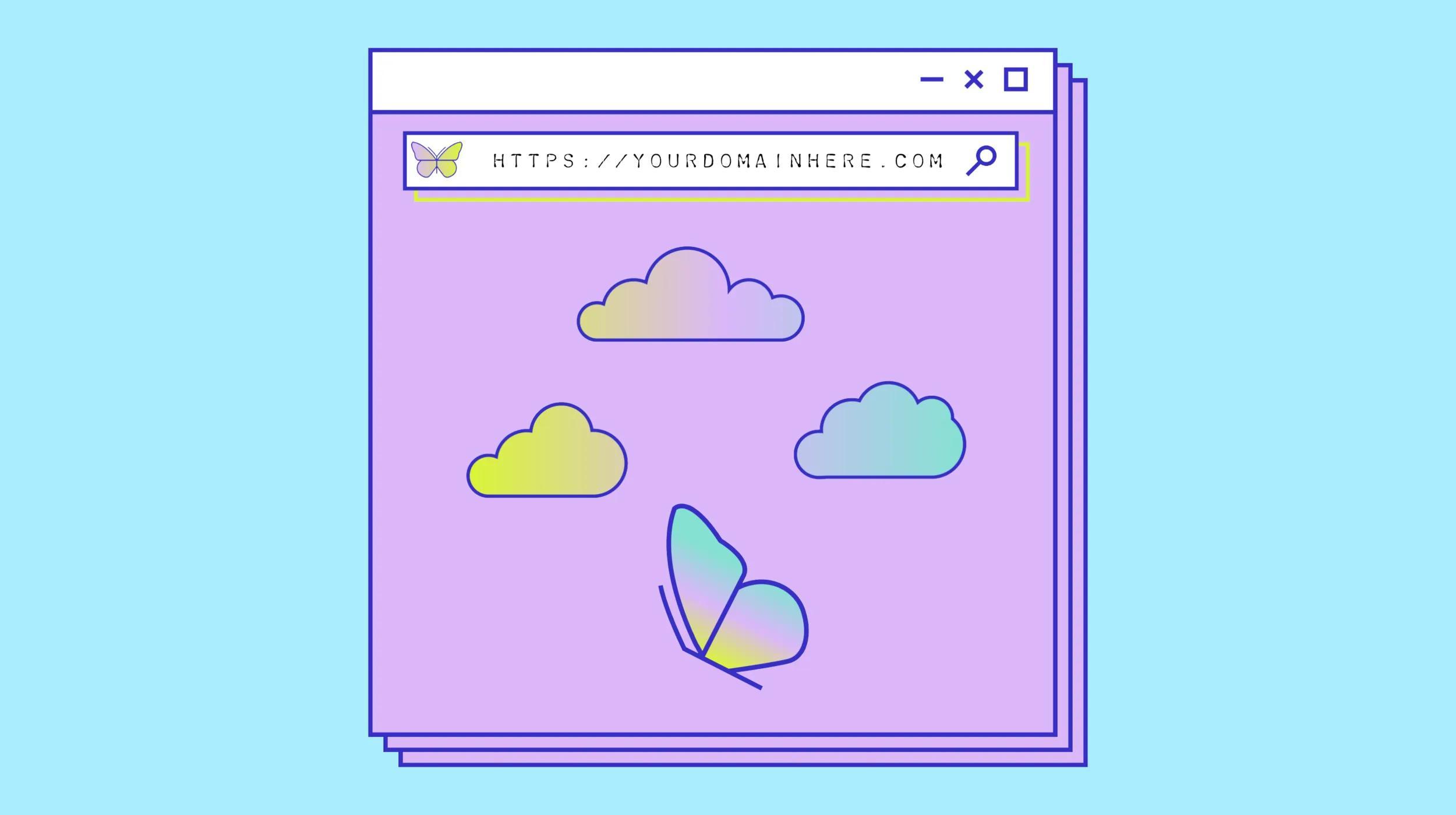
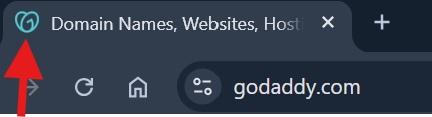
Wondering what is a favicon? A favicon — short for “favorite icon” — is the small image that appears next to your website’s name in a browser tab, bookmark list, or search result. It’s a quick visual cue that helps visitors recognize your site at a glance, even when they have multiple tabs open. Think of it as your site’s logo in miniature form. Most favicons are simplified versions of your brand’s logo or a symbol that represents your business, helping you stay consistent and recognizable across the web.
Where are favicons used?
Favicons show up in more places than you might think. The most common spot is in browser tabs, where they make it easier for visitors to find your site when they have multiple tabs open. They also appear in bookmark bars and browser history lists, giving your site a visual edge that makes it easier to recognize later.
Favicons can even show up in search engine results next to your website name to help you stand out. If someone saves your site to their mobile home screen, the favicon becomes your site’s icon there too. It’s a small design detail that works behind the scenes to build familiarity and trust.
The importance of a favicon
Favicons play an active role in how people perceive, interact with, and return to your website. Once you understand what a favicon is, it’s clear how much influence it has on the user experience and brand perception. They add a professional edge, help your brand stand out visually, and support better site performance in small but meaningful ways.
Builds brand awareness
Your favicon acts like a visual signature for your brand. It shows up consistently across browser tabs, bookmarks, and mobile home screens, helping visitors instantly connect that small image to your business. Even if someone forgets your URL, they may recognize your favicon and click back to your site. Over time, this repeated exposure helps build familiarity and trust — two things every brand needs to grow online.
Increases CTR
In search engine results, a favicon next to your site name adds a touch of professionalism and visual appeal. It helps your listing stand out, especially when users are quickly scanning through pages of results. That extra visual cue can grab attention and increase the likelihood of someone clicking through to your site. When paired with a strong meta title and description, your favicon helps present your brand as credible, relevant, and worth exploring further.
Enhances user experience
A well-designed favicon makes navigating the internet easier for your visitors. It helps users quickly spot your site in a sea of open tabs, improves bookmark organization, and adds to the overall look and feel of your brand. These subtle improvements make your site feel more trustworthy and user-friendly, keeping visitors engaged and encouraging them to return. It’s a small touch that contributes to a smoother, more enjoyable browsing experience.
Improves visibility
Favicons give your brand a consistent visual presence. They increase the number of visual touchpoints users have with your brand, which can lead to better recognition and more repeat visits. It’s one of the easiest ways to keep your site at the forefront of visitors’ minds and ensures your brand stays visible, memorable, and easily accessible across devices.
Tech recommendations for favicons
Before you upload a favicon to your website, it’s important to understand the technical side of things. File format and favicon size may seem like minor details, but getting them right ensures your favicon displays clearly across all browsers and devices. Below, we’ll break down the most common file types and size guidelines so you can create a favicon that looks crisp and loads quickly.
Common favicon file formats
Choosing the right file format for your favicon helps ensure it displays correctly across all browsers and devices. Here are the most common options and when to use them:
- .ICO – The most widely supported format, especially for older browsers like Internet Explorer. It can include multiple icon sizes in a single file, making it a reliable fallback option.
- .PNG – Great for modern browsers thanks to its sharp quality and transparency support. It’s a go-to for most websites today.
- .SVG – Ideal for high-resolution screens and responsive design, since it scales without losing quality. Use this format when you want a sharp, lightweight icon on modern browsers.
- .GIF – Supported by most browsers but rarely used for favicons. It can display simple animations, though this is more of a niche use.
Start with a vector file logo to create a high-quality design you can export into the format that best fits your needs.
Favicon file sizes
Favicons need to scale across different use cases. The most commonly used favicon file size for browser tabs is 16x16 pixels, but 32x32 and 48x48 pixels are recommended to cover a wider range of devices. For best results, create a multi-resolution .ICO file that includes several sizes in one, or generate multiple image files for different uses.
Keep your file size under 100KB for faster load times. Smaller, optimized files help ensure your favicon loads instantly without slowing down your site. As screen resolutions continue to improve, having scalable icons in multiple favicon dimensions keeps your branding looking sharp and consistent everywhere it appears.
Tips for creating a good favicon for your website
Because favicons are so small, designing one that’s effective takes a different approach than creating a full-size logo or brand graphic. It’s all about simplicity, clarity, and strong brand alignment.
Keep it simple
Less is more when it comes to favicon design. At such a small scale, detailed graphics and fine lines won’t translate well. Instead, aim for a bold, recognizable shape or symbol that reflects your brand clearly. If you’re starting from scratch, check out these tips on how to make a logo that works across all formats, including favicons. A simple, clean design will always scale better and leave a stronger impression.
Avoid text-heavy or overly intricate designs, which can become blurry or illegible when shrunk. Stick with strong geometric shapes or stylized icons that retain clarity at even the smallest size. Test your favicon on different devices to make sure it looks crisp whether it’s on a desktop browser tab or a mobile bookmark.
Use the available space wisely
A favicon is typically displayed in a square space, so it’s important to design with that shape in mind. Avoid leaving too much empty space around the edges, as this can make your icon look smaller or off-center. At the same time, don’t cram in too many elements. Focusing on bold logo shapes that fill the space evenly can help create a favicon that feels balanced and intentional. The goal is a design that’s instantly recognizable, even at a glance.
Using vector graphics during the design process can also help maintain proportion and quality. Think strategically about how to use every pixel of that small space for maximum brand impact.
Include your brand colors
Your favicon should feel like a natural extension of your brand. Incorporating your primary brand colors helps tie everything together and makes your site more memorable. Just make sure there’s enough contrast for the colors to stand out, even on dark or light browser backgrounds.
If you’re working with a new design, consider exploring logo examples to see how others use color effectively in small-scale branding. When choosing colors, think about how they appear at a small size and how they’ll render on different screens. Softer colors might get lost, while bold tones typically stand out better.
Use abbreviations
If your full brand name doesn’t fit in a favicon, consider using an abbreviation, monogram, or even a single letter. These options can work especially well for longer business names or when you want to keep the design ultra-clean. Choose a typeface that’s bold and easy to read, even at a small size — check out these recommended fonts for logos for some ideas. A strong lettermark can be just as powerful as a full logo when done right.
Avoid inappropriate symbols
Because favicons show up in public-facing areas like browser tabs and search results, it’s important to keep the imagery professional and on-brand. Avoid using symbols that could be misinterpreted, overly complex, or out of step with your business’s tone. It’s always a good idea to get a second opinion and test how your design looks at a small size. Keeping it neutral, clean, and relevant will help ensure your favicon sends the right message every time it’s seen.
How to add a favicon to your site
Once you’ve created your favicon, the next step is getting it onto your site so it can start working its magic. Most modern website builders, including GoDaddy, have a built-in section where you can easily upload your favicon image. However, if you're working with custom code or a specific platform like WordPress, the process looks a little different.
How to add a favicon in HTML
If you’re coding your site manually, you can add a favicon by placing a <link> tag in the <head> section of your HTML. Here’s what that looks like:
<link rel="icon" type="image/png" href="/favicon.png">Make sure the favicon file is uploaded to your site’s root directory or adjust the path as needed. Most browsers support .ICO, .PNG, and .SVG files, so use the one that best fits your needs. Once it’s uploaded and the code is in place, refresh your site and check the browser tab. It may take a few minutes (or a hard refresh) to appear.
How to add a favicon to your WordPress site
To upload your favicon to your WordPress site:
- Log in to your WordPress dashboard.
- Go to Appearance > Customize.
- Click on Site Identity.
- Find the Site Icon section and click Select Site Icon.
- Upload your favicon image (WordPress recommends 512x512 pixels).
- Crop the image if prompted, then click Publish.
- Refresh your site to see the favicon in action.
How to add a favicon to your GoDaddy site
GoDaddy’s website maker makes it easy to upload and manage your favicon without touching any code. Just follow these steps:
- Log in to your GoDaddy account and open your website editor.
- Click Settings from the main menu.
- Scroll to the Favicon section.
- Click Upload, then select your favicon file (like a .PNG or .ICO).
- Save your changes and publish your site.
- Open your live site in a browser to confirm your favicon is displaying correctly.
How to create a favicon with GoDaddy Airo Plus™ Logo
There are plenty of ways to create a favicon. Some people work with a designer, while others use free online tools. If you’re looking for something fast and beginner-friendly, GoDaddy’s Airo Plus™ Logo is a great AI logo maker for small business owners and entrepreneurs.
Just enter your business name and a few details about your style, and the tool will generate custom AI logo options for you to choose from. You can adjust the fonts, colors, and layout to make it match your brand. Once you’ve designed your logo, save a simplified version to use as your favicon. It’s a quick and easy way to give your site a polished look right from the browser tab.
Examples of effective favicons
A well-designed favicon helps your site stand out, reinforces your brand, and improves user recognition across tabs, bookmarks, and search results. Below are a few favicon examples that show how simplicity and strong brand alignment can go a long way.
1. Google

Google uses a single "G" in its four signature colors. It’s bold, instantly recognizable, and reflects the brand’s identity even without the full name. By distilling its full logo into one memorable character, Google shows how minimalism and brand consistency can create a strong visual cue that users instantly associate with the company.
2. Spotify

Spotify’s favicon features a bright green circle with curved sound waves. It clearly communicates what the platform is about and pops visually against most backgrounds. Even at a small scale, the symbol maintains clarity and brand recognition, making it a smart example of how to match form with function.
3. Pinterest

The stylized “P” inside a red circle keeps things clean and consistent with the rest of Pinterest’s branding. It’s easy to recognize and works well at small sizes. The red background adds a pop of color without being overwhelming, helping the favicon stand out while still feeling cohesive with the brand’s overall aesthetic.
4. Dropbox

Dropbox’s minimalist box icon mirrors its full logo and scales well. The design feels professional, balanced, and easy to spot among open tabs. This icon reinforces Dropbox’s focus on organization and digital storage with a subtle but effective visual message. It’s a great example of how to adapt a full logo into a highly usable favicon.
5. Duolingo

Duolingo uses a simplified version of its green owl mascot. It’s fun, friendly, and reinforces the playful tone of the brand with just a glance. This design choice reflects Duolingo’s casual, gamified approach to learning. It shows how character-based brands can translate personality into even the smallest brand assets.
If your favicon is tied to your logo, take a moment to explore how to trademark a logo to help protect your brand’s identity.
Summary
A favicon might be small, but it plays a big role in making your website look polished and professional. It helps people recognize your brand, keeps your site looking sharp in tabs and bookmarks, and adds that final touch to your online presence.
Need help getting started? Try the GoDaddy Airo Plus AI logo maker to create a favicon that fits your brand in just a few clicks.
Frequently Asked Questions
What is the difference between a logo and a favicon?
A logo is the full design that represents your brand across all platforms, while a favicon is a simplified version that appears in browser tabs, bookmarks, and other small spaces. Think of your favicon as your logo’s tiny but mighty sidekick.
Do I need a favicon for my website?
Yes, adding a favicon helps your site look more polished and professional. It builds brand recognition, improves user experience, and makes it easier for visitors to spot your site in a busy browser window or search engine results page.
Do favicons show up on mobile devices?
Yes! Favicons can appear in mobile browsers, saved bookmarks, and even as shortcut icons on a user’s home screen. Designing a clear, simple favicon helps your brand show up well across all devices.
Disclaimer: All known trademarks contained herein are the property of their respective owners and their inclusion does not represent any affiliation, endorsement, or sponsorship.