Have you ever looked at a logo and instantly recognized the brand, even without reading the name? That’s the power of logo shapes. Shapes are more than just design elements; they speak a visual language that conveys meaning, evokes emotions, and leaves lasting impressions.
Think about brands like Apple, McDonald’s, or Nike. Each logo is simple, yet instantly familiar. The shapes behind those designs play a big role in how they are perceived.
So, how do you choose the right shape when creating your business logo? In this guide, we’ll walk through the psychology behind logo shapes, how they influence perception, and examples of brands that use them effectively.
Get a unique AI-powered logo and more with Airo™ Plus.
What are logo shapes, and why do they matter?
When you think about logo shapes, you might not realize just how much they affect the way we feel about a brand. Every shape has a subconscious association. A tech company may opt for sharp, futuristic lines, while an eco-friendly brand might choose soft, organic curves. The right logo design with shapes ensures your brand is not only seen, but understood.
Our brains are wired to pick out shapes and memorize them as a way of learning new things. That’s why memorable, bold shapes are easier to recall and leave a lasting impact.
We constantly see patterns in our environment — combinations of colors, fonts, and design elements paired with shapes — and we assign meaning to them based on past experiences. This pattern recognition is how different shapes help forge clearer emotional and psychological connections between brands and consumers.
Why shapes matter in logo design
Logo shapes are crucial because:
- They influence emotions and shape how a brand is perceived.
- They communicate characteristics such as stability, innovation, or friendliness.
- Symbols are part of our collective consciousness and have universal meanings that can immediately convey your brand message.
Companies use logo shapes strategically to reinforce their identity and values. A round logo, for example, creates a sense of unity and approachability, while a square logo signals strength and consistency.
How to choose the perfect logo shape for your business
Although aesthetics are important, you need to select a logo shape that represents your brand’s personality and values. Here’s how to make an informed decision:
1. Know your brand identity
Before selecting a logo shape, clarify what your brand stands for. Ask yourself: What are my brand’s core values? What emotions do I want my audience to feel when they see my logo? A brand that aims to be seen as innovative and forward-thinking might benefit from a triangular or dynamic shape, whereas a business that wants to emphasize trust and stability may choose a square or rectangular logo.
2. Understand shape psychology
Each shape triggers a different emotional response. Circles convey friendliness and unity, squares and rectangles signal reliability, triangles suggest movement and innovation, and spirals evoke creativity and transformation. Understanding the psychological impact of shapes can help ensure your logo aligns with your brand’s desired perception.
Understand differentiation and priming
Beyond basic shape associations, two key psychological concepts influence how logos make audiences think and feel:
- Differentiation: A strong logo helps your business stand apart in a crowded market. It gives customers a reason to remember you, not just for what you offer, but for how your brand feels. When your logo creates a distinct emotional impression, it becomes easier for people to recognize and choose your business over others.
- Priming: Visuals can shape perception over time. When someone sees your logo, it can trigger past experiences, emotions, and expectations tied to your brand. Consistent use of your logo across your website, social media, and marketing materials reinforces those associations and helps build trust with every interaction.
3. Consider your audience
Who are your ideal customers, and how do you want them to perceive your brand? A family-friendly brand may benefit from a soft, rounded logo, while a cutting-edge tech company might opt for sharp, futuristic angles. Think about how your audience processes visual cues and learn how to tailor your logo design to them.
4. Keep it simple
A memorable logo is often a simple one. Overly intricate designs can be difficult to recognize at a glance, and complex logos may not scale well across different platforms. Look at brands like Target or McDonald’s. Their logos rely on clean, straightforward shapes that stay consistent everywhere, from mobile screens to storefront signage.
5. Think about versatility
Your logo should look good in all settings, whether it’s printed on business cards, displayed on a billboard, or used in digital formats like social media icons and website headers. Avoid intricate details that may be lost when resized, and ensure you have a vector file of your logo for easy scaling without loss of quality. Test your design in different sizes and formats before launching it to ensure clarity and readability.
6. Test different designs
Once you’ve narrowed down a few potential logo shapes, gather feedback from your audience, employees, or professional designers. A/B testing different logo versions can help you determine which design resonates best with your target audience.
7. Check competitors’ logos
Your logo should stand out, but it still needs to feel relevant to your industry. Reviewing competitor logos helps you understand common design patterns and spot opportunities to take a different approach. This step also helps you avoid creating something that looks too similar to an existing brand.
Once your design is finalized, securing a trademark for your logo is crucial; it protects your brand identity, prevents unauthorized use, and supports your long-term growth.
8. Consider adaptability
Your logo needs to look great everywhere it appears. That includes your website, social media, business cards, ads, and merchandise.
A flexible design holds up across different formats, sizes, and backgrounds. It should also work with different color combinations, including black-and-white versions for print. Strong adaptability keeps your logo clear, consistent, and recognizable across various forms of media.
The psychology behind different logo shapes
Each logo shape has a unique meaning, and companies use them to tell a story. All logo shapes fall into three main categories:
- Geometric shapes: Circles, triangles, squares, rectangles, horizontal lines, and vertical lines. These are structured, mathematical forms.
- Organic shapes: Curved lines, spirals, waves, leaf-inspired forms, and other natural shapes. These are flowing, nature-inspired designs.
- Abstract shapes: Unique, stylized forms such as stars, hearts, loops, and symbolic icons that represent ideas, emotions, or cultural meaning rather than literal objects.
Each logo shape category serves different purposes and conveys distinct psychological messages. Let’s break down the most common shapes in logo design and how they impact branding in more detail.
Disclaimer: All known trademarks contained herein are the property of their respective owners and their inclusion does not represent any affiliation, endorsement, or sponsorship.
Circular logos
A circular logo is all about harmony, unity, community, stability, and collaboration. The softness of a circle feels welcoming, making it perfect for brands that want to appear friendly and inclusive.
Circles also symbolize completeness, infinity, continuity, and perseverance, which reinforce a brand’s longevity and consistency. They are commonly associated with time, planets, and the sun. Circles can convey a sense of femininity and give an air of mystery. Because circular shapes tend to be less common in everyday life, using a circle is also an effective way to draw attention.
- Meaning: Connection, inclusivity, timelessness, continuity, and mystery.
- Impact: Encourages trust and approachability while drawing attention.
- Best for: Social media platforms, nonprofits, tech brands, and wellness industries.
- Examples: Pepsi, Target, Audi, Instagram, Google Chrome, Mastercard, Starbucks
Square logos
Square and rectangular logos represent stability and reliability. These shapes are structured and orderly, making them excellent choices for businesses that want to project professionalism.
These shapes are often associated with strength and consistency. Think of familiar, everyday objects like buildings, boxes, or safes. Each one reinforces ideas of security and structure. That connection carries over into logo design, where straight edges and defined angles signal control and trust.
- Meaning: Strength, order, and dependability.
- Impact: Gives off a serious, corporate, and trustworthy feel.
- Best for: Financial institutions, real estate, construction companies and legal firms.
- Examples: Microsoft, BBC, Lego, LinkedIn
Triangle logos
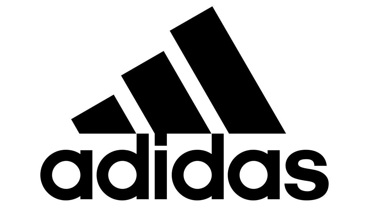
Triangular logos often signal direction, energy, and innovation. Their meaning can shift based on how they’re positioned, which makes them one of the more dynamic shape choices.
An upward-pointing triangle suggests growth, momentum, and leadership. A downward-pointing triangle is often associated with femininity and can create a softer, more balanced feel. When turned on its side, a triangle introduces a sense of motion and action.
- Meaning: Innovation, strength, movement, and power (varies by orientation)
- Impact: Creates a forward-thinking and energetic impression
- Best for: Tech companies, sports brands, creative businesses, science-focused organizations, and law firms
- Examples: Adidas, Google Play, Delta Air Lines, Mitsubishi
Horizontal lines
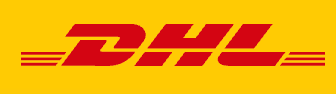
Horizontal lines create a sense of calm and stability. They mirror familiar visuals like the horizon or flat ground, which helps give your logo a grounded, steady feel.
These lines can also soften sharper design elements, adding balance to bold or angular shapes. In some cases, horizontal lines are used to suggest motion and speed, especially in industries like shipping or delivery where forward movement matters.
When used in layers, horizontal lines can add a sense of connection and flow. This creates a more cohesive look that feels balanced and approachable.
- Meaning: Stability, calm, tranquility, femininity, and movement.
- Impact: Creates a grounding influence while softening bold designs; can also convey speed and motion.
- Best for: Shipping and delivery industries, communications companies, and brands seeking tranquil imagery.
- Examples: IBM, AT&T, DHL
Vertical lines
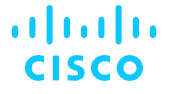
Vertical lines signal strength and structure. They draw the eye upward, which can create a sense of progress, ambition, and forward momentum.
These lines are often associated with reliability and efficiency. Think of tall buildings or strong frameworks. That visual connection helps reinforce ideas of durability and control. Vertical lines can also be layered or combined to build more complex designs while keeping a clean, organized look.
- Meaning: Strength, stability, forward-thinking, efficiency, and infinite possibility.
- Impact: Bold and aggressive; conveys durability and reliability.
- Best for: Tech companies, innovative brands, and disruptors.
- Examples: Adidas, SoundCloud, Cisco
Note: Too many vertical lines can make a brand seem domineering and overly aggressive, so use them carefully.
Spiral logos
A spiral logo represents motion, transformation, and continuous progress. These designs suggest evolution, which makes them ideal for brands that focus on change and creativity.
A spiral is an eye-catching shape that visually draws people inward, symbolizing growth and expansion. Because of this, this type of logo is common among wellness, education, and tech companies.
- Meaning: Growth, creativity, and adaptability.
- Impact: Captures the idea of motion and development.
- Best for: Creative industries, wellness brands, and tech startups.
- Examples: Debian, Whirlpool, Time Warner Cable, Ubisoft
Looped logos
A looped logo conveys continuity and connection, often symbolizing innovation and infinite possibilities.
Loops often create a flowing motion, such as the infinity symbol or interlocking circles. This design suggests flexibility and harmony, making it suitable for modern brands emphasizing networking and collaboration.
- Meaning: Fluidity, collaboration, and movement.
- Impact: Highlights seamless transitions and adaptability.
- Best for: Education platforms, tech brands, and networking companies.
- Examples: Mastercard, Audi, Chanel
Curved line logos
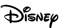
Curved lines bring a sense of movement and flexibility to a logo. Their flowing shapes feel natural and easy to follow, which helps create a more approachable and creative impression.
Unlike rigid, straight edges, curves add a human touch. They guide the eye smoothly through the design, creating a sense of rhythm and flow. Brands that want to feel dynamic, modern, and inviting often rely on curved elements to achieve that balance.
- Meaning: Fluidity, flexibility, and creativity.
- Impact: Creates a sense of movement, organic flow, and approachability.
- Best for: Creative agencies, wellness brands, service industries, and consulting firms.
- Examples: Coca-Cola (script), Disney, Virgin
Star logos
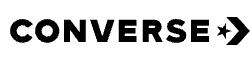
Stars are strong visual signals of achievement and aspiration. They often represent excellence, leadership, and high standards, which makes them a natural fit for brands that want to highlight quality.
This shape naturally draws attention and creates a sense of distinction. It stands out quickly and signals that something is worth noticing. Brands that use stars tap into that instant recognition to reinforce credibility and elevate their positioning.
- Meaning: Hope, guidance, inspiration, and excellence.
- Impact: Suggests achievement, quality, and premium positioning.
- Best for: Hospitality brands, entertainment companies, premium products, and award programs.
- Examples: Macy’s, Heineken, Converse, Paramount
Heart logos
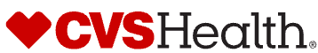
Heart logos communicate emotion and connection. They are commonly associated with care, compassion, and trust, which makes them a strong choice for brands that want to feel personal and human.
This shape creates an immediate emotional response and helps build a sense of warmth and familiarity. It signals that a brand values relationships, which can strengthen customer loyalty and trust over time.
- Meaning: Love, care, compassion, and connection
- Impact: Creates an emotional, approachable, and trustworthy impression
- Best for: Healthcare brands, nonprofits, wellness companies, and relationship-focused businesses
- Examples: CVS Health, I Love New York, American Heart Association
What logo shapes to avoid in a design
Not every shape works for every brand. Here’s what to watch out for when designing or redesigning your logo:
- Overly complex shapes: They can be hard to recognize and remember.
- Cliché symbols: Avoid overused icons and logo fonts that don’t stand out.
- Ambiguous meanings: Some shapes may have unintended interpretations.
- Shapes that don’t fit your industry: Ensure your logo shape aligns with your niche.
- Shapes that don’t scale well: Your logo should look great in all sizes, from social media icons to billboards.
- Shapes that lack balance: Asymmetrical or unstructured designs can appear disorganized.
Final tips for choosing and using shapes in your logo design
Now that you understand the different logo shapes, it’s time to implement the one that best represents your brand.
How to apply logo shape psychology in practice
Start with your brand’s core values and personality. Think about how you want people to feel when they see your logo, then choose shapes that support that impression. You can also combine shapes to create a more layered and distinctive look.
Shapes can frame your entire logo, appear within your icon, or be built into your typography. Here are a few ways to use them effectively:
Using circles:
- Highlight key elements in your design to draw focus
- Incorporate rounded forms into your typography for a connected, approachable feel
- Use a circular layout to create a sense of unity and balance
Using rectangles:
- Add structure and consistency throughout your design
- Frame your logo to reinforce stability and professionalism
Using triangles:
- Introduce subtle accents to add energy or direction
- Use angular elements in lettering for a modern, bold look
Remember, shapes work best when they feel cohesive. A strong logo has a clear visual flow, so avoid combining too many competing elements. Simple, balanced designs tend to be the most versatile and recognizable.
When shapes, colors, and fonts work together, your logo becomes a clear reflection of your brand. The right combination helps communicate your identity, build recognition, and leave a lasting impression. Keep it simple, stay intentional, and choose shapes that align with your business goals.