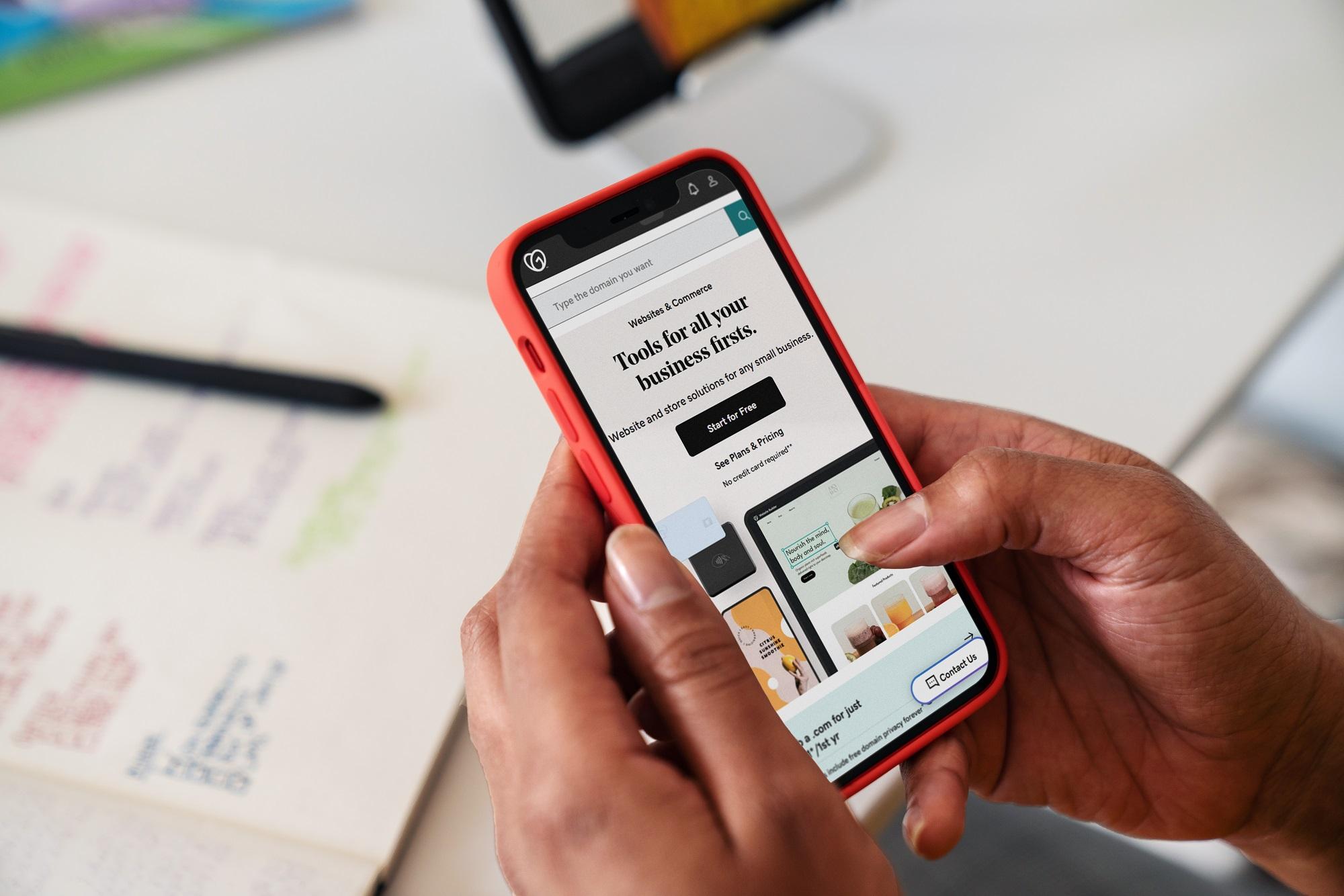
How to make WordPress sites mobile friendly

WebsitesCategory
8 min read
Art Martori

Mobile search makes up more than half of all searches on Google, and for many advertisers, most traffic comes from people on their mobile phones. That means, to make certain the WordPress sites you design are accessible to more people, you’ll need to make sure those sites are mobile-friendly.

In addition to helping you understand just what makes a website mobile friendly, we’ll also walk you through the vital steps you’ll need to take to make sure your WordPress sites are mobile-friendly.

Launch your business in minutes with GoDaddy Airo™

Why should a website be mobile friendly?

Because more people than ever search for and access content on their mobile devices, the sites you design must work well on those devices and provide information in a readable manner.

Need more convincing? Google predominantly uses the mobile version of content for indexing and ranking.

That means mobile-friendly sites show up higher in search results.

Making your WordPress sites mobile-friendly means that the content needs to be responsive and able to display well on any handheld device. Text needs to automatically transition to be large enough to read, images and graphics must be clear, navigation must be easy, and buttons must be touch-friendly.

It’s not enough to ensure your site is easy to read and navigate on mobile devices. It also has to load fast. Mobile devices have smaller processors and may often have less reliable connections than desktop computers, making load times slower.

However, mobile users just won’t wait – they expect fast and easy access to your site. Plus, Google uses site speed as a ranking factor.

Manage multiple WordPress sites in one place with The Hub by GoDaddy Pro

To ensure your sites are up-to-speed (literally), web developers can manage multiple WordPress sites and optimize them for mobile all from one place: The Hub by GoDaddy Pro. You can access all of your client accounts with a single login and check them for mobile performance. As an added benefit, you’ll get priority support, 24/7, from experienced Care Guides.

How to make WordPress sites mobile friendly in 6 steps

Ready to make your WordPress sites mobile-friendly and attractive to smartphone and handheld device visitors? Here’s what you need to do to optimize your WordPress sites for mobile.

1. Test your client’s WordPress site

You don’t know what you don’t know.

The WordPress website you design may look great on your smartphone, but that doesn’t mean it looks just as good on another device. To be sure the site you design offers style, functionality, and a quality user experience, you have to test how it looks across multiple devices.

Designers need to anticipate how it will look on different desktops, smartphones, and tablets – as well as how it looks across different browsers and operating systems. Google’s free mobile-testing tool makes it easy and free to check your WordPress sites for mobile-friendliness.

Is your page mobile friendly?

Simply enter your site’s URL. Google measures the accessibility, readability, and navigation of the site on mobile devices. You’ll get a green “pass” message or a red “fail” message along with suggestions for improvement.

It’s also a good idea to check for engagement rate. In 2021, “engagement rate” replaced “bounce rate” – the percentage of visitors who leave without interacting with your page – as a critical metric within Google Analytics.

Although, from a semantic standpoint, engagement rate is the opposite of bounce rate, the sentiment is the same.

Engagement rate measures a user’s interaction with a website, taking into consideration that the engagement lasts for more than 10 seconds, the user looks at more than one page, and takes at least one conversion-oriented action.

If mobile users have problems accessing or interacting with a site, your engagement rate will be lower. That’s a sign you need to optimize your WordPress site for mobile.

To check engagement rate, look at your Google Analytics data. Go to Insight > Reports in your WordPress dashboard. You will also be able to see how many users visit your WordPress sites from a mobile device and which devices they use.

2. Use the same content on the mobile and desktop site

Make sure that you have the same version of content for both desktop and mobile. If your mobile site has less content than your desktop site, Google’s mobile-first indexing will cause your site to lose traffic. So, make sure your mobile and desktop sites have the same structured data, metadata, and descriptive titles.

But what if your desktop site has plenty of content — yet, making that fit within the narrow confines of a mobile screen is a nightmare?

Don’t delete content. Instead, get creative by using accordions, drop downs, or tabs.

3. Implement a responsive theme

Responsive WordPress themes ensure that your WordPress content and images automatically adjust to fit the device and screen size being used. Without responsive design, your sites will not adjust to mobile devices and will deliver a poor user experience.

Always check to make sure you are using the most up-to-date version of any WordPress theme to be sure your website design will be responsive to mobile users. You can also quickly optimize your site using WordPress software plugins.

All that said, most WordPress themes are responsive. However, it’s always best to test to make sure the responsive capabilities work on your sites. It’s simple to do:

  • Open the landing page of the website you want to test.
  • Open a new tab for Google Chrome.
  • Keep the mouse pointer on the website’s landing page that you want to test and right-click.
  • From the drop-down menu, click Inspect Element. Chrome Dev Tools Window will open.
  • On Dev Tools Window locate and click the Toggle device toolbar.
  • The Device Mode’s screen emulator will open.
  • From the screen emulator, you can test responsive and device-specific viewports of the website.
Chrome Dev Tools
Image source: https://developer.chrome.com/docs/devtools/device-mode/

4. Choose mobile-friendly plugins

Plugins can help optimize WordPress sites for mobile. They also easily deliver added functionality to your sites like forms, shopping cart, buttons, and more. Check to be sure those plugins are mobile-friendly. When creating new websites, use the most updated versions of plugins to ensure mobile-friendly functionality.

The good news is that most new themes or currently updated themes are made with responsiveness in mind. However, when adding responsive functionality to older, non-responsive themes, it can limit the level of customization available.

In these instances, you may want to switch to a WordPress theme that is inherently responsive instead of using plugins to remedy the situation.

Mobile friendly plugins

5. Avoid full-screen pop-ups 

As users, we’ve come to hate pop-ups’ intrusiveness and how difficult they can be to exit. Google agrees. It penalizes intrusive mobile pop-ups that cover the main content of the page.

But as web designers, we know the value they can deliver in driving engagement when they don’t interfere with mobile navigation and content.

Avoid full-screen pop-ups to make your site mobile-friendly. If you must include them, display small ones on second pages or page bottoms or when visitors are about to leave your site. Test them to be sure they close easily on all devices.

You can also avoid pop-ups entirely. Instead, use a CTA or banner that leads to landing pages.

6. Simplify on-site graphics

Large images or too many graphics can take up valuable webpage real estate and can distract from important content messaging. Plus, graphics and images are a major cause of slow load times (and poor user experience) for your mobile web pages.

There’s plenty you can do to speed up your WordPress site – simply consult our Freelancer’s Guide to Speeding Up a Client’s WordPress Site. But if you want to simplify on-site graphics or images to increase your WordPress site’s mobile friendliness, follow these tips:

  • Use the updated version of WordPress (version 4.4 or better) and WordPress themes so that your sites will automatically serve the smallest images and graphics according to screen size and device specs.
  • Google recommends you use the same descriptive image alt text, captions, file names, and text for mobile as you use for desktop.
Data chart on a desk with a laptop

Additional tips and best practices to optimize a WordPress site for mobile

Need a few more tips to make your WordPress sites mobile-friendly and higher ranking? Try these:

  • We can’t stress the importance of this enough: Use the same metadata and headings for both the mobile and desktop version of the site.
  • Use the same structured data across both sites. Again, this ensures that mobile users have the same ease of access and quality of experience as those who access via desktop.
  • Use the same robots meta tags on your mobile and desktop site so Google will index and crawl your mobile page through mobile-first.
  • Use Google Search Console to learn how Google Search sees your desktop and mobile pages. It will even alert you to issues to fix for better optimization.
  • Use proper canonicalization and alternate link elements. These are critical to SEO improvement and mobile friendliness.

Boost your client’s traffic and rankings with a mobile-friendly WordPress site

Your clients want their websites to be accessible to as many people as possible. Make sure you design with mobile in mind. Follow our tips and you’ll be a hero with your clients by boosting their traffic and rankings with a mobile-friendly WordPress site. And The Hub by GoDaddy Pro will be your one-stop dashboard where you can easily manage and monitor site performance.

Products Used