When you’re picking the perfect look for your website or your logo, it’s easy to mix up the terms “typeface” and “font”. They’re often used like synonyms, even on some online guides, but they actually mean different things.
A typeface is the design of a set of characters (which could be letters, numbers, symbols, etc.), while a font is a specific version of that typeface with a certain size, weight, and style.
Think of a typeface like a song. A font could be its acoustic, remix, or orchestral version — the same song but in a different style.
Let’s break it down and explore how these differences matter to web developers, designers, and everyone else!
What is a typeface?
A typeface is the overall design style of a family of characters. It defines how the characters look and feel overall. For example, are the letters sharp or rounded, are they classic or futuristic, playful or serious?
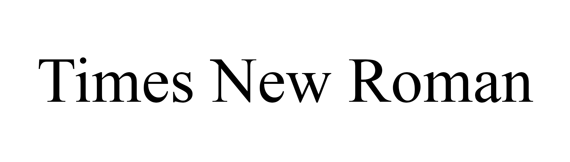
For example, Times New Roman is a typeface. It includes several variations (bold, italic, regular) but is all part of the same typeface and follows the same design DNA.
Typeface types
There are different types of styles that typefaces can fall under. The type of typeface you use will be very important from a branding perspective, helping your brand communicate its personality and stand out.
It’s important to choose a font that matches your logo. If you need help pairing a solid font with a logo, our logo maker can help.
1. Serif
Serif typefaces have small lines or “feet” at the ends of strokes. They feel traditional, formal, and trustworthy, making them great for news sites, law firms, and blogs that want to look classic.
2. Sans serif
As the name suggests, sans means “without”. These typefaces are clean and modern, without extra “flourishes” or those lines at the end of the strokes. They’re great for use online and on apps, because of their digital readability, and are also very popular in tech branding, landing pages, UI design, and more.

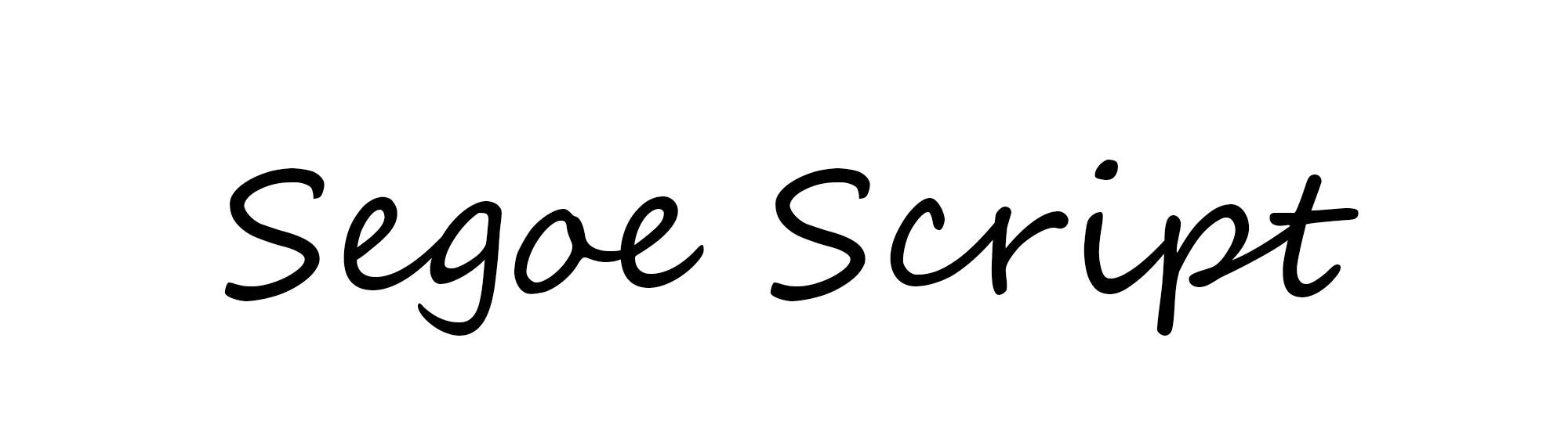
3. Script
Script typefaces mimic handwriting. They feel more elegant, personal, and creative, and you might have seen them on invitation cards, headers of websites, artisanal branding, and more. Script typefaces are also commonly seen in taglines, usually to create a sense of relatability.
Related: What is a tagline?
What is a font?
A font is a specific implementation of a typeface. Instead of the overall design of the characters, it defines their size, weight (bold/light/semibold), and style (italic/condensed).
Taking our previous Times New Roman example, while Times New Roman is a typeface, an example of a font is Times New Roman Bold 14pt. It’s part of the typeface, but styled for emphasis (thus bold) and scaled to 14pts in size.
Think of fonts as the technical execution of a typeface. When coding CSS for your website or designing an email newsletter, you often select a font, not just the typeface, with bold and larger headers, and the body text regular and smaller.
Font types
You may find some font types here. Some typefaces have even font types like semi-bold, extra-light, and thin, but most have the following three:
1. Regular
This is usually the default, no bold or italics. These are clean, simple, and perfect for long-form body text.

2. Bold
Often used for emphasis on a word or topic, and seen in headers, callouts, important words, or buttons on a website.

3. Italic
The slanted design is used similarly to bold to stand out. These are useful for quotes, subtext, soft emphasis, or stylistic flair.

Fonts can make or break your brand identity and bring consistency to your overall image. Check out our guide to logo fonts to learn more!
Typeface vs font
So, what does this all mean when you’re designing a website, a business card or a logo?
Understanding the difference helps you be intentional. Whether you’re branding your product designing a newsletter or creating a wordmark logo, understanding the difference between typefaces and fonts helps you make better branding choices.
In simple terms, a typeface is the overall consistent vision and idea of your brand (artistic, elegant, formal), and a font is the specific variation you use to suit the context (header, body, emphasis). You need to know both to create seamless and effective visual branding.
Here’s how the two compare side-by-side:
| Category | Typeface | Font |
| Definition | A typeface is the design style of a set of characters. | A font is a specific style, weight, and size of a typeface. |
| Examples | Helvetica, Times New Roman, Arial. | Helvetica Bold 12pt, Times New Roman Italic 14pt. |
| Real-world example | GoDaddy uses the “GD Sherpa” typeface for its branding. | On its website, GoDaddy uses “GD Sherpa 20pt” for body text and “GD Sherpa Bold 46pt” for headings. |
Short history of typeface vs font
The terms “typeface” and “font” originate from the early days of printing and metal typesetting, where characters were set on metal blocks to be physically imprinted on paper. Printers used a typeface to guide the overall design of the characters, while fonts were individual sets of those metal blocks for a specific size and weight of that design.
For example, Times New Roman 10pt Bold and Times New Roman 12pt Italic were distinct fonts requiring separate molds and materials.
With the rise of digital publishing and typography, we no longer need physical type. Fonts became software files (.ttf, .otf), and the lines between typeface and font began to blur. This is when many people started using the two terms interchangeably.
However, in professional design and branding contexts, the distinction still exists and matters. Knowing the distinction can help in your branding journey, whether you’re designing a website or logos, newsletters, or fliers.
Real-world examples of typeface vs font
Here are some examples of typefaces and fonts that you might recognize:
- Courier
- Typeface: Courier
- Examples of fonts: Courier Bold Italic 35pt, Courier Italic 50pt, Courier Bold 65pt
- Use: Formal documents, academic papers, resumes.
- Arial
- Typeface: Arial
- Examples of fonts: Arial Regular 35pt, Arial Bold 50pt, Arial Italic 65pt
- Use: Common in apps and emails for its simplicity and cross-platform support.
- Helvetica
- Typeface: Helvetica
- Examples of fonts: Helvetica Oblique 35pt, Helvetica Light 50pt, Helvetica Bold Oblique 65pt
- Use: Widely used in simple, clean branding design and UI/UX designs of apps and websites.
You’ll notice that even though the different fonts within the typefaces look similar, they’re different in their weights, sizes, and styles, and those fonts can be used for different purposes in documents and websites, with the larger and bold fonts used for headings, and lighter, less styled fonts for the body.
Typeface vs font – the bottom line
A typeface is the visual personality of your text, and a font is how that personality is styled and applied in context. Fonts bring a typeface to life in different situations, whether headings, body text, or labels, making your message feel clear, consistent, and on-brand.
Understanding the difference between typefaces and fonts will help you in your branding journey by positioning yourself, your website, and your products better. One defines your voice, and the other delivers it with style.