A website is made up of a lot more than a homepage and a few pages of content. Every screen, button, image, and layout choice plays a part in how people experience your site and how easy it is for them to find what they need. When those pieces work together, a site feels natural to use and easy to trust.
Let’s discuss what web design is, what it involves, the tools you can use, and when professional web design services might be the best choice.
What is web design?
Web design is the process of planning and creating the visual layout, structure, and interactive elements of a website. It brings together design choices like color, typography, imagery, and spacing with practical considerations such as navigation, responsiveness, and usability. The goal is to create a site that looks polished, functions smoothly, and makes it easy for visitors to engage with content across devices.
Web design vs. web development
Web design and web development often go hand-in-hand (and are both crucial for creating a successful online presence), but they represent completely different aspects of the website creation process.
Web design, as the name suggests, is all about the design elements of a website. It's the part of the process where a designer focuses on creating a visually appealing, user-friendly interface. Web designers use their creative flair and understanding of aesthetics to construct a website that resonates with the target audience and offers a smooth user experience.
Web development takes the beautiful designs crafted by web designers and brings them to life. Web developers use various coding languages like HTML, CSS, JavaScript, and others to build and maintain the website's structure, functionality, and overall performance.
Related: How to choose a web designer
Core principles of web design
Behind every effective website is a set of design principles working quietly in the background. These principles help bring order to a page, guide visitors where they need to go, and make content easier to understand at a glance. When applied well, they turn a collection of pages into a site that feels clear, consistent, and easy to use.
Balance
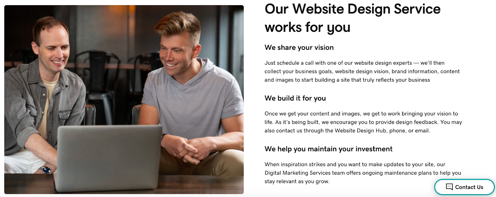
Balance refers to how visual elements are arranged so a page feels stable and intentional. A balanced design does not feel crowded or lopsided, even when it is not perfectly symmetrical. In web design, balance helps pages feel comfortable to scroll and easy to scan. Text, images, and empty space work together so no single area overwhelms the rest.
GoDaddy’s product pages, for example, often balance written content with supporting visuals to create layouts that feel structured, not rigid.
Contrast
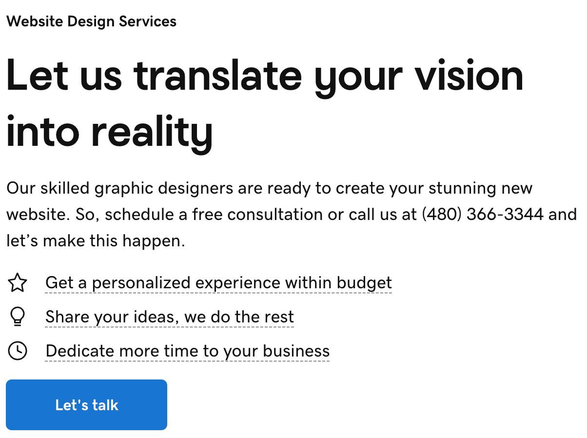
Contrast uses differences in color, size, or style to help elements stand apart. It makes important content easier to notice and easier to read. Contrast can be used to highlight headlines, buttons, and links so users instantly know where to look and what to do next. It also improves accessibility by making content clearer across devices.
GoDaddy uses strong contrast for calls to action. It helps key buttons stand out for website visitors.
Focal point
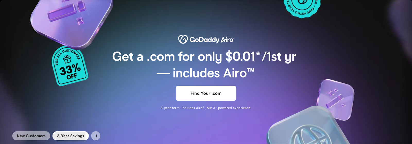
A focal point is the first thing a visitor notices when a page loads. It gives the eye a clear place to land before moving through the rest of the content. Clear focal points help communicate the main message quickly and prevent visitors from feeling unsure about where to start.
For example, GoDaddy homepages often use large headlines and simple visuals to establish a clear focal point right away.
Hierarchy
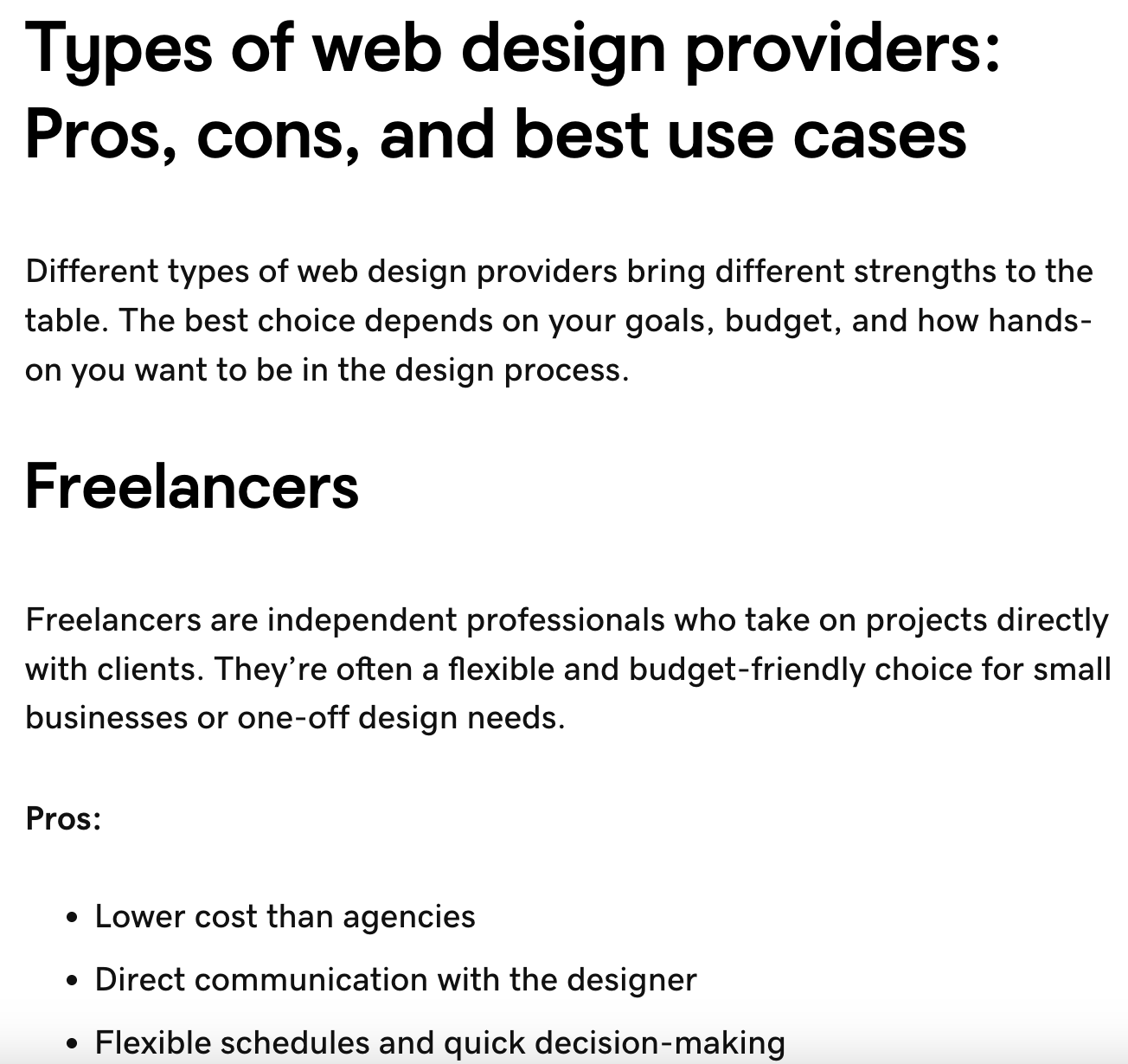
Hierarchy organizes content based on importance. It uses size, spacing, and placement to show what matters most. The goal of hierarchy in web design is to help users understand information and view it in the right order. It also makes long pages easier to navigate and helps visitors skim without missing key details.
Hierarchy principles are used across the GoDaddy website, but they’re easiest to spot in blog posts like the following:
Pattern
Pattern refers to the consistent use of layouts or elements across a site. It creates familiarity as users move from page to page. On websites, patterns reduce guesswork. When visitors recognize how a site works, they can navigate it faster and with more confidence. GoDaddy, for example, uses consistent layouts across product and resource pages to make the experience predictable and easy to follow.
Repetition
Repetition reinforces consistency by reusing colors, fonts, and design elements. It helps tie a site together visually. Repetition also strengthens branding and helps users recognize clickable elements and key sections.
Most GoDaddy product and service pages include a call-to-action (CTA) section like the one below. While they have minor differences, their visual appearance is repetitive to guide visitors.

White space
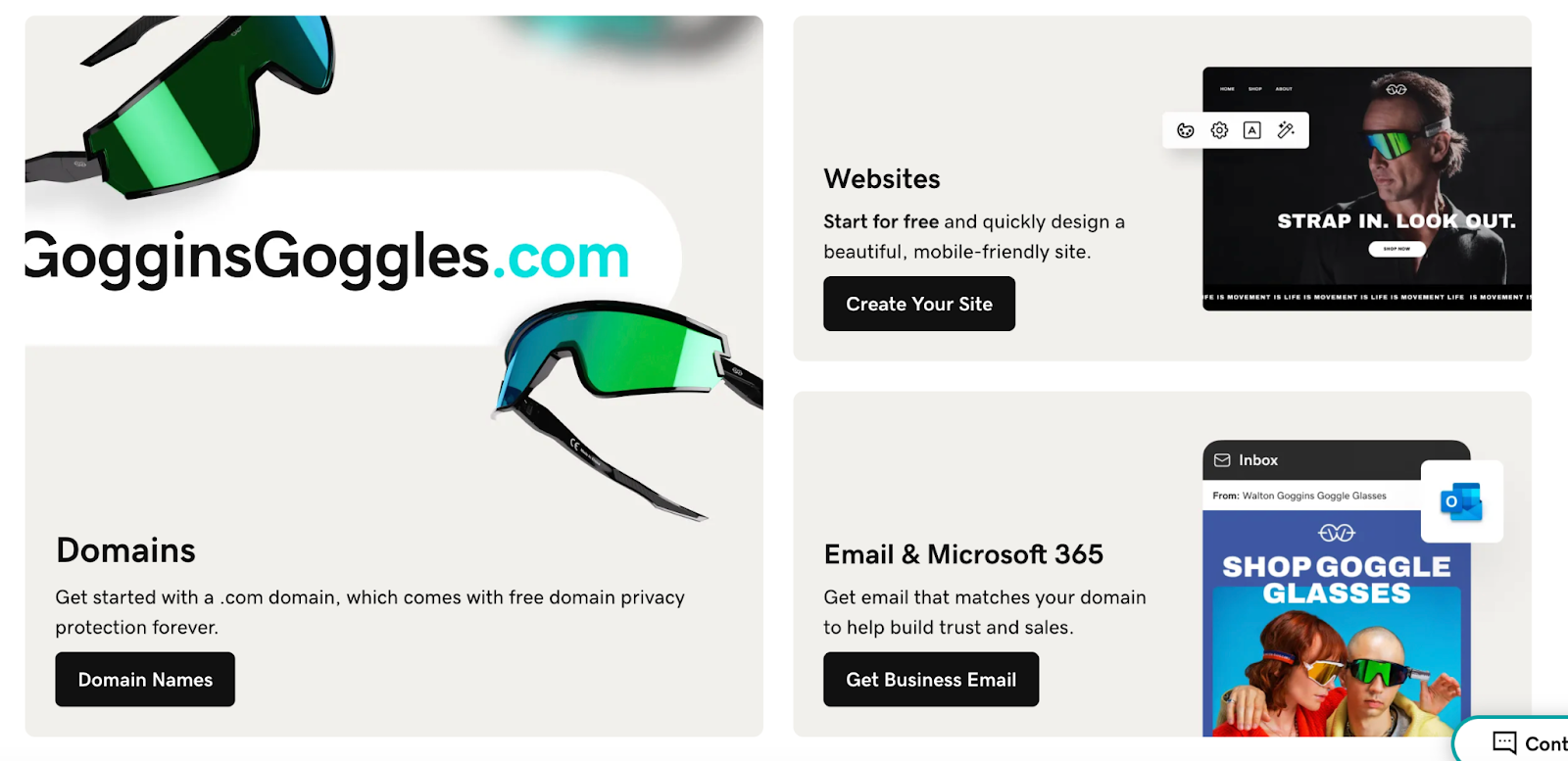
White space is the empty space between elements that helps content stand out. It keeps pages from feeling cluttered or overwhelming. White space also improves readability and makes it easier to focus on what matters most. GoDaddy’s website is a great example of using white space effectively to define sections and elements.
Movement
Movement guides the eye through a webpage naturally. It can be created through layout direction, visual cues, or subtle motion. In web design, movement helps lead visitors from one section to the next and toward key actions without distraction. On GoDaddy’s website, movement is created through headings, animated elements and videos, and text that appears as users scroll.
Unity
Unity is the sense that everything on a page belongs together. It ensures all elements support the same goal and visual style. The overarching goal of unity in web design is to craft a polished experience that feels intentional and trustworthy. If you visit pages across the GoDaddy website, you’ll see the same colors, similar elements, CTAs, and more that promote unity.
Visual elements of web design
Visual elements shape how a website looks, feels, and communicates before a visitor reads a single word. They help establish brand identity, guide attention, and make content easier to understand and interact with. When these elements are used intentionally, they support usability while reinforcing trust and credibility.
Website header and footer
The header and footer frame every page on a website and provide consistent access to essential information. Headers typically house navigation, branding, and primary actions, while footers support user experience with secondary links, contact information, and legal details.
Together, these sections create consistency and orientation. A well-designed header helps visitors understand where they are and how to move forward, while a thoughtfully built footer ensures important information is always easy to find.
Color schemes and psychology
Color influences how people perceive a brand and how they feel while interacting with a site. Different logo color combinations can communicate energy, trust, creativity, or calm, depending on how they’re used. Because of this, you may want to research logo color psychology before embarking on your web design journey.
A strong color scheme supports branding while also improving usability. It helps important elements stand out, creates visual harmony across pages, and reinforces a consistent look and feel throughout the site. Color is a crucial part of websites and branding, so many businesses opt to create AI logos or invest in logo design services.
Typography and readability
Typography plays a major role in how content is consumed. Font choice, size, spacing, and alignment all affect how easily text can be read and understood.
Effective typography creates a clear hierarchy, guiding visitors through headlines, subheadings, and body text. It balances visual personality with readability so content feels approachable on both large and small screens.
Imagery and graphics
Imagery and graphics help bring a website to life by visually supporting content. They can highlight products, explain ideas, or add personality to a brand using static or animated elements. Imagery and graphics can also be used to create balance.
When used intentionally, visuals strengthen messaging rather than distract from it. Consistent image styles and graphic treatments help create a cohesive experience across the entire site.
Animation and micro-interactions
Animation and micro-interactions add subtle movement that responds to user actions. This can include hover effects, button feedback, simple transitions between sections, and more.
These elements provide visual cues that make interactions feel more natural. However, they should be limited to improve usability and add polish without pulling focus away from the content.
Background design
Background design sets the visual tone for a page and helps frame all other elements. Colors, gradients, textures, or images in the background influence mood while supporting readability.
A well-designed background creates contrast without competing for attention. Clean and consistent background choices help sections feel organized, guide the eye through the layout, and keep the overall experience focused on the content.
Functional components of web design
While visuals make a site attractive, the functional elements ensure the website works smoothly. These are the nuts and bolts that allow users to interact with a website and access its content.
Navigation and information architecture
Navigation and information architecture determine how content is organized and accessed. Menus, links, and page groupings should feel intuitive so visitors don’t have to think too hard about where to click next.
Before building out your website, you can test the visual appeal and usability of your desired architecture using tools like website wireframes. These tools help you map out how pages connect and how users will move through them.
Page speed and performance
Page speed affects how responsive a website feels during real use. Long load times, delayed interactions, or content that shifts while loading can interrupt the experience and make a site feel unreliable.
Consistent performance allows visitors to move from page to page without disruption. This is especially noticeable on mobile devices, where slower connections and smaller screens make delays more frustrating and more likely to drive people away.
Site structure
Site structure refers to how pages are organized and connected across a website. A strong structure makes it easy for visitors to understand where they are, how sections relate to each other, and what to explore next.
When designing a website, predictability is key. Visitors can move deeper into content, return to key pages, and discover related information without feeling lost or overwhelmed.
SEO fundamentals
Search Engine Optimization (SEO) helps a website communicate clearly with search engines while still serving real people. Elements like page organization, headings, and content clarity all play a role in how easily a site can be discovered.
When these elements are considered during design, content is easier to scan for both users and search engines. This alignment helps pages perform better over time without forcing SEO into the site after it is already built.
Related: Beginner’s guide to SEO
User experience (UX)
User experience focuses on how a website feels to interact with, from the first visit to the final click. It looks at how easily people can find information, complete actions, and understand what the site is asking them to do.
Strong UX removes unnecessary friction. Pages feel straightforward, actions feel obvious, and visitors can move through the site without confusion or second-guessing.
Mobile-first considerations
Mobile-first design reflects how people actually use the web today. Most visitors arrive on a site through a phone, which means the experience needs to work well on smaller screens.
Designing with mobile in mind encourages focus. Content is prioritized, navigation stays simple, and layouts avoid unnecessary clutter. When a site works smoothly on mobile, it usually translates into a clearer, more usable experience on larger screens as well.
Responsive vs. adaptive web design
When you design a website, it needs to work well on phones, tablets, laptops, and desktops. Two common ways designers achieve that are responsive web design and adaptive web design. Both approaches help a site adjust to different screens, but they do it in different ways.
Responsive web design
Responsive web design uses a single, flexible grid layout (known as breakpoints) that adjusts itself based on the size of the screen. Flexible grids and images change proportionally as the screen grows or shrinks, so content remains readable and usable no matter the device. This approach relies on CSS rules called media queries, which tell the site how to rearrange or scale content for different screen widths.
In 2025, about 64% of global web traffic came from mobile devices, meaning most visitors will be on phones or tablets. Responsive design makes it easier to deliver a smooth experience for the majority without creating separate versions of the site.
Another advantage of responsive design is efficiency. You maintain one set of code and one set of content, so updates are faster and less prone to error. For many businesses and informational sites, responsive design offers strong performance with less ongoing effort.
Adaptive web design
Adaptive web design takes a more targeted approach. Instead of one fluid layout, it uses several distinct layouts created for specific screen sizes. When someone visits the site, the server detects the device type and shows the layout that fits best.
This approach can offer performance benefits because each layout is built for a specific range of devices. Content and elements can be tailored to those environments, potentially improving load times and the overall experience for common screen sizes. Adaptive design is often used on sites with complex interfaces or custom functionality where a tailored experience matters.
The trade-off is complexity. You need to design and maintain multiple layouts instead of one, which can increase development time and ongoing maintenance.
Accessibility in web design
When discussing web design, accessibility cannot be overlooked. Web accessibility means creating websites that are usable by as many users as possible. This includes not only considerations for devices and internet speed, but also those for people with disabilities. Web accessibility is legally required for many websites, so always research guidelines before launching your site.
Why accessibility matters
We live in a digital-first world in which the internet isn’t a luxury, but a necessity. From shopping and banking to education and healthcare, many of our important daily activities have shifted online. When a website is difficult to use, it creates real barriers for people trying to complete basic tasks.
Accessibility also ensures websites can be used by people with a wide range of abilities, including those who rely on screen readers, keyboard navigation, captions, or other assistive technologies. According to the World Health Organization, more than 1 billion people worldwide live with some form of disability, making accessibility vital.
One of the best parts of accessible web design is that it benefits everyone who visits your site. Clear navigation, readable text, strong contrast, and thoughtful structure make sites easier to use across devices and environments. A site built with accessibility in mind tends to be more usable, more inclusive, and more resilient as technology and user needs continue to evolve.
WCAG guidelines overview
The Web Content Accessibility Guidelines (WCAG) are a shared standard for making websites more accessible. Created by the World Wide Web Consortium, these guidelines focus on four core principles: content should be perceivable, operable, understandable, and robust.
WCAG helps designers and developers think through accessibility in practical ways, such as how content is presented, how users interact with a site, and how assistive technologies interpret information. While the guidelines can feel technical, they offer a clear framework for building websites that work for a wider range of people.
Common accessibility features
Many accessibility improvements come down to design and development choices. Legal requirements vary by website, but the features below help remove common barriers and improve usability for a broad audience.
- Alt text for images that describes visual content for screen reader users
- Keyboard navigation so all interactive elements can be accessed without a mouse
- Color contrast ratios that make text readable for users with low vision or color blindness
- Screen reader compatibility through clean structure, semantic HTML, and clear labels
- Captions for videos to support users who are deaf or hard of hearing and those watching without sound
Testing for accessibility
Accessibility should be tested throughout the design and development process, not treated as a final step. Tools like WAVE can help identify issues like missing alt text or low color contrast, but they only catch part of the picture.
Manual testing plays an important role as well. Reviewing a site with keyboard-only navigation or using a screen reader helps uncover real-world usability challenges that tools may miss. Regular testing makes accessibility improvements easier to manage over time.
Legal compliance requirements
Accessibility is also tied to legal responsibility for many organizations. In the United States, the Americans with Disabilities Act is often applied to websites, particularly those of businesses and services open to the public.
Requirements can vary depending on location and industry, but WCAG is commonly used as the standard for determining whether a site meets accessibility expectations. Designing with accessibility in mind from the beginning helps reduce legal risk and shows a clear commitment to equal access for all users.
Essential web design tools
Web design may seem daunting, but with the right tools at your disposal, you can create a stunning and accessible website of your own. Here are some of the top web design tools for 2026.
Related: Best productivity apps
GoDaddy Website Builder
GoDaddy’s Website Builder is an all-in-one tool that lets you build a professional website without needing any technical skills. Its drag-and-drop interface makes it a breeze to design your website, while a wide range of templates lets you customize to your heart's content.
GoDaddy Logo Maker
GoDaddy’s Logo Maker helps you create a logo that fits your brand without needing design experience. The tool guides you through simple prompts and generates logo options based on your style and industry. Once a logo is created, it can be easily adjusted and applied across your website and other brand assets. This makes it easier to maintain a consistent visual identity as your site grows.
Adobe XD
Adobe XD is a design and prototyping tool built for creating user-focused website layouts. It allows designers to build wireframes, design screens, and create interactive prototypes that show how a site will function. The tool is especially useful for planning user flows and testing ideas before development begins.
Figma
Figma is a cloud-based web design tool that enables real-time collaboration. This makes it excellent for teams, as multiple people can work on the same design simultaneously. Figma also has robust design features, like vector editing and prototyping.
Adobe Illustrator
Adobe Illustrator is a vector-based design tool often used for creating graphics that need to scale cleanly. This includes logos, icons, and custom illustrations used across websites. Designs created in Illustrator can be exported for use in web layouts while maintaining clarity at any size.
Sketch
Sketch is a web design toolkit specifically designed for macOS. It's perfect for creating interfaces, websites, and icons. Sketch offers precision and flexibility, with features like Symbols and Shared Styles that make reusing elements quick and easy.
Benefits of professional web design
Professional web design—whether done yourself or through design services—brings together strategy, usability, and technical expertise to create a site that supports real business goals. From improving credibility to ensuring a smooth experience across devices, professional design helps a website perform better and adapt as your needs grow.
Improved search engine rankings
Google loves websites that provide an excellent user experience. That means a well-designed website, with a clear structure and quality content, can help improve your site's ranking on search engine result pages (SERPs). This boosts your visibility and can attract more organic traffic.
Enhanced brand credibility
A clean, well-designed site helps establish trust and shows visitors that your business is professional and reliable. Consistent branding, clear messaging, and intuitive design choices make it easier for users to feel confident in your business. When a site looks credible, visitors are more likely to stay, engage, and take the next step.
Reduced bounce rates
Ever visited a website only to be met with a cluttered layout and confusing navigation? That's a one-way ticket off the website. Professional web design keeps users engaged and encourages them to explore your site further, thus minimizing bounce rates.
Higher conversion rates
A site that's easy to navigate, quick to load, and pleasing to the eye can keep visitors longer and lead them down the path to conversion, whether that's making a purchase, signing up for a newsletter, or contacting your team.
Better user experience
Ultimately, good web design is about providing a seamless, enjoyable user experience. When visitors can find what they're looking for without frustration, they're more likely to view your brand positively and return to your site.
Competitive advantage
A professionally designed website can help you stand out in a crowded market. When visitors compare multiple options, a site that is easy to use and visually polished can leave a stronger impression than one that feels outdated or difficult to navigate. Clear layouts and thoughtful structure help communicate your value without forcing users to work to understand it.
Long-term cost savings
Investing in professional web design can save time and money over the long run. A well-built site is easier to maintain, update, and expand as your business grows. It also reduces the need for frequent fixes or redesigns. When a site is designed to be scalable, future changes tend to be simpler and more cost-effective.
Start designing your website today
Web design is an ongoing process that evolves alongside technology, user expectations, and your business goals. As you move forward, it helps to stay aware of how design continues to change. If you want some help, try GoDaddy’s web design services.
Frequently asked questions
What is meant by web design?
Web design refers to the process of planning, conceptualizing, and arranging content intended for the Internet. It involves website structure, user interface, navigation ergonomics, layout, colors, contrasts, fonts, and imagery. These are combined with design principles to create a website that meets the goals of the owner and designer.
What is the purpose of a web designer?
A web designer is a professional who creates and designs websites. They focus on layout, aesthetic elements, and user interface. They use various design programs to create functional, attractive websites that enhance user experience. Their work can involve graphic design, coding, and basic SEO best practices.
Is web design still needed in 2026?
Yes, web design is still needed in 2026. As the digital face of a business or brand, a well-designed website can increase visibility, improve user experience, and drive business growth. It also supports search engine optimization (SEO) strategies, making it integral to online success.
Do I need coding skills for web design?
Coding skills are not always required for web design. Many modern website builders and design tools let you create layouts, add content, and customize your site using visual editors rather than code. That said, having a basic understanding of HTML and CSS can be helpful if you want more control or customization.
What's the difference between UX and web design?
Web design focuses on the visual layout and structure of a website, including elements like color, typography, imagery, and overall presentation. It determines how a site looks and how content is organized on the page. User experience, or UX, focuses on how a site feels to use. It looks at how easily visitors can navigate, find information, and complete actions.


