Digital design continues to push boundaries, blending emerging technology with bold creative expression. Designers are rethinking how people experience the web, focusing on visuals that feel immersive and memorable. Because of this trend, this year’s design directions reflect a shift toward more human-centered digital experiences.
Below, we’ll break down the key ideas influencing how digital platforms look, feel, and function in 2026.
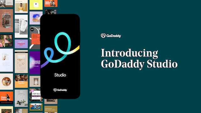
Launch your business in minutes with GoDaddy Airo®
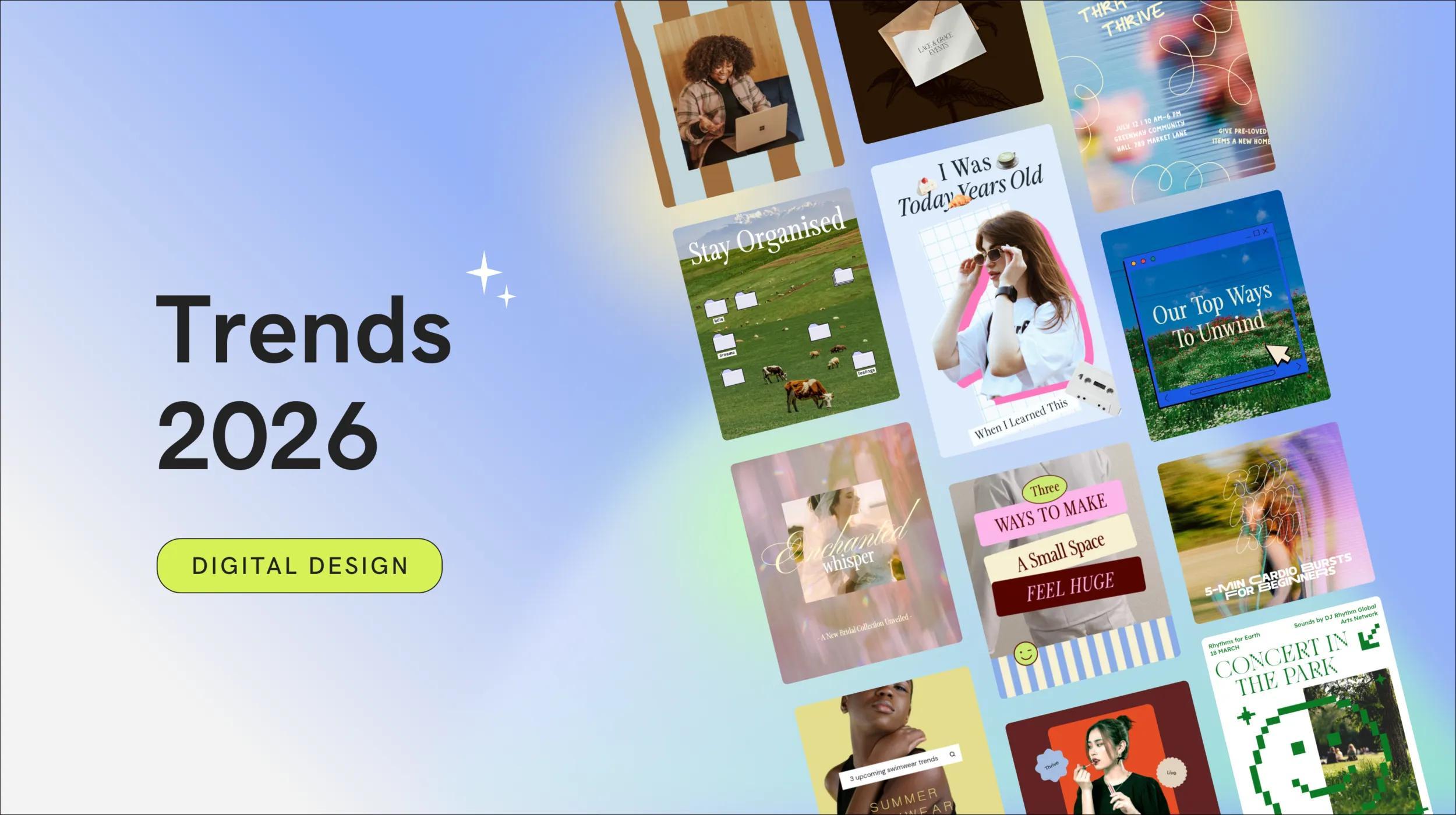
Digital design trends for 2026
With the dawn of each new year, we are introduced to a fresh wave of creative trends that set the tone for digital innovation, and 2026 is no different. Our Studio team here at GoDaddy has been working hard to research and discover the trends leading the way this year. So, let's check out the results of their research into the future of digital design trends for 2026.
- Diffused Worlds
- Newstalgia
- Neo-Nostalgic Patterns
- Scroll Stopping Scrapbook
- Ethereal Reverie
- Power of Gaia
- Retro Luxe Rebellion
- The Pixel Effect
- Playful Classicism
- Socie(tea)
- Butter Yellow
1. Diffused Worlds
Diffused Worlds embraces softness, space, and atmosphere as a response to overstimulating digital environments. Visuals feel fluid and immersive, using blur, refraction, and subtle distortion to suggest motion without demanding attention.
Open layouts and restrained typography give designs room to breathe, encouraging viewers to slow down and engage more intentionally.
This digital design trend resonates strongly across fashion, beauty, wellness, media, and automotive brands, where emotion and mood play a critical role. Instead of loud visuals competing for clicks, Diffused Worlds creates an editorial, almost meditative experience that feels modern, expressive, and quietly futuristic.
Key characteristics
- Blurred, refracted, or glass-like imagery
- Spacious compositions with minimal clutter
- Subtle motion cues that feel atmospheric
- Clean typography that supports visual storytelling
2. Newstalgia
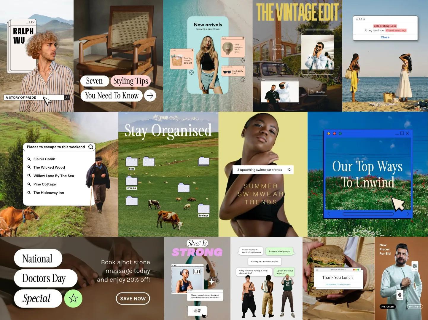
Newstalgia blends the warmth of early digital culture with contemporary design sensibilities. Familiar interface elements like pop-ups, folders, and chat bubbles are repurposed as visual storytelling tools, layered over candid photography and analog textures.
The result feels personal, tactile, and intentionally imperfect.
This approach appeals to fashion, beauty, food and drink, fitness, and creative brands looking to build emotional connections with Gen Z and Millennial audiences. It revisits early internet aesthetics and pre-smartphone nostalgia to make digital experiences feel more human, conversational, and approachable.
Key characteristics
- Interface elements used as decorative layers
- Film grain, paper textures, and collage layouts
- Casual microcopy with a conversational tone
- Retro-inspired fonts and iconography
3. Neo-Nostalgic Patterns
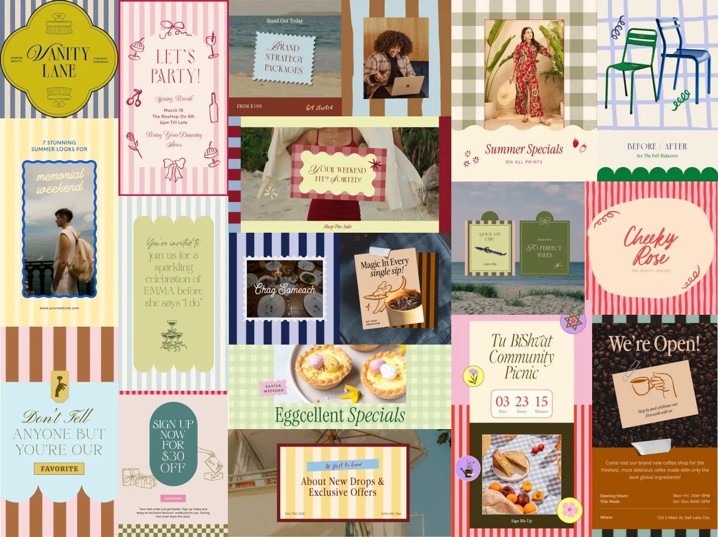
Neo-Nostalgic Patterns channel the optimism and leisure of past decades through bold repetition and playful color. Stripes, checks, and graphic motifs create rhythm and movement, while bright pastels and coastal tones evoke carefree summer memories.
Popular across fashion, hospitality, food and drink, travel, and home decor, Neo-Nostalgic Patterns offer a joyful escape rooted in familiarity. The patterns feel expressive without overwhelming the layout, making them ideal for brands that want energy, warmth, and visual personality.
Key characteristics
- Repeating stripes, grids, and graphic motifs
- Bright, pastel, or sun-washed color palettes
- Decorative illustrations and whimsical details
- Typography ranging from playful to retro-inspired
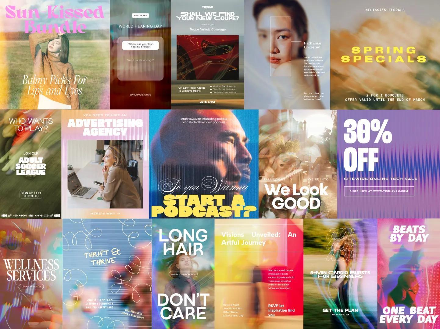
4. Scroll Stopping Scrapbook
Scroll Stopping Scrapbook brings the tactile charm of traditional scrapbooking into digital storytelling. Layered photos, handwritten notes, stickers, and textures combine to form rich visual narratives that unfold as users explore the page.
This trend works especially well for fashion, retail, music, marketing, and food brands competing in discovery-driven spaces like social media and search. Instead of relying on a single image, Scroll Stopping Scrapbook uses micro-moments and layered storytelling to draw viewers in and hold attention.
Key characteristics
- Mixed media layering and collage-style layouts
- Paper textures, tape effects, and cut-out imagery
- Emotion-driven storytelling and candid photography
- Flexible compositions that feel curated yet personal
5. Ethereal Reverie
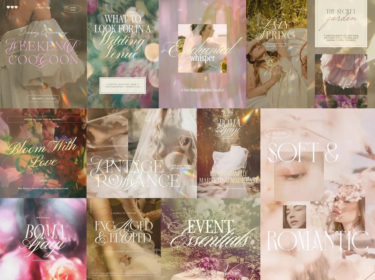
Ethereal Reverie leans into softness, romance, and a slower visual pace. Gentle lighting, floral elements, and muted tones create dreamlike compositions that feel poetic and emotionally rich. Typography often mirrors this softness through elegant serifs and flowing letterforms.
Ethereal Reverie offers a counterbalance to hyper-polished visuals, favoring intimacy, nostalgia, and quiet elegance. This design approach appears frequently in beauty, photography, events, retail, and lifestyle branding, where mood and storytelling take precedence.
Key characteristics
- Soft-focus imagery with subtle grain or blur
- Nature-inspired palettes and floral motifs
- Elegant serif or calligraphic typography
- Cinematic lighting and romantic composition
6. Power of Gaia
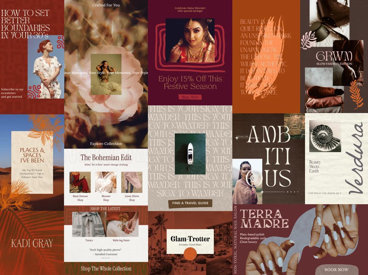
Power of Gaia draws inspiration from the earth, mythology, and ancestral symbolism. Rich textures and warm, grounded colors evoke ritual, femininity, and a deep connection to nature. Visuals feel tactile and organic, often embracing imperfections rather than polishing them away.
This design resonates across fashion, beauty, food and drink, travel, and personal brands that value sustainability and storytelling. Power of Gaia communicates strength through grounded visuals, creating designs that feel rooted, intentional, and timeless.
Key characteristics
- Botanical and geological motifs
- Deep browns, ochres, and clay-inspired hues
- Heavy textures and natural finishes
- Handcrafted or display-style typography
7. Retro Luxe Rebellion
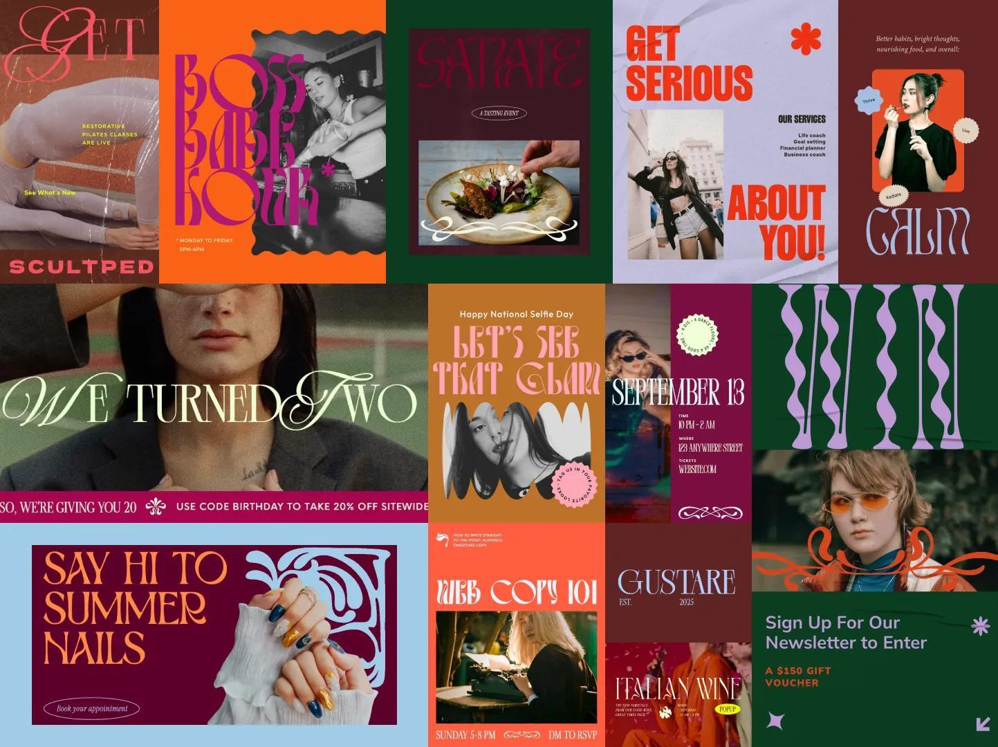
Retro Luxe Rebellion blends vintage glamour with bold self-expression. Plush typography, saturated colors, and editorial imagery create designs that feel indulgent and confident. The look celebrates personality and individuality while maintaining a sense of sophistication.
Seen often in retail, wellness, lifestyle, food and drink, and marketing campaigns, it moves away from sterile minimalism. Retro Luxe Rebellion invites brands to make a statement through warmth, confidence, and expressive visual storytelling.
Key characteristics
- Curved serifs and statement typography
- Rich, saturated color palettes
- Confident portraiture and bold compositions
- Vintage references with a modern edge
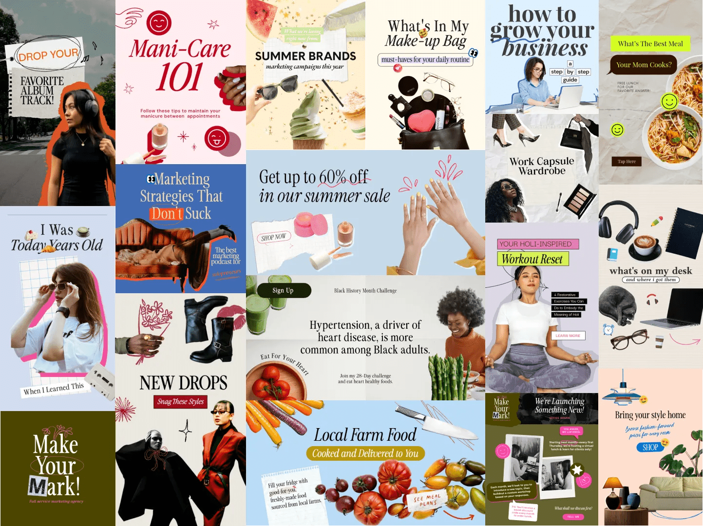
8. The Pixel Effect
The Pixel Effect reimagines early digital aesthetics through a contemporary lens. Pixelation, glitches, and blocky forms are used as intentional graphic elements to transform low-resolution visuals into bold design statements.
This digital design trend distorts familiar imagery, sparking curiosity and encouraging viewers to pause and take a closer look. It is especially effective for fashion, music, sports, fitness, and food brands seeking high-impact visuals in crowded feeds.
Key characteristics
- Pixel-based textures and digital distortions
- High-contrast, saturated color palettes
- Bitmap and pixel-inspired typography
- Experimental, attention-grabbing layouts
9. Playful Classicism
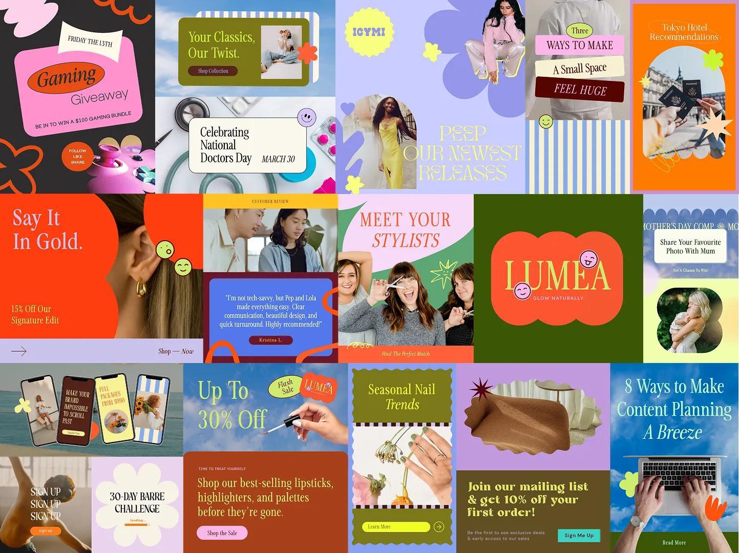
Playful Classicism balances refined structure with lighthearted charm. Classic layouts and traditional typography are softened with pastel colors, rounded shapes, and whimsical accents that make designs feel warm and approachable.
It bridges timeless design principles with modern friendliness and ease. Playful Classicism works well for marketing, media, beauty, food and drink, and creative brands that want to feel polished without appearing rigid.
Key characteristics
- Clean, structured layouts
- Soft pastel or light color palettes
- Rounded frames and playful shapes
- Subtle doodles and decorative accents
10. Socie(tea)
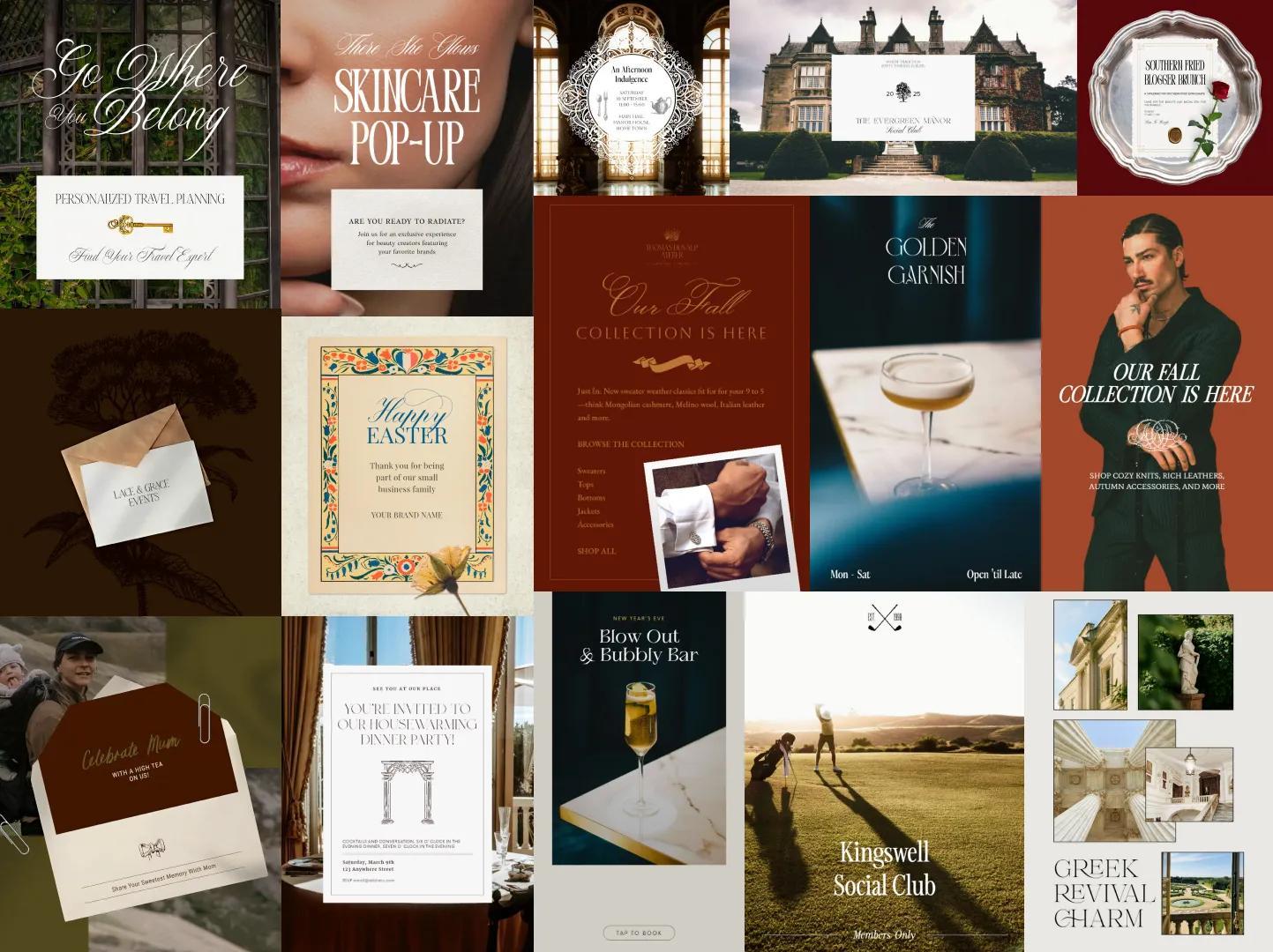
Socie(tea) evokes understated luxury through restraint and detail. Inspired by private clubs, stamped stationery, and imagined rituals, the visual language relies on texture, typography, and atmosphere rather than overt branding.
Frequently seen in fashion, beauty, travel, and premium food and drink brands, Socie(tea) signals exclusivity through subtle cues. It creates a sense of belonging and refinement without excess.
Key characteristics
- Refined serif and script typography
- Muted, low-contrast color schemes
- Delicate decorative flourishes
- Paper, linen, and textile-inspired textures
11. Butter Yellow
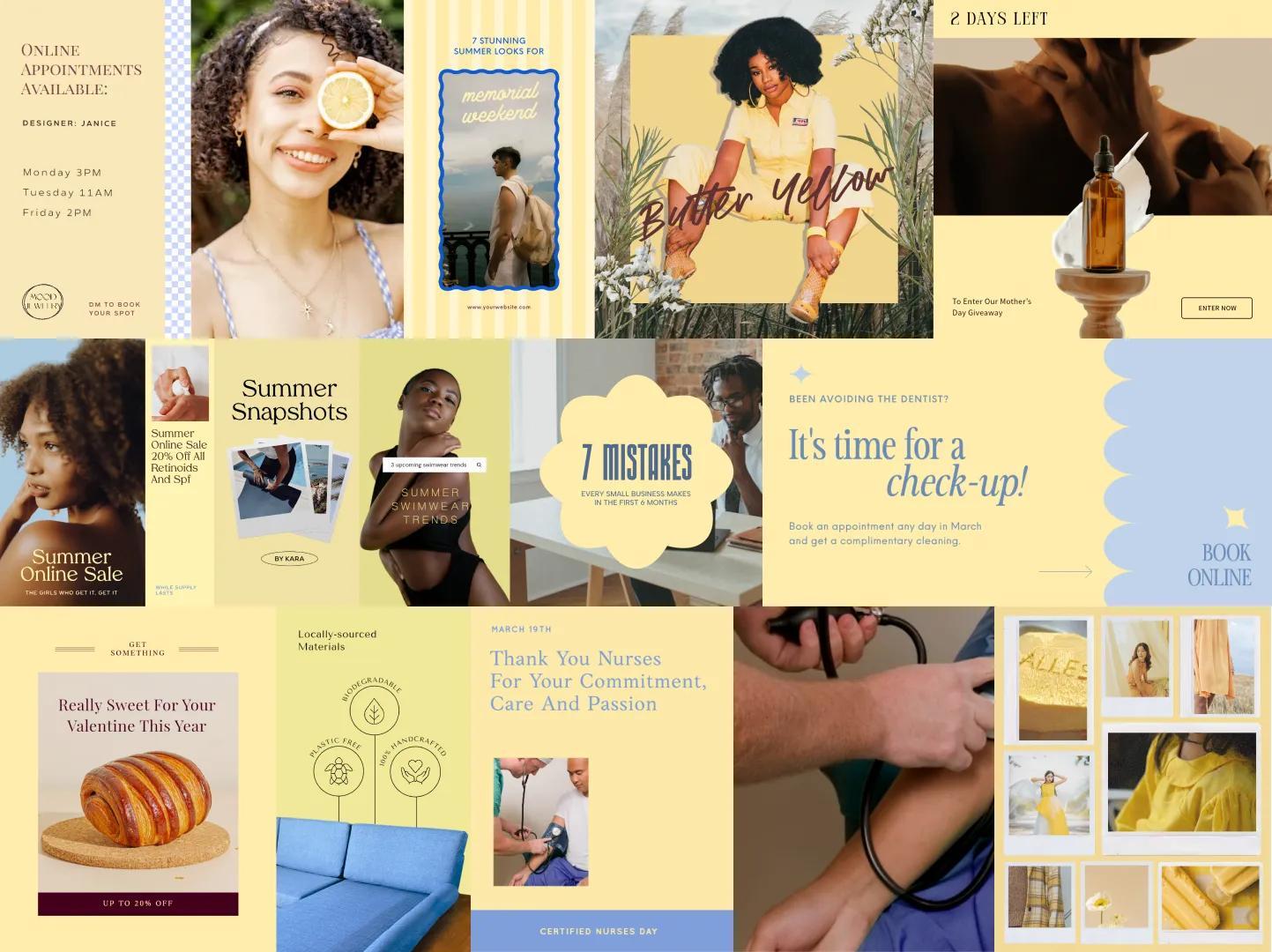
Butter Yellow introduces warmth and optimism through color-led design. This soft, creamy yellow feels nostalgic yet current, bringing lightness and comfort to digital experiences. Paired with cool pastels or neutral tones, it creates an inviting visual balance.
Popular across fashion, beauty, hospitality, fitness, and home decor, Butter Yellow supports brands that want to feel friendly and approachable. The color adds personality without overpowering the layout, making it versatile across platforms.
Key characteristics
- Soft yellow used as a primary or accent color
- Light, airy supporting color palettes
- Natural, candid photography
- Clean layouts with an inviting tone
The future is now
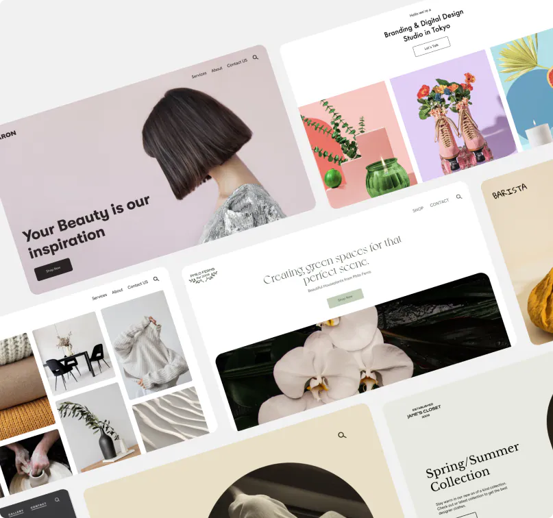
The most impactful websites in 2026 are intentional, expressive, and built with real people in mind. These design trends show how digital design can attract attention and strengthen brand identity across every touchpoint.
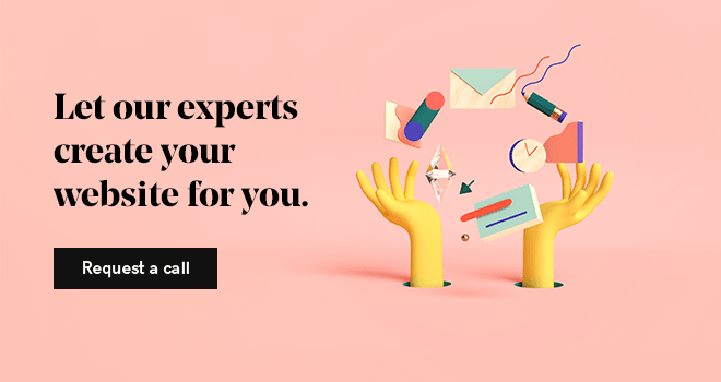
Turning inspiration into a functional, high-performing website takes more than a great idea, though. GoDaddy’s web design services help bring these trends to life with expertly crafted sites built for performance and growth.
Storme Conradie (Trends Lead, Writer), Stacey Hartman, and the GoDaddy Trends Squad contributed to this post.