Fact: About one in seven people is considered neurodivergent — meaning they may think and learn in different ways than others typically do. That’s a lot of people. And that’s why exploring ways to make your website content more inclusive for neurodivergent users is not only the right thing to do — it’s the smart thing to do for your business.
Unfortunately, many businesses don’t offer inclusive website design to their users. This miss excludes neurodivergent users from accessing certain digital brands or services (or using them to their full advantage) and alienates businesses from countless potentially loyal, engaged customers.
In this digital age, making your website content more inclusive should be up there on your priority list. But if you’re unsure how to make your website design, layout or messaging more accessible, don’t worry — we’re going to walk you through some practical tips.
But first …
Why making your website content more inclusive for neurodivergent users counts
Before we start exploring how to create or design website content for neurodivergent users, let’s consider why doing so is important. Primarily:
Inclusion should exist in every facet of our society. Everyone should have access to opportunities, activities and services.
We live in a hyper-connected digital age with unlimited access to information, communication touchpoints, and shopping opportunities. But, without considering the needs of all, many people can only access a fragment of what the web has to offer.
As a modern brand, placing value in inclusion will ensure as many people as possible can interact with your business and, ultimately, benefit from what you have to offer.
By making your website more accessible, you play a part in making the internet as a whole more accessible for all users. Plus, a more inclusive website can accelerate your business’s growth and build your brand reputation in the process. It’s a triple win.
7 ways to make your website more inclusive for neurodivergent users
To ensure that your website is truly inclusive, check out these ideas that will help neurodivergent users interact with your business while maintaining your core brand identity across the board.
1. Use simple and cohesive colors on the page.
2. Write your content in plain, simple language.
3. Format your text into digestible and scannable chunks.
4. Use practical graphics or imagery to support your text.
5. Make your call-to-action (CTA) buttons descriptive.
6. Produce your content in additional formats.
7. Use ADA compliance and WCAG guidelines to your advantage.
Let’s kick things off by looking at colors for accessible web design.
1. Use simple and cohesive colors on-page
Neurodivergent people experience the world in a different way than neurotypical people (those whose brain functions are considered “standard”). This means that certain colors, layouts, functions, images or messaging might not make sense to a neurodivergent user — some design elements might also cause distress.
Many neurodivergent users struggle to digest or process colors that are too bright or too contrasting.
So, when you’re designing your website, it’s important to choose subtle colors that blend well rather than display too much contrast as this can prove jarring.
- Consider single-hue colors or pastel tones on a regular white background.
- Choose a maximum of three colors and ensure they are used consistently.
For example, assign one color to headings, one to anchor or link text, and one to call-to-action buttons to enhance the neurodivergent user experience (UX).
Related: How to choose brand colors and use them on your website
2. Write your website copy in plain, simple language
Another important way to make your website content more inclusive is to write the copy (aka the words, or text, on the page) in plain, simple language.
It’s essential that you're direct, literal, and get straight to the point.
Overusing obscure phrasing, idioms or adverbs is likely to confuse a neurodivergent user and make your messaging redundant. And, when that happens, people will look elsewhere for their products or services.
To ensure your website copy is as accessible as possible:
- Try to write your sentences or points in as few words as possible. Cut away any unnecessary words or phrases.
- Write in short, snappy sentences.
- Use the active tense rather than the passive tense.
- Make sure your messaging follows a logical format as if you are telling a story.
Pro tip: Online tools like Readable and Hemingway will help you edit your content and make it more accessible to neurodivergent users.
Related: Copywriting tips for your small business
3. Format your text into digestible and scannable chunks
In addition to making sure that your copy is digestible, your formatting should also help neurodivergent users navigate your web pages with ease.
Before you start formatting your content, it’s worth noting that using too much underlined, CAPITALIZED or italic text can make it difficult for neurodivergent people — particularly dyslexic users — to understand your messaging. Instead:
- Use bolded text sparingly to help guide users toward key parts of your messaging.
- Use bulleted or numbered lists to make your content more accessible.
- Break up big blocks of copy (in other words, include more whitespace).
The goal is to make it easier for neurodivergent users to scan your copy and navigate their way through the page.

As you can see from the above example, Zendesk’s subtle use of pastel colors, logical formatting, and concise content makes it as easy as possible for neurodivergent users to digest the on-page design.
Here the buttons tell the user exactly what to do or expect and the language is crystal clear. The text is also broken up into easy-to-read chunks rather than squashed together in one large wall of text.
4. Use practical graphics or imagery to support your text
Like the colors and words on your websites, you’ll want to keep a few accessibility guidelines in mind when using images on your web pages.
- Use clear and clutter-free images or graphics that offer a literal representation of what you’re selling or offering.
- When you’re choosing or editing your images, follow the same rules of color as the rest of the page (nothing too confusing, contrasting or bright).
- Choose images with only one or two points of focus.
You should also use images to support your written messaging wherever possible as long as your page follows a logical pattern (for example, a small block of text, an image, and a button) and doesn’t overcrowd the page.
Simple, consistent and clutter-free designs are the most effective for neurodivergent users.
Here’s an example:

Airbnb’s homepage is a solid example of clean, accessible web design with clean imagery that directly supports the messaging (in this case, user reviews) and makes it easy for users to not only navigate the page, but make an informed choice when picking the right kind of accommodation.
Related: How to optimize images for the web
5. Make your call-to-action (CTA) buttons descriptive
We’ve mentioned CTA buttons a few times already because they play an essential role in telling users what they can do or where they can go next on your website.
If your CTA button text is clunky or uses awkward phrasing, neurodivergent users will find accessing the next stage in their web journey especially difficult. To smooth the way:
- Be clear and concise.
- Tell your users exactly why they should click through.
- Choose one subtle background color for the CTA button.
Here’s an example of an inaccessible CTA button copy:
<Click Here For More>
This text is clunky, uses too many words, and in this case, the word ‘more’ offers little context on what to expect.
Here’s an example accessible CTA button copy:
<Shop for Shoes>
This text is clear, concise, and tells the user exactly why they should click through and what to expect next — which is incredibly important for neurodivergent users.
Another important thing to consider when designing your CTA buttons is how they stand out on the page. While they shouldn’t be too bright or overbearing, your buttons should be clearly defined. Here’s a good example from the GoDaddy homepage:
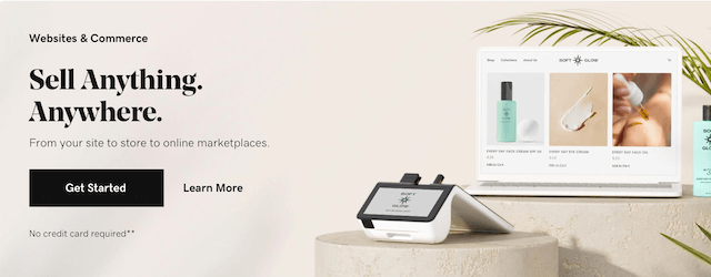
The color scheme is consistent, the messaging is direct, and you can view these buttons with a glance.
6. Produce your content in additional formats
When finding ways to make website content more inclusive for neurodivergent users, it’s essential to look at additional content formats.
Using additional formats will give neurodivergent users more choice in how they interact with your website and consume your content.
Equipping your website with different accessibility options will also enhance the browsing experience for people with hearing or visual impairments.
Here are some additional content formats to consider:
- Descriptive subtitles for any video content.
- Additional microcopy (the additional text you see when hovering over different design elements with your cursor) text.
- Audio reader functionality that narrates your copy to users when they’re browsing your page.
- Website customization bars that allow users to change brightness, text size or color schemes while on the page.
Working with additional formats will give your users plenty of options as well as control over how they consume your content, building trust and inspiring customer loyalty in the process.
Pro tip: Always add alt text (descriptions that sit in the background) to your images as this will allow audio readers to describe the images to your users.
Related: What is a meta description?
7. Use ADA compliance and WCAG guidelines to your advantage
ADA stands for Americans with Disabilities Act and sets out guidelines designed to prohibit discrimination. The ADA’s main principles include Web Content Accessibility Guidelines (WCAG).
The Web Content Accessibility Guidelines are as follows:
Perceivable: If someone can’t see, they can read written content with a screen reader. Audio content should include captions for those who can’t hear or find it difficult to process audio information.
Operable: If a user can’t use a mouse or touchpad, they can navigate a web page with a keyboard or by using voice commands.
Understandable: If users click on a navigation menu or a form, it should behave in a way that’s predictable and expected.
Robust: The website or product is compatible with existing assistive technology and can accommodate new or future versions.
By using these core principles as working guidelines, you will ensure every aspect of your web design is accessible to neurodivergent users.
Key takeaways
Let’s recap why website accessibility matters and ways to make your website content more inclusive for neurodivergent users.
- Making your website design accessible is a social responsibility.
- Improving your web design will help you engage a wider and more highly-engaged audience.
- When you’re designing your website content, you should use consistent and simple layouts as well as subtle tones and colors.
- Your website language should be literal, clear, consistent and well-formatted. This includes CTA buttons.
- Imagery and visuals should support your messaging or statements and should not be too cluttered.
- Offer additional ways to consume or interact with your website content.
Related: The basics of accessible web design
Next steps
"Diversity: the art of thinking independently together." ~ Malcolm Forbes
With a consistent set of reasonable adjustments, you can make your website more accessible to neurodivergent users.
Take the time to work through these design tips and principles to open up your business to a wider audience. Tackle each page one by one, and ask neurodivergent users to test your website journey. With enough thought, consistency and a methodical approach, you will have a more dynamic, more inclusive website in no time.


