Today, over half of all internet usage comes from mobile devices. If you’re not optimizing your store to cater to multiple screen sizes, you’re going to miss out on a large segment of your target audience. That's why we have this WooCommerce mobile optimization guide.
What are the challenges of creating a great mobile experience?
In this guide, we will examine how to optimize your WooCommerce store to create a fast and user-friendly mobile experience.
Save money selling products, your way
Our Managed Hosting for WooCommerce includes more than $5,000 in free premium WooCommerce extensions, empowering you to sellproducts, your way, with additional customization.
Specialized store extensions can cost hundreds, even thousands of dollars per year once you get them all added to your store.
But with our Managed Hosting for WooCommerce, you can build the exact store you needed to sell subscriptions, book appointments, enable digital downloads and much, much more — with free access to more than $5,000 in premium WooCommerce extensions.
Performance issues
Mobile sites tend to load slower than desktop sites. Desktop computers have more powerful processors and usually have a better connection. Plus, mobile and desktop browsers work differently, the latter being better equipped to handle pages with many requests.
Security is another challenge of creating a great mobile ecommerce site. Some people are naturally cautious when providing their payment details online. This concern is heightened when shopping on a mobile device. Brands have to counter this by finding a way to boost the credibility and trustworthiness of their mobile site.
Presenting product and order information
With less screen space, it is more difficult to give customers all the information they need. If you have products with detailed descriptions, users will need to do quite a bit of scrolling to access the information. The same applies to category pages. Browsing your collections to find the best product will take longer on a phone than it does on a computer.
With a mobile site, you also need to find a way to present order details through the checkout experience. These elements take up precious screen space but not including them forces your customers to backtrack to previous pages to review their cart.
How to test the mobile-friendliness of your WooCommerce site
Before we dive into how to improve the mobile experience for your WooCommerce store, you’ll want to know how to test the current mobile version of your site. Doing so will inform you of the best areas for optimization.
There are several ways you can test your site’s mobile friendliness. A good starting point is the Google Mobile-Friendly Test tool. The tool uses a test designed by Google themselves, giving you a clear insight into the technical factors the search engine deems important for creating a great user experience.
After you enter a URL, the tool will display a rendered version of the page and state whether or not it is mobile-friendly.
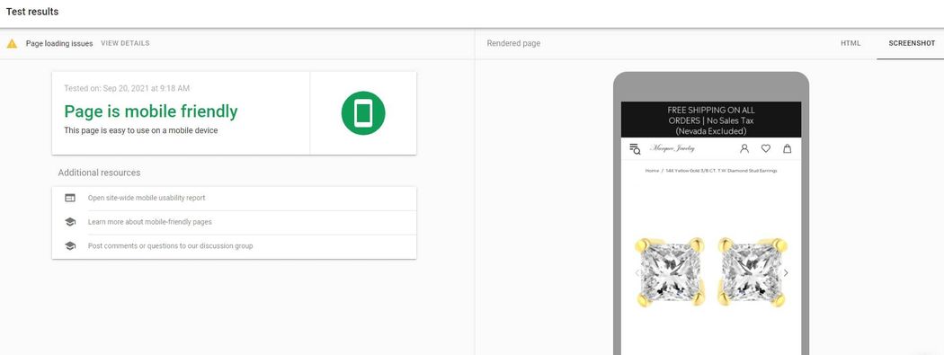
You can see what elements are impacting your site performance by clicking on View Details. Doing so will take you to a report that shows your page resources and which are having trouble loading on mobile.
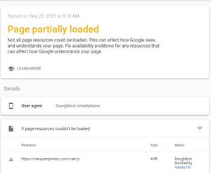
The tool also scans your mobile site for usability issues. When you perform a test, the tool will identify any of the following errors:
- Uses incompatible plugins
- Viewport not set
- Viewport not set to ‘device-width’
- Content wider than the screen
- Text too small to read
- Clickable elements too close together
Google’s mobile-friendly test tool only allows you to test one URL at a time. If you want to get an overview of your sitewide mobile-friendliness, you will need to use the Mobile Usability report in Google Search Console.
Steps to optimize your WooCommerce mobile experience
1. Use a mobile-friendly theme
The first step to optimizing your WooCommerce mobile experience is to use a mobile-friendly WordPress theme. There is a good chance you already do, but this foundational step is one you don’t want to overlook.
There are two key traits that make a theme mobile-friendly. To start, mobile-friendly themes use responsive web design. With a responsive site, your web pages dynamically adjust depending on the size of the user’s screen. Because of this, you do need to create a custom mobile site in addition to your desktop site.
The second key aspect of mobile-friendly themes is that they are lightweight. A somewhat subjective description, a lightweight theme is one with smaller file sizes. Because they are smaller, lightweight themes make fewer HTTP requests. As a result, your pages can load faster.
If you want to check how responsive your theme is, you can do so using the Responsive Website Design Testing Tool. Enter a URL and choose a device to see how your site looks to a particular user.
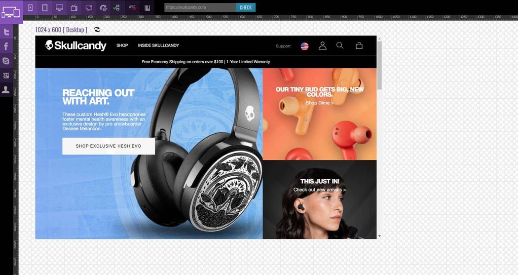
You can then change the device to see how your site responds.
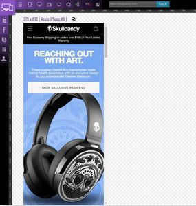
Understanding the mobile viewport
Your website’s viewport is the area of your web pages that are visible to the end-user. The viewport is defined by the viewport meta tag placed in the page’s <head>. Here is an example of a viewport meta tag:
<meta name="viewport" content="width=device-width, initial-scale=1">
“Width=device-width," instructs the browser to render the page to fit in the device’s screen width.
You need to modify all your page elements so that they can fit within the viewport. If not, the entire image won’t fit into the viewport and the user will have to scroll side to side to see the whole picture.
As a general rule, you should avoid elements with a fixed width. Look to use relative width values in your CSS. Absolute values and positioning values can lead to assets loading outside of the viewport.
To see a page’s viewport in action, simply resize your browser to see how the page adjusts:
2. Streamline your checkout flow
A smooth checkout experience is important no matter what device your visitors are using. Your website should remove any points of friction as to not deter shoppers from completing their orders. This doesn’t need to be a complex process as a few quick implementations can lead to a smooth checkout on both mobile and desktop.
To start, you should allow customers to check out without needing to create an account. Research from Baymard Institute shows that 24% of shoppers abandon their carts when being forced to create an account to complete a purchase.
This effect is amplified for mobile shoppers where creating an account is a more tedious process. People can easily get frustrated if they have to fill out multiple forms just to make a simple purchase.
Fortunately, this is a simple issue to avoid. Go to WooCommerce > Settings > Accounts & Privacy and check Allow customers to place orders without an account.

Another way to improve your checkout flow is to give customers the ability to edit their cart details on the checkout page. With the default WooCommerce configuration, are unable to do so. As a result, anyone that wants to add or remove products must leave the checkout page and will be more likely to abandon their purchase.
You can give customers the ability to change their cart quantity from the checkout page by downloading and activating the Change Quantity on Checkout for WooCommerce plugin.
3. Limit your forms and popups
The next step to make your mobile site more user-friendly is to limit the number of forms on your site. These lead generation tools are great for engaging your desktop visitors. However, with a small screen, they can quickly become obtrusive. Particularly popups.
A poorly timed popup can alienate potential customers. This effect is amplified on mobile devices. Many mobile popups are so large that they take up the entire screen, making it difficult for the user to close.
Hiding these pop-ups on mobile devices can help prevent you from frustrating your users. Your choices are to remove any popups altogether or adjust their size so that they do not take up the whole screen.
Many of the top popup plugins include a setting to disable forms on mobile devices. If not, you can use custom CSS and JavaScript. This will allow you to identify the user’s device type and prevent showing the form to mobile users.
4. Use accelerated mobile pages (AMPs)
AMP is an open-source project designed by Google and other developers to help web pages load faster on mobile devices. It is an ecosystem that delivers mobile-optimized pages by handling the HTML, rendering resources, and caching for the webpage. There are three components to the ecosystem; AMP HTML, AMP JavaScript, AMP Cache.
You enable AMP on your site by adding the amp link meta tag to the HTML for your web pages. Because adding the tag to every single page would be a tedious process, it is recommended to use a WordPress plugin to set up AMP for your pages.
There are several quality options available. If you are looking for something with more advanced features, the AMP for WP plugin is a good choice. It features a page builder that you can use to quickly create AMP optimized landing pages. It also implements with top analytics platforms to help you accurately track your mobile traffic.
After you download and activate the plugin, you will need to choose the view for your dashboard. If you want access to the settings panel, choose Advance.
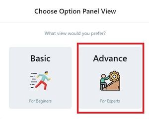
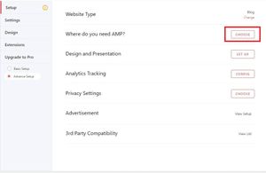
Next, you will choose which of your pages to use AMP. On the Setup page, find the section for where do you need AMP and select Choose.
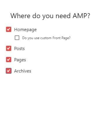
This will open a window for you to select your AMP pages. Check the pages you want to enable and return to the Setup page.
If you want to connect your analytics platform, go to Analytics Tracking and click Config. There you can your Google Analytics Tracking ID. The plugin also supports other popular analytics solutions including Piwik, Alexa, and Google Tag Manager.

You will then want to enable support for WooCommerce. Go to AMP > Settings > E-Commerce and enable WooCommerce compatibility.

The plugin is also compatible with other WordPress plugins including SEO solutions like Yoast and page builders like Elementor. You can enable support for these tools and other advanced options from the Settings page.
5. Lazy load images
Images are an essential component of any ecommerce site. Customers rely on them to visualize an item before making a purchase. Because of this, more (and higher quality) images usually leads to more sales.
This creates some challenges as high-quality images have larger file sizes. Bigger files mean slower loading times. You need to optimize your images if you don’t want your mobile visitors waiting a seeming eternity for them to load.
The most common form of image optimization is to compress images to reduce their file size. With smaller files, your customers’ browsers are able to load your pages faster.
Another way to optimize the delivery of your images is to use lazy loading. With lazy loading, your images won’t load on the initial page load. Instead, they will only load when the user scrolls to that area of the page.
By reducing the number of files needed for the initial page load, your website will load much faster on mobile devices.
There are several ways you can enable lazy loading for your WooCommerce store. The first is to do so manually by editing your site’s code.
You can enable lazy loading for images manually by adding the following code to your theme js file:
// Lazy loading images

document.addEventListener("DOMContentLoaded", function() {

let lazyImages = [].slice.call(document.querySelectorAll("img.lazy"));

let active = false;const lazyLoad = function() {

if (active === false) {

active = true;setTimeout(function() {

lazyImages.forEach(function(lazyImage) {

if ((lazyImage.getBoundingClientRect().top <= window.innerHeight && lazyImage.getBoundingClientRect().bottom >= 0) && getComputedStyle(lazyImage).display !== "none") {

lazyImage.src = lazyImage.dataset.src;

lazyImage.srcset = lazyImage.dataset.srcset;

lazyImage.classList.remove("lazy");lazyImages = lazyImages.filter(function(image) {

return image !== lazyImage;

});if (lazyImages.length === 0) {

document.removeEventListener("scroll", lazyLoad);

window.removeEventListener("resize", lazyLoad);

window.removeEventListener("orientationchange", lazyLoad);

}

}

});active = false;

}, 200);

}

};lazyLoad();document.addEventListener("scroll", lazyLoad);

window.addEventListener("resize", lazyLoad);

window.addEventListener("orientationchange", lazyLoad);

});
You can override WooCommerce image loading to instead load a placeholder image. To do so, you need to add the following code to your functions.php file, replacing “your-image.png” with the URL for your placeholder image:
add_action('init', function(){

remove_action( 'woocommerce_before_shop_loop_item_title', 'woocommerce_template_loop_product_thumbnail', 10);

add_action( 'woocommerce_before_shop_loop_item_title', 'woocommerce_template_loop_product_thumbnail', 10);

});if ( ! function_exists( 'woocommerce_template_loop_product_thumbnail' ) ) {

function woocommerce_template_loop_product_thumbnail() {

echo woocommerce_get_product_thumbnail();

}

}if ( ! function_exists( 'woocommerce_get_product_thumbnail' ) ) {

function woocommerce_get_product_thumbnail( $size = 'shop_catalog' ) {

global $post, $woocommerce;

$output = '';if ( has_post_thumbnail() ) {

$src = get_the_post_thumbnail_url( $post->ID, $size );

$output .= '<img class="lazy" src="your-image.png" data-src="' . $src . '" data-srcset="' . $src . '" alt="Lazy loading image">';

} else {

$output .= wc_placeholder_img( $size );

}return $output;

}

}
If you’d prefer not to make manual code edits, you can use a WordPress plugin to enable lazy loading for your images. One of the best lazy loading plugins is A3 Lazy Load. Another solid option is Rocket Lazy Load. The plugin works for all site images including thumbnails. It is also lightweight as there are no JavaScript libraries.
Conclusion
With more people shopping via phone, a mobile-friendly site is a must for ecommerce businesses. You want to make sure that your store works great on all devices so that each one of your customers has a great shopping experience.
Here is a review of the steps you can take to optimize your mobile WooCommerce site:
- Use a responsive, mobile-friendly theme
- Streamline your checkout flow by removing fields and enabling guest checkout
- Limit your forms and popups
- Use accelerated mobile pages
- Lazy load your images


