
Why learn how to build a WordPress website? Well, here’s a scenario to consider: You run into a friend you haven’t seen in quite some time at the supermarket. While catching up, you mention that you started your own business recently and things are going well. She immediately responds with, “Oh, that’s great! I’ll have to check it out … What’s your website address?”
Panic. Dread. Cold sweats.
You see, you haven’t yet tackled what you view as the overwhelming issue of building a website. You know you want to use WordPress, but you don’t know how to build a WordPress website. Who even knows where to start?!

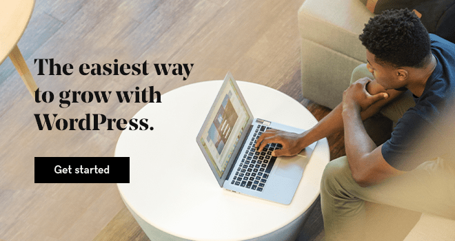
Go from idea to online in minutes with GoDaddy Airo™
Get started now.
Deep breaths … you can do this.
Learning how to build a WordPress website for the first time isn’t as hard as you might think.
You can also check out our article on how to create a website, to get help on the process of website building.
How to build a WordPress website — A guide for first-timers
With the right tools and a little know-how, you can have a great-looking website that you’ll be proud to show off. Here’s what we’re going to cover in this guide:
- What is WordPress?
- Who should use WordPress?
- How does WordPress work?
- What you need to build a WordPress website.
- The easiest way to build a WordPress website.
- Step 1: Choose a domain name and hosting for your website
- Step 2: How to install WordPress manually.
- Step 3: Getting to know the WordPress dashboard.
- Step 4: Setting your URLs by configuring permalinks.
- Step 5: Choosing a theme for your WordPress website.
- Step 6: Adding content to your WordPress website.
- Step 7: Use plugins and tools to enhance your website.
- Common building a WordPress website questions.
- What’s next?
Ready? Let’s get your first WordPress website up and running!
What is WordPress?
WordPress is one of the most popular content management systems (CMS) available, powering 43% of all websites. While that might sound highly technical, it’s really quite simple.
A content management system does exactly that — it manages how your content is displayed.
Basically, you provide what you want to show on your site, and the CMS takes care of how it gets displayed. This means that a CMS is fantastic for anyone who wants to create or maintain a professional-looking website without having to earn a new degree in computer programming.
There are many different content management systems available, but we’re going to focus on WordPress. It is widely supported, easy to customize, and best of all, free to use (with the exception of hosting — more on that below). WordPress is a great option for building a flexible, polished website without learning code.
Related: 7 benefits of WordPress websites
Who should use WordPress?
In short, anyone who wants an easy-to-maintain but highly customizable site should learn how to build a WordPress website. WordPress is often thought of as a platform for bloggers, but it works well for many different types of websites.
A small business needing an online presence to advertise, a family wanting to keep loved ones up to date with photos and news, and the professional offering their services to the public can all benefit from WordPress.
And yes, it works great for blogs, too.
OK, but how does WordPress work?
Think of it like this — WordPress is your framework. Just like a house, you first start with the framing.
Think of WordPress as the skeleton of your website.
It is the backbone and provides the support for all the main functions you will need.
Next, we add the content. This consists of text, images and videos that you use to convey your message to visitors. In our house analogy, this is the furniture, pictures and items within your site.
Your theme controls how your site looks; overall colors and page layouts are part of your theme. These are your paint and carpet in your website house.
But, as you’re learning how to build a WordPress website, what if you decide you want to change your color schemes and rearrange your furniture? You don’t want to have to buy a whole new house just to change the look. This is where building your website with WordPress provides a huge advantage. Once your content is set up initially, you can change your design without having to recreate your pages.
The beauty of WordPress is you can easily edit content, add features, or completely redesign your site without having to start over from scratch.
You can expand, remove or edit content without any change in functionality. You can also choose to change your look (i.e. your WordPress theme) without losing any content or having to recreate your page structure.
WordPress can do many things right out of the box, but what if you want to add functionality?
This is where plugins come into play.
Plugins are additional features you can install (or plug INto) your WordPress website to add functionality. Think of them like adding apps to your mobile device; you can add capabilities to the basic structure by finding a plugin that does something WordPress doesn’t offer by default.
What you need to build a WordPress website
Let’s get down to the nitty-gritty: what do you need to get started?
Every website needs two main components: a domain name (also called your URL, or website address) and hosting.
The domain name is how people will access your site, and the hosting refers to the physical computers that store and serve the website files.
A word of advice: stick with a reputable hosting company. “Discount” hosting can cost you much more in the long run.
Start by securing your hosting and domain name.
Related: How to buy a domain name in 3 steps
A GoDaddy WordPress Hosting hosting account would be a great place to start. WordPress is automatically installed and configured on these plans. And with managed hosting, tasks such as automatic core software updates, website backups and malware scanning are handled for you.
If you decide to go with an unmanaged hosting plan and install WordPress yourself, you can grab the latest version download from WordPress.org. Any hosting plan will work as long as you have access to both a database to store values and a place to upload files. We’ll cover self-installation below.
Related: What is web hosting? Complete guide for beginners
Once you’ve secured hosting and registered a domain name, there are a few other things you’ll need to gather to get your website up and running:
- Content — What are you going to say?
- Images and/or videos — Because an all-text website would be incredibly dull.
- Theme — WordPress comes with several defaults installed, and there are many free themes to choose from beyond the default options. If you prefer a certain look, there are also themes available for purchase from online sources such as ThemeForest
- A cup of coffee — OK, I guess this one could be optional.
What you DON’T need to get started:
- Expensive editing or web-design software — Everything in WordPress is created, added and edited from within your web browser.
- A rich uncle or family inheritance — WordPress is free and hosting plans are very affordable.
- An advanced degree in computer programming, mathematics or physics — once you know the basics, WordPress is easy!
Related: Cheat Sheet — Managed Hosting for WordPress
The easiest way to build a WordPress website
The single easiest way to set up WordPress is to start with a hosting account specifically designed for WordPress websites. If you choose a plan like the GoDaddy Managed Hosting for WordPress account, for example, WordPress is already installed for you. Furthermore, if you purchase any annual WordPress Hosting plan from GoDaddy, you can also get a free domain.
GoDaddy’s WordPress Hosting makes building your first WordPress website easier with a Quick Start Wizard, pre-built themes, core software updates, daily backups and 24/7 support.
Many hosts will offer a one-click option or simple directions to install WordPress directly from their control panel. If WordPress is already installed, you can skip the next section.
Step 1: Choose a domain name and hosting for your website
A domain name is the name of a website, and it can be seen as the most important part of your online presence. A domain name is like your physical address or phone number. So there is no way there can be two identical domain names. GoDaddy is a great option for choosing domain names because you can instantly find the right domain with their search tool.
You will also need to choose a hosting company - like GoDaddy to host your website.
Step 2: Installing WordPress manually
If you are feeling more adventurous and want to install WordPress yourself, we’ve still got you covered. Before you can install WordPress, we’ll need to do a little bit of setup work. Let’s install WordPress manually.
1. Create a database
We’ll start by creating a database. A WordPress website is slightly different from what we used to think of as the “standard” site. Back when the internet was new (you know, when dinosaurs roamed the earth), websites were only a collection of files stored on a computer.
WordPress operates differently; your site is generated from a combination of files stored on a server AND information saved and accessed from a database. This means we need to set up a database for WordPress to use.
You should have received credentials to log into your hosting control panel, or cPanel. Once you log in, you should see several options on your administrative dashboard. We want to start by locating the Databases section; we’re going to create a database using the MySQL Database Wizard.
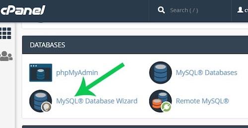
Follow the prompts in the wizard to create your database. You will specify a database name and create a database user with a password. When prompted, make sure that the user has “All Privileges” to the database.
Note the database name and username and password you set — you’ll need these in a minute.
2. Upload the WordPress files
Next, we’re going to set up the files needed by WordPress. Download the latest version of WordPress from WordPress.org.
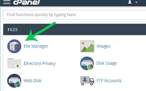
Return to your cPanel dashboard and click on your File Manager.
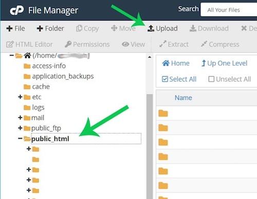
Once there, click on the public_html folder; this is where you want to set up your files. Click Upload and upload the zip file you just saved from WordPress.org.
Once the file is finished uploading, return to the main File Manager window. Right-click on the file and select “Extract”. This will unpack all of the files needed by WordPress into your working directory (be patient, this part might take a few moments to complete).
Once finished, you’ll see a “wordpress” directory under your “public_html” folder. Click on that folder and select everything inside.
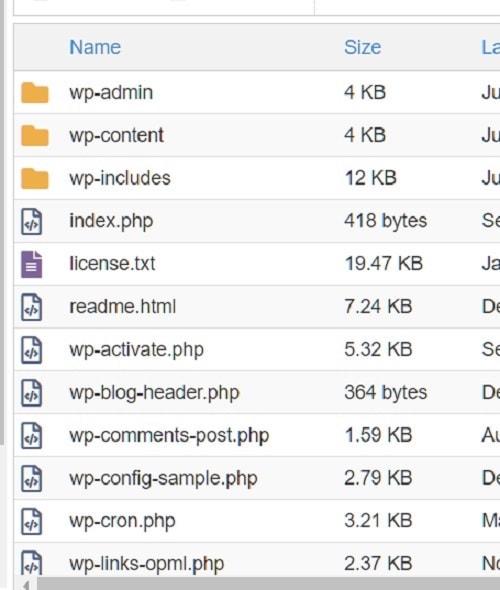
At the top of your screen, click Move and move all of the files into your pubic_html directory. You can delete the (now empty) “wordpress” folder and the original wordpress zip file. If you’ve done everything correctly, you should now have a file structure that looks like this:
3. Install WordPress
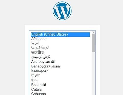
For the final step, go to a web browser and visit your website at whatever domain name you picked. The installation process should begin automatically for you by asking you to select a language.
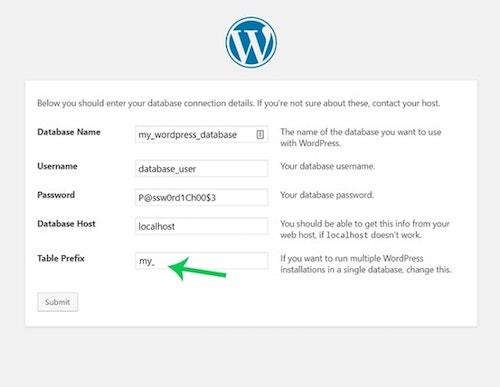
4. Enter your database credentials
Remember those credentials we saved from earlier? Here is where you will need them. Enter the database name, username and user password in the appropriate boxes. Most hosts will use localhost for the hostname.
If you are uncertain, your web host can provide this information.
It’s also a good idea to change the default table prefix from wp_ to something different. It doesn’t matter what you choose, just make it different from the default. Click Submit to continue the installation.
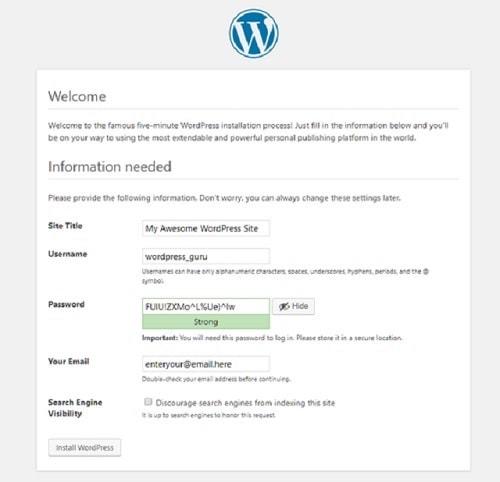
5. Set username and password
Now you will set the username and password that you will use to log into your new WordPress website.
It is a good idea to use a username other than “admin.”
This is the default username, and therefore increases the chances of your site being hacked later on.
Select a secure password, or let WordPress generate one for you. Give your website a title if you wish, and continue the installation.
That's it! WordPress is now installed.
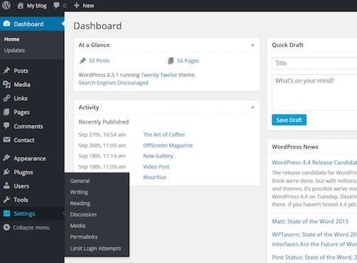
Step 3: Getting to know the WordPress dashboard
As you learn how to build a WordPress website, the dashboard is where you will control every aspect of the project. Access the dashboard by going to “yourdomainname/wp-admin” in your browser. Log in using the username and password you created in the last step of the install process.
This dashboard is the center for all things WordPress. Where to start?
Let’s begin with a quick overview of the different areas you can use to add content to your site and configure WordPress.
The bulk of your website will be built using posts and pages. Posts are generally used for content that is updated frequently, such as blog articles. For content that does not change as frequently, such as an About Us or Contact link, it is better to use Pages.
Most themes will display your most recent posts on the home page by default (think blogs). However, you can change this setting to always display a static page if you wish. This option, as well as other options — like setting your time zone or changing the administrator email address — are found under the Settings tab on the left menu.
The Appearance menu is where you will control your theme and everything related to the visual display of your website. Here you can select and upload themes, create menus, and decide what will show in your sidebar using widgets.
The Plugins menu allows you to view plugins currently installed and add new ones.
Any plugin currently installed on your WordPress website will show on this page. However, only plugins that are activated can be used on your website.
Sometimes when you install a plugin, a new menu item will be added to the left-hand menu (themes can also add these menus). Often, however, new options will be added to one of the existing menu items.
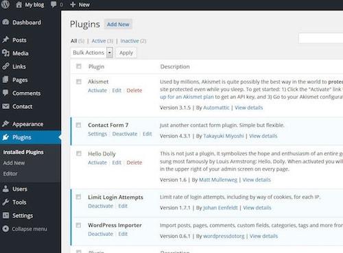
The Media Library is where you can view, edit or delete images you have added to your WordPress website. All images, regardless of where they are added, will appear in the media library. For example, you can add an image to a post or page directly from the post or page edit screen.
These images will still show up in the gallery. If you add an image directly to the media gallery, it is accessible from the Content section of your pages.
Now that you’re familiar with the different areas, let’s do some basic setup work. Start by setting your URL structure.
Related: New user's guide to the WordPress dashboard
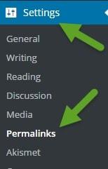
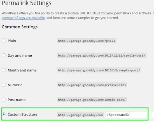
Step 4: Setting your URLs by configuring permalinks
By default, WordPress utilizes a form of URL writing that is not SEO (search engine optimization) friendly. We want to change this setup so search engines will rank the website pages higher in their results.
Do not wait to complete this task — get it done quickly before you start publishing pages or blog posts.
There are many other SEO tips and tricks you can use later, but let’s start by setting your permalinks.
In the Dashboard find the Settings category link on the left rail navigation. Select Settings and then Permalinks. The Plain URL writing rule will be selected by default. We need to change that, so select the Post Name and click Save Changes.
What did that accomplish?
By default, WordPress uses “messy” URLs that specify the post ID. We changed them to be more user-friendly and readable. This will not only help our visitors find the pages they want, but it is much better for SEO.
Now that WordPress will create “pretty” links when we add content, we can start focusing on the website display.
Related: Setting up WordPress — Configuring settings, changing admin username and more
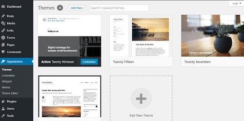
Step 5: Choosing a theme for your WordPress website
While the most critical piece of building a WordPress website is the content, you should also give careful attention to your theme. The theme affects how your website is displayed and the overall impression it gives to your visitors.
There are many things to consider when choosing a good theme, but anyone can learn how to design a website when you’re not a web designer. Overall, you want a theme that is stable, clean and easy to work with.You also want to select a theme that is responsive (meaning it will handle different screen sizes, like tablets and mobile devices, as well as desktops).
Many themes are also highly customizable, allowing you to change colors and backgrounds with ease. This can help you achieve a more unique look that better suits your website design idea.
Step 6: Adding content to your WordPress website
As I mentioned before, nearly all content is added via a post or a page in WordPress. Adding content to a page and post are handled the same way. With the release of WordPress 5.0, the method for entering content on a page changed dramatically.
WordPress now uses what is known as the Gutenberg editor, and you can read this great article that details how it works.
There are a few tips to note when working with your content. Along the right-hand side, you will see some additional options. Setting a featured image, for instance, automatically sets the thumbnail image that goes along with posts in many themes. You can also save an item in draft format if it is not yet finished. This saves your changes but does not make them live to your website.
Only posts and pages that are published will be visible.
Related:How to write a blog post properly using AI
Step 7: Use plugins and tools to enhance your website
Use plugins and tools to make your website look nicer and work better. Here is a short list of WordPress plugins that can make your life easier:
- HubSpot’s free WordPress Plugin can help you centralize marketing for your WordPress website. With HubSpot, you can add free forms, live chat, email marketing, analytics, and more to your site.
- Sucuri Security – Auditing, Malware Scanner and Security Hardening plugin can complement your existing security posture by offering additional auditing, monitoring and scanning functionalities, as well as recommendations and notifications.
- Yoast SEO plugin helps millions of websites worldwide improve their search results. It offers SEO analysis, readability analysis and bulk editors.
- W3 Total Cache plugin reduces page load time and improve user experience by saving up to 80% of bandwidth via minify and HTTP compression of HTML, CSS, JavaScript and feeds.
- Smush Image Compression and Optimization plugin optimizes performance in terms of both speed and quality, by compressing media uploads and stored images.
- WordPress with WooCommerce can help you sell things online. It makes it really easy to set up an online store and manage your products. You can add pictures and descriptions of the things you want to sell and keep track of your inventory. When someone wants to buy something, they can add it to their shopping cart and then checkout. WooCommerce also helps you accept payments from your customers, so you can get paid for the things you sell.
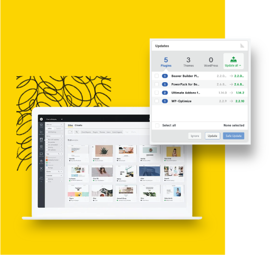
Some of the most popular WordPress plugins and capabilities are automatically installed when you spin up a new WordPress site using GoDaddy WordPress Hosting. If you are a web designer or developer, you should check out how GoDaddy Pro saves you time by giving you access to every client and their website from a single dashboard. GoDaddy Pro includes features like bulk WordPress updates, client shopping carts, and uptime monitoring. Other benefits include site management and account delegation.
What’s next?
There is so much that WordPress can do that we have hardly scratched the surface. Ready for more?
You can discover how to optimize your website for SEO, and learn all about making your WordPress website more secure.
Once you’ve got your WordPress site looking and working the way you want it to, share it with the world!
Start including a link to your website in your social media posts. Add a website link to your email signature. Use a plugin to begin building an email subscriber list. Generate a link in bio website to market your website and social media channels in one place...the possibilities are endless.
Whatever your needs, building a WordPress website for the first time is easier than you might have thought. So go have fun and create!
*AI-assisted full website including all of the premium features like online store, appointment scheduling, and marketplace selling to name a few, requires paid subscription.
Social media marketing calendar available with GoDaddy Airo, some features will require paid subscription.
Professional Email through Microsoft Office 365 30-day free trial with an option to renew into a paid subscription beyond the promotional period.
While the LLC starter plan is free, there are likely some state and/or local filing fees associated with your filing which will be determined during the filing process.