You work hard to create great products and drive visitors to your WooCommerce store. However, people can only buy the products that they can find. Once on your site, it’s essential for shoppers to have an easy way to move throughout your site and find the items they are interested in. That's why you should have a strategy for WooCommerce navigation.
This post outlines how to create a strong navigation design for your WooCommerce store.
What makes a good WooCommerce navigation menu?
The layout of your site navigation significantly impacts how visitors discover products. Shoppers don’t want to sift through a confusing maze to find the items they’re interested in. This is why it’s critical to arrange your menu in a clear and concise manner.
To create a user-friendly WooCommerce navigation menu, you need systematic labeling and an organized hierarchy.
Visitors should quickly know where to go after landing on your homepage. They should not have to consciously think about how to move through the site or where they should look to click.
There are generally two styles that are most effective to achieve this.
Horizontally across the top of the page
The most common, and effective, approach to an ecommerce navigation menu is a top-level navigation menu, spanning horizontally across the page.
This layout is the most effective because it is where customers normally look first when determining where to go.
Numerous eye-tracking studies have consistently shown that users start by looking at the header menu. Specifically, they begin on the left side of the page and quickly scan from left to right.
Vertically down the left side of the page
While most ecommerce sites go for the horizontal navigation menu, others have so many categories that they don’t have enough space to cover them all.
For these sites, the best approach is to use a vertical menu on the left-side of the page. The most common example is Amazon. The ecommerce giant has dozens of categories that couldn’t possibly fit (in a legible manner) in a traditional navigation menu.
When you click the All icon on the retailer’s site, a menu opens with different departments. Clicking any of these departments opens a menu with the nested categories.
Keep in mind, that there are some downsides to this approach.
When the entire catalog navigation is hidden under an All label, customers must make multiple clicks to move through the menu. It also obscures what type of products your store carries.
Below, we can see an example of this with Best Buy’s website.
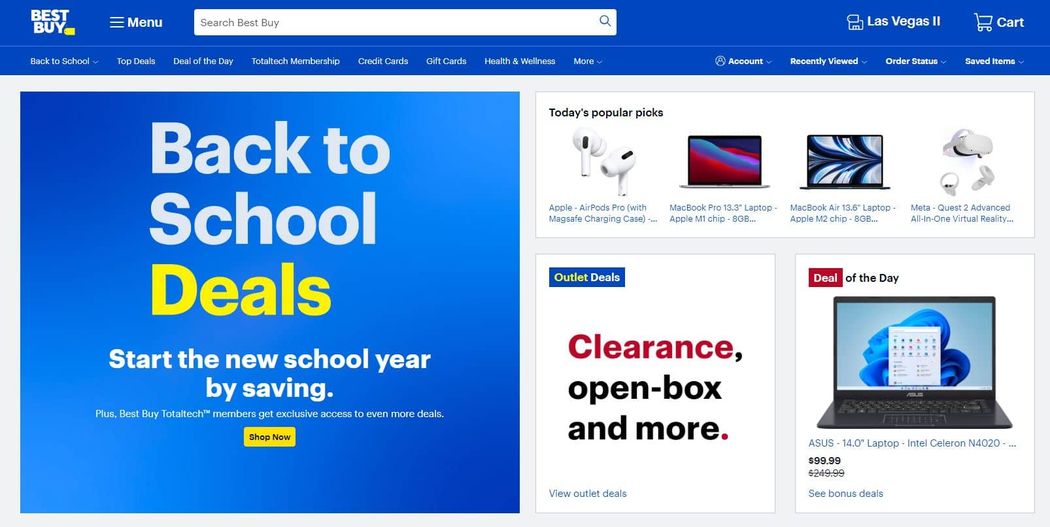
All the products are nested under the Menu label. Shoppers more familiar with the company may know what to expect. But those who are not may not be clear on the specific types of products the large retailer offers.
WooCommerce navigation best practices
Here are some other best practices to help you optimize your WooCommerce navigation menu.
1. Category taxonomies
It's best practice to place your most important product categories as the main items in your menu. This will ensure that these categories are always visible when customers navigate your site.
Additionally, if you have a new category that you want to promote, you can include it in the main navigation menu to increase its exposure.
According to Baymard, the average ecommerce site has significant issues when it comes to category taxonomies, with 50% of sites having a poor category layout. Specifically, overcategorization is the biggest category-based navigational issue for e-commerce sites.
2. Breadcrumbs
Breadcrumbs are another useful navigation feature. They help customers know where they are on your site. Breadcrumbs also make it easier for visitors to return to previous pages as well as connected pages in your hierarchical structure.
Without the breadcrumbs, it’s more difficult for shoppers to move through your site.
Breadcrumbs also have an SEO benefit. They help Google understand the hierarchy of your site which in turn helps your pages rank better.
A typical breadcrumb menu on a product page looks like this: Parent Category > SubCategory > Product.
When someone clicks the clickable text for the parent or subcategory, they will be quickly directed to that page. Many ecommerce sites also include the homepage as a base for all breadcrumb menus.
In most cases, you can turn off breadcrumbs in your theme settings. Depending on the specific theme, you may have this option for pages, products, and categories.
If your theme doesn’t have breadcrumbs, there are several plugins you can use to quickly implement them. For instance, with Jetpack, you can quickly enable breadcrumbs for your website pages. However, the plugin won't add breadcrumbs for product or category pages.
So, to get the breadcrumbs on your ecommerce pages you'll need a solution that supports WooCommerce, like Yoast SEO or All-In-One SEO
Each plugin will allow for different levels of customization, and setup will vary. For a full list of options, take a look at the WordPress plugin repository.
3. Only use common icons
Icons are everywhere on the internet. These symbols allow sites to replace text with an easy-to-process symbol that takes up less space. But, for icons to work as intended, they must be understood by your audience.
If you use icons that no one is familiar with, they won’t have the desired effect of improving the user experience.
To give you an example, think of the magnifying glass that is common on many sites. You are likely familiar with this symbol and know that it indicates a site search feature. Similarly, you probably know that bag, cart, and basket icons lead to the ecommerce shopping cart page.
4. Include a logo with a link to your homepage
To some, this one may seem obvious but it’s important not to overlook. At this point, it’s an internet standard to include your logo in your site header, next to the navigation menu. The logo should also contain a link to your homepage.
Having this element makes it easy for users to return to the front of your site. Everyone expects it and some will be thrown off if this common feature is missing.
The position of your logo also matters. A study from NNgroup found that returning to the homepage is six times harder when your logo is positioned in the center of the navigation menu
Additionally, in the study, they found that customers remembered the brand's name at a much greater rate with the logo on the left side of the menu. The lift in brand recall was 89% for left versus right-aligned logos.
This is largely due to the left-to-right way most people's brains process information. When viewing a page, people usually look to the left side first and are therefore more likely to remember what they see on that side of the page.
5. Make the navigation sticky
Sticky navigation is when the menu is locked into a fixed position. This means it doesn’t disappear on scrolling, making it visible regardless of where the shopper is on the page.
Sticky menus are quite convenient for users to navigate. They make it quick and easy to browse, especially on category pages where users tend to do a lot of scrolling.
Creating a WooCommerce navigation menu
With WordPress, the default setup for creating menus and populating them with items is available by going to Appearance > Menu. The layout of your menu items is determined by your WordPress theme’s CSS.
If you want to customize this design, your options are to dive into the CSS or to use a WordPress plugin. A plugin can save you time from editing files and writing new code.
Below, we’ll look at how to use WordPress plugins to create a great menu for your WooCommerce store.
Max Mega Menu
Max Mega Menu is one of the most popular WordPress navigation plugins. It has extensive features for creating both extensive mega menus and flyout menus. It is great for ecommerce stores looking to create navigation menus with many categories and subcategories.
The plugin works in tandem with the default WordPress menu editor. There is also an easy-to-use, drag-and-drop editor to quickly craft your robust mega menus.
Menu themes
While you’ll still define your menu items with the default WordPress menu editor, you’ll configure the design of your new menus in the Mega Menu settings.
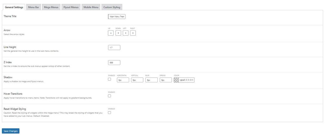
Start by going to Mega Menu > Menu Themes > General Settings. From there, you can set the arrow styles, line height, and the optional shadow to apply to both mega and flyout menus. You can also enable hover transitions for your menu items.
Next, you’ll want to go to the Menu Bar tab to set the sizing and colors for your menu bar. You can adjust padding, fonts, border radiuses, backgrounds, and spacing.

Below, you’ll see similar settings for the top-level menu items.
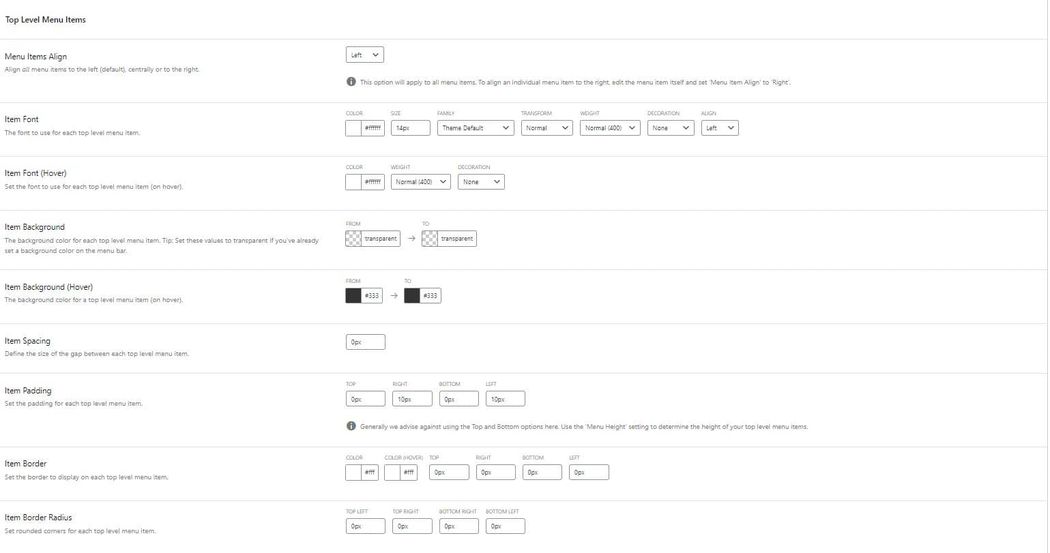
The plugin has separate design settings for Mega Menus, Flyout Menus, and Mobile Menus.
Menu Locations
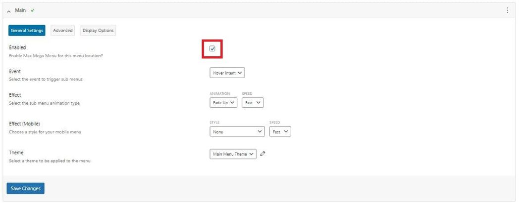
Once you’ve designed your themes, you must assign them to the appropriate menu location. Click the label for Menu Locations. There, you’ll see a list of your current WordPress menus.
Find the menu that you want to assign a theme and open the dropdown. This will take you to the General Settings where you can enable the Mega Menu plugin for that specific menu.
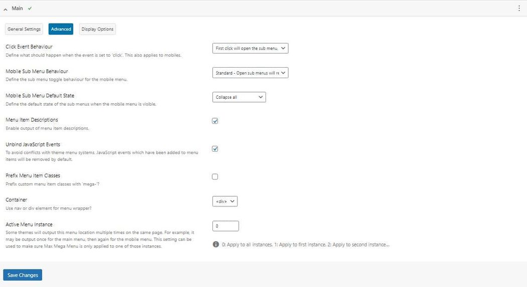
In the Menu Locations section, you’ll also find advanced settings
Site search navigation
Site search is another key component of good e-commerce navigation. Currently, you can only search for WooCommerce SKUs in the admin of your shop (the “Products” list).
However, this search functionality isn’t available on the frontend of your site; customers cannot search for product SKUs to return a list of products. If customers search for all or part of a SKU, and the search query isn’t contained anywhere else on the site, they’ll get no results.

We can make some changes that will let customers search for products by SKU on your site instead using search plugins that modify the default WordPress search.
WooCommerce SKU search for simple products
If you have mostly simple products, then the easiest way to allow customers to search by SKU is to install the free Relevanssi plugin. This will replace your WordPress and WooCommerce product searches with the Relevanssi search and will allow you to include product SKUs in the search index.
First, go to Settings > Relevanssi and configure your desired settings. The most important one to change right now is to include the “product” post type in your site’s search results.
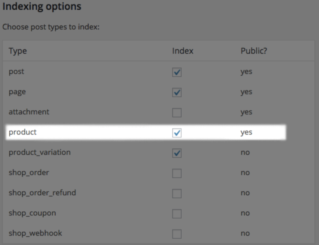
Once you’ve done that, you’ll want to add the custom field for your product SKU to your search index. Scroll down to “Custom Fields to index” and add _sku to this field (the underscore matters). This will tell Relevanssi to include SKUs in the search index and lets customers enter the SKU as a search query.

Now when a customer searches for a string that’s part of your simple / parent product’s SKU, the product will be returned as a result:
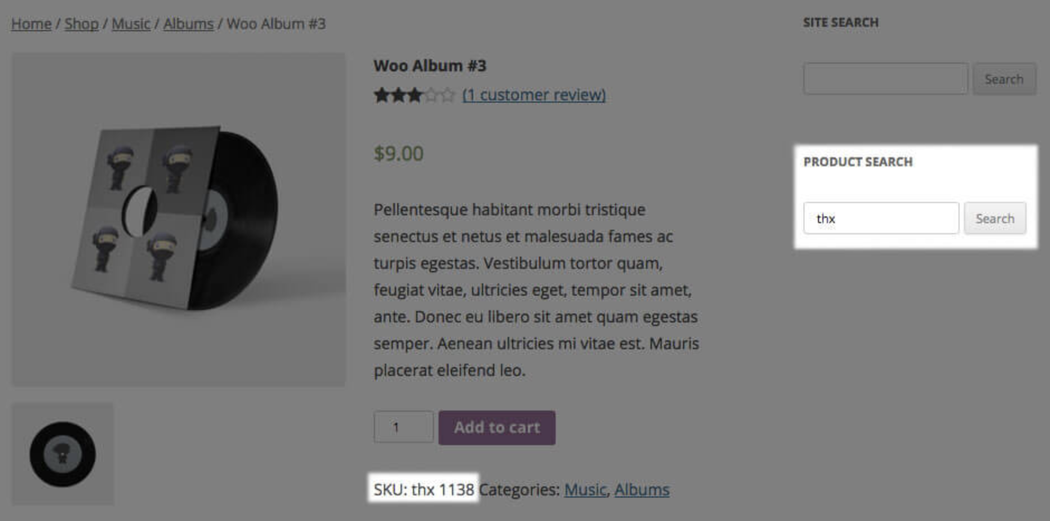
However, variation SKUs (if different from the parent product’s SKU), will not be searchable. Product variations are stored with some data separated from the parent product, and the SKU is one of these pieces of data. Therefore, if the variation’s SKU is different, searching for the variation SKU will not return the product in the search results.
Closing thoughts on WooCommerce navigation
Good WooCommerce navigation design is simple, clean, and attractive to your shoppers. Implementing strong navigation isn’t overly difficult but it is easy to overlook.
Especially when you’re primarily focused on optimizing your pages and checkout for conversions.
Take the time to intentionally set up your navigation so users can easily find what they’re after. Both your customers and bottom line will be pleased as a result.

