
Key takeaways
- Set your foundation: Clearly define your website’s goals, target audience, and unique value to guide your decisions.
- Organize for your identity: Plan your site’s structure with a sitemap, create engaging content for each page, and select a memorable, relevant domain name that fits your brand.
- Choose the right tools and strategy: Research website builders or platforms that match your technical skills and needs, and incorporate SEO best practices and measurable objectives.

From an aspiring entrepreneur to a blogger or a small business owner, having a website is a must in today’s society. But walking blindly into the world of site creation can be a bit daunting. Fortunately, we’ve got you covered with a detailed list of to-do items to plan a website before you build it yourself or hire a professional to do it for you.
Recent research shows that customers are 88% less likely to return to a website after a bad experience, so it’s important to carefully plan out your website from the very start. And, with visitors forming an impression of your website in 0.05 seconds, having a well-designed website is critical to retaining visitors.
Use this post as a project plan that outlines exactly how to get your new website ready to launch.
How to plan a website in 9 steps
- Identify your website goals
- Identify your target audience
- Define your unique selling proposition
- Plan the website structure
- Secure a domain name and hosting
- Pick a website builder
- Create and collect design elements
- Create content for your core website pages
- Develop a content strategy and optimize for SEO
Creating a website plan helps you organize your project, collect the assets you need, and start with an outline of your goals and a clear strategy for achieving them.
The website plan will serve as an anchor you can refer to for any later decisions, as well as a roadmap that can be used to set deadlines and targets.
Read on for a website plan that will help you launch your site quickly, easily, and strategically. If you're still in the early stages, have a look at this guide on how to start a business.
Related: How to build a website
1. Identify your website goals
Before you start building a website, you need to know why you are building it.
- What is your primary objective?
- What do you want your website to accomplish for your business?
- Is it strictly informational, or are you selling products?
- Are you looking to increase engagement with customers via your site?
- Is your goal to leverage your website to bolster year-end profits?
Knowing the answers to these questions will help you create a plan that is strategically tied to your business goals, so it’s important to always start at square one: the purpose of your website.
Start thinking about the broad purpose of your website
The purpose of your website is the reason why you want to build it. It’s the somewhat obvious reason for what you think a website can do for you. You might think the purpose is to:
- Attract traffic and grow an audience
- Showcase your products
- Share what you know
- Advertise your business
- Entertain your readers
While those are good reasons to have a website, they won’t necessarily help you do anything specific, which is why you need to turn the purpose into a concrete goal.
Turn your purpose into a concrete goal
The goal is the real, concrete reason why you want (and need) a website. It’s what you want to happen as a result of having a website.
To find your concrete goal, start with the purpose that seems obvious and then keep asking yourself “why,” until you get to the real purpose.
Examples of this might be:
| Broad purpose | Concrete goal |
| Attract traffic and grow and audience | Sell an ebook to your audience |
| Showcase your products | Sell more products |
| Share what you know | Build authority and get speaking engagements |
| Advertise your business | Get clients to register for a consultation |
| Entertain your readers | Build your newsletter subscriber base |
As you can see in the examples, this exercise narrows your focus so you can define what you actually want your website to do. You can identify the conversion or action you want your audience to take when they are on your website.
Decide what your website needs to help you reach your goal
Understanding the goal for the website (the action you want to trigger) enables you to start designing a strategy that leads to that conversion.
When you plan a website, consider your goal and determine what your site needs to accomplish that objective.
For example, if your goal is to:
- Sell an ebook to your audience: You need to funnel users to your ebook product pages and have a way for them to make their purchase.
- Build authority and get speaking engagements: You need to highlight your expertise through blog posts and authoritative content, and create a page that tells audiences why and how to hire you as a speaker.
- Build your newsletter subscriber base: Create interesting and engaging lead magnets and add opt-in forms on your site.
Break down your goal, and determine the elements you need on your site (such as opt-in forms, landing pages, etc.) to reach that goal. Then, design a funnel on your site that will drive audiences toward the action you want them to take.
Depending on your goal and business type, also consider your website costs.
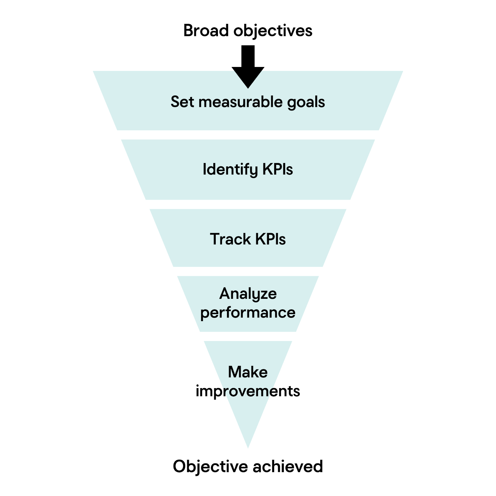
Set measurable goals and track KPIs (Key Performance Indicators)
Now that you’ve decided on your overall goals, the next step is to break those goals down further into achievable parts. A goal of “increase sales” is good, but a better way to manage that goal would be to set milestones like “generate 50 new product sales per month.”
Once those manageable goals are set, you’ll need to create KPIs to measure those goals in relation to your website. Some example KPIs could be:
- Number of website visitors
- Conversion rate
- Average time spent on site
- Number of leads generated
- Sales or revenue generated
With your KPIs selected, you can measure your website’s performance over time and make targeted improvements to achieve your goals.
2. Identify your target audience
When you’re planning your website, knowing your target audience is crucial. It will help shape the content, design, and features that will attract and engage the website visitors that you want, even before you’ve launched your business.
How to get to know your target audience
Let’s go over the steps you’ll need to take to figure out your target audience:
1. Review your network and interests
First, you’ll need to make a list of the people you want to target with your website. Who are the clients, readers, employers, or collaborators you’re looking to attract? What are the topics that those communities are most passionate about?
2. Research key demographics
How you choose to define your key demographics will partially depend on your particular niche. Does your niche tend to appeal to those in a certain age range, such as college-aged adults? Or is your target community based around a particular life stage, such as newlyweds?
Another demographic to consider would be location. Is your audience worldwide, or is your website aimed at hyperlocal communities?
Is your future website intended for those with a specific profession, job title, or industry? Or is it intended more for those with an interest in specific hobbies or causes?
Figuring out who your content is truly for will help immensely when planning your first website.
3. Identify pain points and motivations
You might have noticed a pattern emerging when making your list of interests and demographics. The flipside of interests and causes that are meaningful to your target audience is the pain points associated with them.
What challenges are your audience facing that you’re able to help with? What information, services, or inspiration would enable your audience to be successful?
Along those lines, it’s also a good idea to consider what goals your audience has as a result of those challenges. Are they looking for networking with like-minded people? Do they need additional resources to help them learn how to overcome those challenges? Or is there something that they need to purchase to solve their concern?
Pain points are a powerful impetus for users, so having a website that can solve those issues should be a high priority.
4. Observe behaviors and preferences
Now that you’ve got a decent idea of who your ideal audience is, the next step is to figure out what their behaviors and preferences are online. What type of websites or other online content does your audience already engage with? How do they prefer to get their information, articles, videos, or social media? And what devices are they typically using to consume that information?
Knowing this information is helpful when planning what type of content to focus on with your website.
Create a simple audience profile
After you’ve compiled your target audience demographics, it’s time to combine your research into a basic description of your ideal website visitor. Here’s an example of what that description might look like:
“My ideal audience is young professionals looking for career advice and resources, who value practical tips and connect through LinkedIn and blogs.”
Use this description to guide your website design planning from the beginning, and you’ll have a solid foundation for scaling later.
3. Define your unique selling proposition
So far in your process of planning a website, you’ve determined your goals and defined your target audience. Now, you can start developing marketing strategies for reaching the audience and encouraging them to act.
The first step in that process is creating a unique selling proposition.
What is a unique selling proposition?
A unique selling proposition, or USP, is something special that makes your brand, products, or services different from and/or better than your competitors.
It explains the selling points that get prospects to act and take a step closer to becoming your customer.
It grabs the attention of your ideal customers and is the reason why they choose you over all others.
You need to know your USP as you plan a website because your site will be positioned around your unique selling propositions. All of your copy and content will be positioned to subtly (and sometimes not so subtly) promote your USP and tell website visitors why they should choose your brand.
Before nailing down your USP, make sure that your business name fits your brand and is easy for customers to remember. If you’re still brainstorming, try using a business name generator to spark new ideas and check for domain name availability.
How to develop your unique selling proposition
To develop your unique selling proposition, think about your brand, products and services and answer the following questions.
- How are you different from your competitors?
- Why does that difference matter to customers?
- What specific benefit do customers get by choosing you over the competition?
- Why does that benefit matter to customers?
Don’t rush through this exercise. The things that immediately come to mind might be too obvious. Spend time really digging into how your offerings truly help your customers and solve their problems.
Tips for finding your USP
If you’re having a difficult time identifying your unique selling proposition, use the following tips for help.
- Think about what your customers value and how you help them get those things.
- Think about the problems your customers have and how you help solve them.
- Consider the unique strengths your brand brings to the table.
- Look at your competitors to see how you can differentiate your brand.
Remember, unique selling propositions aren’t specific to ecommerce sites and service-oriented businesses. If you’re a content creator or blogger, you’re “selling” information and want to establish yourself as a thought leader. The questions still apply — what are you doing to set yourself apart from the crowd?
For more tips, use this guide on finding your unique selling proposition.
4. Plan your website structure
With your goals, audience, and USP in mind, it’s time to plan your site structure. A well-designed website not only helps your users navigate easily through your site, but it also supports your search engine optimization (SEO) efforts.
1. Sketch out your site structure
First, start by outlining the main pages that your website needs. This outline should be a simple diagram (or list) that shows the page hierarchy for your website. Your list could include:
- Home
- About
- Services/Products (with sub-pages for each category)
- Blog
- Contact
Design your page structure and layout
For each page, sketch a basic wireframe showing the main sections: headers, navigation menus, content areas, images, and calls-to-action. Wireframes don’t need to be fancy; they’re to help you visualize the layout and flow of information.
When sketching your layout, think about the content order and the actions you want visitors to take on each page. Once you’ve settled on a basic layout, be sure to apply that structure to other similar pages. Consistent layouts make your site feel cohesive and user-friendly.
Plan your navigation menus
Your primary navigation menu should include links to important top-level pages on your website. The goal is to make it easy for your visitors to find what they need in as few clicks as possible. Keep your menu clear and uncluttered.
If your site is complex, you can group related pages under top-level pages in your navigation via dropdown menus. And don’t forget that you can also use internal links within your site content to help your visitors discover related information without needing the navigation bar at all.
Use SEO-friendly URLs
To help SEOs find and successfully index your website, structure your URLs in a clear and descriptive way. For example:
- Good: yourwebsite.com/services/web-design
- Not ideal: yourwebsite.com/page?id=27
Be sure to use keywords in your URLs where appropriate. Keep your URLs short and relevant, and avoid unnecessary numbers, symbols, or long text strings.
Optimize your site for user experience and SEO
Search engines prioritize websites that are helpful and well-organized, so creating an optimized user experience flows nicely into search engine optimization. A good site structure helps your visitors find information quickly and encourages them to stay longer. It also makes it easier for search engines to crawl and index your site. Win-win.
To optimize your site layout, keep important pages accessible from your navigation menu and try to minimize the number of clicks needed to navigate between pages.
5. Secure a domain name and hosting
You’ve mapped out your business goals and your website structure; it’s time to make your web presence official. If you don’t have a domain name registered already, be sure to grab it now:
Your domain name and hosting work together to create the foundation for your new website, so it’s important to consider your options carefully. Here are some tips to help guide an informed decision:
Domain name selection tips:
- Choose a domain that’s short, memorable, and clearly represents your brand.
- Check to be sure that your desired domain isn’t too similar to another established company.
- Avoid using numbers or hyphens in the domain to keep it easy to type.
- Verify social media handle availability for your name.
- Include relevant keywords, if possible. Prioritize brevity, however.
Website hosting selection tips:
- Choose a hosting type that fits your needs.
- Shared hosting is a good option for smaller companies, while VPS or dedicated hosting is better for larger or more complex sites.
- Look for reliable uptime, good customer support, and scalable options to support you as your website grows.
- Verify that your hosting provider offers robust, up-to-date security for their hosting services.
In general, you can expect the cost of domain names to range anywhere between $2 to $20 per year. Hosting plans tend to start around a few dollars a month, ranging upwards to support more features and traffic. Both your domain name and hosting plans will need to be renewed regularly to keep your website online.
Related: What is web hosting?
6. Pick a website builder
At this point in planning, you’re ready to choose how you will build your website.
You have a few options for building your site. You can:
- Use a drag-and-drop website builder like the one from GoDaddy (take advantage of the power of AI website builders).
- Use a more advanced content management system like WordPress that requires a bit more technical know-how (although GoDaddy's WordPress Hosting makes starting a WordPress site much easier).
- Use custom code and start from scratch rather than using a pre-designed template.
- Hire a professional web designer to do it all for you.
As you plan a website, take a closer look at what type of builder will best suit your needs. Ask yourself the following questions to get an idea about your needs.
- Do you want to blog?
- Do you want to collect visitor information?
- Do you want to sell products or services?
- Will you accept electronic payment?
- Will you use a calendar or schedule appointments?
- Do you want to track inventory and shipping?
- Do you want total control over the site’s code?
- Do you prefer an easy-to-use builder?
- Are you going to hire a professional?
- Are you going to design on your own?
- What’s your budget?
These answers will help you determine the platform that will work best for you.
Option 1: Drag-and-drop website builder
Website builders help you develop websites without extensive coding or technical skills. Builders provide a user-friendly interface that allows you to design, customize, and publish websites using pre-designed templates, drag-and-drop tools, and artificial intelligence (AI).
With a website builder, you choose a theme (a premade website design) and customize it to suit your needs. You can add structural components (such as spaces, dividers, background images, custom headings, footers, and menus) and design elements such as:
- Images
- Videos
- Text blocks
- Titles
- Galleries
- Forms
- Slideshows
- Buttons
With the introduction of AI tools, website builders can now aid you in the process of creating your site. During set-up, you provide answers to prompts about your type of business, website goals, and business information (such as contact information and details about products and services), and the website builder will deliver a site that matches your criteria.
You can then customize the site using drag-and-drop elements and by adding your own branded elements such as images, color palettes, and fonts.
GoDaddy Website Builder uses both AI and drag-and-drop features to help you easily create a website. With its swipe-to-style interface, dozens of industry-specific themes, professionally selected photos and more, you’ll have everything you need to build a site. GoDaddy’s solution is cost-effective, incredibly easy to use, and comes with many built-in features — like SEO tools,SSL and email marketing. Even better? You can try it first for free.
If you’re short on time (or money) or simply don’t want to add “web design” to your already overflowing plate of tasks, then a site builder might be in your best interest.
Option 2: Content management system (WordPress)
If you want more options and customization than what is available with a website builder, you may want to choose a more robust content management system (CMS) like WordPress.
Building a website using WordPress provides a balance between ease of use, flexibility, and scalability.
Creating a website using a CMS like WordPress requires some intermediate tech skills. If you choose to go with the free version of WordPress, you’ll need to purchase a hosting account and install the WordPress files. You’ll also be tasked with installing plugins and maintaining your site’s security through any necessary software updates, backups, etc.
If you want the customization and functionality that a WordPress site offers but don’t have the time or skills to handle the more technical aspects of creating and maintaining a WordPress website, a solution such as GoDaddy’s WordPress Hosting could be the answer.
GoDaddy’s WordPress Hosting comes with WordPress, plugins, and design themes built in. It supports ecommerce and offers a variety of tools and specifications that keep your site secure and running speedily and smoothly.
GoDaddy’s WordPress CMS also offers AI-powered site design tools that make creating your site easy, while also offering the flexibility for customization if you want and need it.
Option 3: Custom code
If you want the ultimate flexibility for your website, you can build it with custom code. But coding your own website requires specialized knowledge and is usually impractical for entrepreneurs who aren’t in the coding business.
To go this route, you need to use a web programming or scripting language that provides instructions for either the client side (a user’s web browser) or the server side (the server where your site’s files are stored). Those languages include:
- ASP/ASP.NET
- CSS
- HTML
- JavaScript
- Perl
- PHP
- Python
- Ruby on Rails
- XML
The operating system of your hosting account determines which languages you can use so if you choose to go this route, be mindful of what language you want to use when you purchase hosting.
Option 4: Hire a professional website designer
If you don’t want to go any of these routes, you have one other option. You can hire an expert web designer to create your website.
A professional web designer will take the information you have collected and construct your site for you. That site may be built through one of the options mentioned above. The designer may use a website builder, content management system or custom code for your site. The price of your site will be more expensive for custom projects and less expensive when designers use prebuilt themes and drag-and-drop tools.
Ask the designer what they will use to build your site to get an idea about their work, experience, and pricing. Also, keep the following questions in mind as you research to find the perfect designer to work with.
- Has the designer committed to a career in web design?
- Does the designer provide direct access to their completed work?
- Are they good at communicating?
- Do they have references?
- Do they have a portfolio?
- Do you like their portfolio?
- Are their previous projects high-quality?
Before you hire a designer, get to know them and their work to make sure they are the right person for the job.
The pros at GoDaddy's Website Design Service can build a mobile-friendly, modern WordPress website that reflects your industry while following your lead and input. Check out the design gallery.
Once you’ve determined the type of platform you’re going to use, it’s time to start creating design elements. Go through the rest of this website plan post to make sure you have all of the strategic design and copy ideas you need to launch the right way.
7. Create and collect design elements
By now, you have a strategy, domain name, and platform for where you will build your site. The next step in this website plan is putting together the content you need to fill your site. Start this process by creating and collecting design elements.
Create and collect brand design elements
Brand design elements are graphical representations of your business. A whopping 75% of people admit to making judgments about a business’s credibility based on its website design alone. These design elements define your brand personality and help customers feel what your brand represents through the use of:
- Colors
- Fonts and typography
- Logos
- Images and photos
If you aren’t sure what this means, look at competitor websites and sites you love for inspiration, in addition to website themes and templates available in website builders.
For a more structured resource, check out our guide on how to make a logo, we offer best practices and step by step instructions on how to choose a font, colors or the type of logo that works best for your business.
Pay attention to how other companies use branded design elements to tell a story about who they are.
Once you decide on the elements you will use to graphically represent your brand, outline all of these elements and standards in a brand style guide. When you have a brand guide, you can create consistency across your website and all of your other marketing materials as everyone on your team will have a guide to direct the look and feel of your content.
Pick out a theme/template you like
Even if you aren’t going to use a theme for your website, you can benefit by browsing through theme showcases.
The best way to determine what you want from your site is to examine what else is available.
You can identify what you like and what you don’t, and then use that in your development process.
If you are building your site using WordPress or a website builder, pick out a theme/template. Note that you don’t have to use the exact look of the theme. There are ways to customize the style and design to match your branding and preferences.
If you are hiring someone to build your site or do custom coding, pick out two to five themes that have elements (such as color schemes, layouts, functionality, fonts, etc.) that you would like to see on your site. Provide these themes to your designer to show them what you like or don’t like. Or, use them as inspiration if you choose to code your site yourself.
Create and curate images
Images on your website are just as important as the copy that fills your pages. They visually display your offerings and help audiences get to know you.
Create and curate images that accurately and effectively represent your brand, products, and services.
If you have products, take professional, high-quality photos of each item. Get three to four shots of each product to show it from different angles. Customers want to see what they are going to buy, so product images will be vital for driving sales and interest on your website.
If the website is about you (for example, a personal or professional blog, consulting website, etc.), get a few high-quality photos of yourself. Make sure whoever is taking the photos understands that you will be using them on a website. You will want a variety of shots and angles. The best photos for service professionals include a few shots where you (or your staff) are near the edge of the frame as well as in the center.
If you are selling a service that has an end result, take photos of your finished work. This would include screenshots if you are a designer or photos of a completed project if you are an artist.
If you are selling an abstract idea or lifestyle, find stock photos (that don’t look cheesy) that represent the feeling you want people to have about your brand.
If you can’t find existing images to capture your brand, hire a graphic designer to create custom designs for you. Or explore your options with AI-powered image generators that can produce graphics and illustrations based on your directions and descriptions.
Create a file with all of your brand design elements and photos so it will keep them organized until you are ready to start putting your site together.
8. Create content for your core website pages
Now you have a plan for your website and almost everything you need to build it. You just need one final thing — your copy.
For a standard website, you should have content prepped for five key pages: the home, about, product/service, testimonials/reviews, and contact pages. If you plan to have a blog on your site, you should also have at least one blog post ready to go.
Before you start writing the content for your pages, though, spend time planning it. You should focus on clear messaging that will directly address your visitors’ needs while also highlighting your unique selling proposition. Planning your content now will deliver the right information needed to convert visitors into customers, while also delivering a stellar user experience.
Let’s go over what you should include for your core website pages:
Home page
The home page is your first opportunity to tell your story and start driving website visitors toward the end goal you set out for the site (to get them to join your list, buy a product, etc.).
Lay out your home page content so it introduces who you are, what you do and how you help. This starts to lead visitors down your conversion funnel.
As you create your home page content, remember to:
- Keep it simple. Don’t go into too much detail. Use short, scannable blurbs and then drive users to longer pages for more information.
- Put important information first. Users typically don’t scroll very far down the page so put all of the most important information near the top of the homepage.
- Explain how you help. Catch attention right away by clearly stating what you do and how you help your audience solve a problem.
- Present your unique value propositions. Immediately show what makes you different from competitors.
- Include calls-to-action. Design strategic calls-to-action that move users through your site toward your end goal.
About page
Your about page is a chance to go deeper into who your brand is, what you do, and why you do it. Tell a story that answers the following questions:
- Who is the site for?
- What can visitors do on the site?
- Why is the site different from others like it?
- Why did you start this venture?
- Was there a moment or event that sparked your desire to bring your idea to the web?
Your about page will likely be one of the most visited pages on your site. So, if you are rushing to launch, get something up quickly. But then, when you have more time, go back and spend time fine-tuning your about page.
Product/service page
It’s likely that you are using your website to sell something, whether it’s a service that clients must call to schedule or a product that customers can buy directly on the site. This means that a landing page for your services or an ecommerce product page is a must-have.
Use this page as an opportunity to showcase and promote your offers and provide:
- Information: general details about the product/service
- Assurance: the reasons why customers will benefit from the product/service
- Motivation: words that guide interested prospects to the next step toward doing business with you
Testimonial/review page
Customers need to learn to trust your brand before they will choose to do business with you.
You can build that trust by creating a page filled with customer testimonials or reviews. Adding customer testimonials or reviews to your website can increase conversions by up to 3.5 times. Real feedback from other customers builds trust and helps new visitors feel confident in choosing your business.
Reviews and testimonials connect with readers in ways that sales copy cannot because the messages are authentic views of other people’s experiences with your brand.
Contact page
The contact page may feel like a boring, afterthought page, but it is one of the most visited pages on a website. Plus, it’s usually one of the first touchpoints that customers encounter when they decide they are ready to work with or buy from you. So don’t overlook this page.
9. Develop a content strategy and optimize for SEO
With your core website pages now planned, it’s important to create a content strategy plan to carry your momentum forward. Not only will a solid content strategy help with creating future content, but it’ll also help with SEO strategies.
How? Here are a few ways:
- Helps maintain a consistent publishing schedule that signals to search engines that your site is relevant and active.
- Allows effective keyword strategy alignment and topic clustering.
- Assists in aligning your content with keyword intent.
68% of online experiences begin with a search engine, so planning content that is optimized and consistent is important for making your new website discoverable.
Tips for creating a content strategy:
- Identify core themes and pillars: Don’t create random content. Instead, group topics into 3-5 categories (or pillars) that align with your brand and your audience's needs.
- Map out key dates/campaigns: Ensure that you have content planned to align with your product launches, seasonal promotions, industry events, etc. Your content should support and leverage these events.
- Determine your publishing frequency: Don’t overcommit. It’s better to publish high-quality content once a week than rushed daily posts.
- Focus on a keyword strategy: For each topic, identify primary and secondary keywords. Then, think about how individual pieces of content can be grouped together to create topic clusters.
- Plan for content promotion: A content calendar isn’t complete without a promotion plan. Think about how you’ll be promoting each piece of content, from social media to newsletters or even paid ads.
With your content strategy in mind, you’ll also want to ensure that you’ve tied in an SEO strategy as well.
Tips for optimizing for SEO:
- Conduct keyword research: Using keyword research tools, like Google Keyword Planner, find out what potential customers are searching for, then ensure that you’re using those keywords naturally throughout your site.
- Optimize every page:
- Make sure that every page has a unique and descriptive title, a clear meta description, and uses headers (H1, H2, etc.) to organize information.
- Use keyword-rich URLs.
- Add descriptive alt text to all images to help with accessibility and SEO.
- Leverage off-page SEO: Try to get other websites to link to yours. This helps to build credibility and authority for your website.
- Pay attention to technical SEO: Make sure that your website loads quickly, is mobile-friendly, and that all of your links work properly.
With a solid content strategy and a well-optimized website, you’ll be better positioned to attract more visitors while also providing a better user experience.
If blog posts will be part of your content strategy, let’s cover some best practices and recommendations for your website.
Recommended starter blog posts
If you choose to add a blog to your site, it helps to have some content ready to go so you aren’t left with a blank blog page. Here are two types of posts to get you started.
Write a post about your launch. Tell readers about you, your inspiration, and what you hope to accomplish with your site. By welcoming readers and introducing yourself, you will start to build your relationship early on.
Write your first blog installment. Now that you’ve introduced why your site exists, write another blog post that will show readers what they can expect to find there in the future. Write a post that is an example of the type of content your readers can come to expect from your site.
Continuing your blogging journey
If you choose to write the content yourself, read up on copy and blog writing best practices. Get tips for how to write a blog post that is engaging, interesting, and formatted for online readers. Learn copywriting tips that help you write landing page copy that leads audiences through your online sales funnel and converts them into customers.
Consider supporting your copywriting efforts using AI content generation tools like ChatGPT and Copy.ai. Copy generators can help you come up with ideas, create first drafts, improve your copy, and check for grammar errors. Just remember that you can’t rely 100% on AI-generated content. AI copy may include inaccuracies and bias. The copy may also not fully reflect your brand voice and tone, so always have a human review and revise the copy produced by AI tools.
If you don’t have the time or inclination to write your own website content, consider hiring a freelance writer to help you create awesome website content. Work with a writer who understands the importance of CTAs on each page and on-site SEO, and collaborate to create guidelines and outlines so your brand and business are accurately reflected on every page.
Put your website plan into action
Phew! Now, you have everything you need to plan a website and start to build it.
This post helped you create a website plan template that:
- Identified the goals for your website
- Identified your target audience
- Defined your brand’s unique selling propositions
- Secured a domain name (and hosting) for your site
- Planned the best way to build your site
- Created and collected the design assets you need
- Created the copy content you need
Now all that’s left is putting your plan to work. Take the next steps to bring your business, idea or project to life and launch your site! Also, check out our video list on how to plan a website with GoDaddy, for a different view.
Get the tools you need to get your business online — including the right domain name, website builder, and our AI-powered solution GoDaddy Airo® — at GoDaddy.
Bonus step: Don’t forget ongoing website maintenance
Launching your website is only the beginning. In order to keep it running smoothly and attracting new visitors, you’ll need to regularly maintain your website.
Here’s what ongoing website maintenance typically involves:
- Content updates: Refresh your website with new blog posts, product updates, and seasonal information to keep visitors engaged and improve your SEO.
- Performance monitoring: Use analytics tools to track visitor behavior, page speed, and traffic sources. Look for ways to improve your site based on this data.
- Regular site backups: Set up automatic backups so you can easily restore your website if something goes wrong.
- Checking for broken links: Test your site’s links periodically to make sure everything works and prevent a poor user experience.
- Security reviews: Use tools or services that monitor for malware and other threats, and ensure your SSL certificate is always current.
Regular maintenance protects your investment and delivers a better user experience, allowing you to achieve your website goals over time.