Website navigation shapes what happens after that very first click. Visitors arrive with a goal in mind, and your navigation decides how quickly they get there. When it’s clear and intuitive, people stick around, explore more pages, and take action. When it’s not, they leave without a second thought.
This guide covers website navigation best practices that help you create a seamless experience. You’ll learn how to make your site easier to explore and more effective at turning visitors into customers.
What is website navigation?
Website navigation refers to the menus on a website that direct users to internal pages on that site. It includes the top menu bar, links in the footer, and sidebar menus. These elements work together to organize your site for visitors while also showing search engines how your pages are connected.
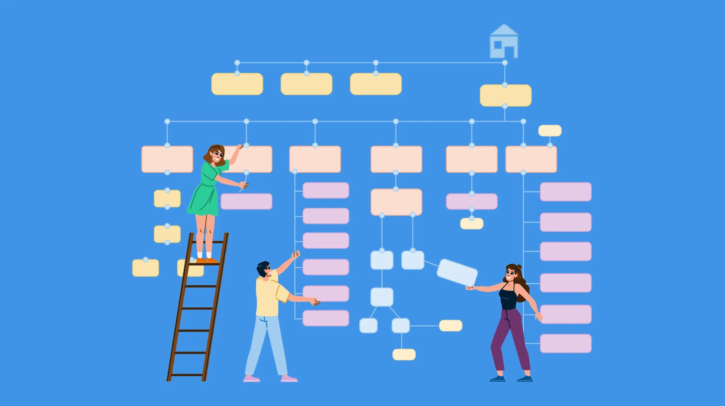
Internal link architecture is the structure behind that navigation. Think of it as a sort of map that shows how pages on a website are connected to each other. This structure signals which pages matter most, adds context by linking related content, and creates a clear hierarchy of information. The most important pages sit at the top, leading visitors and search engines into more detailed content as they explore.
Why does website navigation design matter?
Good website navigation design serves both users and search engines. It helps visitors understand where to go next while giving search engines a clear view of your site’s content and structure. The primary goal is always a streamlined user experience. SEO benefits naturally follow when your navigation is clear and easy to use.
Search engines rely on navigation and internal links to discover pages, understand what each page is about, and see how everything connects. Clear navigation creates logical groupings of content, such as parent and child categories, and reinforces which pages matter most through link placement and visibility. Consistent anchor text also adds context, helping search engines interpret the meaning of each destination page.
Confusing navigation can work against you. It signals a poor user experience and makes it harder for crawlers to find and understand your content.
An intuitive, well-structured navigation system can help:
- Increase search engine rankings and drive website traffic.
- Increase time-on-site and number of page views.
- Improve user experience.
- Increase conversions and on-site sales.
- Make your website accessible to users with disabilities by supporting screen readers, keyboard navigation, and other assistive technologies.
When you use good website navigation design, it benefits readers, search engines, and, ultimately, your business.
14 best practices for website navigation
Use these 14 best practices for website navigation to improve your existing site structure or create a plan for your new website. Just remember, these are best practices. Use them to guide your process, but make adjustments based on what is best for your audience and industry.
Related: Optimize your UX design with AI
1. Start with a site map
If you don’t know where to begin with your website navigation design, start with a site map. A site map is a list of all the pages on your website. It outlines your pages by starting with primary categories and themes and then defining pages within those main ideas.
This step also sets the foundation for SEO. A well-structured site includes dedicated pages for each service, product, team member, and core topic. Pages with broad or generic content often struggle to rank because they lack focus. A single page that tries to cover everything usually doesn’t perform as well as multiple pages that each target a specific topic or keyphrase. Clear focus gives every page a better chance to rank.
That’s why it’s important to avoid relying only on umbrella pages. A general Services page can exist, but it should support individual, search-focused pages for each service you offer. For example, instead of listing everything on one page, create separate pages like Web Design Services, SEO Services, Content Marketing Services, and Social Media Management. This structure helps both users and search engines quickly understand what each page is about.
Once your site map is in place, you can use it to guide your navigation. Your main menu and footer should highlight your most important, focused pages, making it easy for visitors to find what they need and for search engines to understand your site structure. Check out these website wireframe examples for inspiration.
2. Cater to visitors' wants and needs
Website navigation should be built with your target audience in mind. Visitors arrive with a purpose, and your job is to help them find the most relevant information as quickly as possible. Clear, user-focused navigation makes it easy to move through your site without confusion or extra clicks.
Think about the path users take from their first visit to conversion. Which pages answer their biggest questions? Which ones build trust or move them closer to taking action? Those are the pages that deserve a spot in your main navigation. When your menu reflects what your audience actually needs, your site becomes easier to use and more effective at driving results.
Not sure who will be visiting your website? Learn how to find your target audience in this guide.
3. Use descriptive, short menu titles
Long menu titles can clutter the navigation and make a website look messy on mobile, so use short titles when possible. Cut titles down to as few words as possible. Ideally, use one or two words, but include enough description that users — and search engines — can predict what they will find on each page.
Recommended reading: Customer journey mapping for web designers and developers
4. Make navigation visible and accessible
Visibility is a core part of effective website navigation. Visitors should not have to search for your menu or guess where to click next. Clean, familiar placement and clear design choices make your site easier to use from the start.
Here are a few ways to keep your navigation visible and accessible:
- Placement: Most users expect to find the main menu at the top of the page and the footer menu at the bottom. Sticking to these familiar patterns helps people navigate your site with less effort.
- Contrast: Navigation links should stand out from the rest of your content. Strong color contrast makes links easier to see and interact with. A contrast checker can help you confirm your navigation meets accessibility standards.
- Mobile considerations: Mobile users look for the standard hamburger icon to open a menu. Using a familiar icon keeps navigation intuitive and avoids confusion.
- Clear labels for multiple menus: Many websites include more than one navigation area, such as a main menu, footer navigation, sidebar links, or a utility menu. Each one should have a short, descriptive label like Main Menu, Quick Links, Footer Navigation, Social Media, or Account Menu. These labels help all users understand where they are, and they are especially important for screen reader users who rely on them to move between navigation areas and understand the purpose of each menu quickly.
You can label menus using ‘aria-label’ or ‘aria-labelledby’ attributes. Keep labels short but descriptive — examples include “Main Menu,” “Quick Links,” “Footer Navigation,” “Social Media,” or “Account Menu.” Screen reader users can then jump between different navigation areas and immediately understand the purpose of each menu.
For example:
Label menus with ‘aria-label’
<nav aria-label="Main Menu">

<ul>

<li><a href="/">Home</a></li>

<li><a href="/services/">Services</a></li>

<li><a href="/contact/">Contact</a></li>

</ul>

</nav>
Label footers with ‘aria-label’
<nav aria-label="Footer Navigation">

<ul>

<li><a href="/privacy/">Privacy</a></li>

<li><a href="/terms/">Terms</a></li>

</ul>

</nav>
5. Limit the number of menu items in the top navigation
Just as long labels can clutter your navigation, so can too many menu options. Visitors scan your site to find what they need quickly. A crowded menu slows them down and makes it harder to decide where to click.
Aim to keep your top-level navigation to around five to seven items. This keeps your menu easy to scan and forces you to prioritize the pages that matter most to your target audience. If everything feels important, it becomes harder for users to know where to start.
Focus on your highest-value pages and group related content under broader categories when it makes sense. Dropdown menus can help organize subpages without overwhelming your main navigation. Clear, concise labels also go a long way in keeping your menu clean and easy to understand.
6. Don’t use more than two menu levels in the top navigation
Complex businesses may need to use more than seven menu items in their top navigation. You can use dropdowns to add more items, but keep it to two menu levels. Don’t use a dropdown that leads to another dropdown. Instead, consider using a “mega menu” that populates a larger menu from the main navigation.
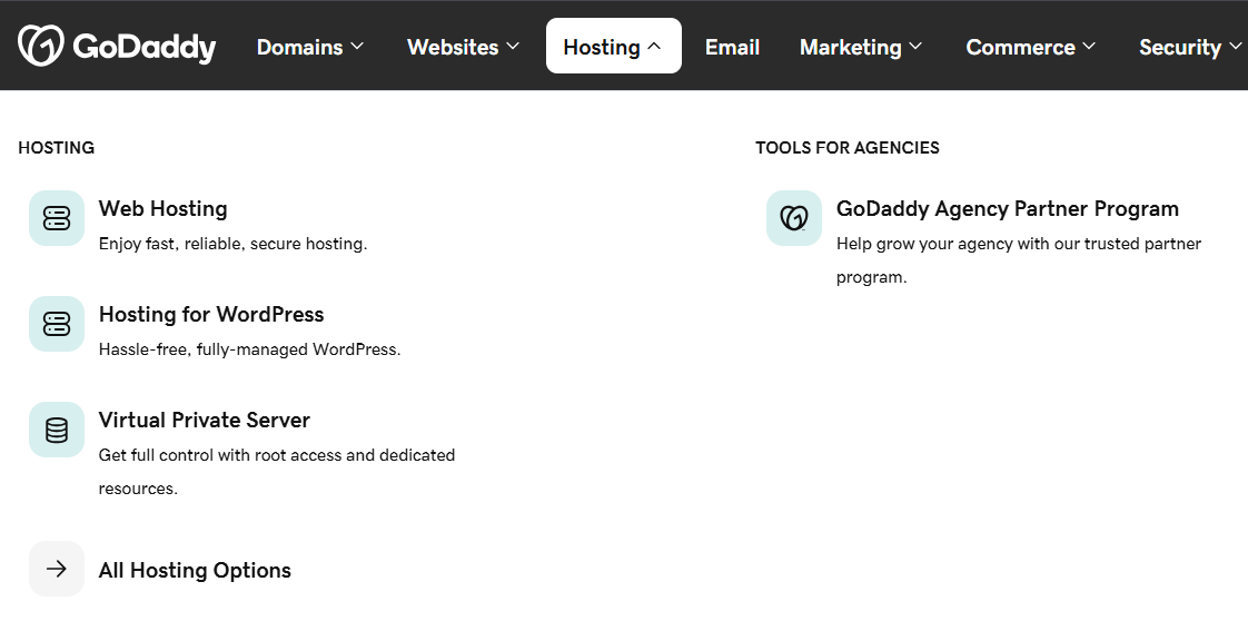
7. Add breadcrumb navigation
Breadcrumb navigation is a secondary navigation pattern that shows users their current location in your site’s structure. It usually appears near the top of a page as a simple trail of links, moving from a broad category to a more specific page.
Home > Services > Web Design > Ecommerce Design
Breadcrumbs support both usability and SEO in a few key ways:
- Orientation: They help users understand where they are in your site, especially if they land on a deeper page from a search engine instead of starting on your homepage.
- Easy backtracking: Visitors can quickly jump to a higher-level page without relying on the back button or searching through your main menu.
- SEO benefits: Search engines can use breadcrumb paths to better understand your site structure. These paths sometimes appear directly in search results, giving users more context before they click. Adding structured data helps search engines interpret your breadcrumbs correctly.
Breadcrumbs work especially well on ecommerce sites, documentation hubs, and any website with multiple levels of content. They support your main navigation without adding extra clutter, giving users a simple way to stay oriented as they explore.
Accessibility tip: Use the <nav> element with an aria-label="Breadcrumb" to help screen reader users identify and skip the breadcrumb navigation. Use an ordered list (<ol>) since breadcrumbs represent a sequential path, and mark the current page with aria-current="page" so assistive technologies can announce it correctly.
<nav aria-label="Breadcrumb">

<ol>

<li><a href="/">Home</a></li>

<li><a href="/services/">Services</a></li>

<li><a href="/services/web-design/">Web Design</a></li>

<li><a aria-current="page" href="/services/web-design/ecommerce/">E-Commerce Design</a></li>

</ol>

</nav>
8. Use menu headings in “fat footers” and “mega menus”
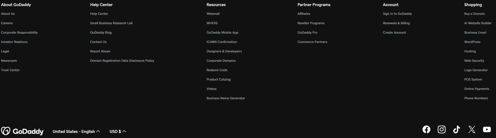
A “fat footer” (also called a "sitemap-lite" or "doormat" footer) is a navigation structure at the bottom of a website that includes multiple menus and links. These content-rich sections are still widely used, but there are more modern versions like multi-column link directories and areas that highlight calls to action or important resources. If you use a “fat footer” or a “mega menu” that has a lot of links, incorporate headings to help categorize the links and make it easier for users to scan.
Mobile experience is just as important. On smaller screens or pages with infinite scroll, fat footers can be hard to reach. In these cases, consider alternatives like sticky mini-footers, floating action buttons, or designs that pause scrolling to surface important footer content. No matter the format, strong labeling and logical grouping keep navigation clear and usable.
Beyond visual organization, menu headings in complex navigation structures provide important accessibility benefits. Screen readers can use these headings to help users jump between different sections of a large menu, making it easier to find specific content without having to listen to every single link. Structure your headings properly using HTML heading elements (h2, h3, etc.) rather than just styling regular text to look like headings.
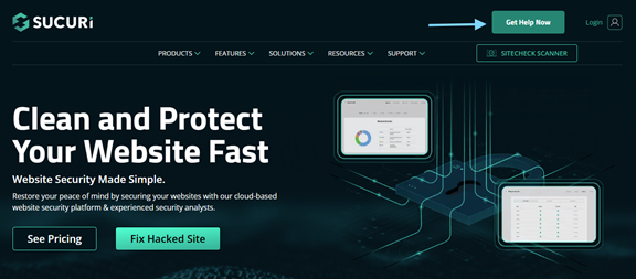
9. Add a call-to-action button in the top navigation
Use your main navigation to drive audiences to the primary call-to-action (CTA) on your site by adding a button. A colorful button with a clear CTA can help website visitors easily see the next step you want them to take.
10. Experiment with sticky top navigation menus
A sticky top navigation is a menu bar that remains at the top of a webpage even as the user scrolls. It keeps your most important links within reach at all times, which can make it easier for visitors to explore your site without having to scroll back up.
This approach works best when your top navigation highlights the pages your target audience needs most. It is especially useful if your menu includes a call-to-action button, since it remains visible and ready for users to click throughout their visit.
Keep screen space in mind, especially on mobile. Sticky navigation takes up valuable vertical space, so it should stay clean and compact. On smaller screens, consider simplifying the menu to a hamburger icon and a clear CTA button. Some sites also use a smart sticky navigation that hides as users scroll down and reappears when they scroll up, keeping the experience smooth without getting in the way.
11. Consider the mobile view of your menus
Responsive website design adjusts your website layout based on screen size, and today, every website must be responsive. Your site should work seamlessly across mobile phones, tablets, and desktops. Navigation is a key part of that experience, so it needs to be considered from the start, not added at the end.
As your layout adapts across devices, your navigation should stay clear, usable, and easy to access. Keep these best practices in mind:
- Test across screen sizes: Check how your menu looks and functions on mobile, tablet, and desktop during development.
- Manage vertical space: Long menus can quickly take over a small screen. Keep mobile navigation concise and easy to scroll.
- Make menus easy to find: Hamburger icons should be clearly visible and placed where users expect them.
- Use touch-friendly sizing: Buttons and links should be large enough to tap comfortably, with a minimum size of 44 by 44 pixels.
GoDaddy Airo AI Builder
Describe your idea. We'll build your live website in minutes.
With a few prompts, Airo AI Builder generates your website, web app, pages, databases and logic in minutes — no coding required. Start for free with 50 AI credits a month. No credit card required.
Build for FreeConsistency across devices is just as important as usability. Even if your layout changes, your navigation should feel familiar:
- Same order: Menu items should appear in the same sequence across all screen sizes.
- Same wording: Use the same labels on every device to avoid confusion.
- Same destinations: Each link should take users to the same page, no matter how they access it.
- Consistent structure: Dropdown items on desktop should still be accessible on mobile, even if they are displayed differently.
This consistency helps users move between devices without having to relearn how your site works, creating a smoother and more reliable experience.
Related: Choosing the right website designer
12. Supplement navigation with site search
Menus are crucial, but they cannot cover every possible path a user might take. On larger websites, a site search feature gives your target audience a faster way to find exactly what they need without browsing through multiple categories.
Site search becomes especially valuable in a few key situations:
- Large product catalogs: Shoppers looking for a specific item can get there faster through search than by clicking through layered categories.
- Support and documentation sites: Users often arrive with a specific question and want a quick answer.
- Content-rich sites: Blogs, news platforms, and resource libraries with a high volume of pages benefit from giving users a direct way to navigate.
To make the most of your site search, follow these best practices:
- Make it easy to find: Place the search bar, or a search icon that expands, in your top navigation where users expect it.
- Use autocomplete and suggestions: Real-time suggestions help users refine their queries, reduce errors, and discover relevant pages or products faster.
- Show useful results: Prioritize relevance and include helpful details like descriptions or images. Filters can also improve the experience by narrowing results.
- Track search behavior: Search data reveals what users are looking for. Frequent searches for hard-to-find content can highlight gaps in your navigation or content strategy.
Even the most organized navigation cannot predict every user’s intent. Site search fills that gap, giving users a reliable way to find what they need when menus fall short.
13. Use your analytics to improve
As with all marketing tactics, there is no exact formula that will work for every brand all the time.
Use Google Analytics to monitor results, see what works best for you, and adjust based on what you learn. Look at your analytics and use heat-map tracking to determine how people use your site, and then iterate to improve user experience and results. You may need to:
- Remove or rename menu items that are rarely clicked.
- Make it easier to get to pages that have a lot of views.
- Move menu items that get a lot of clicks to the top or front.
Recommended reading: What is website analytics — and how can it help your business grow?
14. Use semantic HTML markup for accessible navigation
HyperText Markup Language (HTML) is the foundation of every website, and how you structure it shapes how users and search engines understand your navigation. Semantic HTML adds meaning to your code, making it easier for screen readers, keyboard users, and other assistive technologies to move through your site. It also helps search engines interpret your structure more clearly.
Start by clearly identifying your navigation areas. The HTML5 nav element signals that a section contains navigation links, allowing assistive technologies to find and jump to menus more easily.
Within those navigation areas, use lists to organize your links in a logical way:
- Unordered lists: Use these for most navigation menus where order does not matter, such as your main menu, footer links, or sidebar navigation.
- Ordered lists: Use these when sequence matters, such as step-by-step tutorials or multi-step processes.
This semantic structure allows assistive technologies to announce the total number of menu items and provide appropriate navigation functionality, making your website more inclusive and user-friendly.
Here are a few examples of what this can look like in practice:
Example: Sequential navigation using <nav> and an ordered list <ol>
<nav aria-label="Setup steps">

<ol>

<li><a href="/setup/account/">Create account</a></li>

<li><a href="/setup/profile/">Complete profile</a></li>

<li><a href="/setup/launch/">Launch</a></li>

</ol>

</nav>
Keep improving your website
Your website is always a work in progress. Use these best practices for website navigation design to improve user experience, boost SEO, and drive more conversions. And then, see what other changes and updates will make your website even more effective. Get more tips in the GoDaddy guide 10 elements of an effective small business website homepage.