
Email is one of the primary and most successful marketing tools available to small businesses and entrepreneurs. However, many people struggle with creating attractive emails because they’re not professional graphic designers.
Fortunately, there are plenty of email templates out there you can use to make sure your outreach is effective. Let’s explore the importance of email design, key elements to include, and how to use email templates.
Why email design matters
You want to send emails that get opened and read, right? Of course you do! That's why it is so important to use a professional business email address and create emails that are visually appealing and built to drive action.
Strong email design helps guide readers toward your goals. That can mean growing your subscriber list, increasing clicks on your calls to action, and turning interested readers into customers. Consistent results like these support long-term business growth.
Branding plays a central role in this process. It shapes how people recognize and remember your business.
Every email you send contributes to that perception. Clear design choices and consistent use of colors, fonts, and messaging help build brand awareness over time.
Elements of effective email design
There are four basic elements of every great email that must be considered:
- Email images
- Font choices
- Colors
- Mobile design
1. Email images
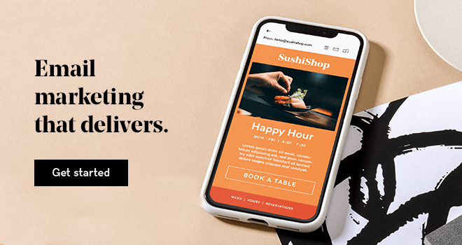
The first image your subscribers will see is your banner image. The banner image is an integral part of your email design because it represents your business and the reason for your communication. It has the power to draw your readers in, communicate your message, reinforce your brand, and connect visually, as do additional images within your email.
High-quality images are imperative for providing a professional presentation.
The image format you use is also crucial. The correct format depends on the content of the image you are going to use. However, the basic guideline is to use the .jpg format for photographic images and the .png format for images with text or those that require a transparent background.
Email image size guidelines
Strong email visuals start with the right image sizing and a mobile-first mindset. Most people read emails on their phones, so images need to look sharp, load quickly, and scale cleanly across devices.
A few guidelines to follow:
- Use a width of 600 to 640 pixels for desktop layouts so images scale well on mobile (around 320 pixels)
- Keep banner heights around 100 to 200 pixels to avoid overwhelming the email
- Make sure image sizes for email newsletters can adapt to different devices
- Design larger, then scale down to maintain image quality
- Source images around 1200 to 1500 pixels wide to balance quality and cost
- Compress images to keep file sizes low (ideally under 200 KB) for faster load times
- Use consistent image sizes and styles to create a cohesive, recognizable look
- Choose visuals that support the content and guide readers toward your call to action
- Add alt text to every image to improve accessibility and ensure context if images do not load
You can use tools like compressor.io to resize image files. Following these practices helps create emails that are easy to scan, visually consistent, and built to perform across inboxes and devices.
2. Best fonts for email design
Before your readers actually read your email, they see it. Maybe even feel it.
Choosing the best fonts for your email is an important step in your email marketing efforts.
Your choice of fonts will help support your brand and set the tone. Whimsical, serious, fun, educational? There are fonts that will fit pretty much any theme or personality.
Choose those that align with your business's overall image, then use them regularly to build your brand awareness. You should also:
- Start with web-safe fonts: Ensures emails display consistently across devices and prevents unexpected font substitutions
- Avoid decorative or script fonts in body text: Keeps content clean, readable, and accessible across all screen sizes
- Limit to one or two fonts: Creates a cohesive look that aligns with your brand and avoids visual clutter
- Pair fonts thoughtfully: Combine serif and sans-serif styles in a way that makes headings and body text easy to distinguish
- Use at least 16px font size: Improves readability, especially for mobile users
- Stick with left-aligned text: Makes content easier to scan and follow for most readers
3. Choosing email colors
Colors are critical when designing your emails. They guide attention, highlight important elements like calls to action, and shape how a brand is perceived.
A thoughtful color palette keeps emails consistent and recognizable. If you’re unsure where to start, tools like Coolors or Paletton can generate combinations and help you choose brand colors that align with your style.
You may know that color psychology can be used in logos, but did you know that it can also support email marketing goals? Although the meanings of colors can vary across audiences and cultures, each color is often associated with specific emotions or ideas. Some common color meanings are:
- Red: Power, energy, importance, intensity, danger
- Orange: Balance, warmth, vitality, enthusiasm
- Blue: Trustworthiness, order, security, loyalty
- Green: Environment, health, generosity, vigor
- Yellow: Optimism, idealism, joy, caution
- Pink: Feminine, caring, compassion, self-confidence
- Black: Power, sophistication, elegance, wealth
- Purple: Royalty, nobility, wisdom, transformation
For example, blue is often used by banks because it signals trust and security.
How to use color in emails
Whatever colors you decide to use, remember that less is more.
Using your primary color in your banner and headings will help to create the impression you want. We don't want to overwhelm your readers with everything being in a different color.
The colors you use in your emails can significantly increase your brand recognition, so it’s best to do some quick testing and then stick with that color scheme. This is because your color choices will become powerfully associated with you and your brand.
If you want readers to click a specific link in your email, try making the call-to-action link red or orange. Red is the most powerful color in the color spectrum, and it might even elicit a physical response. Because of this, a red link is more likely to be clicked on than a blue one.
Balance is very important, though. Simple design always works best and provides a more trustworthy and professional appearance when compared to overly large, bright or flashing elements.
4. Mobile email design

55% of emails are opened on mobile devices worldwide, which makes mobile design and optimization crucial. If an email is hard to read on a phone, it’s likely to be ignored, deleted, or unsubscribed from.
This is why every campaign should be built with mobile in mind. Clear layouts, readable text, and easy-to-tap calls to action can make the difference between engagement and missed opportunity. The three steps below will help create mobile-friendly emails that look polished and perform better.
Step 1: Simplify, simplify, simplify
You've heard of the KISS principle (Keep It Simple, Stupid), right? This is commonly used for email marketing because simple, focused content performs better, especially on mobile devices where space and attention are limited. To do this:
- Prioritize what matters most in each campaign.
- Tighten the copy and remove anything that does not support the main goal. Clear, direct messaging makes it easier for readers to understand what to do next.
- Keep calls to action focused. Each email should guide readers toward a single primary action rather than competing priorities.
Layout also matters here. A single-column design is easier to read on mobile and helps keep content organized. Multi-column layouts may look appealing on desktop but often break down on smaller screens.
And remember, not everything needs to sit at the top. Scrolling is expected in email, so use strong visuals, clear hierarchy, and engaging content to keep readers moving through the message.
Step 2: Stick to mobile-first defaults
Now that your foundation is set, zero in on the details that make emails work on mobile.
Start with a mobile-ready template. Most email platforms include responsive defaults, but strong results come from using those features intentionally. Focus on these key elements:
- Fonts: Use web-safe fonts with a minimum size of 16 pixels for body text.
- Text links: Avoid nesting links so closely that they're hard to click or target.
- Formatting: Too much text looks like too much to read. Your subscribers will most likely be scanning, so use short paragraphs and lists where appropriate. This helps to keep things easy on the eye.
- Buttons: CTA buttons also need to be easy to click. Aim for a minimum size of 44 x 44 pixels.
- Graphics: Don't include images for the sake of having imagery. Choose graphics with one prominent point of interest, and use them when they complement your content or back up your CTA.
Step 3: Test, then test again (and again)
Testing is necessary and should be ongoing.
With every addition or modification that you make, you want to run a test to see how your changes display.
Preview campaigns across common devices and send test emails to confirm everything works as expected. Split testing can also help identify which versions perform best.
Most email platforms include tools to preview campaigns and segment test audiences based on demographics or behavior. What works for one group may not work for another, so these insights help create more targeted campaigns.
Use reporting and testing data to refine performance over time. Once a solid foundation is in place, test specific elements like subject lines and calls to action.
Consistent review of campaign metrics helps uncover opportunities to improve results. Many platforms handle much of the technical work, so it makes sense to take full advantage of those tools.
DIY vs. professional email design
You can create your own email images or hire a professional to handle them for you. The route you choose depends on your technical proficiency and available resources.
Do-it-yourself email image design
If Photoshop feels too complex, web-based image creation tools offer a simpler way to design professional visuals that align with your email marketing goals.
The GoDaddy app, for example, makes it easy to create graphics that match your brand and fit your campaigns. Choose from pre-set sizes or customize dimensions, then apply fonts, colors, and templates that keep your emails consistent and recognizable. You can even save and reuse brand elements across your designs to reinforce your identity with every message.
When creating email banners, images like storefront photos can be uploaded and customized, or templates can be used as a starting point. Designs can also be resized to promote campaigns across platforms.
Hiring a designer for email images

There are times when investing in professionals who can do a better job than we can ourselves is just smart business.
If you feel you have hit a creative block, finding a graphic designer you can trust is worth the cost.
Just be sure that when working with a designer, you provide as much detail as possible for what you want them to create for you. Provide color codes, logo files, preferred font styles, and share the tone or personality you are trying to convey.
Using email templates (themes)

If you don’t have coding experience, you don’t have to design your emails from scratch. Email templates are a simple way to build consistent, professional campaigns and make future sends faster to create. They also help establish a recognizable look. Consistent layout, colors, and structure reinforce your brand and create a better experience for readers.
Keep these guidelines in mind when creating or customizing templates:
- Create a color scheme: Use colors from your logo and website to keep emails aligned with your brand.
- Choose a banner image: Start with a strong visual and use exact color codes to keep design elements consistent.
- Define supporting colors: Select secondary colors for headings, links, and accents to create a clear hierarchy.
- Keep it easy to read: Use light backgrounds behind text and strong contrast for clarity.
- Use contrast with purpose: Darker borders or sections can help guide attention without overwhelming the design.
- Experiment carefully: Test variations of brand colors, but keep body text in dark, readable tones like black or gray.
A word on creating email content
Email design gets attention, but content drives results. Clear, well-structured messaging is just as important for engagement and ROI.
The good news is that writing is a skill you can improve over time.
The more you write, the better you’ll get at creating messages that will resonate with your target audience. Here are some tips to help you learn how to write emails people will actually read:
- Make content easy to scan.
- Use headings and subheadings to organize content
- Break up long sections of text with spacing or images
- Keep sentences around 20 to 25 words and paragraphs to three to four sentences
- Use color to highlight key links and calls to action
You can also use tools like Hemingway to make your message clear and catchy. The site automatically tells you how readable your message is and gives you tips to improve your sentences.
Email design mistakes to avoid
Even the best-designed email can fall flat if it includes errors or misses the mark with tone. Content should feel clear, relevant, and written for the reader, not at them.
Here are some common mistakes to watch for:
- Skipping a full proofread: spellcheck helps, but it will not catch every issue. Review content carefully for context and clarity
- Broken links: test every link to confirm it leads to the correct destination
- Generic subject lines: keep subject lines clear and concise. Avoid overhyped or spam-like language
- Unclear “From” name or address: use a recognizable sender name and a monitored email address so replies are possible
- Using “noreply” addresses: this discourages engagement and creates a poor customer experience
- Clashing colors: make sure text and links are easy to read against the background
- Missing or broken images: use full image URLs to ensure visuals load correctly across email clients
- Broken personalization: check dynamic fields like first names to avoid showing placeholders such as %FNAME%
The best way to avoid these issues is through thorough testing. Review emails multiple times, send test versions, and check them across devices. A fresh review later or reading the email out loud can help catch errors that are easy to miss during initial edits.
Design emails that convert
Great email design makes messages easier to read, guides attention to key actions, and creates a consistent experience your audience can recognize. When layout, images, typography, and mobile optimization all work together, emails become more effective at driving engagement.
Putting these design principles into practice is easier with the right tools. GoDaddy Digital Marketing offers customizable templates and built-in features that help create clean, mobile-friendly emails without extra complexity. Explore GoDaddy Digital Marketing today to design emails that look sharp, stay on brand, and perform across every device.