Color is one of the first things people notice about a logo. It can influence how your brand is perceived, shape emotional connections, and even affect purchasing decisions. That’s why choosing the right color palette is just as important as picking the right name or font.
In this guide, we’ll explore how color psychology in logo design impacts your branding and how to choose the right hues.
Related: What is a logo?
The basics of color psychology for logo design
Every color sends a message, so color psychology plays a big role in logo design. Before choosing a specific palette, it’s worth understanding how color influences perception, emotion, and recognition across different industries and audiences.
How color influences perception
Colors help shape first impressions before a single word is read. A bold red might feel energizing, while soft pastels can seem calming or approachable. These gut-level reactions happen instantly, which is why color choices are a key part of logo design strategy. When used well, color creates a mood that supports your brand’s personality and purpose.
The science behind color and emotion
Research shows that color activates the brain’s emotional center. In marketing and branding, this means certain colors can trigger feelings like trust, excitement, or security. While context and culture also play a role, studies in color psychology suggest that visual cues like hue, brightness, and saturation influence how people react. Because of this, strategic use of color can make a logo more memorable and impactful.
Common color associations in everyday life
Many colors have built-in meanings based on life experience. Think of how green often relates to nature or how yellow can feel cheerful. These associations help people connect with a brand quickly. While not universal, they’re powerful shortcuts for communicating values or tone. When building a logo, tapping into these familiar signals can make your message clearer without saying a word.
The role of color in brand recognition
According to studies from the University of Loyola, color increases brand recognition by up to 80%. A consistent color scheme helps customers recall your business faster and builds trust over time. Think of iconic brands like Coca-Cola or Tiffany & Co. — color is core to their identity.
Understanding the color wheel and color harmony for logos
The color wheel is a great tool for choosing logo colors. It organizes primary, secondary, and tertiary colors in a way that shows how they relate and interact. For logo design, this tool is especially useful when building a color palette that feels balanced and on brand.
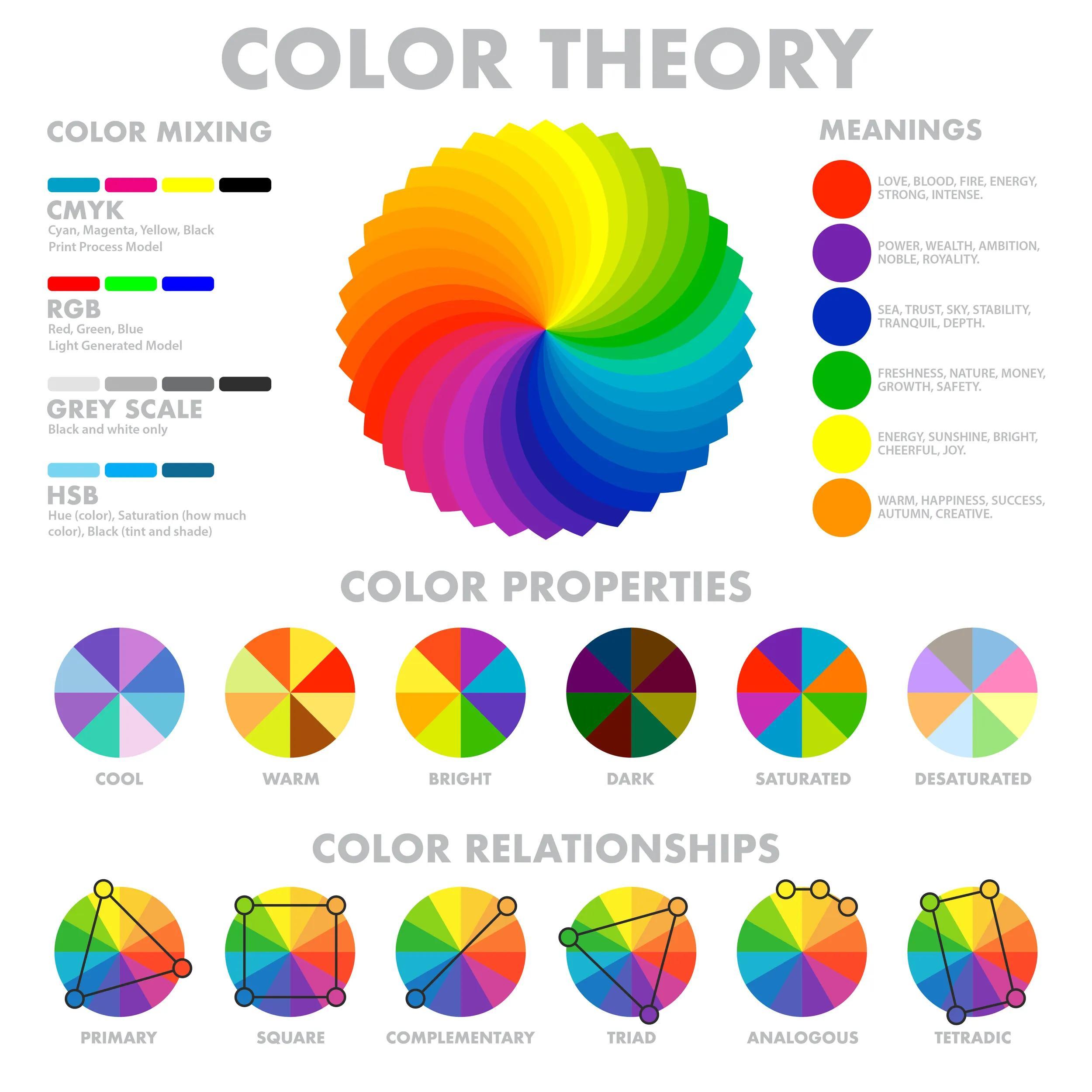
The color wheel helps you apply basic principles of color harmony. This refers to color combinations that look good together and support the tone you want to set.
- Complementary colors sit opposite each other on the wheel. They create bold contrast and are often used to make a logo feel energetic and dynamic.
- Analogous colors sit side by side and produce a more subtle, unified look. These combinations are common in designs that aim for consistency or calmness.
- Triadic colors form a triangle by selecting three colors evenly spaced on the wheel. This creates a vibrant palette with contrast that still feels balanced.
- Split-complementary colors start with a base color and use the two colors next to its direct complement. This offers visual interest like a complementary scheme, but with less tension or intensity.
- Square color schemes use four colors evenly spaced around the color wheel in a square shape. This creates a balanced palette with variety and is often used by brands that want a bold, dynamic look.
- Monochromatic colors use variations of a single hue. This creates a clean, cohesive appearance and is ideal for brands that want a minimalist or sophisticated feel.
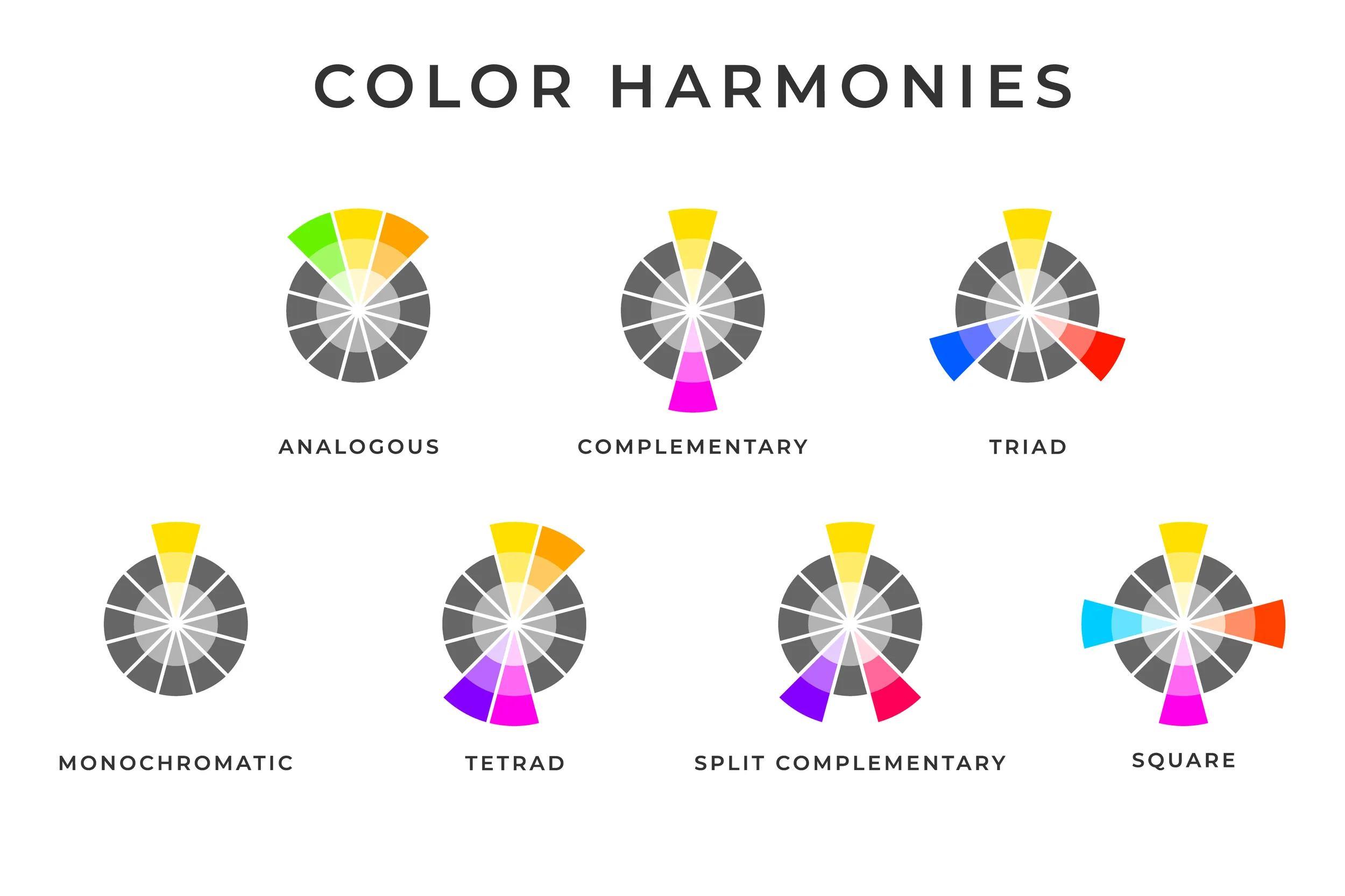
Strong color harmony makes a logo feel intentional, polished, and easy to remember. It helps maintain consistency across platforms, which supports long-term brand recognition.
How different colors impact brand perception
The colors you choose reflect your brand’s tone and values. Understanding logo color meanings helps you create a stronger connection with your audience. Let’s explore each color and its impact on logo psychology.
Blue: trust, calm, professionalism

Blue is a staple in business logo color psychology. It creates a sense of calm, confidence, and trust, which is why it’s commonly used by banks, healthcare providers, and tech companies. Lighter shades feel fresh and approachable, while darker blues suggest stability and tradition. Overall, blue works well for brands that want to appear responsible, secure, and reliable.
Purple: creativity, luxury, wisdom

Purple blends emotional richness with creative flair. In logo psychology, it often represents luxury, innovation, and insight. Because of its historical link to royalty, purple adds a sense of prestige to a brand. It’s frequently used in beauty, tech, and lifestyle industries where originality and sophistication are important. Lighter purples feel more playful and modern, while darker tones bring depth and elegance. Purple is ideal for brands that want to stand out with a thoughtful edge.
Red: power, passion, energy
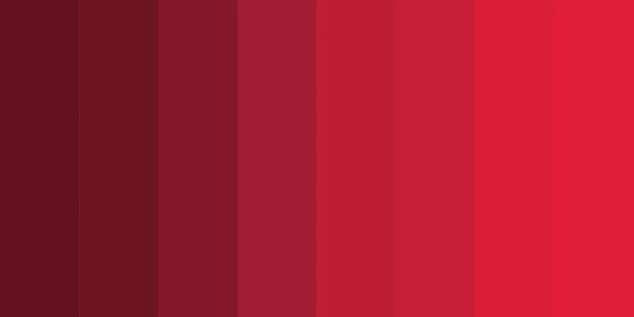
Red is one of the most attention-grabbing colors in logo design. It’s bold, emotional, and often used to create a sense of urgency or excitement. In color psychology, red is linked to power and passion, making it a strong fit for food, sports, and entertainment brands. However, because red carries so much intensity, it works well in moderation or paired with neutral tones to keep your logo balanced and approachable. Explore our guide to logo color combinations for more guidance.
Orange: enthusiasm, creativity, friendliness

Orange combines the vibrancy of red with the warmth of yellow, resulting in a color full of energy and personality. It’s a go-to choice for brands that want to feel friendly, modern, and approachable. It’s a popular choice in industries like marketing, tech, and fitness. Used well, orange makes a logo feel bold without being too aggressive or overwhelming.
Yellow: optimism, clarity, warmth

Yellow is bright, energetic, and full of optimism. It can make a logo feel inviting, youthful, and uplifting. According to logo color psychology, yellow works especially well for brands that want to spark happiness or creativity. It’s a common accent in retail and food logos and is often used to highlight key features. Because yellow can be hard to read at smaller sizes, it’s best paired with darker or neutral tones.
Green: nature, growth, health

Green is closely tied to nature, prosperity, and financial stability. Lighter greens feel fresh and clean, while deeper shades suggest trust, maturity, and heritage. Green is a popular choice for health, finance, agriculture, and sustainability-focused brands. It’s also a strong option for companies that want to project balance and long-term growth.
White: simplicity, modernity, clarity

White adds space, contrast, and visual breathing room. In logo color psychology, white conveys simplicity and openness, making it a strong choice for modern and minimalist designs. It can make a brand feel clean and focused. White also helps highlight other colors in your palette, allowing your logo to feel structured without looking crowded or overly busy.
Pink: playfulness, compassion, femininity

Pink is expressive, warm, and emotionally engaging. In business logo color psychology, it reflects empathy, creativity, and charm. Lighter pinks feel calming and romantic, while brighter or bolder shades bring confidence and fun. Pink is often used in beauty, wellness, and lifestyle branding. It helps a brand feel relatable and human, especially when paired with modern typography or clean layouts.
Black: sophistication, power, elegance

Black is a classic logo color that works across many industries. It brings a sense of strength, professionalism, and timelessness, as well as luxury and control. It’s frequently used by fashion, automotive, and high-end tech brands that want to appear sleek and refined. Black also pairs well with bold accent colors for added contrast. If you want your brand to feel confident and modern, black is a strong foundation for your logo.
Brown: stability, warmth, tradition

Brown is earthy, honest, and grounded. In logo psychology, it reflects durability, tradition, and trust. It’s commonly seen in food, beverage, and outdoor brands, where a natural and dependable image is important. Brown pairs well with warm neutrals or muted tones to create a handcrafted or heritage feel. It’s a great option for businesses that value authenticity, craftsmanship, or a close connection to the physical world.
Best practices for using color in logo design
Color can make or break your logo, but even strong color choices can fall flat without the right strategy behind them. From brand alignment to accessibility, it’s important to think through how your logo colors will perform in the real world. Here are a few tips to help you get the most from your color palette.
Align color choices with brand personality
Start by thinking about how you want people to feel when they see your logo. Color should reflect your brand’s personality and tone. If your brand is bold and adventurous, bright colors may work well. If it's professional and reserved, you might lean toward muted or neutral tones. Use business logo color psychology to guide your choices, then combine it with your audience’s expectations. Your brand colors should support the story you want to tell.
Limit your color palette for impact
It can be tempting to use the full rainbow, but less is often more with logos. A strong logo typically uses two or three main colors to stay clean and memorable. Too many colors can make your design feel busy or unfocused. A limited palette also scales better and works more consistently across different formats. Use contrast strategically to highlight key elements. If your logo appears too soft or chaotic, narrowing your palette is an easy way to bring it back into focus.
Ensure accessibility and legibility
Your logo should be easy to read and understand for everyone. This means choosing colors with strong contrast and avoiding combinations that make text or icons hard to see. Legibility is especially important when designing for screens. Accessibility isn’t just a design best practice—it’s also part of creating an inclusive brand. Learn more about what is web accessibility and how it can help you reach a wider audience.
Test logo colors across different backgrounds and mediums
Your logo won’t always live on a white background. It might show up on packaging, signage, your website, or even a favicon. That’s why it’s important to test how your logo colors look in different settings. Make sure it’s still readable and effective at small sizes, especially on social media. For reference, check out our blogs on social media image sizes and favicon creation tips.
Pair your colors with the right typography
Color and typography work hand in hand in logo design. A modern font paired with the right color can feel confident and approachable, while the wrong pairing might send mixed signals. Make sure your color palette complements the style and weight of your text. If you’re still exploring options, read our tips on how to find the best font for your logo.
Common mistakes in color selection
Color selection is a big part of building a strong visual identity, and small mistakes can lead to a logo that feels off-brand or hard to use. Whether you're refreshing your look or creating something from scratch, avoiding these common pitfalls can save you time and help you make a more polished final product.
Relying too heavily on current trends
Trendy colors might look fresh today, but they can feel dated in a year or two. While it’s fine to take inspiration from what’s popular, your brand colors should support long-term recognition. Instead of chasing the latest palette, focus on what aligns with your brand’s tone, audience, and goals. A strong foundation will outlast any trend. For more help defining your style, take a look at our brand identity guide.
Overlooking the emotional impact of colors
Color choices affect how people feel about your brand. If you pick colors only because they look nice, you may miss an opportunity to create deeper connections with your audience. Use logo color psychology to ask yourself what emotions your colors are sending and whether they align with your message. Your palette should support your name, tagline, and tone.
Related: What is a tagline?
Using inconsistent color application
Once you choose your brand colors, use them consistently. If your logo looks different on your website, social media, and packaging, it weakens your brand recognition. Build a style guide with exact color codes, and stick to them across platforms. Consistency makes your brand feel polished and intentional. It also makes it easier to scale over time.
Neglecting the effects of print vs. digital
Colors can look different depending on the medium. What appears vibrant on screen might look muted in print, and vice versa. Always test your logo in both formats before locking in your final version. This includes checking how colors appear on merchandise, signage, and small-scale uses like favicons or watermarks. Saving your design as a vector logo ensures it stays sharp and accurate in every format.
Ready to put logo color psychology into practice? Use GoDaddy’s online logo tool to make your own custom logo today!
Case studies: successful use of color in logos
The most iconic brands use color as a core part of their identity. Let’s take a look at a few examples of logo types that show how color theory can elevate a brand.
Coca-Cola
Coca-Cola’s red logo is one of the most recognizable in the world. The bold color conveys energy, emotion, and passion. Paired with its flowing script font, the red helps create a feeling that is both classic and full of life.
Spotify

Spotify uses green to stand out in the tech space, which is often filled with blues and blacks. Green suggests growth, creativity, and a sense of calm—all things that reflect the brand’s role as a hub for personal music discovery. The bright shade adds a fresh, modern edge to the simple icon.
Tiffany & Co.
Tiffany blue is a signature that evokes sophistication and exclusivity while also feeling calming and elegant. It reflects both the quality of the product and the emotional experience of gifting something special.
McDonald’s

McDonald’s uses a high-contrast color combo that works hard. Red creates urgency and stimulates appetite, while yellow adds friendliness and visibility. Together, they create a logo that grabs attention, builds familiarity, and works well across signs, packaging, and ads.
Implementing color psychology in logo design
Color plays a key role in how your logo communicates with the world. It can highlight your brand’s personality, create emotional impact, and help people recognize your business at a glance. When you align your palette with your brand’s values and apply it consistently, your logo becomes a tool for connection and credibility.
Ready to design a logo that captures your brand’s personality? Use GoDaddy’s Logo Maker to start creating a custom logo with colors that reflect your unique style.
Disclaimer: Third-party logos, names, and marks are registered trademarks of their respective owners. All rights reserved.
